


如果你想了解Behavior,可以移步另一篇文章
A super-powered FrameLayout—协调布局CoordinatorLayout(二):Behavior
一、CoordinatorLayout介绍
CoordinatorLayout is a super-powered FrameLayout.
CoordinatorLayout is intended for two primary use cases:
  1. As a top-level application decor or chrome layout
     (作为顶级应用程序或者框架布局)
  2. As a container for a specific interaction with one or more child views
      (作为与一个或者多个child view 进行特定交互的容器)

By specifying Behaviors for child views of a CoordinatorLayout you can provide many different interactions within a single parent and those views can also interact with one another. View classes can specify a default behavior when used as a child of a CoordinatorLayout using the CoordinatorLayout.DefaultBehavior annotation.
(通过为 CoordinatorLayout 的子view指定 Behaviors,您可以在单个父视图中提供很多不同的交互,并且这些视图也可以相互交互。当视图类用作 CoordinatorLayout 的子项时,可以使用CoordinatorLayout.DefaultBehavior 注释指定默认行为)

Behaviors may be used to implement a variety of interactions and additional layout modifications ranging from sliding drawers and panels to swipe-dismissable elements and buttons that stick to other elements as they move and animate.
 (Behaviors可以提供很多很多牛批的交互,炫酷的效果)

Children of a CoordinatorLayout may have an anchor. This view id must correspond to an arbitrary descendant of the CoordinatorLayout, but it may not be the anchored child itself or a descendant of the anchored child. This can be used to place floating views relative to other arbitrary content panes.

Children can specify CoordinatorLayout.LayoutParams.insetEdge to describe how the view insets the CoordinatorLayout. Any child views which are set to dodge the same inset edges by CoordinatorLayout.LayoutParams.dodgeInsetEdges will be moved appropriately so that the views do not overlap.
二、基本使用
1. 配合AppBarLayout使用
1.1关于layout_scrollFlags属性的解释
layout_scrollFlags中的属性可以相互结合使用,用于实现不同的效果
注意:exitUntilCollapsed、enterAlways、 enterAlwaysCollapsed 、snap、snapMargins必须结合scroll使用才会生效
| 属性名 | xml | 说明 |
|---|---|---|
| SCROLL_FLAG_NO_SCROLL | noScroll | 禁用视图上的滚动。此标志不应与任何其他滚动标志结合使用 |
| SCROLL_FLAG_SCROLL | scroll | 视图将与滚动事件直接相关。需要设置此标志才能使任何其他标志生效。如果在此之前的任何兄弟视图没有此标志,则此值无效 |
| SCROLL_FLAG_EXIT_UNTIL_COLLAPSED | exitUntilCollapsed | 视图滚动时,目标视图将折叠,折叠高度由视图的最小高度决定,当滚动视图到顶部时展开 |
| SCROLL_FLAG_ENTER_ALWAYS | enterAlways | 随着上下滚动事件,立即折叠或展开 |
| SCROLL_FLAG_ENTER_ALWAYS_COLLAPSED | enterAlwaysCollapsed | 初始状态下随着向上滚动开始折叠,向下滚动时到达初始状态后开始展开 |
| SCROLL_FLAG_SNAP | snap | 在滚动结束时,如果视图只是部分可见,那么它将被捕捉并滚动到它最近的边缘 |
| SCROLL_FLAG_SNAP_MARGINS | snapMargins | 与 ‘snap’ 一起使用的附加标志。如果设置,视图将捕捉到其顶部和底部边距,而不是视图本身的边缘 |
1.2 layout_scrollFlags的对应效果
文字的描述始终是没有看图来的直接,先贴布局
<?xml version="1.0" encoding="utf-8"?>
<androidx.coordinatorlayout.widget.CoordinatorLayout
    xmlns:android="http://schemas.android.com/apk/res/android"
    xmlns:app="http://schemas.android.com/apk/res-auto"
    xmlns:tools="http://schemas.android.com/tools"
    android:layout_width="match_parent"
    android:layout_height="match_parent"
    tools:context=".MainActivity">

    <com.google.android.material.appbar.AppBarLayout
        android:layout_width="match_parent"
        android:layout_height="wrap_content">

        <androidx.appcompat.widget.AppCompatImageView
            android:layout_width="match_parent"
            android:layout_height="wrap_content"
            android:adjustViewBounds="true"
            android:minHeight="50dp"
            android:src="@mipmap/test"
            app:layout_scrollFlags="noScroll" />

    </com.google.android.material.appbar.AppBarLayout>

    <androidx.core.widget.NestedScrollView
        android:layout_width="match_parent"
        android:layout_height="wrap_content"
        app:layout_behavior="@string/appbar_scrolling_view_behavior">

        <androidx.appcompat.widget.AppCompatTextView
            android:layout_width="match_parent"
            android:layout_height="wrap_content"
            android:layout_marginTop="10dp"
            android:gravity="center_horizontal"
            android:lineSpacingExtra="20dp"
            android:text="@string/it_is_a_man"
            android:textSize="23sp" />

    </androidx.core.widget.NestedScrollView>

</androidx.coordinatorlayout.widget.CoordinatorLayout>
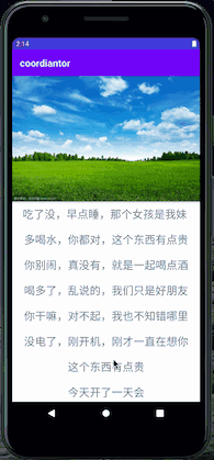
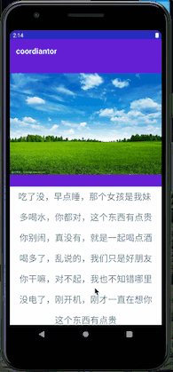
1.2.1 layout_scrollFlags 之 noScroll
图片不会随着的滚动做出任何变化
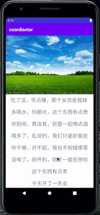
1.2.2 layout_scrollFlags 之 scroll
图片好像是嵌套在NestedScrollView顶部一样,随着滚动改变了原本的位置
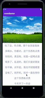
1.2.3 layout_scrollFlags 之 scroll|exitUntilCollapsed
- 向上开始滑动时,图片开始随着滑动向上滑动,直到达到设置ImageView的最小高度时(我这里设置的是50dp),图片不会再随着滑动继续滑动
- 向下滑动时(注意细节),图片不会随着滑动立马展开,而是当NestedScrollView滑动到顶部时,继续向下滑动,此时图片才会随着滑动展开
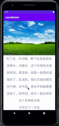
1.2.4 layout_scrollFlags 之 scroll| enterAlways
- 向上开始滑动时,图片开始随着滑动向上滑动,直到完全离开可视区域,无视最小高度的属性
- 向下滑动时(注意细节),图片会立马开始跟随滑动展开,直到图片完整展开时,NestedScrollView中的内容才会随着继续滑动展示
1.2.5 layout_scrollFlags 之 scroll| enterAlwaysCollapsed
- 向上开始滑动时,图片开始随着滑动向上滑动,直到完全离开可视区域,无视最小高度的属性
- 向下滑动时(注意细节),图片不会随着滑动立马展开,而是当NestedScrollView滑动到顶部时,继续向下滑动,此时图片才会随着滑动展开

1.2.6 layout_scrollFlags 之 scroll|snap
当手指一直处于屏幕上滑动,效果和scroll| enterAlwaysCollapsed完全相同,它俩的区别在于,当在滑动的过程中图片还可见时手指离开屏幕的效果
- 当图片滑动未超过图片高度的1/2时,回弹到全部展开状态
- 当超过1/2时,自动滑动到全部收缩状态

1.2.7 layout_scrollFlags 之 scroll|snap| snapMargins
和scroll|snap基本一样,唯一的区别是,自动滑动到的并非是图片的顶部或者底部,而是会加上marginTop或者marginBottom的距离。
修改xml,给ImageView增加margin属性
    // 增加margin属性
...
    <androidx.appcompat.widget.AppCompatImageView
        android:layout_width="match_parent"
        android:layout_height="wrap_content"
        android:adjustViewBounds="true"
        android:minHeight="50dp"
        android:src="@mipmap/test"
        android:layout_marginVertical="30dp"
        app:layout_scrollFlags="scroll|snap|snapMargins" />
...
到此AppBarLayout的layout_scrollFlags属性值对应的不同的效果就介绍完了,下面再介绍一下,经常和CoordinatorLayout&AppBarLayout一起使用的另外一个控件CollapsingToolbarLayout(折叠工具栏布局)
2. 配合CollapsingToolbarLayout使用
CollapsingToolbarLayout是一个实现了折叠app bar的wrapper(包装器),它只能用作AppBarLayout的直接子View —— 来自官方类说明(灵魂翻译)
2.1 CollapsingToolbarLayout这厮的layout_collapseMode属性也有flag
- none —— view将正常运行,没有折叠行为
- pin —— view将固定在那个位置
- parallax —— view将以视差方式滚动
xml布局文件如下⬇️
<?xml version="1.0" encoding="utf-8"?>
<androidx.coordinatorlayout.widget.CoordinatorLayout xmlns:android="http://schemas.android.com/apk/res/android"
    xmlns:app="http://schemas.android.com/apk/res-auto"
    xmlns:tools="http://schemas.android.com/tools"
    android:layout_width="match_parent"
    android:layout_height="match_parent"
    tools:context=".MainActivity">

    <com.google.android.material.appbar.AppBarLayout
        android:layout_width="match_parent"
        android:layout_height="wrap_content">

        <com.google.android.material.appbar.CollapsingToolbarLayout
            android:layout_width="match_parent"
            android:layout_height="wrap_content"
            app:layout_scrollFlags="scroll|exitUntilCollapsed">

            <androidx.appcompat.widget.AppCompatImageView
                android:layout_width="match_parent"
                android:layout_height="wrap_content"
                android:adjustViewBounds="true"
                android:src="@mipmap/test"
                app:layout_collapseMode="parallax" />

            <View
                android:layout_width="match_parent"
                android:layout_height="?android:actionBarSize"
                android:background="@mipmap/test"
                app:layout_collapseMode="pin"/>

<!--            <androidx.appcompat.widget.Toolbar-->
<!--                android:layout_width="match_parent"-->
<!--                android:layout_height="?android:actionBarSize"-->
<!--                app:layout_collapseMode="pin"-->
<!--                android:background="@mipmap/test"/>-->

        </com.google.android.material.appbar.CollapsingToolbarLayout>

    </com.google.android.material.appbar.AppBarLayout>

    <androidx.core.widget.NestedScrollView
        android:layout_width="match_parent"
        android:layout_height="wrap_content"
        app:layout_behavior="@string/appbar_scrolling_view_behavior">

        <androidx.appcompat.widget.AppCompatTextView
            android:layout_width="match_parent"
            android:layout_height="wrap_content"
            android:layout_marginTop="10dp"
            android:gravity="center_horizontal"
            android:lineSpacingExtra="20dp"
            android:text="@string/it_is_a_man"
            android:textSize="23sp" />

    </androidx.core.widget.NestedScrollView>

</androidx.coordinatorlayout.widget.CoordinatorLayout>
2.1.1 layout_collapseMode之none、pin
经不完全测试,pin值只对Toolbar控件设置起作用,其他控件设置none或者pin没啥区别(结论草率,细纠大佬还请赐教)


2.1.1 layout_collapseMode之parallax
以视差方式滚动,仔细看,随着滑动,并不是单纯的上下一起折叠/展开,整体图片还伴随的滑动,这种视差效果可以通过layout_collapseParallaxMultiplier属性来设置,取值[0,1],默认值为0.5

随着CollapsingToolbarLayout简单介绍完毕,CoordinatorLayout+ AppBarLayout + CollapsingToolbarLayout +Toolbar +NestedScrollingChild(经常使用的NestedScrollView或RecyclerView),这一套最基础的搭配使用就基本介绍完毕了。
3 应用场景
有哪些应用场景呢,这个只能说仁者见仁了。
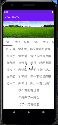
CollapsingToolbarLayout配合Toolbar,在详情页里比较常见;- 还有常用到的是在页面滑动过程中,有些控件需要悬停在顶部,比如悬停TabLayout,方便用户切换tab
4 彩蛋总是在最后
4.1 重中之重——Behavior
当你看完前面的内容,感觉自己又可以了的时候,我要把你拉回来,那些只是皮毛上的毛皮,只是最最基本的使用。
思考一个问题,为什么使用CoordinatorLayout做为父布局,子View之间就会产生相互作用,这到底是谁在搞事情,它不是CoordinatorLayout,而是Behavior,理论上CoordinatorLayout的直接子view必须设置Behavior,这样才能实现子view间的相互作用;当然了你也可以不设置,那它就是个傻傻的控件。
看xml布局的<androidx.core.widget.NestedScrollView ...有个layout_behavior属性,设置的是@string/appbar_scrolling_view_behavior
<string name="appbar_scrolling_view_behavior" translatable="false">com.google.android.material.appbar.AppBarLayout$ScrollingViewBehavior</string>
    <androidx.core.widget.NestedScrollView
        android:layout_width="match_parent"
        android:layout_height="wrap_content"
        app:layout_behavior="@string/appbar_scrolling_view_behavior">
  ...
那AppBarLayout并没有设置layout_behavior属性,为什么可以随着滑动做出相应的效果
 <com.google.android.material.appbar.AppBarLayout
     android:layout_width="match_parent"
     android:layout_height="wrap_content">

...
莫要着急,点进去,看看AppBarLayout的实现,当看到implements CoordinatorLayout.AttachedBehavior,一切都很明朗了
public class AppBarLayout
          extends LinearLayout
          implements CoordinatorLayout.AttachedBehavior {

...
4.2 总结:设置Behavior的几种方式
- 像
AppBarLayout一样,View直接实现CoordinatorLayout.AttachedBehavior - 通过
CoordinatorLayout.LayoutParams的setBehavior(···)方法设置 - (常用)新建子类继承自
CoordinatorLayout.Behavior,重写其中的方法,通过layout_behavior属性设置
通过layout_behavior属性设置分2种方式
- 直接设置该子类的全路径包名,例如
<androidx.core.widget.NestedScrollView
   android:layout_width="match_parent"
   android:layout_height="wrap_content"
   app:layout_behavior="com.google.android.material.appbar.AppBarLayout$ScrollingViewBehavior">
...
- 将该子类的全路径包名写到string.xml中,通过@string/xxxx的方式设置
<androidx.core.widget.NestedScrollView
        android:layout_width="match_parent"
        android:layout_height="wrap_content"
        app:layout_behavior="@string/appbar_scrolling_view_behavior">
...
关于重写CoordinatorLayout.Behavior,我决定再开一篇单独的文章。
本身这篇文章篇幅已经很长了,再者我也累了,正儿八经写文章实则不易。
如果文章对你有帮助,点个赞再走呗
如果文章中存在错误,还望评论区指出
一起成长,共同进步


 433
433


 被折叠的 条评论
为什么被折叠?
被折叠的 条评论
为什么被折叠?
 到【灌水乐园】发言


