


一.字体图标
字体图标的优点:
- 灵活性:灵活地修改样式,例如:尺寸、颜色等.
- 轻量级:体积小、渲染快、降低服务器请求次数.
- 兼容性:几乎兼容所有主流浏览器
- 使用方便.
图标库:
Iconfont:https://www.iconfont.cn/ 阿里巴巴字体库 (常用)
字体图标引入方式:
- 线上引入字体图标样式
复制地址前面记得加:http://
- 线下引入字体图标样式表
<link rel="stylesheet" href="./iconfont.css">1.使用字体图标-类名(常用):
- 调用图标对应的类名,必须调用2个类名
- iconfont类:基本样式,包含字体的使用等
- icon-xxx:图标对应的类名
<span class="iconfont icon-xxx"></span>2.使用字体图标 - unicode编码:
- HTML
<strong></strong>- 然后调用类名 calss="iconfont"
3.使用字体图标 - 伪元素:
- 通过查看iconfont.ccs文件

二.2D平面转换
位移(transform:translate):
- 属性名:transform:translate(水平方向距离,垂直方向距离)
- 取值(正负均可):1.像素单位数值 2.百分比(参照物为盒子自身尺寸)
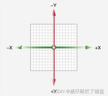
- 注意点:X轴正向为右,Y轴正向为下
- margin和位移的区别:1margin会影响下面的元素,位移不会影响其他元素 2.margin的100%以浏览器进行移动,位移的100%以自己大小进行移动.
<style>
        .box{
            width: 400px;
            height: 400px;
            background-color: red;
            transform: translate(200px,200px);
            /* 当y轴为0时 可以省略的 */
            /* 位移x是水平方向,y轴是垂直方向 */
            /* transform: translate(200px);
            单方向写法:
            /* 水平方向 */
            transform: translateX(200px);
            /* 垂直方向 */
            transform: translateY(200px);
        }
</style>盒子位移水平垂直居中(1) :
<style>
        /* 盒子垂直水平居中 */
        .father{
            position: relative;
            width: 800px;
            height: 800px;
            background-color: pink;
        }
        .son{
            position: absolute;
            /* 移动父盒子宽的一半 */
            left: 50%;
            /* 移动父元素高的一半 */
            top: 50%;
            /* 移动自己宽和高的一半 */
            transform: translate(-50%),-50%;
            width: 200px;
            height: 200px;
            background-color: red;
        }
</style>盒子位移水平垂直居中(2) :
    <style>
        /* 盒子垂直水平居中 */
        .father{
            /* 先让盒子在原来的位置脱离标准流 */
            position: relative;
            width: 800px;
            height: 800px;
            background-color: pink;
        }
        .son{
            position: absolute;
             left: 0;
             right: 0;
             top: 0;
             bottom: 0;
             /* 通过margin:auto;4个方向全部auto盒子就可以居中 */
             margin: auto;
            width: 200px;
            height: 200px;
            background-color: red;
        }
    </style>
旋转(rotate)
- 属性名:transform:roitate(角度)
- 注意:单位是deg 1turn=360deg
- 取值(正负均可)取值为正,则顺时针旋转 取值为负,则逆时针旋转
<style>
.box:hover{
            /* 360deg对于1turn */
            /* 旋转:rotate(角度) */
            transform: rotate(2turn);
        }
</style>
转换原点(transform:origin)
- 属性名:transfrom-origin:(原点水平位置,原点垂直位置)
- 默认原点是盒子中心店
取值:1.方位名词(left,right,top,bottom,center) 2.像素单位数值 3.百分比(参照盒子自身尺寸计算)
<style>
  transform-origin: left center;
              /* 改变旋转中心 transfrom-origin水平方向 垂直方向 */
              /* 方位名词:left左 right右 center居中  top上  bottom下 */
              /* transform-origin:right top; */
        }
</style>
多重转换(transfrom复合属性)
- 多重转换原理 :
1.旋转会改变网页元素的坐标轴向
2. 先写旋转,则后面的转换效果的轴向以旋转后的轴向为准,会影响转换结果
3.多重变换时先移动后旋转
缩放(scale)
- 属性:transfrom:scale(X轴缩放倍数,Y轴缩放倍数);
- 一般情况下,只为scale设置一个值,表示X轴和Y轴等比例缩放
- transfrom:scale(缩放倍数)
- scale值大于1表示放大,scale值小于1表示缩小
<style>
    .father:hover img{
            /* scale(缩放的倍数); */
            transform: scale(2);
        }
</style>
倾斜(skew)
- 属性:transform:skew(度数 deg)
- 正负值均可,正值往左边倾斜,负值往右边倾斜
- 度数不能是90deg,盒子不显示变成一条线.
transform: skew(120deg);三.渐变背景(background-image)
- 属性:background-imag:linear-gradient(颜色1,颜色2)
- 默认从上到下:background-imag:linear-gradient(颜色1,颜色2)
- 从左到右:background-imag:linear-gradient(to right,颜色1,颜色2) to+方位名词改变渐变方向
- 渐变色也可以通过角度来改变,
- 透明到半透明色:background-imag:linear-gradient(trans)
<style>
/* 默认渐变色是从上到下 */
            background-image: linear-gradient(red,yellow,blue);
           /* 渐变色从左到右 to改变它的渐变的方向 */
           /* to属性后面跟上方位名词 left左  right右 top上  bottom下 */
            background-image: linear-gradient(to right, red,yellow,blue);
            /* 从透明色变成半透明色使用的最多 */
            background-image: linear-gradient( transparent,rgba(0,0,0,.5 ));
</style>


 293
293


 被折叠的 条评论
为什么被折叠?
被折叠的 条评论
为什么被折叠?
 到【灌水乐园】发言


