


HTML5
HTML5添加了很多新的标签
比如video标签,可以播放视频
其中,有些属性:
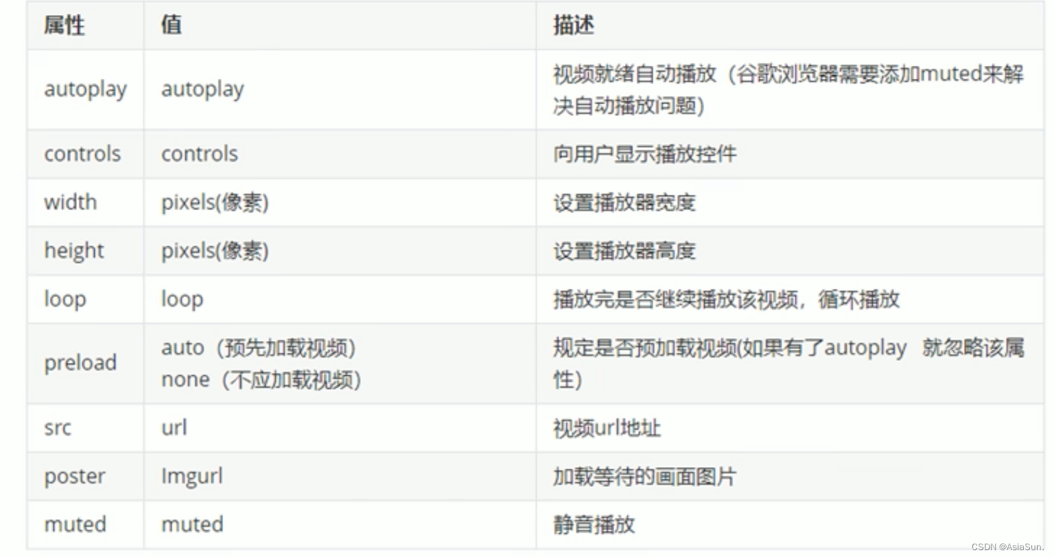
例如:
<video src="video/RPReplay_Final1643010740.MP4" autoplay="autoplay" muted="muted"></video>
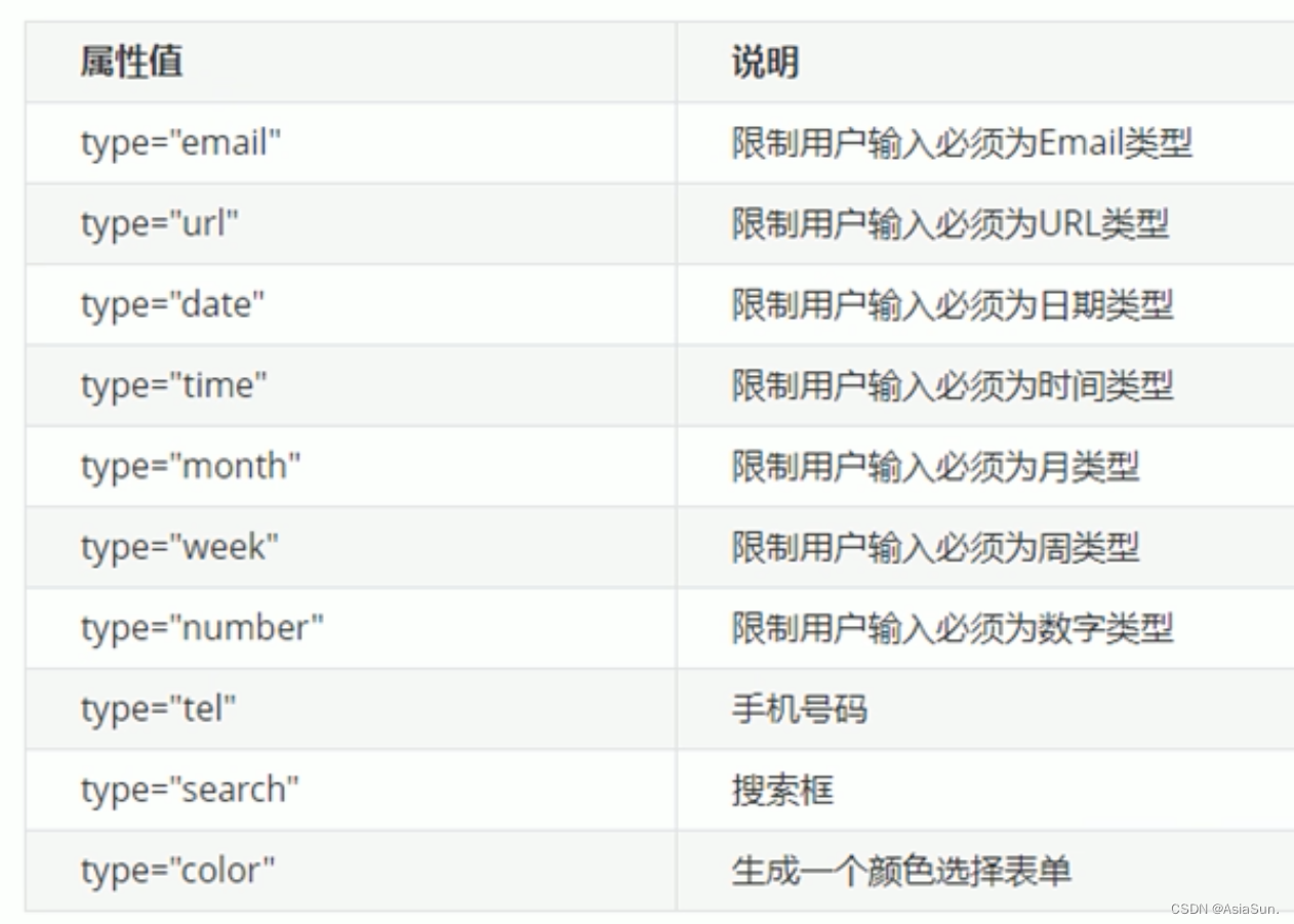
HTML5新加的input类型:
属性选择器:

类选择器、属性选择器、伪类选择器,权重都是10
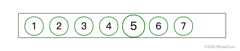
first-child、last-child、nth-child(n)的用法

<!DOCTYPE html>
<html>
	<head>
		<meta charset="utf-8" lang="en">
		<title></title>

		<style>
			* {
				margin: 0px;
				padding: 0px;
			}

			ul{
				float: center;
				width: 200px;
				margin: 100px auto;
			}

			li {
				list-style: none;
				text-align: center;
				border: 1px solid lightblue;
			}

			/* 第一个 */
			ul li:first-child{
				background-color: pink;
			}

			/* 最后一个 */
			ul li:last-child {
				background-color: green;
			}

			/* 第3个,从1开始数 */
			ul li:nth-child(3){
				background-color: blue;
			}

			/* 偶数 */
			ul li:nth-child(even) {
				background-color:  lightgray;
			}

			/* 奇数 */
			ul li:nth-child(odd) {
				color: red;
			}

			/* 代表选中了所有的 */
			/* ol li:nth-child(n){
				background-color: #008000;
			} */

			/* 2n所有的偶数 */
			/* ol li:nth-child(2n) {
				background-color: red;
			} */

			/* 2n所有的奇数 */
			/* ol li:nth-child(2n+1) {
				background-color: blue;
			} */

			/* 从第2个开始(包括第2个) */
			/* ol li:nth-child(n+2) {
				background-color: green;
			} */

			/* 只要前2两 */
			ol li:nth-child(-n+2) {
				background-color: green;
			}
		</style>
	</head>
	<body>
		<ul>
			<li>1</li>
			<li>2</li>
			<li>3</li>
			<li>4</li>
			<li>5</li>
			<li>6</li>
			<li>7</li>
			<li>8</li>
		</ul>

		<ol>
			<li>1</li>
			<li>2</li>
			<li>3</li>
			<li>4</li>
			<li>5</li>
			<li>6</li>
			<li>7</li>
			<li>8</li>
		</uol>
	</body>
</html>
first-child与first-of-type的区别
			/* 所有孩子排序号,找第1个,然后看是否为对应类型 */
			section div:nth-child(1) {
				background-color: #008000;
			}

			/* 只会将div排序号,然后找第1个 */
			section div:nth-of-type(1) {
				background-color: #0000FF;
			}
伪元素
伪元素选择器
::before 在元素内部的前面插入内容
::after 在元素内部的后面插入内容
before、after创建的元素,属于行内元素
但是,新创建的元素,在文档树中是找不到的,所以称为伪元素
-
伪元素选择器和标签选择器的权重为1
-
box-sizing:border-box;padding大小不再影响盒子的大小 -
filter: blur(5px);模糊处理
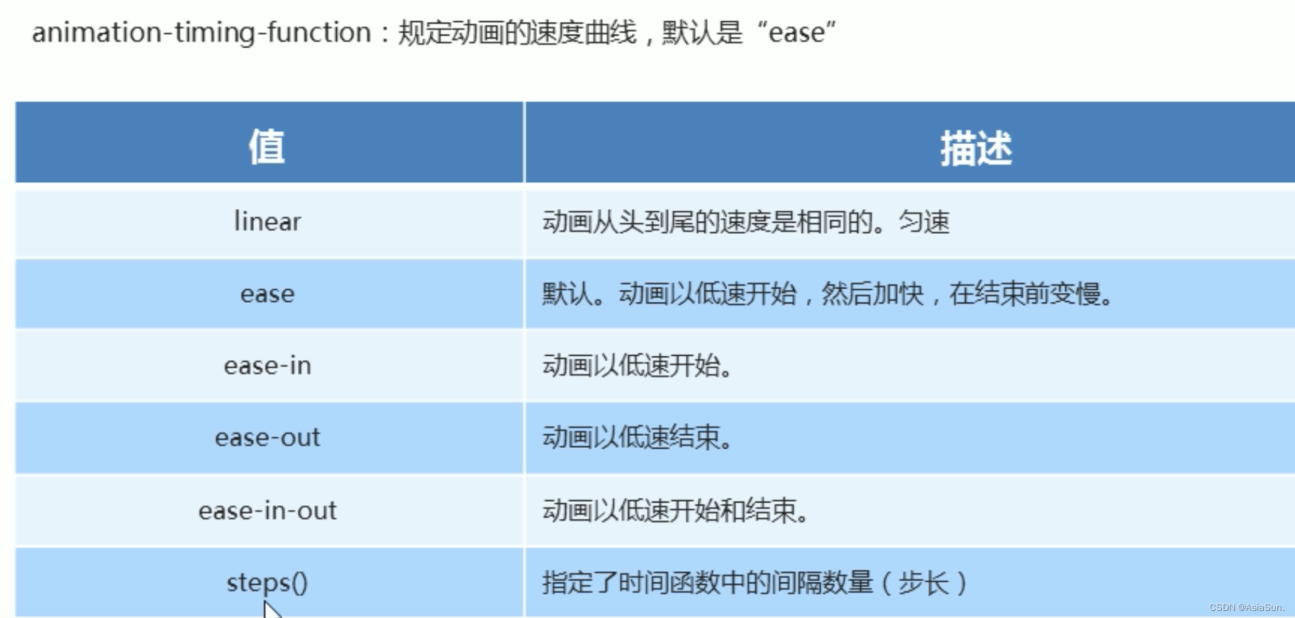
transition
transition: 变化的属性 花费时间 运动曲线 何时开始;后面两个可以省略
transition: width 50ms ease 1s;
品优购项目实战
SEO(search engine optimization) 搜索引擎优化,可以提高网址在搜索的自然排名方式
页面必须有三个标签来符合SEO优化:
title、description、keyword
网站的首页,一般命名为index
常用模块类名命名
2D转换
左右移动
transform: translate(100px, 50px);向x轴移动100,向y轴移动50
transform: translate(100px, 0);向x轴移动100,y轴0不可省略
transform: translateX(100px);向x轴移动100
transform: translateY(50px);向y轴移动50
transform的移动,不会影响其他元素的位置
translate对于行内元素无效
旋转
transform: rotate(xdeg);
正值,旋转是顺时针
单位为deg
举例:transform: rotate(30deg);
默认以中心点做旋转
transition: all 1.3s;过度;谁过度,给谁加
-
设置旋转的中心点
transform-origin: 0% 100%;,默认是50% 50%,中间使用空格隔开 -
缩放scale
transform: scale(2, 3);缩放x2倍,y3倍
这个不会影响后面的内容位置
举个小栗子:
<!DOCTYPE html>
<html>
	<head>
		<meta charset="utf-8" lang="en">
		<title></title>

		<style>
			* {
				margin: 0px;
				padding: 0px;
			}

			li {
				list-style: none;
			}

			.box {
				position: relative;
				margin: 100px auto;
				width: 349px;
				height: 40px;
				border: 1px #666666 solid;
			}

			ul {
				margin-top: 5px;
			}

			li {
				float: left;
				border: 1px #008000 solid;
				width: 30px;
				height: 30px;
				border-radius: 15px;
				text-align: center;
				line-height: 30px;
				margin-left: 10px;
			}

			li:hover{
				transform: scale(1.2);
			}

		</style>
	</head>

	<body>
		<div class="box">
			<ul>
				<li>1</li>
				<li>2</li>
				<li>3</li>
				<li>4</li>
				<li>5</li>
				<li>6</li>
				<li>7</li>
			</ul>
		</div>
	</body>
</html>
多个转换,可以写在一起,具体写法:
transform:translate(100px, 100px) scale(1.4) rotate(90deg);
注意:
- 先写什么,先执行什么
- 位移放前面
动画
动画分为两步:
- 定义动画
- 使用动画
定义动画
使用keyframes(关键帧)定义动画
<style>
			/* 定义动画 */
			@keyframes move{
				0% {
					transform: translate(0px, 0px);
				}
				100% {
					transform: translate(100px, 300px);
				}
			}

			div {
				width: 109px;
				height: 140px;
				background-color: green;
				/* 使用动画 */
				animation-name: move;
				animation-duration: 1.0s;
				/* 重复N次 */
				animation-iteration-count: 10;
				/* 默认是normal,alternate是反方向播放 */
				animation-direction: alternate;
			}

		</style>
简直了,用HBuilderX运行,没有效果
换了VSCode才好用
动画常用属性

动画简写属性
animation: 动画名称 持续时间 运动曲线 何时开始 播放次数 是否反方向 动画起始或者结束的状态;
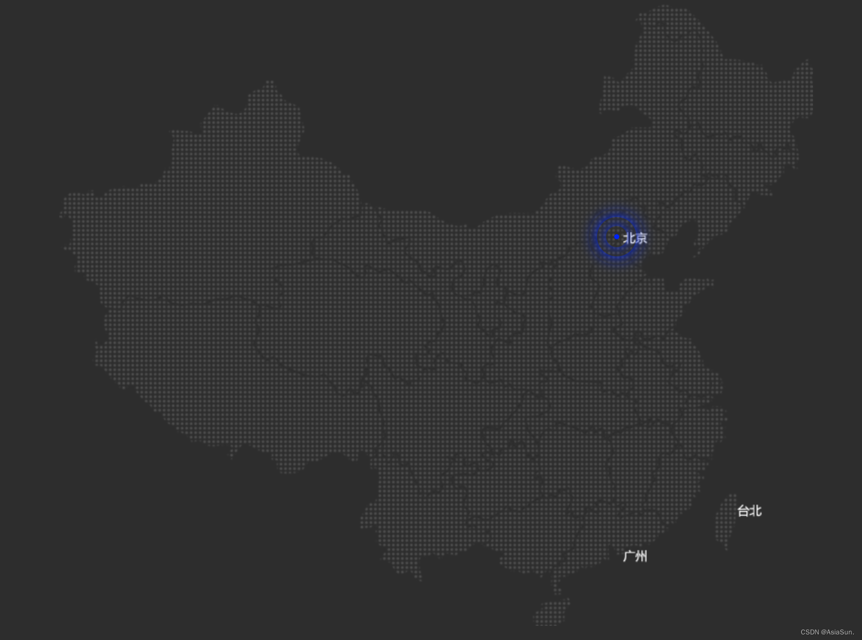
一个好看的例子:
<!DOCTYPE html>
<html>
	<head>
		<meta charset="utf-8">
		<title></title>

		<style type="text/css">

			body {
				background-color: #333;
			}
			.map {
				/* 子绝父相 */
				position: relative;
				width: 747px;
				height: 616px;
				background: url(img/map.png) no-repeat;
				margin: 0px auto;
			}

			.city {
				/* 子绝父相 */
				position: absolute;
				top: 228px;
				right: 192px;
				color: white;
			}

			.dot {
				width: 5px;
				height: 5px;
				background-color: blue;
				/* 圆角50% */
				border-radius: 50%;
			}

			/* 这块。。。忘记了 */
			.city div[class^="bowen"] {
				position: absolute;
				/* 父盒子的50% */
				top: 50%;
				left: 50%;

				/* 自己的50% */
				transform: translate(-50%, -50%);

				width: 8px;
				height: 8px;
				/* 阴影 */
				box-shadow: 0 0 12px #0000FF;
				border-radius: 50%;
				animation: animationName 1.2s linear infinite;
			}

			/* 后面那个是 交集选择器 */
			.city div.bowen2 {
				animation-delay: 0.4s;
			}

			.city div.bowen3 {
				animation-delay: 0.8s;
			}

			@keyframes animationName{
				0%{}
				60%{
					width: 40px;
					height: 40px;
					opacity: 1;
				}

				100% {
					width: 60px;
					height: 60px;
					opacity: 0;
				}
			}
		</style>

	</head>
	<body>
		<div class="map">
			<div class="city">
				<div class="dot">

				</div>

				<div class="bowen1"></div>
				<div class="bowen2"></div>
				<div class="bowen3"></div>
			</div>
		</div>
	</body>
</html>
打字机效果
<!DOCTYPE html>
<html>
	<head>
		<meta charset="utf-8">
		<title></title>

		<style>
			.box {
				/* 单个文字多大 */
				font-size: 20px;
				/* 多的隐藏 */
				overflow: hidden;
				/* 让文字可以一行显示 */
				white-space: nowrap;
				width: 0px;
				height: 30px;
				background-color: pink;
				/* steps(n),让动画可以分几步完成 */
				animation: changeWidth 2.0s steps(10) forwards;
			}

			@keyframes changeWidth{
				0% {
					width: 0px;
				}
				100% {
					width: 200px;
				}
			}
		</style>

	</head>
	<body>
		<div class="box">
			好好学习,天天向上!
		</div>
	</body>
</html>
奔跑的熊大
老师这个例子是来自于 百度浏览器,然后我就想着去百度浏览器看看现在的效果,才发现:
百度浏览器停止服务了!!!
百度啊百度,真是干啥都是半途而废,干啥都不行
糯米完犊子了…
百度外卖完犊子了…
刚知道百度浏览器也完犊子了…
就看哪天 百度云盘 也倒闭,天天5kb的速度,要你干啥

<!DOCTYPE html>
<html>
	<head>
		<meta charset="utf-8">
		<title></title>
		<style type="text/css">
			body {
				background-color: #ccc;
			}

			.mountain {
				height: 300px;
				background: url(img/bg1.png);
				animation: mountain 15s ease infinite;
			}

			.box {
				position: absolute;
				overflow: hidden;
				margin-top: 200px;
				width: 200px;
				height: 100px;
				background: url(img/bear.png) no-repeat;
				animation: bear 0.8s steps(8) infinite, move 4.0s ease-in-out forwards;
			}

			@keyframes bear{
				0%{
					background-position: 0 0;
				}
				100%{
					background-position: -1600px 0;
				}
			}

			@keyframes move{
				0%{
					left: 0;
				}
				100%{
					left: 50%;
					/* margin-left: -100px; */
					transform: translateX(-50%);
				}
			}

			@keyframes mountain{
				0%{
					background-position: 0 0;
				}
				100%{
					background-position: 100% 0;
				}
			}
		</style>
	</head>
	<body>

		<div class="mountain">

			<div class="box">
			</div>
		</div>
	</body>
</html>
3D转换
Z轴,往外是正值,往里是负值
translateZ(30px);单位,一般是px
perspective: 透视
透视是添加在父元素上的;
数值约小,离的越近,图像就越大
数值约大,离的越远,图像就越小
z轴越大,物体越大
当perspective值固定,可以改变Z值大小,从而使得物体大小不一样
元素旋转方向的判断准则:左手准则

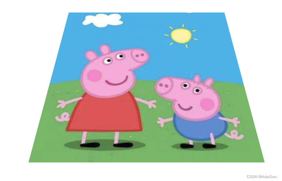
<!DOCTYPE html>
<html>
	<head>
		<meta charset="utf-8">
		<title></title>
		<style type="text/css">

			div {
				perspective: 500px;
			}

			img {
				display: block;
				margin: 100px auto;
				transition: all 1.0s;
			}


			img:hover {
				transform: rotateX(40deg);
			}


		</style>
	</head>
		<div class="box">
			<img src="img/pig.jpg" >
		</div>
	<body>
	</body>
</html>
3D呈现 transform-style
- 控制子元素是否开启三维立体环境
transform-style: flat子元素不开启3d立体空间 默认的transform-style: preserve-3d;子元素开启立体空间- 代码写给父级,但是影响的是子盒子
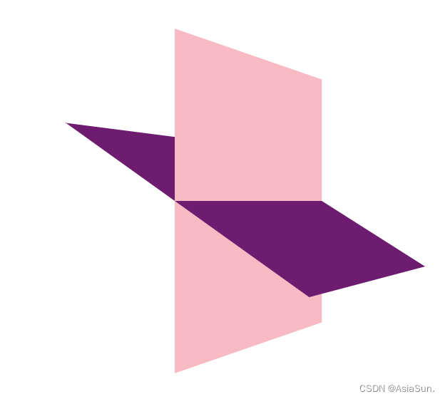
<!DOCTYPE html>
<html>
	<head>
		<meta charset="utf-8">
		<title></title>
		<style type="text/css">
			body {
				perspective: 500px;
			}

			.box {
				position: relative;
				width: 200px;
				height: 200px;
				margin: 100px auto;
				transition: all 1.0s;
				transform-style: preserve-3d;
			}

			.box:hover {
				transform: rotateY(60deg);
			}

			.box div {
				position: absolute;
				top: 0;
				left: 0;
				width: 100%;
				height: 100%;
				background-color: pink;

			}

			.box div:last-child {
				background-color: purple;
				transform: rotateX(60deg);
			}

		</style>

	</head>
	<body>
		<div class="box">
			<div></div>
			<div></div>
		</div>
	</body>
</html>
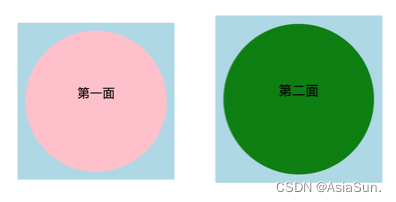
两面翻转的盒子
<!DOCTYPE html>
<html>
	<head>
		<meta charset="utf-8">
		<title></title>
		<style type="text/css">

			body{
				perspective: 500px;
			}

			.box {
				position: relative;
				width: 200px;
				height: 200px;
				background-color: lightblue;
				margin: 100px auto;
				transition: all 1.0s;
				transform-style: preserve-3d;
			}

			.box:hover {
				transform: rotateY(180deg);
			}

			.box div {
				position: absolute;
				width: 180px;
				height: 180px;
				top: 0px;
				left: 0px;
				border-radius: 50%;
				margin-top: 10px;
				margin-left: 10px;
				text-align: center;
				line-height: 160px;
				backface-visibility: hidden;
			}

			.box .first {
				background-color: pink;
			}

			.box .second {
				background-color: green;
				transform: rotateY(180deg);
			}

		</style>
	</head>
	<body>
		<div class="box">
			<div class="first">第一面</div>
			<div class="second">第二面</div>
		</div>
	</body>
</html>
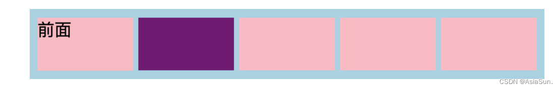
3D导航栏
<!DOCTYPE html>
<html>
	<head>
		<meta charset="utf-8">
		<title></title>

		<style type="text/css">

			*{
				padding: 0;
				margin: 0;
			}

			ul {
				width: 510px;
				height: 70px;
				background-color: lightblue;
				margin: 100px auto;
			}

			ul li {
				float: left;
				list-style: none;
				width: 90px;
				height: 50px;
				margin-left: 10px;
				margin-top: 10px;
				perspective: 500px;
			}

			.box {
				position: relative;
				width: 100%;
				height: 100%;
				transition: all 0.5s;
				backface-visibility: hidden;
				/* 必须写在box,写在ul上没效果 */
				transform-style: preserve-3d;
			}

			.box:hover {
				transform: rotateX(90deg);
			}

			.front,.bottom {
				position: absolute;
				left: 0;
				top: 0;
				width: 100%;
				height: 100%;
				backface-visibility: hidden;
			}

			.box .front {
				background-color: pink;
				/* 忘记写分号,导致错误 */
				transform: translateZ(25px);
				z-index: 1;
			}

			.box .bottom {
				background-color: purple;
				/*先移动,后旋转*/
				transform: translateY(25px) rotateX(-90deg);
			}

		</style>

	</head>
	<body>
		<ul>
			<li>
				<div class="box">
					<div class="front">前面</div>
					<div class="bottom">底面</div>
				</div>
			</li>
			<li>
				<div class="box">
					<div class="front"></div>
					<div class="bottom"></div>
				</div>
			</li>
			<li>
				<div class="box">
					<div class="front"></div>
					<div class="bottom"></div>
				</div>
			</li>
			<li>
				<div class="box">
					<div class="front"></div>
					<div class="bottom"></div>
				</div>
			</li>
			<li>
				<div class="box">
					<div class="front"></div>
					<div class="bottom"></div>
				</div>
			</li>
		</ul>
	</body>
</html>
旋转木马

<!DOCTYPE html>
<html>
	<head>
		<meta charset="utf-8">
		<title></title>
		<style type="text/css">

			* {
				padding: 0;
				margin: 0;
			}

			body {
				perspective: 800px;
			}

			section {
				width: 300px;
				height: 300px;
				position: relative;
				margin: 200px auto;
				transition: all 3.0s;
				transform-style: preserve-3d;
				/* linear匀速 infinite无限循环 */
				animation: rotate 10s linear infinite;
				background: url(img/3.1@2x.png) no-repeat;
			}

			@keyframes rotate{
				0%{
					transform: rotateY(0deg);
				}
				100%{
					transform: rotateY(360deg);
				}
			}

			section:hover {
				/* 鼠标放上面,暂停 */
				animation-play-state: paused;
			}

			div {
				position: absolute;
				float: left;
				top: 0px;
				left: 0px;
				width: 200px;
				height: 200px;

				background: url(img/ldh.jpg) no-repeat;
			}

			section div:nth-child(1) {
				transform: translateZ(200px);
			}

			section div:nth-child(2) {
				transform: rotateY(60deg) translateZ(200px);
			}

			section div:nth-child(3) {
				transform: rotateY(120deg) translateZ(200px);
			}

			section div:nth-child(4) {
				transform: rotateY(180deg) translateZ(200px);
			}

			section div:nth-child(5) {
				transform: rotateY(-120deg) translateZ(200px);

			}

			section div:nth-child(6) {
				transform: rotateY(-60deg) translateZ(200px);
			}
		</style>
	</head>
	<body>
		<section>
			<div></div>
			<div></div>
			<div></div>
			<div></div>
			<div></div>
			<div></div>
		</section>
	</body>
</html>


 5768
5768


 被折叠的 条评论
为什么被折叠?
被折叠的 条评论
为什么被折叠?
 到【灌水乐园】发言


