


1、background-image+background-clip+background-origin(推荐)
这种方法是最推荐的一种方式,因为只需要目标盒子单个元素即可。为其分别设置 background-image(背景图片) 、background-clip(背景的绘制区域)、background-origin(背景的展示区域)这三个属性,每个属性设置两个值,按照css规范第一个值未覆盖的区域会由第二个值进行填充,所以第一个值设置的是内容区域的背景,第二个值设置的是边框区域的渐变背景。这种方法目前还没有发现什么弊端。
代码如下:
<div class="box"></div>

.box { width: 100px; height: 100px; margin: 20px auto; border: 5px solid transparent; border-radius: 10px; background-clip: padding-box, border-box; background-origin: padding-box, border-box; background-image: linear-gradient(to right, #fff, #fff), linear-gradient(to right, red, #578aef); }
效果如下图:
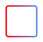
image
2、伪元素+透明边框(推荐)
这种方法是指给目标盒子创建一个before伪元素(写一个子元素div效果相同,但是伪元素看起来更优雅),设置其背景颜色为渐变背景,并使用定位使其位于当前盒子的下层。然后我们再通过设置目标盒子的边框为透明,以及通过background-clip: padding-box;属性设置元素颜色渲染区域不包括边框。然后我们就实现了渐变色边框,而且可以准确的设置border-radius属性。
代码如下:
<div class="box3"></div>

.box3 { position: relative; width: 100px; height: 100px; margin: 20px auto; border-radius: 10px; background: #fff; background-clip: padding-box; border: 5px solid transparent; } .box3::before { content: ''; position: absolute; top: 0; right: 0; left: 0; bottom: 0; z-index: -1; margin: -5px; border-radius: 10px; background: linear-gradient(to right, red, #578aef); }
效果如下图:
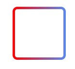
image
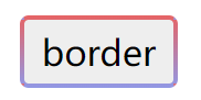
3、border-image + background
div class="border7">border</div>

.border7 { display: inline-flex; align-items: center; justify-content: center; cursor: pointer; user-select: none; border: 4px solid transparent; border-image: linear-gradient(#e66465, #9198e5); padding: 8px 16px; font-size: 32px; border-radius: 8px; /* 圆角属性测试 */ background-image: linear-gradient(#eee, #eee), /* 底色,即原有的背景 */ linear-gradient(#e66465, #9198e5); /* 模拟渐变边框 */ background-clip: padding-box, border-box; background-origin: border-box; }
使用 border-image 和 linear-gradient() 实现渐变的边框
说明:
①.因为我们需要将底色覆盖在渐变背景之上,层级最高,所以底色背景是 background-image 的第一项,渐变背景为第二项。
②.由于是模拟边框效果,所以底色的绘制区域为 padding-box,渐变背景的绘制区域为 border-box。
③.上面所说的覆盖背景,其实指的是覆盖背景区域,而元素的背景区域是由 background-origin 属性来决定的,默认值是 padding-box,故默认情况下,渐变背景是填不满整个元素的,需要改为 border-box。
效果如下图:


 扫一扫
扫一扫


 1707
1707

 被折叠的 条评论
为什么被折叠?
被折叠的 条评论
为什么被折叠?
 到【灌水乐园】发言


