


文章目录
开关 Switch
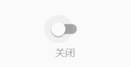
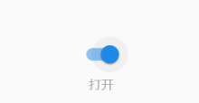
通过 Switch组件可以实现如下图中开关的打卡和关闭。当Switch被点击时,会触发onChanged回调。
复选框 Checkbox
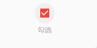
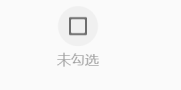
当Checkbox被点击时,会触发的onChanged回调
Switch、Checkbox 例子伪代码实现
class _MyHomePageState extends State<MyHomePage> {
  bool _switchSelected = true; //维护单选开关状态
  bool _checkboxSelected = true; //维护复选框状态
  @override
  Widget build(BuildContext context) {
    return Scaffold(
      appBar: AppBar(
        title: Text(widget.title),
      ),
      body: Center(
        child: Column(
          mainAxisAlignment: MainAxisAlignment.center,
          children: <Widget>[
            Row(
              mainAxisAlignment: MainAxisAlignment.center,
              children: <Widget>[
                Switch(
                  value: _switchSelected, //当前状态
                  onChanged: (value) {
                    //重新构建页面
                    setState(() {
                      _switchSelected = value;
                    });
                  },
                )
              ],
            ),
            Row(
              mainAxisAlignment: MainAxisAlignment.center,
              children: <Widget>[
                Text(
                  _switchSelected ? "打开" : "关闭",
                  style: TextStyle(fontSize: 14.0, color: Colors.grey),
                )
              ],
            ),
            Row(
              mainAxisAlignment: MainAxisAlignment.center,
              children: <Widget>[
                Checkbox(
                  value: _checkboxSelected,
                  activeColor: Colors.red, //选中时的颜色
                  onChanged: (value) {
                    setState(() {
                      _checkboxSelected = value;
                    });
                  },
                )
              ],
            ),
            Row(
              mainAxisAlignment: MainAxisAlignment.center,
              children: <Widget>[
                Text(
                  _checkboxSelected ? "勾选" : "未勾选",
                  style: TextStyle(fontSize: 14.0, color: Colors.grey),
                )
              ],
            ),
          ],
        ),
      ),
    );
  }
}
进度条 Indicator
水平进度条LinearProgressIndicator和圆形进度条CircularProgressIndicator,刷新进度条RefreshIndicator。
水平进度条 LinearProgressIndicator
查看源码可发现LinearProgressIndicator有以下属性:
  const LinearProgressIndicator({
    Key key,
    // 表示当前的进度,取值范围为[0,1],如 value:null 则表示是加载中的进度条
    double value,
    // 进度条的背景色
    Color backgroundColor,
    // 进度条的颜色
    Animation<Color> valueColor,
    // 后两个字段,暂时还未理解,字面意思是语意相关
    String semanticsLabel,
    String semanticsValue,
  })
加载中进度条
LinearProgressIndicator(
  backgroundColor: Colors.grey[200],
  valueColor: AlwaysStoppedAnimation(Colors.blue),
),
进度条显示50%
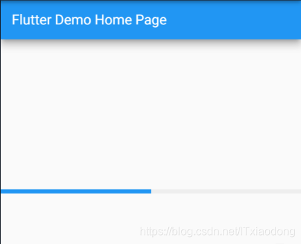
LinearProgressIndicator(
  backgroundColor: Colors.grey[200],
  valueColor: AlwaysStoppedAnimation(Colors.blue),
  value: .5,
)
圆形进度条 CircularProgressIndicator
查看源码可发现CircularProgressIndicator有以下属性:其他属性和LinearProgressIndicator相同,默认设置了this.strokeWidth = 4.0,表示进度条的粗细。
  const CircularProgressIndicator({
    Key key,
    double value,
    Color backgroundColor,
    Animation<Color> valueColor,
    this.strokeWidth = 4.0,
    String semanticsLabel,
    String semanticsValue,
  })
加载中圆形进度条
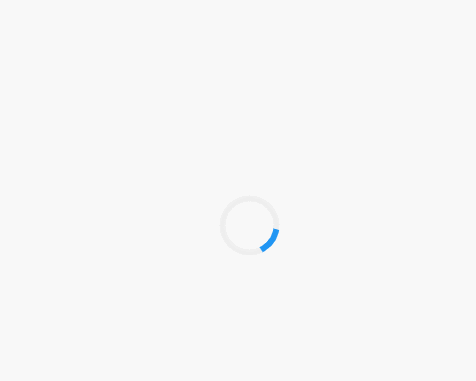
CircularProgressIndicator(
  backgroundColor: Colors.grey[200],
  valueColor: AlwaysStoppedAnimation(Colors.blue),
),
进度条显示50%,会显示一个半圆
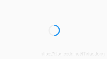
CircularProgressIndicator(
  backgroundColor: Colors.grey[200],
  valueColor: AlwaysStoppedAnimation(Colors.blue),
  value: .5,
),
刷新进度条 RefreshIndicator
查阅资料了解到RefreshIndicator有如下属性:
  const RefreshIndicator({
    Key key,
    @required this.child,// 布局
    this.displacement = 40.0,// 指示器显示时距顶部位置
    @required this.onRefresh,// 下拉刷新回调
    this.color,// 指示器颜色
    this.backgroundColor,// 指示器背景颜色
    this.notificationPredicate = defaultScrollNotificationPredicate,
    // 语意化字段
    this.semanticsLabel,
    this.semanticsValue,
  })
下拉刷新例子
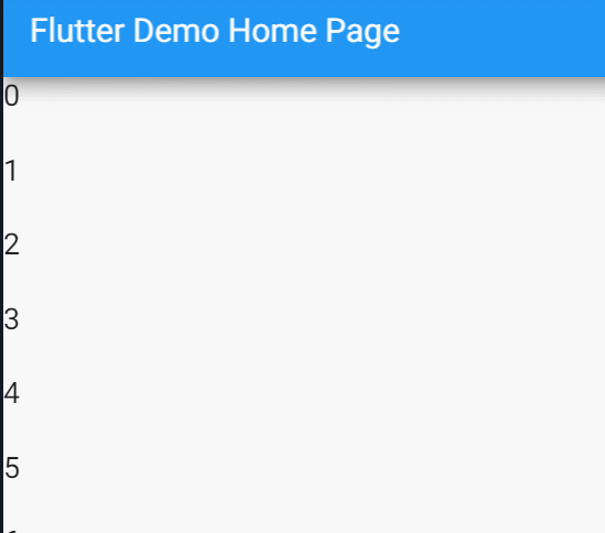
伪代码如下:
class _MyHomePageState extends State<MyHomePage> {

  var listData = List<String>.generate(30, (i) => "$i");

  Future<Null> _pullToRefresh() async {
    print("下拉刷新");
    return null;
  }

  Widget _buildListView(BuildContext context){
    return ListView.builder(
      itemCount: listData.length,
      itemBuilder: (context, i) {
        return Container(
          height: 45.0,
          child: Text(
            "$i",
            style: TextStyle(fontSize: 18.0),
          ),
        );
      },
    );
  }

  @override
  Widget build(BuildContext context) {
    return Scaffold(
      appBar: AppBar(
        title: Text(widget.title),
      ),
      body: RefreshIndicator(child: _buildListView(context), onRefresh: _pullToRefresh)
    );
  }
}
完~


 1120
1120


 被折叠的 条评论
为什么被折叠?
被折叠的 条评论
为什么被折叠?
 到【灌水乐园】发言


