


scss是css预编译器,可以简化css代码的书写,并可以编译成css文件使用;
有关scss的安装使用可以参考:Sass语法---sass的安装和引用_引入sass-CSDN博客
嵌套、循环、条件(@for,@if)
嵌套
scss支持选择器的嵌套写法,具体规则如下:
// scss:

body{
    color:#ccc;
    .box{
        color: #666;
    }
}
// css:

body {
  color: #ccc;
}
body .box {
  color: #666;
}
属性内部可以嵌套其他 选择器,内部的选择器会和外部的选择器形成子代选择器
//scss:

body{
    color:#ccc;
    .box{
        color: #666;
    }
    &:hover{
        color:white;
    }
}
//css:
body {
color: #ccc;
}
body .box {
color: #666;
}
body:hover {
color: white;
}嵌套伪类和伪元素时需要带上'&',否则伪类和伪元素会被识别成标签选择器
循环---@for
@for $i from start to end{}

@for $i from start through end{}
以上时@for的写法,它们的的差别在于:to不包含end,through包含end,
转换成js的循环就像:
// to:
for(let i = end;i<start;i++){

}

// through:
for(let i = end;i<=start;i++){

}
@for循环 常用来给数字差异的类名选择器和子元素伪类添加差异化的属性
// scss:

@for $i from 1 to 3{
    .box#{$i}{
        font-size: #{$i}em;
    }
}

.box{
    @for $i from 1 through 3{
        .box:nth-child(#{$i}){
            font-size: #{$i}em;
        }
    }
}
// css:
.box1 {
font-size: 1em;
}
.box2 {
font-size: 2em;
}
.box .box:nth-child(1) {
font-size: 1em;
}
.box .box:nth-child(2) {
font-size: 2em;
}
.box .box:nth-child(3) {
font-size: 3em;
}以上的scss代码使用了模板语法,#{}类似js的${}可以将scss变量转成css的字符;
注意 :这里的css字符是指 100px 这种,而不是 'red'
条件---@if ,@else if, @else
和js的if语句一样,这里要注意scss里的布尔运算符(and ,or, not--- &&,||,!)
// scss:
.box {
    @for $i from 1 through 3 {
        @if ($i == 2) {
            .box:nth-child(#{$i}) {
                color:#ccc;
            }
        }

        .box:nth-child(#{$i}) {
            font-size: #{$i}em;
        }
    }
}
// css:
.box .box:nth-child(1) {
font-size: 1em;
}
.box .box:nth-child(2) {
color: #ccc;
}
.box .box:nth-child(2) {
font-size: 2em;
}
.box .box:nth-child(3) {
font-size: 3em;
}混入@mixin,@include
@mixin混入可以定义一个css属性块,类似于js定义函数,使用@include可以将属性块的内容混入到选择器的属性中,
tips:@mixin可以携带参数
scss:
@mixin size($arg){
    width: $arg;
    height: $arg;
}
@mixin color{
    color:#ccc;
}

.box{
    @include size(100px);
    @include color;
}
css:
.box {
  width: 100px;
  height: 100px;
  color: #ccc;
}
继承@extend
@extend 可以将其他选择器中的属性混入到自身中,
scss:
.box{
    @include size(100px);
    @include color;

}

%size{
    width: 100px;
    height: 200px;
}

.item{
    @extend .box;
    @extend %size;
}
css:
.box, .item {
  width: 100px;
  height: 100px;
  color: #ccc;
}

.item {
  width: 100px;
  height: 200px;
}
注意:当使用%标记选择器时,scss不会将其编译成css选择器,这样就变成了一个类似于@mixin混入的效果
导入@import
在scss中,可以使用@import导入(引用)其他scss文件(不同于js,scss文件并不需要导出),通常这会用来单独存放定义好的scss变量
@import 'xxx.scss'// _root.scss:
// 使用'_'命名的scss文件不会被编译成css,
// 此文件可以作为scss模块进行导入
$bgLeft: rgb(255, 185, 185);
$bgRight: rgb(255, 228, 170);
$bg:#ccc;
// style.scss:
@import '_root.scss';
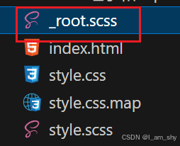
注意:使用'_'命名的scss文件不会被编译成css,
补充:sass和scss
sass和scss是同一个css预编译器,只是文件名称和写法上稍有差异,(.sass .scss)


可以看到在写法上,scss采用的是和css一样的{}包裹块,而sass使用的是类似python这样的缩进语法,其他并无差别


 8259
8259

 被折叠的 条评论
为什么被折叠?
被折叠的 条评论
为什么被折叠?
 到【灌水乐园】发言


