


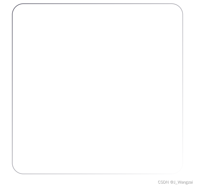
效果演示
css
     .border {
            width: 300px;
            height: 300px;
            border-radius: 20px;
            margin: auto;
            box-sizing: border-box;
            border: 1px solid transparent;
            background-image: linear-gradient(#fff, #fff),
                linear-gradient(to bottom right, #4D4C5C, #ffffff);
            background-origin: border-box;
            background-clip: content-box, border-box;
            border-radius: 20px;
        }
html
    <div class="border">
    </div>
个人见解
主要是利用background的属性来巧妙地设置border的效果,因为渐变色border-image的设置和圆角的设置 border-radius是不能共同存在的,如果共同存在的话,那么只有渐变色会生效,圆角则显示不出来
background-clip中,content-box 对应于第一个没有实际效果的渐变,而 border-box 对应于第二个渐变。


 2257
2257


 被折叠的 条评论
为什么被折叠?
被折叠的 条评论
为什么被折叠?
 到【灌水乐园】发言


