


2022学年第1学期人文地理学展示所负责的珠三角工业化现状出图部分,基于python进行简单的统计分析和图像绘制,本系列主要用于记录代码,大家可进行参考,初学者,Python编码习惯不好,见谅。
import numpy as np
import xlrd
import matplotlib.pyplot as plt

data = xlrd.open_workbook(r'E:\\UniversityGrade3\\Human_Geography\\小组作业\\data.xls')
table = data.sheets()[0]
gdp = table.col_values(2)
cityrate = table.col_values(3)
cy1 = table.col_values(4)
cy2 = table.col_values(5)
cy3 = table.col_values(6)
cy1people = table.col_values(8)
gdp = (np.array(gdp))/10000
cityrate = np.array(cityrate)
cy1 = np.array(cy1)
cy2 = np.array(cy2)
cy3 = np.array(cy3)
cy1people = np.array(cy1people)

# 绘制准备
config = {# 图表绘制初始字体字典设置
    "font.family": "serif",  # 使用衬线体
    "font.serif": ["Microsoft YaHei"],  # 全局默认使用衬线宋体
    "font.size": 12,
    # "font.weight": "bold",
    "axes.unicode_minus": False,
    "mathtext.fontset": "stix",  # 设置 LaTeX 字体,stix 近似于 Times 字体
}
plt.rcParams.update(config)

ticklabels_style = {# 刻度绘制初始字体字典设置
    "fontname": "Arial",
    "fontsize": 10,
}
labels_city = np.array(np.arange(0, 10, 1))
# shymean gzymean
# x_year = np.arange(len(labels_year))
width = 0.5
fig, ax1 = plt.subplots()
# rects1 = ax1.bar(labels_city - width, cy1, width, label='第一产业占比', color='#63E398', ec='black', lw=0.5)
# rects2 = ax1.bar(labels_city , cy2, width, label='第二产业占比', color='#F1D77E', ec='black', lw=0.5)
# rects3 = ax1.bar(labels_city + width, cy3, width, label='第三产业占比', color='#9DC3E7', ec='black', lw=0.5)

plt.bar(labels_city , cy1, width, label='第一产业', color='#63E398', ec='black', lw=0.75)
plt.bar(labels_city , cy2, width, bottom=cy1, label='第二产业', color='#F1D77E', ec='black', lw=0.75)
plt.bar(labels_city , cy3, width, bottom=cy2+cy1,label='第三产业', color='#9DC3E7', ec='black', lw=0.75)


ax1.grid(axis='y', linestyle='-.', alpha=0.1)
ax1.set_title('2020年珠三角及珠三角九市产业结构图', weight='bold', fontsize=16)
ax1.set_ylabel('产业占比(%)', fontsize=14)
# ax1.set_ylabel('产业占比', weight='bold', fontsize=14)
ax1.set_ylim(bottom=0, top=110)
ax1.set_yticks(np.arange(0, 100.01, step=10))
# plt.yticks(fontsize=10, weight='bold')
plt.yticks(fontsize=10)
ax1.set_xlabel('城市', fontsize=14)

# ax1.set_xlabel('城市', weight='bold', fontsize=14)
ax1.set_xticks(np.array(np.arange(0, 10, 1)),['广州', '佛山', '肇庆', '深圳', '东莞', '惠州', '珠海', '中山', '江门', '珠三角'])
# plt.xticks(fontsize=10, weight='bold')
plt.xticks(fontsize=10)
plt.gca().spines['left'].set_linewidth(1.5)
plt.gca().spines['bottom'].set_linewidth(1.5)
plt.gca().spines['right'].set_linewidth(1.5)
plt.gca().spines['top'].set_linewidth(1.5)
# ax1.spines['top'].set_visible(False)
ax1.tick_params(direction='out', width=2)

ax1.tick_params(direction='out', width=2)
# legend_form = {'weight': 'bold', 'size': 20}
ax1.legend(fontsize=8, frameon=False, ncol=3,  loc='upper left')
# ax1.bar_label(rects1, padding=3, fmt='%.1f', fontsize=8, weight='bold')
# ax1.bar_label(rects1, padding=5, fmt='%.1f', fontsize=8)
# ax1.bar_label(rects2, padding=5, fmt='%.1f', fontsize=8)
# ax1.bar_label(rects3, padding=5, fmt='%.1f', fontsize=8)
ax2 = plt.twinx()
plt.plot(np.array(np.arange(0, 10, 1)), cy1people, '-', c="#EF7A6D", label="从事第一产业人口比重", marker="o", linewidth=2)
for a, b in zip(np.array(np.arange(0, 10, 1)), cy1people):
    plt.text(a, b+1, '%.3f' % b, ha='center', va='bottom', fontsize=8, color='black', weight='bold')
ax2.set_ylabel('从事第一产业人口比重(%)', fontsize=14)# y轴标题
ax2.spines['top'].set_visible(False)
ax2.set_yticks(np.arange(0, 50.01, step=5))# y轴刻度
# ax2.axis["y"].set_axisline_style("->", size=1.5)
ax2.set_ylim(bottom=0, top=55.01)
ax2.legend(fontsize=8, frameon=False, ncol=1, loc='upper right')# 图例
ax2.tick_params(direction='out', width=2)

plt.savefig('2020年珠三角及珠三角九市产业结构图.jpg',dpi=600)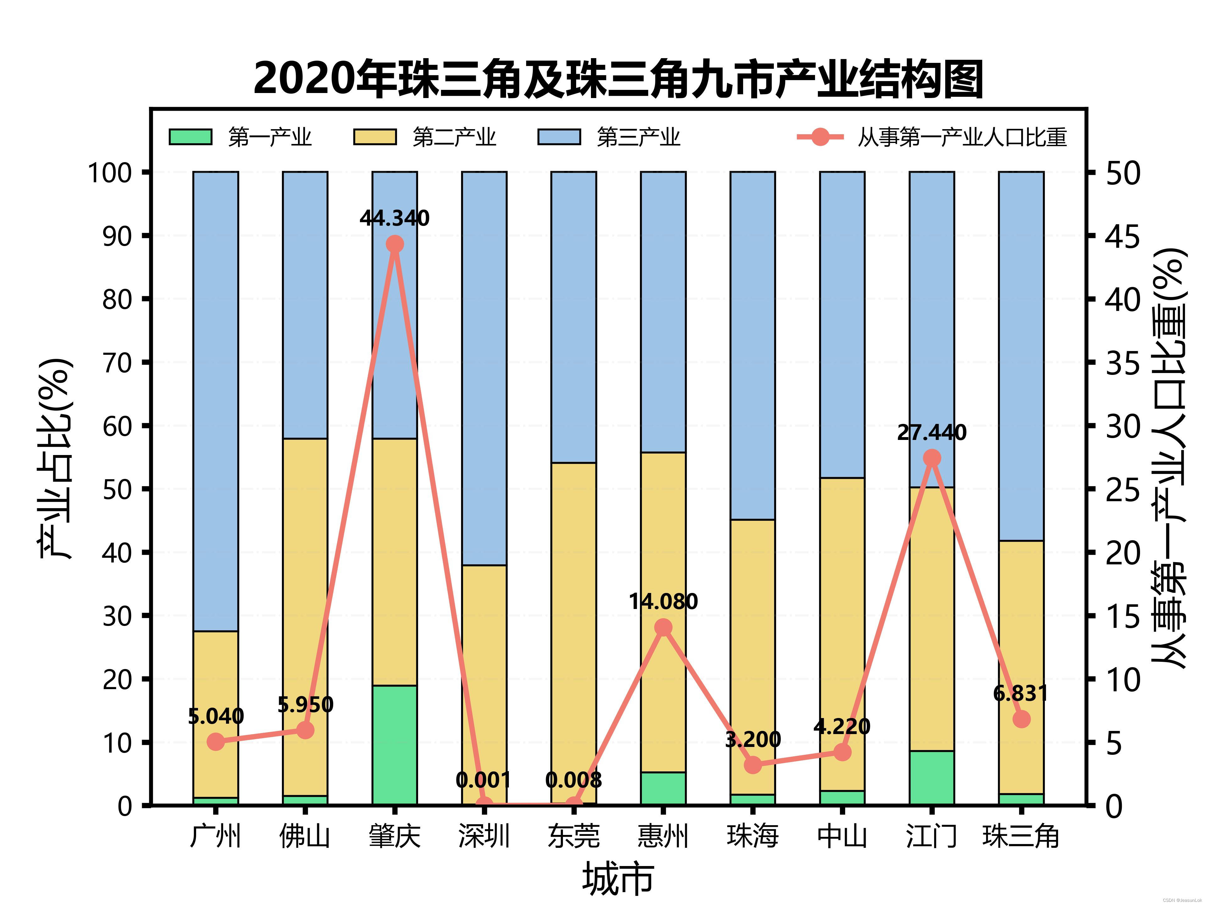
import numpy as np
import xlrd
import matplotlib.pyplot as plt
data = xlrd.open_workbook(r'E:\\UniversityGrade3\\Human_Geography\\小组作业\\data.xls')
table = data.sheets()[0]
gdp = table.col_values(2)
cityrate = table.col_values(3)
cy1 = table.col_values(4)
cy2 = table.col_values(5)
cy3 = table.col_values(6)
cy1people = table.col_values(8)
gdp = (np.array(gdp))/10000
cityrate = np.array(cityrate)
cy1 = np.array(cy1)
cy2 = np.array(cy2)
cy3 = np.array(cy3)
cy1people = np.array(cy1people)
# 绘制准备
config = {# 图表绘制初始字体字典设置
"font.family": "serif", # 使用衬线体
"font.serif": ["Microsoft YaHei"], # 全局默认使用衬线宋体
"font.size": 12,
# "font.weight": "bold",
"axes.unicode_minus": False,
"mathtext.fontset": "stix", # 设置 LaTeX 字体,stix 近似于 Times 字体
}
plt.rcParams.update(config)
ticklabels_style = {# 刻度绘制初始字体字典设置
"fontname": "Arial",
"fontsize": 10,
}
figure, ax1 = plt.subplots()
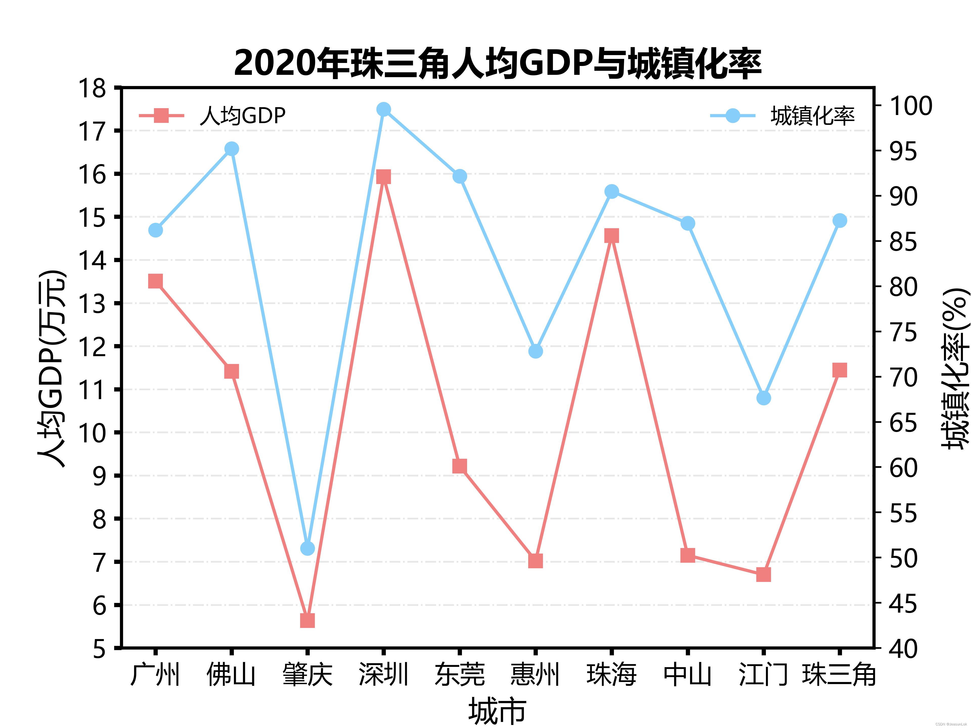
plt.plot(np.array(np.arange(0, 10, 1)), gdp, '-', c="lightcoral", label="人均GDP", marker="s", linewidth=1.5)
ax1.grid(axis='y', linestyle='-.', alpha=0.3)# 背景网格
ax1.set_title('2020年珠三角人均GDP与城镇化率', fontsize=16, weight='bold')# 图标总标题
# ax1.set_xlabel('城市', weight='bold', fontsize=14)# x轴标题
ax1.set_xlabel('城市', fontsize=14)# x轴标题
ax1.set_xticks(np.array(np.arange(0, 10, 1)),['广州', '佛山', '肇庆', '深圳', '东莞', '惠州', '珠海', '中山', '江门', '珠三角'])
# ax1.set_ylim(bottom=-2.5, top=2.51)# y轴范围
ax1.set_yticks(np.arange(5, 18.01, step=1))# y轴刻度
# ax1.set_ylabel('人均GDP(万元)', weight='bold', fontsize=14)# y轴标题
ax1.set_ylabel('人均GDP(万元)', fontsize=14)# y轴标题
ax1.legend(fontsize=10, frameon=False, ncol=1, loc='upper left')# 图例
plt.gca().spines['left'].set_linewidth(1.5)# 左边框宽度
plt.gca().spines['bottom'].set_linewidth(1.5)# 下边框宽度
plt.gca().spines['right'].set_linewidth(1.5)# 右边框宽度
plt.gca().spines['top'].set_linewidth(1.5)# 上边框宽度
# plt.show(block=True)
ax2 = plt.twinx()
plt.plot(np.array(np.arange(0, 10, 1)), cityrate, '-', c="lightskyblue", label="城镇化率", marker="o", linewidth=1.5)
# ax2.grid(axis='y', linestyle='-.', alpha=0.1)# 背景网格
# ax2.set_title('2020年珠三角人均GDP与城镇化率', fontsize=16, weight='bold')# 图标总标题
# ax2.set_xlabel('城市', weight='bold', fontsize=14)# x轴标题
ax2.set_xlabel('城市', fontsize=14)# x轴标题
ax2.set_xticks(np.array(np.arange(0, 10, 1)),['广州', '佛山', '肇庆', '深圳', '东莞', '惠州', '珠海', '中山', '江门', '珠三角'])
# ax2.set_ylim(bottom=-2.5, top=2.51)# y轴范围
ax2.set_yticks(np.arange(40, 101, step=5))# y轴刻度
# ax2.set_ylabel('城镇化率(%)', weight='bold', fontsize=14)# y轴标题
ax2.set_ylabel('城镇化率(%)', fontsize=14)# y轴标题
ax2.legend(fontsize=10, frameon=False, ncol=1, loc='upper right')# 图例
plt.savefig('2020年珠三角人均GDP与城镇化率.jpg',dpi=600)


 2053
2053


 被折叠的 条评论
为什么被折叠?
被折叠的 条评论
为什么被折叠?
 到【灌水乐园】发言


