


在工作中做一些活动类的H5的时候,经常会遇到UI大佬给出的难题,比如卡卷类的上下半圆角,如图:

看到这个的时候显示蒙了一下,然后快速想出了解决办法,一个盒子内填充两个伪元素不就解决了吗?
事实结果是可以解决,但是阴影加不上去被伪元素覆盖,代码过于耦合。
于是通过查阅资料,在《CSS揭秘》书中找到了一种解决方案,可以实现两个挖空半圆的效果;但又发现一个问题————不能
加阴影box-shadow,使用了fliter:drop-shadow 属性后问题得以解决;最终得出了个完美版!
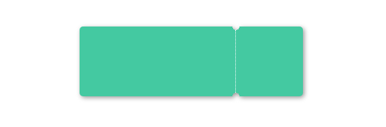
效果如图:
下面闲话不多说上码:
<!DOCTYPE html>
<html lang="en">
<head>
  <meta charset="UTF-8">
  <meta name="viewport" content="width=device-width, initial-scale=1.0">
  <meta http-equiv="X-UA-Compatible" content="ie=edge">
  <title>内圆角</title>
  <style type="text/css">
    * {
      margin: 0;
      padding: 0;
    }
    body {
      /* background: #999; */
      padding-top: 50px;
    }
    .wrapper {
      display: flex;
      position: relative;
      width: 320px;
      height: 100px;
      margin: auto;
      filter: drop-shadow(2px 2px 3px #999);
    }
    .wrapper div {
      height: 100%;
    }
    .wrapper b {
      position: absolute;
      right: 30%;
      top: 5px;
      height: calc(100% - 10px);
      border-left: 1px dotted #fff;
    }
    .left {
      background: #58a;
      background:  radial-gradient(circle at top right, transparent 5px, #44C9A1 0) top right ,radial-gradient(circle at bottom right, transparent 5px, #44C9A1 0) bottom right ;
      background-size: 100% 60%;
      background-repeat: no-repeat;
      color: white;
      width: 70%;
      border-radius: 5px 0 0 5px;
    }
    .right {
      background: #58a;
      background: radial-gradient(circle at top left, transparent 5px, #44C9A1 0) top left ,radial-gradient(circle at bottom left, transparent 5px, #44C9A1 0) bottom left ;
      background-size: 100% 60%;
      background-repeat: no-repeat;
      width: 30%;
      color: white;
      border-radius: 0 5px 5px 0;
    }
  </style>
</head>
<body>
  <div class="wrapper">
    <div class="left"></div>
    <b></b>
    <div class="right"></div>
  </div>
  </div>
</body>
</html>
喜欢博主的可以点赞关注一下

--------------------------------------------------------------- END ------------------------------------------------------------------
珍惜眼前人,莫要失去才懂珍惜~~~


 扫一扫
扫一扫


 3481
3481

 被折叠的 条评论
为什么被折叠?
被折叠的 条评论
为什么被折叠?
 到【灌水乐园】发言


