


 本文详细介绍了如何使用绝对定位、grid、flex、表格布局等方法实现HTML中垂直居中、两栏布局(左右固定自适应)和三栏布局(左右固定中间自适应)。从CSS技巧到实战案例,涵盖了前端开发者必备的布局知识。
垂直居中DIV
HTML部分
    <div class="father">
        <div class="son">我是垂直居中的div</div>
    </div>
这里简单给出几种
1.绝对定位(盒子宽高已知)
        .father {
            position: relative;
            width: 500px;
            height: 500px;
            background-color: red;
        }

        .son {
            position: absolute;
            left: 50%;
            top: 50%;
            margin-left: -150px;(-盒子一半宽度)
            margin-top: -150px;(-盒子一半高度)
            width: 300px;
            height:300px;
            background-color: blue;
        }
2.绝对定位(宽高已知)
        .father {
            position: relative;
            width: 500px;
            height: 500px;
            background-color: red;
        }

        .son{
            position:absolute;
            margin:auto;
            top:0; left:0; bottom:0;right:0;
            width: 300px;
            height:300px;
            background-color: blue;
        }
3.定位 (宽高未知)
        .son {
            position: absolute;
            top: 50%;
            left: 50%;
            transform: translate(-50%, -50%);
            background-color: blue;
        }
4.grid布局(父元素设置,宽高未知)(兼容性ie 10以上支持)
        .father {
            display: grid;
            align-content: center;
            justify-content: center; //等同于place-content:center;
            width: 500px;
            height: 500px;
            background-color: red;
        }
5.flex布局(父元素设置,宽高未知)(兼容性ie 11以上支持)
        .father {
            display: flex;
            align-items: center;
            justify-content: center;
            width: 500px;
            height: 500px;
            background-color: red;
        }
6.表格布局(父元素设置,宽高未知)(兼容性较好)
        .father {
            display:table-cell
            text-align: center;
            vertical-align: middle
            width: 500px;
            height: 500px;
            background-color: red;
        }
        .son {
       		display: inline-block;
        }
两栏布局左边固定右边自适应
这与右边固定左边自适应,上固定下自适应是一个道理。
HTML部分
        <div class="father">
            <div class="left"></div>
            <div class="right"></div>
        </div>
1.float布局
            .left {
                width: 200px;
                height: 200px;
                float: left;
                background-color: blue;
            }
            .right {
                margin-left: 200px;
                height: 200px;
                background-color: red;
            }
2.绝对定位
            .father {
                position: relative;
                height: 200px;
            }

            .left {
                position:absolute;
                width: 200px;
                height: 100%;
                float: left;
                background-color: blue;
            }

            .right {
                position:absolute;
                height: 100%;
                left:200px;
                right: 0;
                background-color: red;
            }
3.flex布局
            .father {
                height: 300px;
                width: 100%;
                display: flex;
            }

            .left {
                width: 300px;
                height: 100%;
                background-color: blue;
            }

            .right {
                flex: 1;
                height: 100%;
                background-color: red;
            }
4.grid布局
HTML部分
        <div class="father">
            <div class="left"></div>
            <div class="right"></div>
        </div>
CSS部分
.father {
  display: grid;
  grid-template-columns: 100px auto; //左边列的列宽100px,右边自适应
  grid-gap: 5px;
  grid-auto-rows: 50px;
}
.left,
.right{
  hight:100px;
}
.left{
  background:red;
}
.right{
  background:yellow;
}
三栏布局左右固定中自适应
这与左中固定右边自适应,中右固定左边自适应,以及上下固定中间自适应是一个道理
HTML部分
        <div class="father">
            <div class="left"></div>
            <div class="right"></div>
            <div class="main"> </div>
        </div>
1.float布局
        .father{
            height: 50px;
             div{
                height: 100%;
            }
        }

        .left {
            width: 200px;
            float: left;
            background-color: red
        }

        .main {
            margin-left: 200px;
            margin-right: 200px;
            background-color: blue
        }

        .right {
            float: right;
            width: 200px;
            background-color: yellow
        }
2.绝对定位
        .father{
            position: relative;
            height: 50px;
              div{
                position: absolute;
                height: 100%;
            }
        }

        .left {
            left: 0;
            width: 200px;
            background-color: red
        }

        .main {
            left: 200px;
            right: 200px;
            background-color: blue
        }

        .right {
            right: 0;
            width: 200px;
            background-color: yellow
        }
3.flex布局
HTML部分
        <div class="father">
            <div class="left"></div>
            <div class="main"> </div>
            <div class="right"></div>
        </div>
CSS部分
        .father {
            display: flex;
            height: 50px;
             div{
                height: 100%;
            }
        }

        .left {
            width: 200px;
            background-color: red
        }

        .main {
            flex: 1;
            background-color: blue
        }

        .right {
            width: 200px;
            background-color: yellow
        }
4.grid布局
HTML部分
        <div class="father">
            <div class="left"></div>
            <div class="main"> </div>
            <div class="right"></div>
        </div>
CSS部分
.father {
  display: grid;
  grid-template-columns: 100px auto 100px; //左、右列的列宽100px,中间自适应
  grid-gap: 5px;
  grid-auto-rows: 50px;
}
.left,
.main,
.right{
  hight:100px;
}
.left{
  background:red;
}
.main{
  background:blue;
}
.right{
  background:yellow;
}
设置 div下面的两个div元素水平居中
效果图
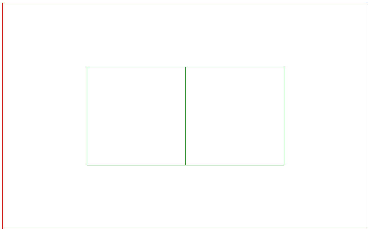
HTML + CSS部分
    <style>
        .box {
            border: 1px solid red;
            width: 100%;
            height: 50vh;
        }

        .item {
            border: 1px solid green;
            width: 200px;
            height: 200px;
        }
    </style>
    <div class="box">
        <div class="item left"></div>
        <div class="item right"></div>
    </div>
- 绝对定位
     .box {
            position: relative;
        }
        .item {
            position: absolute;
            top: 0;
            bottom: 0;
            right: 0;
            margin: auto;
        }
        .left{
            left:  -200px
        }
        .right{
            left:  200px
        }
平移
     .box {
            position: relative;
        }
        .item {
            position: absolute;
            top: 50%;
            left: 50%;
        }
        .left {
            transform: translate(-200px, -50%);
        }
        .right {
            transform: translate(0, -50%);
        }
- flex
父元素直接设置flex
     .box {
            display: flex;
            align-items: center;
            justify-content: center;
        }
- grid
        .box {
            display: grid;
            grid-template-columns: repeat(2, 200px);  //每一列的列宽200px,重复两次
            justify-content: center;  //水平居中
            align-content: center;      //垂直居中
        }
设置 div下面的两个div元素垂直水平居中
效果图
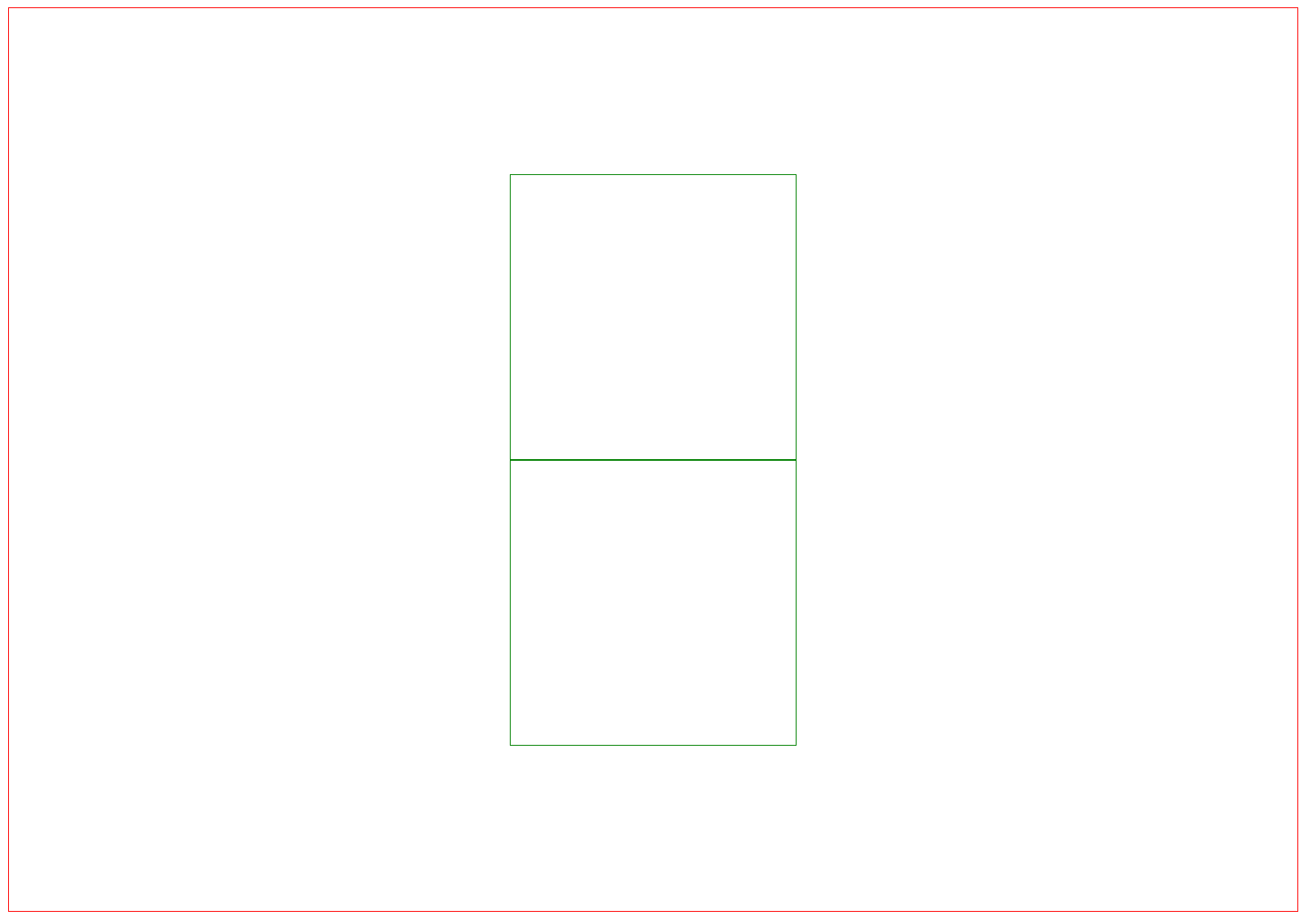
HTML + CSS部分
    <style>
        .box {
            border: 1px solid red;
            width: 100%;
            height: 50vh;
        }

        .item {
            border: 1px solid green;
            width: 200px;
            height: 200px;
        }
    </style>
    <div class="box">
        <div class="item left"></div>
        <div class="item right"></div>
    </div>
- 绝对定位
        .box {
            border: 1px solid red;
            width: 100%;
            height: 80vh;
            position: relative;
        }

        .item {
            border: 1px solid green;
            width: 200px;
            height: 200px;
            position: absolute;
            left: 0;
            right: 0;
            bottom: 0;
            margin: auto;
        }

        .left {
            top: -200px;
        }

        .right {
            top: 200px;
        }
- flex
        .box {
            display: flex;
            justify-content: center;
            align-items: center;
            flex-direction: column; //主轴排列方向
        }
- grid
        .box {
            border: 1px solid red;
            width: 100%;
            height: 80vh;
            display: grid;
            justify-content: center;
            align-content: center;
            grid-template-rows: repeat(2, 200px); ///每一行的宽为200px,重复两次
        }
总结
这里列出的是一些我比较常用的方法,
其他的像table布局,网格布局可以看阮一峰——网格布局教程
想了解更多关于flex布局可以看css flex 布局详解
关于gird布局可以看css grid布局详解
如有不足之处,请指出。


 扫一扫
扫一扫


 25万+
25万+

 被折叠的 条评论
为什么被折叠?
被折叠的 条评论
为什么被折叠?
 到【灌水乐园】发言


