


背景
初项目构想时,以两个不同的角色分不同的项目提供进入平台的开发目标来实现,在实际开发过程中被告知业务方只提供一个入口,所以只能把现有的两个项目代码进行合并,前提底部导航栏按不同端进行变更,一个中间按钮凸起,一个没有,为了完成这个功能进行了探索。
构思
实现思路首先创建一个基础底部配置文件和一个tabbar页面,用来控制业务端的切换变更的。再者按实际所需创建多个底部切换页面,说到这里那我们就可以利用uniapp提供的组件easycom模式来解决子组件多引用的问题。设想就是一个页面共用多个端使用v-if或者v-show的形式进行切换,最后在外层再做一层父类统一入口控制整个tabbar的切换。
实现
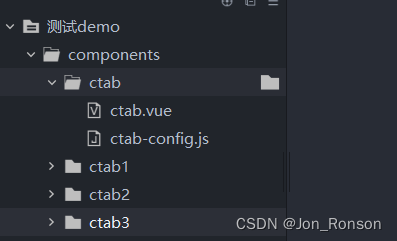
第一步,在根目录components(没有就新建一个components目录)下新建一个文件夹(ctab),然后分别新建一个ctab.vue组件和一个ctab-config.js文件。这样组件可以在其他页面上引用,js文件主要用于做配置。

第二步,新建底部页面组件,组件最多限制5个tab组件,然后需要通过easycom占位来实现,所以你需要几个tab组件就在components目录下建几个组件命名为ctab{n}。如下所示:
第三步,这里就直接贴ctab.vue的实现代码,想尝试就直接拷贝试一下,举个栗子。
<template>
	<view>
		<!--中间按钮凸起模式-->
		<block v-if="midBtn && midBtn.show">
			<!--凸起模式最多展示四个-->
			<block v-if="tabs.length < 4">
				<ctab1 v-show="sindex == 0"></ctab1>
				<ctab2 v-show="sindex == 2"></ctab2>
			</block>
			<block v-else="tabs.length >= 4">
				<ctab1 v-show="sindex == 0"></ctab1>
				<ctab2 v-show="sindex == 1"></ctab2>
				<ctab3 v-show="sindex == 3"></ctab3>
				<ctab4 v-show="sindex == 4"></ctab4>
			</block>
			<view class="tabbar">
				<!--中间按钮凸起模式tab为3个或者5个-->
				<view class="tab-item"
					  v-for="(item,index) in (tabs.length < 4 ? 3 : 5)"
					  :key="item"
					  @click="handleTabClick(index)">
					  <!--中间按钮凸起显示图片和文字-->
					<block v-if="index == floor">
						<view :style="'bottom: calc('+(midBtn.offset ? midBtn.offset : '50rpx')+' + env(safe-area-inset-bottom));width: '+(midBtn.width ? midBtn.width : '150rpx')+';height: '+(midBtn.width ? midBtn.width : '150rpx')+';background:'+(midBtn.background ? midBtn.background : '#ffffff')"
								class="mid-btn">
							<image :src="midBtn.icon"
								   :style="'width: '+(midBtn.iconwidth ? midBtn.iconwidth : midBtn.width)+';height: '+(midBtn.iconheight ? midBtn.iconheight : midBtn.width)+';'"
								   @click="handleMidBtn"/>
						</view>
						<text class="mid-text"
							  :style="'margin-top: '+(midBtn.textoffset ? midBtn.textoffset : '50rpx;')"
							  v-show="midBtn.showtext">{{midBtn.text}}</text>
					</block>
					<!--普通tab这里需要注意index选择-->
					<block v-else>
						<view class="c-tab-item">
							<text :class="'tab-iconfont iconfont '+(tabs[index < floor ? index : index-1].iconfont)"
								  :style="'color:'+(sindex == index ? scolor : color)"
								  v-if="tabs[index < floor ? index : index-1].iconfont"/>
							<image :src="sindex == index ? tabs[index < floor ? index : index-1].iconSelect : tabs[index < floor ? index : index-1].icon"
								   class="tab-icon"
								   v-else/>
							<text class="tab-text"
								  :style="'color:'+(sindex == index ? scolor : color)">{{tabs[index < floor ? index : index-1].text}}</text>
							<view class="corner"
								  v-show="tabs[index < floor ? index : index-1].mark > 0">{{tabs[index < floor ? index : index-1].mark > 99 ? '99+' : tabs[index < floor ? index : index-1].mark}}</view>
						</view>
					</block>
				</view>
			</view>
		</block>
		<!--普通模式-->
		<block v-else>
			<block v-if="tabs.length == 1">
				<ctab1 v-show="sindex == 0 && tabs[0].show"></ctab1>
			</block>
			<block v-else-if="tabs.length == 2">
				<ctab1 v-show="sindex == 0 && tabs[0].show"></ctab1>
				<ctab2 v-show="sindex == 1 && tabs[1].show"></ctab2>
			</block>
			<block v-else-if="tabs.length == 3">
				<ctab1 v-show="sindex == 0 && tabs[0].show"></ctab1>
				<ctab2 v-show="sindex == 1 && tabs[1].show"></ctab2>
				<ctab3 v-show="sindex == 2 && tabs[2].show"></ctab3>
			</block>
			<block v-else-if="tabs.length == 4">
				<ctab1 v-show="sindex == 0 && tabs[0].show"></ctab1>
				<ctab2 v-show="sindex == 1 && tabs[1].show"></ctab2>
				<ctab3 v-show="sindex == 2 && tabs[2].show"></ctab3>
				<ctab4 v-show="sindex == 3 && tabs[3].show"></ctab4>
			</block>
			<block v-else-if="tabs.length >= 5">
				<ctab1 v-show="sindex == 0 && tabs[0].show"></ctab1>
				<ctab2 v-show="sindex == 1 && tabs[1].show"></ctab2>
				<ctab3 v-show="sindex == 2 && tabs[2].show"></ctab3>
				<ctab4 v-show="sindex == 3 && tabs[3].show"></ctab4>
				<ctab5 v-show="sindex == 4 && tabs[4].show"></ctab5>
			</block>
			<view class="tabbar">
				<view class="tab-item"
					  v-for="(item,index) in tabs"
					  :key="item.text"
					  v-show="item.show"
					  @click="handleTabClick(index)">
					<view class="c-tab-item">
						<text :class="'tab-iconfont iconfont '+(item.iconfont)"
							  :style="'color:'+(sindex == index ? scolor : color)"
							  v-if="item.iconfont"/>
						<image :src="sindex == index ? item.iconSelect : item.icon"
							   class="tab-icon"
							   v-else/>
						<text class="tab-text"
							  :style="'color:'+(sindex == index ? scolor : color)">{{item.text}}</text>
						<view class="corner"
							  v-show="item.mark > 0">{{item.mark > 99 ? '99+' : item.mark}}</view>
					</view>
				</view>
			</view>
		</block>
	</view>
</template>
<script> //读取配置 import ctabbar from './ctab-config.js' export default { name: "ctab", data() { return { tabs: [], color: '', scolor: '', midBtn: {}, sindex: 0, floor: -1,//midButton开启时使用 } }, mounted() { let tabbar = ctabbar.tabbar this.color = tabbar.color this.scolor = tabbar.selectcolor if(tabbar.midButton && tabbar.midButton.show && tabbar.tabs.length < 2){ throw new Error('midButton模式开启,配置tab选项不能少于2个') } if(tabbar.midButton && tabbar.midButton.show){ let mlength = tabbar.tabs.length < 4 ? 3 : 5 this.floor = Math.floor(mlength/2) } //普通模式,设置选中的tab项 let tablen = tabbar.tabs.length if(!tabbar.midButton.show){ if(!tabbar.tabs[0].show){ this.sindex ++ if(tablen >= 2 && !tabbar.tabs[1].show){ this.sindex ++ if(tablen >= 3 && !tabbar.tabs[2].show){ this.sindex ++ if(tablen >= 4 && !tabbar.tabs[3].show){ this.sindex ++ if(tablen >= 5 && !tabbar.tabs[4].show){ throw new Error('tab不能全部隐藏') } } } } } } if(tabbar.tabs.length <= 5){ this.tabs = tabbar.tabs }else { this.tabs = tabbar.tabs.slice(0,5) } this.midBtn = tabbar.midButton }, methods: { setTheme(color){ this.scolor = color this.midBtn.background = color }, //设置tab隐藏和显示,midButton模式失效 setTabVisible(index,visible){ if(this.tabs[index]){ this.tabs[index].show = visible } }, //设置角标 setCorner(index,num){ if(this.tabs[index]){ this.tabs[index].mark = num } }, handleTabClick(tab){ if(this.midBtn && this.midBtn.show){ if(tab == this.floor){ return } } this.sindex = tab let rindex = tab if(this.midBtn && this.midBtn.show){ if(tab > this.floor){ rindex -- } } this.$emit('tabClick',rindex) }, handleMidBtn(){ this.$emit('midClick') } } } </script><style> /*这里引入字体图标,如果使用字体图标的话*/ @import '@/common/font/iconfont.css'; .tabbar { position: fixed; z-index: 99; width: 100%; height: 100rpx; background-color: #ffffff; bottom: 0; left: 0; box-shadow: 0rpx 4rpx 8rpx 0rpx rgba(0,0,0,0.5); border-radius: 0px 0px 0px 0px; opacity: 1; display: flex; flex-direction: row; align-items: center; justify-content: center; padding-bottom: constant(safe-area-inset-bottom); padding-bottom: env(safe-area-inset-bottom); box-sizing: content-box; } .tab-item { flex: 1; height: 100rpx; display: flex; flex-direction: column; align-items: center; justify-content: center; } .c-tab-item { height: 120rpx; display: flex; flex-direction: column; width: 120rpx; align-items: center; justify-content: center; position: relative; } .tab-icon { width: 45rpx; height: 45rpx; } .tab-iconfont { font-size: 45rpx; font-weight: bold; } .tab-text { font-size: 26rpx; color: #333333; margin-top: 5rpx; } .mid-btn { position: absolute; display: flex; flex-direction: row; justify-content: center; align-items: center; background-color: red; border-radius: 50%; } .mid-text { font-size: 25rpx; color: #999999; } .corner { text-align: center; width: 45rpx; height: 45rpx; position: absolute; background-color: red; border-radius: 50%; color: white; font-size: 20rpx; font-weight: bold; top: 5rpx; right: 0; display: flex; flex-direction: row; justify-content: center; align-items: center; } </style>
第四步,这里就是配置文件ctab-config.js代码,按需进行调整,举个栗子。
1)通过修改配置文件中的midButton中的show属性来开启是否中间按钮凸起。
2)通过配置或者动态修改tabs中tab obj中的show属性来动态形式和隐藏某个tab。2)其他字段配置按需进行配置。
var tabbar = {
	/*开启midButton模式时取前两个或者前四个显示,其他忽略*/
	midButton: {
		show: true,//是否是中间凸起模式
		width: '153rpx',//不填默认150rpx 中间按钮大小
		iconwidth: '67rpx',//不填默认150rpx 中间图标大小
		iconheight: '60rpx',
		offset: '40rpx',//不填默认50rpx
		background: '#F7D456',//中间按钮背景颜色
		text: '拍一拍',
		textoffset: '50rpx',//不填默认50rpx
		showtext: false,
		icon: '../../static/tabbar/camera.png'
	},
	color: '#333333',//未选中颜色
	selectcolor: '#F7D456',//选中颜色
	/*tabs最多5个,超过5个超过的部分会被忽略,show属性用来控制tab显示隐藏,midButton开启时失效,iconfont优先,没有就使用icon*/
	tabs: [{
		icon: '../../static/tabbar/main_tab_home_normal.png',
		iconSelect: '../../static/tabbar/main_tab_home_select.png',
		text: '首页',
		iconfont: '',
		show: true,
		mark: 0//角标数量,小于等于0不显示
	}, {
		icon: '../../static/tabbar/main_tab_task_normal.png',
		iconSelect: '../../static/tabbar/main_tab_task_select.png',
		text: '任务',
		iconfont: '',
		show: true,
		mark: 100
	}, {
		icon: '../../static/tabbar/main_tab_my_normal.png',
		iconSelect: '../../static/tabbar/main_tab_my_select.png',
		text: '我的',
		iconfont: 'icon-wode',//注意配置字体图标会优先使用字体图标,这里是示例
		show: true,
		mark: 9
	}]
}

module.exports = {
	tabbar
}
第五步,tab切换1~n(ctab{1~n})的页面就是自己业务功能页面了,举个栗子。
<template>
	<!--用户端-->
	<view v-if="isUser"></view>
	<!--管理端-->
	<view v-else></view>
</template>

<script>
	export default {
		data() {
			return {
				isUser: true
			}
		}
	}
</script>

<style>
</style>
第六步,最后就是定义统一入口的页面,用于调用底部tabbar导航栏了,举个栗子。
<template>
	<ctab @midClick='midClick' @tabClick='tabClick' ref="ctab"/>
</template>

<script>
	export default {
		data() {
			return {}
		},
		onLoad() {},
		methods: {
			//凸起按钮点击事件
			midClick(){
				console.log('midClick')
			},
			//tab切换点击事件
			tabClick(tab){
				console.log('tabClick',tab)
			}
		}
	}
</script>

<style>
	page {
		width: 100%;
		height: 100%;
	}
</style>
最后
写到这里就宣告结束了。在此祝大家身体健康,越码越浓后会有期~~


 5117
5117


 被折叠的 条评论
为什么被折叠?
被折叠的 条评论
为什么被折叠?
 到【灌水乐园】发言


