


一、简单介绍
ConstraintLayout(约束布局)是一 个ViewGroup,支持Api9以上的Android系统,主要解决的问题是 布 局 嵌 套 过 多 \color{red}{布局嵌套过多} 布局嵌套过多。开发过程中经常能遇到一些复杂的UI,可能会出现布局嵌套过多的问题,嵌套得越多,设备绘制视图所需的时间和计算功耗也就越多。
二、使用
2.1 属性介绍
2.1.1 相对位置
layout_constraintLeft_toLeftOf
layout_constraintLeft_toRightOf
layout_constraintRight_toLeftOf
layout_constraintRight_toRightOf
layout_constraintTop_toTopOf
layout_constraintTop_toBottomOf
layout_constraintBottom_toTopOf
layout_constraintBottom_toBottomOf
layout_constraintBaseline_toBaselineOf
layout_constraintStart_toEndOf
layout_constraintStart_toStartOf
layout_constraintEnd_toStartOf
layout_constraintEnd_toEndOf
上面的属性,是用于设置一个控件相对于其他控件、Barrier、Guideline或者其父容器的位置。其中 l a y o u t _ \color{red}{layout\_} layout_是固定格式,重要的信息是以下两部分:
- constraintXXX:指定当前控件需要设置约束的属性部分。如
constraintRight表示对当前控件的右边进行约束设置。 - toXXXOf:其指定的内容是作为当前控件设置约束需要依赖的控件或父容器(可以理解为设置约束的参照物)。并通过XXX指定被依赖对象用于参考的属性。如
toLeftOf="parent":表示当前控件相对于父容器的左边进行约束设置。
<?xml version="1.0" encoding="utf-8"?>
<android.support.constraint.ConstraintLayout xmlns:android="http://schemas.android.com/apk/res/android"
    xmlns:app="http://schemas.android.com/apk/res-auto"
    android:layout_width="match_parent"
    android:layout_height="match_parent">

    <Button
        android:id="@+id/button_ro"
        android:layout_width="wrap_content"
        android:layout_height="70dp"
        android:text="Reference Object"
        app:layout_constraintBottom_toBottomOf="parent"
        app:layout_constraintLeft_toLeftOf="parent"
        app:layout_constraintRight_toRightOf="parent"
        app:layout_constraintTop_toTopOf="parent" />

    <Button
        android:id="@+id/button_A"
        android:layout_width="wrap_content"
        android:layout_height="wrap_content"
        android:text="A"
        app:layout_constraintRight_toLeftOf="@+id/button_ro"
        app:layout_constraintTop_toBottomOf="@id/button_ro"
        />

    <Button
        android:id="@+id/button_B"
        android:layout_width="wrap_content"
        android:layout_height="wrap_content"
        android:text="B"
        app:layout_constraintRight_toLeftOf="@+id/button_ro"
        app:layout_constraintBottom_toTopOf="@id/button_ro"
        />

    <Button
        android:id="@+id/button_C"
        android:layout_width="wrap_content"
        android:layout_height="100dp"
        android:gravity="bottom"
        android:text="C"
        app:layout_constraintLeft_toRightOf="@+id/button_ro"
        app:layout_constraintBaseline_toBaselineOf="@id/button_ro"
        />
</android.support.constraint.ConstraintLayout>

2.1.2 角度定位
角度定位指的是可以用一个角度和一个距离来约束两个空间的中心。for example:
<TextView
        android:id="@+id/textView1"
        android:layout_width="wrap_content"
        android:layout_height="wrap_content" />

    <TextView
        android:id="@+id/textView2"
        android:layout_width="wrap_content"
        android:layout_height="wrap_content"
        app:layout_constraintCircle="@+id/textView1"
        app:layout_constraintCircleAngle="120"
        app:layout_constraintCircleRadius="150dp" />
上面例子中的TextView2用到了3个属性:
app:layout_constraintCircle="@+id/textView1"
app:layout_constraintCircleAngle=“120”(角度)
app:layout_constraintCircleRadius=“150dp”(距离)
指的是TextView2的中心在TextView1的中心的120度,距离为150dp,效果如下:

2.1.3 边距
在ConstraintLayout中,控件除了可以设置普通的边距属性,还可以设置当控件依赖的控件GONE之后的边距属性。即我们可以理解可以根据被依赖控件是否GONE的状态,设置两种边距值。分别通过如下属性进行设置:
- 普通属性
android:layout_marginStart
android:layout_marginEnd
android:layout_marginLeft
android:layout_marginTop
android:layout_marginRight
android:layout_marginBottom
- 被依赖控件GONE之后的边距属性goneMargin
layout_goneMarginStart
layout_goneMarginEnd
layout_goneMarginLeft
layout_goneMarginTop
layout_goneMarginRight
layout_goneMarginBottom
简单举个例子:
<?xml version="1.0" encoding="utf-8"?>
<android.support.constraint.ConstraintLayout xmlns:android="http://schemas.android.com/apk/res/android"
    xmlns:app="http://schemas.android.com/apk/res-auto"
    android:layout_width="match_parent"
    android:layout_height="match_parent">


    <Button
        android:id="@+id/button_A"
        android:layout_width="wrap_content"
        android:layout_height="wrap_content"
        android:text="A"
        android:layout_marginLeft="25dp"
        app:layout_constraintLeft_toLeftOf="parent"
        app:layout_constraintTop_toTopOf="parent"
        android:visibility="visible"
        app:layout_constraintBottom_toBottomOf="parent"
        />

    <Button
        android:id="@+id/button_B"
        android:layout_width="wrap_content"
        android:layout_height="wrap_content"
        android:text="B"
        app:layout_goneMarginLeft="70dp"
        app:layout_constraintLeft_toRightOf="@+id/button_A"
        app:layout_constraintBottom_toBottomOf="@id/button_A"
        />

</android.support.constraint.ConstraintLayout>

2.1.4 居中
- 水平居中:相对一个控件或者父容器左右对齐
app:layout_constraintLeft_toLeftOf="parent"
app:layout_constraintRight_toRightOf="parent
- 垂直居中:相对一个控件或者父容器上下对齐
app:layout_constraintTop_toTopOf="parent"
app:layout_constraintBottom_toBottomOf="parent"
2.1.5 偏移
在设置控件的居中属性之后,通过偏移属性可以设置让控件更偏向于依赖控件的某一方,偏移设置为0~1之间的值。相应属性:
layout_constraintHorizontal_bias // 水平偏移
layout_constraintVertical_bias   // 垂直偏移
例子:
<Button
        android:id="@+id/button_A"
        android:layout_width="wrap_content"
        android:layout_height="wrap_content"
        android:text="A"
        app:layout_constraintLeft_toLeftOf="parent"
        app:layout_constraintTop_toTopOf="parent"
        app:layout_constraintRight_toRightOf="parent"
        app:layout_constraintBottom_toBottomOf="parent"
        app:layout_constraintHorizontal_bias="0.2"
        />

2.1.6 可见性
可见性这个属性大家应该很熟悉,但是约束布局的可见性属性和其它布局相比,存在以下区别:
- 当控件设为GONE时,被认为尺寸为0。可以理解为布局上的一个点。
- 若GONE的控件对其它控件有约束,则约束保留并生效,但所有的边距(margin)会清零。
2.1.7比例
控件可以定义两个尺寸之间的比例,目前支持宽高比。 前提条件是至少有一个尺寸设置为0dp,然后通过layout_constraintDimentionRatio属性设置宽高比。设置方式有以下几种:
- 直接设置一个float值,表示宽高比
- 以” width:height”形式设置
- 通过设置前缀W或H,指定一边相对于另一边的尺寸,如”H, 16:9”,高比宽为16:9
2.1.8链
链这个概念是约束布局新提出的,它提供了在一个维度(水平或者垂直),管理一组控件的方式。如果两个或以上控件通过下图的方式约束在一起,就可以认为是他们是一条链(图为横向的链,纵向同理)。

 <TextView
        android:id="@+id/TextView1"
        android:layout_width="wrap_content"
        android:layout_height="wrap_content"
        app:layout_constraintLeft_toLeftOf="parent"
        app:layout_constraintRight_toLeftOf="@+id/TextView2" />

    <TextView
        android:id="@+id/TextView2"
        android:layout_width="wrap_content"
        android:layout_height="wrap_content"
        app:layout_constraintLeft_toRightOf="@+id/TextView1"
        app:layout_constraintRight_toLeftOf="@+id/TextView3"
        app:layout_constraintRight_toRightOf="parent" />

    <TextView
        android:id="@+id/TextView3"
        android:layout_width="wrap_content"
        android:layout_height="wrap_content"
        app:layout_constraintLeft_toRightOf="@+id/TextView2"
        app:layout_constraintRight_toRightOf="parent" />
- 链头
最 左 边 或 最 上 面 的 控 件 , 链 的 属 性 由 链 头 控 制 \color{red}{最左边或最上面的控件,链的属性由链头控制} 最左边或最上面的控件,链的属性由链头控制 - 设置
通过layout_constraintHorizontal_chainStyle和layout_constraintVertical_chainStyle在链的第一个元素上设置。默认spread样式。如上所示,A作为链头,设置了chainStyle:
app:layout_constraintHorizontal_chainStyle="spread_inside"。
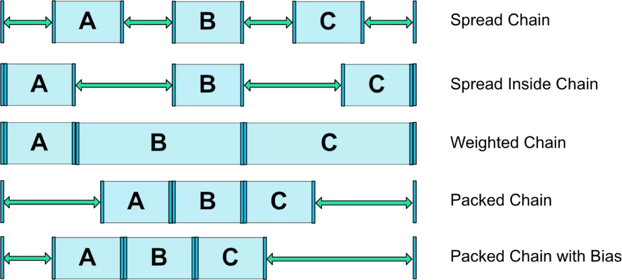
几种链的样式如下图所示:
三、拓展工具
3.1 Barrier(屏障)

3.2 Guideline
Guildline像辅助线一样,在预览的时候帮助你完成布局(不会显示在界面上)。
Guildline的主要属性:
android:orientation 垂直vertical,水平horizontal
layout_constraintGuide_begin 开始位置
layout_constraintGuide_end 结束位置
layout_constraintGuide_percent 距离顶部的百分比(orientation = horizontal时则为距离左边)
<android.support.constraint.Guideline
        android:id="@+id/horizontal_guideline"
        android:layout_width="wrap_content"
        android:layout_height="wrap_content"
        android:orientation="horizontal"
        app:layout_constraintGuide_begin="50dp" />

    <android.support.constraint.Guideline
        android:id="@+id/vertical_guideline"
        android:layout_width="wrap_content"
        android:layout_height="wrap_content"
        android:orientation="vertical"
        app:layout_constraintGuide_percent="0.4" />


3.3 Group
Group可以把多个控件归为一组,方便隐藏或显示一组控件,举个例子:
<TextView
        android:id="@+id/TextView1"
        android:layout_width="wrap_content"
        android:layout_height="wrap_content" />

    <TextView
        android:id="@+id/TextView2"
        android:layout_width="wrap_content"
        android:layout_height="wrap_content"
        app:layout_constraintLeft_toRightOf="@+id/TextView1" />

    <TextView
        android:id="@+id/TextView3"
        android:layout_width="wrap_content"
        android:layout_height="wrap_content"
        app:layout_constraintLeft_toRightOf="@id/TextView2" />

现在有3个并排的TextView,用Group把TextView1和TextView3归为一组,再设置这组控件的可见性,如下所示:
 <android.support.constraint.Group
        android:id="@+id/group"
        android:layout_width="wrap_content"
        android:layout_height="wrap_content"
        android:visibility="invisible"
        app:constraint_referenced_ids="TextView1,TextView3" />
效果如下:

3.4 Placeholder
Placeholder指的是占位符。在Placeholder中可使用setContent()设置另一个控件的id,使这个控件移动到占位符的位置。
 <android.support.constraint.Placeholder
        android:id="@+id/placeholder"
        android:layout_width="wrap_content"
        android:layout_height="wrap_content"
        app:content="@+id/right_text"
        app:layout_constraintLeft_toLeftOf="parent"
        app:layout_constraintTop_toTopOf="parent" />

    <TextView
        android:id="@+id/right_text"
        android:layout_width="wrap_content"
        android:layout_height="wrap_content"
        android:background="#cccccc"
        android:padding="16dp"
        android:text="right_text"
        android:textColor="#000000"
        app:layout_constraintRight_toRightOf="parent"
        app:layout_constraintTop_toTopOf="parent" />


 1737
1737

 被折叠的 条评论
为什么被折叠?
被折叠的 条评论
为什么被折叠?
 到【灌水乐园】发言


