


- 要实现Media Queries 样式模块,需要在head 标签内导入一个CSS 样式文件,如,
(1)media 属性定义当前屏幕可视区域的宽度最大值是600 像素时应用:
<ink rel="stylesheet" media="screen and(max-width:600px)" href="small.css"/>在small.css 样式文件内,需要定义media 类型的样式,例如:
@media screen and (max-width:600px){
.demo{
background-color:#CCC;
}
}
(2)当屏幕可视区域的宽度长度在600 像素和900 像素之间时,导入CSS 文件写法如下:
<link rel="stylesheet"
media="screen and(min-width:600px) and(max-width:900px)" href="small.css"/>
(3)同样也可以判断当移动设备(如iPad)的方向发生变化时,当移动设备处于纵向(portrait)模式下时,应用portrait 样式文件;当移动设备处于横向(landscape)模式下时,应用landscape 样式文件。
<link rel="stylesheet" media="all and(orientation:portrait)" href="portrait.css"/>
<link rel="stylesheet" media="all and(orientation:landscape)" href="landscape.css"/>
Media Queries 的语法如下所示:
@media [media_query] media_type and media_featuremedia_query表示查询关键字,可以使用not(取反操作)或only(作用是,让不支持Media Queries 的设备但能读取Media Type 类型的浏览器忽略这个样式)
media_type 参数的作用是指定设备类型
media_feature 的主要作用是定义CSS 中的设备特性
2.devicePixelRatio = 屏幕物理像素/设备独立像素(320px,可以看做css中的px) iphone4 的 640/320 = 2(2倍图)
3.手机端有两个容器:visual viewport(视觉容器)和layout viewport(虚拟容器),ideal viewport并没有一个固定的尺寸,不同的设备拥有有不同的ideal viewport。所有的iphone的ideal viewport宽度都是320px。
4.响应式布局采用了①媒体查询(@media screen and (max-width:960px){})、②流式布局(以百分比进行布局)、③液态图片(img{max-width:100%;})三项技术
5.<link rel=”stylesheet” media=”screen and (判断条件)” herf=”需要调用的样式表文件” />
6.定义页面尺寸(屏幕和视口),其中width=device-width就是说把页面宽度设置成和屏幕宽度一样
<meta name="viewport" content="width=device-width,initial-scale=1.0">7.无法使用代码实现禁止用户旋转设备
8.webkit内核中的一些私有的meta标签
<meta content="width=device-width, initial-scale=1.0, maximum-scale=1.0, user-scalable=0;" name="viewport" />表示:强制让文档的宽度与设备的宽度保持1:1,并且文档最大的宽度比例是1.0,且不允许用户点击屏幕放大浏览,
user-scalable表示用户是否可以手动缩放;
<meta content="yes” name=" apple-mobile-web-app-capable" />是iphone设备中的safari私有meta标签,它表示:允许全屏模式浏览;
<meta content="black" name=" apple-mobile-web-app-status-bar-style"/>它指定的iphone中safari顶端的状态条的样式;
<meta content="telephone=no" name="format-detection" />表示:告诉设备忽略将页面中的数字识别为电话号码
<link rel="apple-touch-icon" href="custom_icon.png">设置保存到桌面图标
mobile的设配方法
1.利用 css 将图像限定在元素内( img 图片使用 [max-]width: 100% ,背景图像使用 background-size ),布局只针对元素进行;
2.实现方式:
(1)固定高度,宽度自适应(水平方向混合使用定值和百分比或者利用弹性布局),viewport width 设置为 device-width,以较小宽度(如 320px)的视觉稿作为参照进行布局。
(2)固定宽度,viewport 缩放:
视觉稿、页面宽度、viewport width 使用统一宽度,利用浏览器自身缩放完成适配。页面样式(包括图像元素)完全按照视觉稿的尺寸,使用定值单位 (px、em)即可完成
(3)利用 rem 布局:css 及 js 都以 16px 作为基数换算 rem
常见问题及解决:
1. 移动端的字体设置没有作用,可能原因是viewpoint没有设置
2.移动设备上的自适应布局模式:使用webkit-box(box-flex的作用是按百分比划分兄弟相同标签的width,也就是当ul里有个两个li时,每个li会自动划分ul的宽度,如果box-flex:1;那么此时,li的width就是50%)
3.避免Android自动识别页面中的邮件地址:使用webkit-b.
<meta content="email=no" name="format-detection" />
ios和Android中的输入url控件:满足当前文档的内容高度必须是高于窗口的高度时,添加:
window.onload=function(){
  setTimeout(scrollTo,0,0,0);
}4.去掉ios的input自带的圆角样式,添加css:
input {-webkit-appearance:none;}即可
5 移动端a点击后出现阴影效果(高亮显示)
(1)需要去掉这种效果,需添加:-webkit-tap-highlight-color: rgba(0,0,0,0);
(2)移动端如果需要实现旋转后的a,点击出现也是旋转后阴影的效果:如果直接针对a设置样式进行旋转,在pc端有这种效果,但移动端无法实现。可采用以下实现方式,在a外面加一层div,针对div进行旋转,将a点击默认样式去掉,然后在点击a事件时为div添加border.
如:
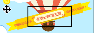
图1:点击前
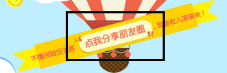
图2:点击后
(3)在不引入其他js文件(如jqm)时,有时a点击不会出现高亮效果,可使用css3进行手动添加:
如:a:active{
/*display: inline-block;*/
/*border-color:rgba(141,39,142,.75); */
box-shadow:0 0 4px;
}
移动端的字体设置
1.阅读的理想行宽是65个字符(1个汉字2个字符)左右
2.行距的标准通常是1.4em
3.移动端文字不能采用两端对齐方式,而应该采用左对齐
4.IOS: 选用冬青黑体或者华文黑体即可,推荐使用冬青黑体,效果更好。
Android:Droid Sans Fallback(其实冬青黑或者华文黑也可以考虑啦)
ios开发中规定,按钮(可点按区域)的高度最好不要小于44px
Jqm实现UI效果
可添加到页眉的按钮有3种类型:
a.带文本的按钮
b.只带图标的按钮(添加属性:data-icon和data-iconpos=”notext”)、
c.既带图标也带文本的按钮(添加属性:data-icon),若只有一个button需要右对齐时,可添加class=ui-btn-right
注:页眉的第一个按钮是左对齐,第二个按钮是右对齐修复被截断的页眉和页脚:
ui-header .ui-title,.ui-foot ui-title{
margin-right:0 !important;
margin-left:0 !important;
}
3.添加回退按钮/链接
a.添加回退按钮方式:
(1)data-auto-back-btn=”true”可以为特定页面添加回退按钮;
(2)在绑定mobileinit方法时,将addBackBtn选项设置为true;
b. 添加回退链接:data-rel=”back”
永久标签栏:class=’ui-state-persist’;自定义图标:data-icon:custom
图标默认是左对齐,可设置data-iconpos改变。
自定义button的图标步骤:
(1)为链接添加data-icon属性,如:data-icon:’my-custom-icon’
(2)创建一个类属性名必须为“.ui-icon-“来指定自定义图像的背景源,如:class=’.ui-icon- my-custom-icon’
jqm的touch事件
1.包含三个触摸事件:touchstart、Touchmove和Touchend
2.每个触摸事件包含了三个触摸列表:
(1)touches :当前位于屏幕上的所有手指的一个列表。
(2)targetTouches :位于当前DOM元素上的手指的一个列表。
(3)changedTouches :涉及当前事件的手指的一个列表。
这些列表由包含了触摸信息的对象组成:通过event对象取到(一般是通过event.changedTouches属性),包括下面一些重要的属性:
client / clientY: 触摸点相对于浏览器窗口viewport的位置
pageX / pageY: 触摸点相对于页面的位置
screenX /screenY:触摸点相对于屏幕的位置
identifier: touch对象的ID
target: 当前的DOM元素
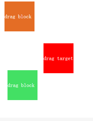
实例:滑动指定的区域块,打开指定的网址
<!DOCTYPE html>
<html>
  <head>
    <title>滑动目标块打开网址例子(touch事件)</title>
    <meta http-equiv="keywords" content="keyword1,keyword2,keyword3">
    <meta http-equiv="content-type" content="text/html; charset=UTF-8">
    <meta name="viewport" content="width=device-width, initial-scale=1">

    <style>
        *{margin:0;padding:0}
        html,body{height:100%}
        a{text-decoration:none;color:white;}
        #canvas{position:relative;width:100%;background-color:#ccc}
        .testBlock1,.testBlock2,.targetBlock{
           position:absolute;width:100px;height:100px;line-height:100px;font-size:18px;
        }
        .testBlock1{background:#E46D25;top:10px;left:20px;}
        .testBlock2{background:#43E064;top:240px;left:30px;}
        .targetBlock{background:red;top:150px;left:150px;}
    </style>
  </head>

  <body>
    <div id="canvas">
     <div class="testBlock1"><a href='http://www.w3school.com.cn'>drag block</a></div>
     <div class='targetBlock'><a href='http://www.baidu.com'>drag target</a></div>
     <div class="testBlock2"><a href='http://www.w3school.com.cn'>drag block</a></div>
    </div>
    <script src="js/jquery-1.6.4.min.js" type="text/javascript"></script>
    <script>
            var canvas = document.getElementById("canvas"),
                        spirit,
                        startX,
                        startY;

            function touchStart(event) {
                //阻止网页默认动作(即网页滚动)
                event.preventDefault();
                if (spirit || !event.touches.length) return;
                var touch = event.touches[0];
                startX = touch.pageX;
                startY = touch.pageY;

                var currClassName=$(touch.target).attr('class');
                spirit=$('.'+currClassName);
            }

            function touchMove(event) {
                event.preventDefault();
                if (!spirit || !event.touches.length) return;
                var touch = event.touches[0],
                    x = touch.pageX - startX,
                    y = touch.pageY - startY;
                    target=touch.target;

                  var targetClassName=$(target).attr('class');
                  spirit=$('.'+targetClassName);

                  $(spirit).css('left',touch.pageX +'px');
                  $(spirit).css('top',touch.pageY+'px');

        alert('移动x:'+Math.abs(x)+', 移动y:'+Math.abs(y)+", 元素class:"+targetClassName);

                //只有滑动目标块才触发链接
                if ( Math.abs(y)>30 ||Math.abs(x)>30) {
                  if(targetClassName && 'targetBlock'==targetClassName){
                      window.location.href=$('.targetBlock a').attr('href');
                  }
                }
            }

            function touchEnd(event) {
                if (!spirit) return;
                canvas.removeChild(spirit);
                spirit = null;
           }

            canvas.addEventListener("touchstart", touchStart, false);
            canvas.addEventListener("touchmove", touchMove, false);
            //canvas.addEventListener("touchend", touchEnd, false);
    </script>

  </body>
</html>
效果图:


 967
967

 被折叠的 条评论
为什么被折叠?
被折叠的 条评论
为什么被折叠?
 到【灌水乐园】发言


