


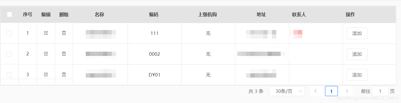
效果如图:
1、ETable,封装的子组件
<template>
  <div class="table-conatianer">
    <div class="flex">
      <div class="table">
        <el-table border
                  :data="data.records">
          <el-table-column v-if="checkbox"
                           fixed
                           type="selection"
                           width="50px"
                           align="center"></el-table-column>
          <el-table-column v-if="orderNum"
                           fixed
                           type="index"
                           label="序号"
                           width="50px"
                           align="center">
          </el-table-column>
          <el-table-column v-if="operateEdit"
                           fixed
                           label="编辑"
                           width="50px"
                           align="center">
            <template slot-scope="scope">
              <i class="el-icon-edit-outline"
                 @click="operatorBtn(scope.row, 'edit')"></i>
            </template>
          </el-table-column>
          <el-table-column v-if="operateDel"
                           fixed
                           label="删除"
                           width="50px"
                           align="center">
            <template slot-scope="scope">
              <i class="el-icon-delete"
                 @click="operatorBtn(scope.row, 'delete')"></i>
            </template>
          </el-table-column>
          <template v-for="(item,index) in columns">
            <slot v-if="item.slotLabel"
                  :name="item.slotLabel"></slot>
            <el-table-column v-else
                             :key="index"
                             v-bind="item"
                             align="center"></el-table-column>
          </template>
        </el-table>
        <div class="bottom"
             v-if="pagination">
          <div>
            <slot name="leftBottom"></slot>
          </div>
          <div>
            <el-pagination @size-change="handleSizeChange"
                           @current-change="handleCurrentChange"
                           :current-page="listFilter.page"
                           :page-sizes="rows"
                           :page-size="listFilter.rows"
                           layout="total, sizes, prev, pager, next, jumper"
                           :total="data.total">
            </el-pagination>
          </div>
        </div>
      </div>
    </div>
  </div>
</template>
<script>
export default {
  props: {
    checkbox: { // 是否可勾选
      type: Boolean,
      default: true
    },
    orderNum: { // 是否显示序号
      type: Boolean,
      default: true
    },
    operateEdit: { // 是否显示编辑
      type: Boolean,
      default: true
    },
    operateDel: { // 是否显示删除
      type: Boolean,
      default: true
    },
    columns: {
      type: Array,
      default: () => {
        return []
      }
    },
    data: {
      type: Object,
      default: () => {
        return {}
      }
    },
    pagination: {
      type: Boolean,
      default: true
    },
    listFilter: {
      type: Object,
      default: () => { }
    }
  },
  data: () => {
    return {
      rows: [20, 30, 50]
    }
  },
  created () {

  },
  methods: {
    operatorBtn (row, status) {
      if (status == 'edit') {
        this.$emit('handlEdit', row)
      } else {
        this.$emit('handlDelete', row.id)
      }
    },
    // 每页多少条
    handleSizeChange (val) {
      console.log(val)
      this.$emit('handleSizeChange', val)
    },
    // 当前多少页
    handleCurrentChange (val) {
      console.log(val)
      this.$emit('handleCurrentChange', val)
    }
  }
}
</script>
<style lang="scss" scoped>
.table-conatianer {
  width: 100%;
  height: 100%;
  .flex {
    display: flex;
    .tree {
      height: 100%;
      overflow-y: scroll;
    }
    .table {
      display: flex;
      flex-direction: column;
      .bottom {
        display: flex;
        justify-content: space-between;
      }
    }
  }
}
</style>
复选框,序号,编辑,删除默认都是显示的,表格底部的左侧还留有一个插槽,如果需要添加什么可以直接添加。
2、父组件调用子组件,需要传列表名称,props参数,也可以传其它的elementui的table行的参数,比如,width,fixed等。如果需要对参数进行自定义,那么使用slot插槽
<el-table-column slot="联系人"
                       label="联系人">
        <template v-slot="{row}">
          <span style="color:red">{{row.contactperson}}</span>
        </template>
      </el-table-column>
对应子组件里的
<slot v-if="item.slotLabel" :name="item.slotLabel"></slot>父组件调用子组件:
<template>
  <div>
    <e-table :data="resultData"
             :columns="columns"
             :listFilter="listFilter"
             @handlEdit="handlEdit"
             @handlDelete="handlDelete"
             @handleSizeChange="handleSizeChange"
             @handleCurrentChange="handleCurrentChange">
      <el-table-column slot="联系人"
                       label="联系人">
        <template v-slot="{row}">
          <span style="color:red">{{row.contactperson}}</span>
        </template>
      </el-table-column>
      <template v-slot:操作>
        <el-table-column label="操作">
          <template v-slot="{row}">
            <el-button :data-id="row.id">添加</el-button>
          </template>
        </el-table-column>
      </template>

    </e-table>
  </div>
</template>
<script>
import ETable from '@/components/ETable.vue'
import { organization } from '@/framework/api/index'
export default {
  components: { ETable },
  data () {
    return {
      resultData: {},
      listFilter: {
        page: 1,
        rows: 20
      },
      columns: [
        {
          label: '名称',
          prop: 'name'
        },
        {
          label: '编码',
          prop: 'code'
        },
        {
          label: '上级机构',
          prop: 'parentName'
        },
        {
          label: '地址',
          prop: 'address',
          width: 150
        },
        {
          slotLabel: '联系人'
        },
        {
          slotLabel: '操作'
        }
      ]
    }
  },
  created () {
    this.getData()
  },
  methods: {
    getData () {
      this.showTableLoading()
        .then(_ => {
          if (this.organizationId) {
            return organization.getlist({ ...this.listFilter }, this.organizationId)
          } else {
            return organization.list({ ...this.listFilter })
          }
        })
        .then(res => {
          this.resultData = res.data
        })
    },
    showRow (row) {
      console.log(row)
    },
    handlEdit (row) {
      console.log(row)
      alert('编辑')
    },
    handlDelete (id) {
      console.log(id)
      alert('删除')
    },
    // 当前页多少条
    handleSizeChange (val) {
      this.listFilter.rows = val
      this.getData()
    },
    // 当前第几页
    handleCurrentChange (val) {
      this.listFilter.page = val
      this.getData()
    }
  }
}
</script>
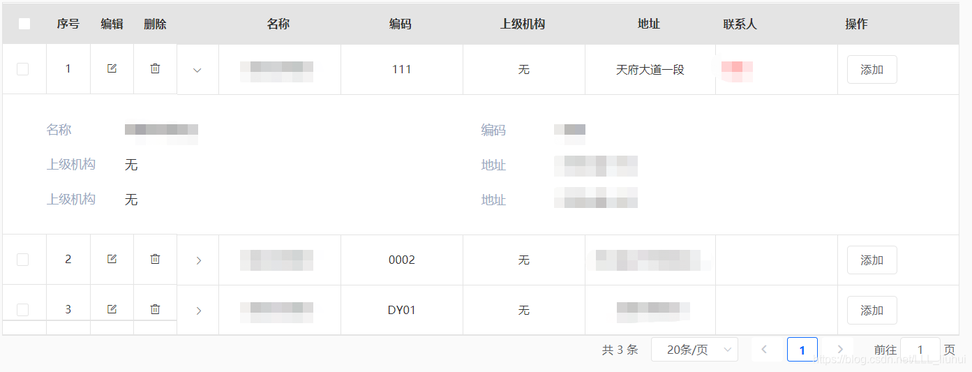
3、如果想实现展开行,如图,需要添加type:expand
子组件,主要是这一部分
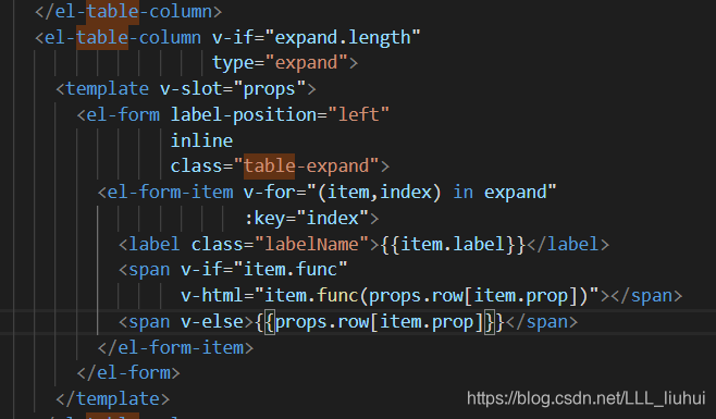
<el-table border
                  :data="data.records">
          <el-table-column v-if="orderNum"
                           fixed
                           type="index"
                           label="序号"
                           width="50px"
                           align="center">
          </el-table-column>
          <el-table-column v-if="expand.length"
                           type="expand">
            <template v-slot="props">
              <el-form label-position="left"
                       inline
                       class="table-expand">
                <el-form-item v-for="(item,index) in expand"
                              :key="index">
                  <label class="labelName">{{item.label}}</label>
                  <span v-if="item.func"
                        v-html="item.func(props.row[item.prop])"></span>
                  <span v-else>{{props.row[item.prop]}}</span>
                </el-form-item>
              </el-form>
            </template>
          </el-table-column>
          <template v-for="(item,index) in columns">
            <slot v-if="item.slotLabel"
                  :name="item.slotLabel"></slot>
            <el-table-column v-else
                             :key="index"
                             v-bind="item"
                             align="center"></el-table-column>
          </template>
        </el-table>


....
props:{
...
expand: {
      type: Array,
      default: () => []
    }
}
在父组件,调用子组件的时候,则还需要传expand
expand: [
        {
          label: '名称',
          prop: 'name'
        },
        {
          label: '编码',
          prop: 'code',
          func: (val) => {
            switch (val) {
              case '1':
                return '四川'
              default:
                return '其他'
            }
          }
        },
        {
          label: '上级机构',
          prop: 'parentName'
        },
        {
          label: '地址',
          prop: 'address'
        },
        {
          label: '上级机构',
          prop: 'parentName'
        },
        {
          label: '地址',
          prop: 'address'
        }
      ]
父组件传:expand="expand"
<e-table :data="resultData"
             :columns="columns"
             :listFilter="listFilter"
             :tree="true"
             :expand="expand"
             @handlEdit="handlEdit"
             @handlDelete="handlDelete"
             @handleSizeChange="handleSizeChange"
             @handleCurrentChange="handleCurrentChange">
      <el-table-column slot="联系人"
                       label="联系人">
        <template v-slot="{row}">
          <span style="color:red">{{row.contactperson}}</span>
        </template>
      </el-table-column>
      <template v-slot:操作>
        <el-table-column label="操作">
          <template v-slot="{row}">
            <el-button :data-id="row.id">添加</el-button>
          </template>
        </el-table-column>
      </template>

    </e-table>


 扫一扫
扫一扫


 3100
3100

 被折叠的 条评论
为什么被折叠?
被折叠的 条评论
为什么被折叠?
 到【灌水乐园】发言


