


前端CSS基础系列
前端基础-CSS-01
前端基础-CSS-02
前端基础-CSS-03
前端基础-CSS-04
前端基础-CSS-05
前端基础-CSS-06
前端基础-CSS-07
文章目录
8.1. 边偏移
-
作用:用来控制盒子的移动
-
属性:
边偏移属性 示例 描述 toptop: 80px顶端偏移量,定义元素相对于其父元素上边线的距离 bottombottom: 80px底部偏移量,定义元素相对于其父元素下边线的距离 leftleft: 80px左侧偏移量,定义元素相对于其父元素左边线的距离 rightright: 80px右侧偏移量,定义元素相对于其父元素右边线的距离
8.2. 定位模式
-
语法:
选择器 { position: 属性值; } -
属性值:
值 语义 static静态定位 relative相对定位 absolute绝对定位 fixed固定定位
8.2.1. 静态定位
静态定位是元素默认的定位方式,按照标准流的特性摆放元素,没有偏移量,一般情况下不使用
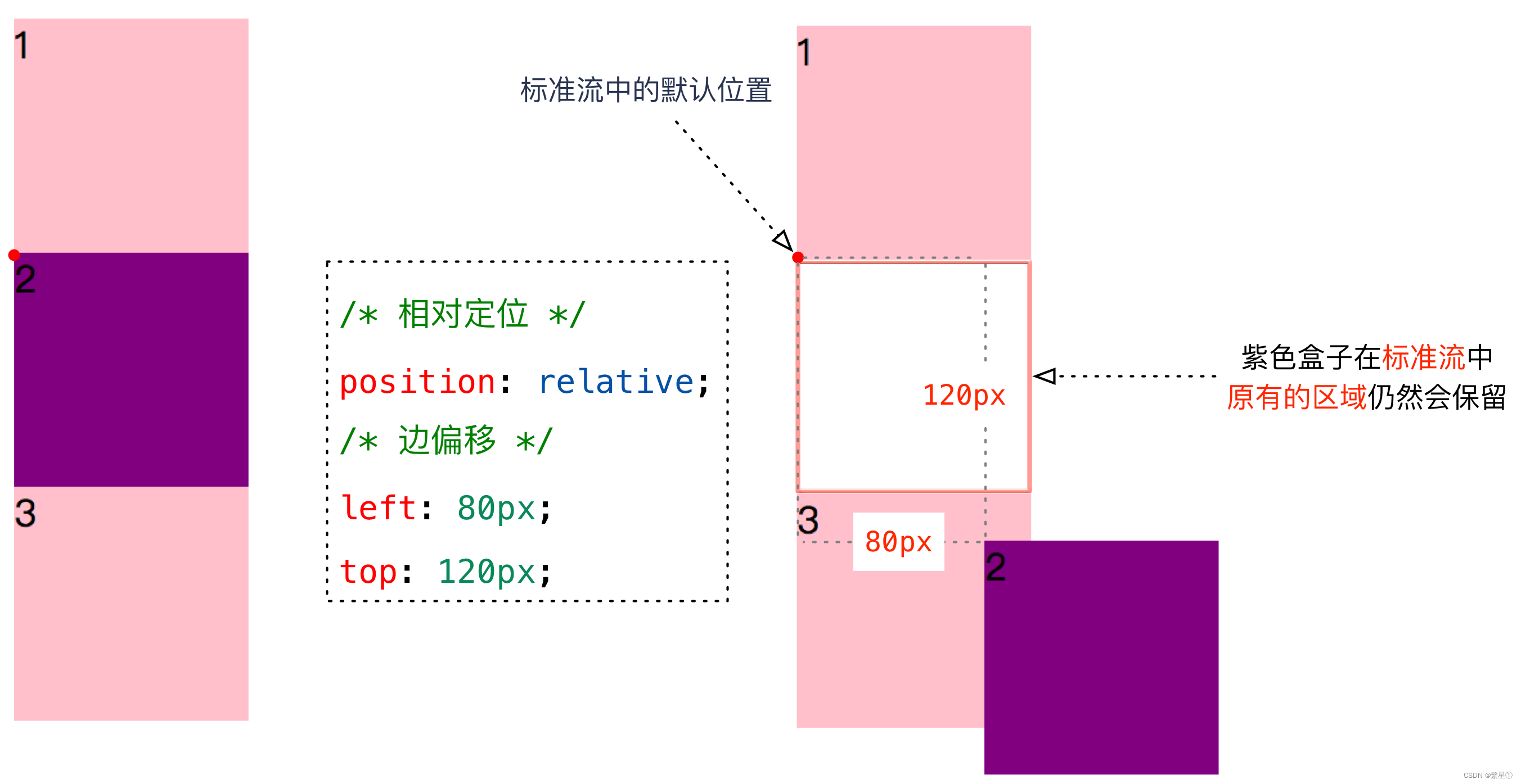
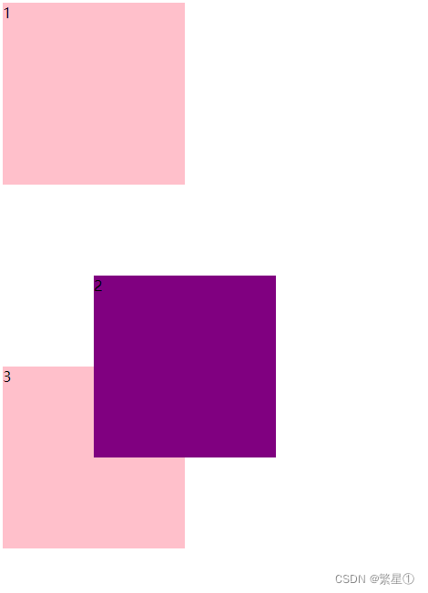
8.2.2. 相对定位
-
相对定位是元素相对于它原来在标准流中的位置来说的
-
特点:
- 相对于自己原来在标准流中的位置来移动的
- 原来在标准流中的位置继续占有
-
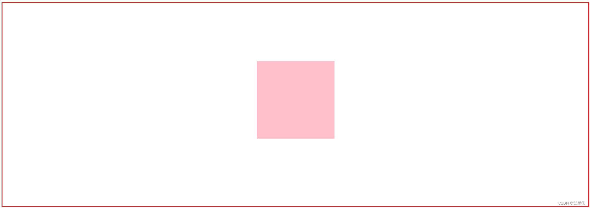
代码示例:
<style> div { height: 200px; width: 200px; background-color: pink; } .two { background-color: purple; position: relative; top: 100px; left: 100px; } </style><body> <div>1</div> <div class="two">2</div> <div>3</div> </body> -
示例效果:
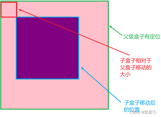
8.2.3. 绝对定位
-
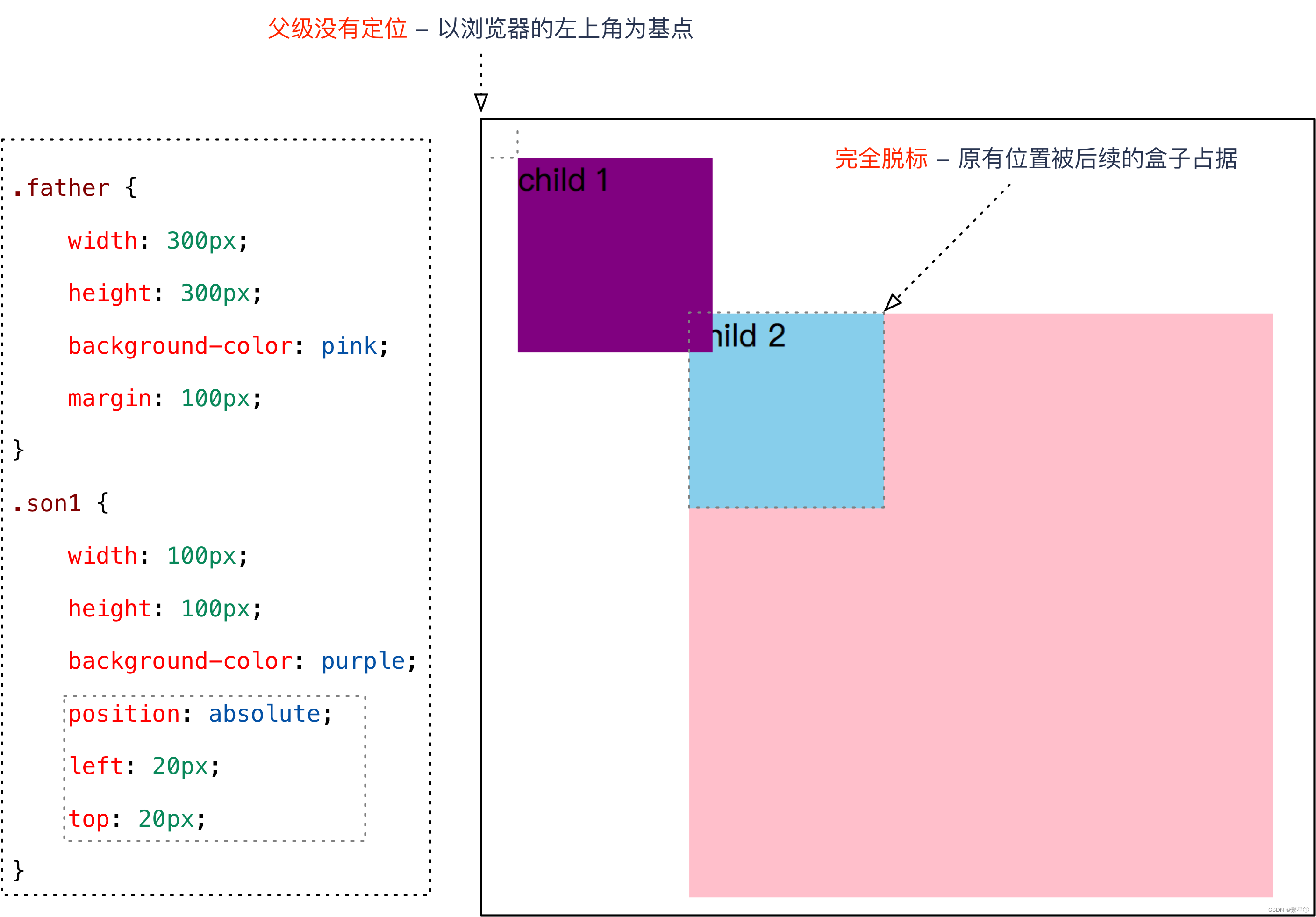
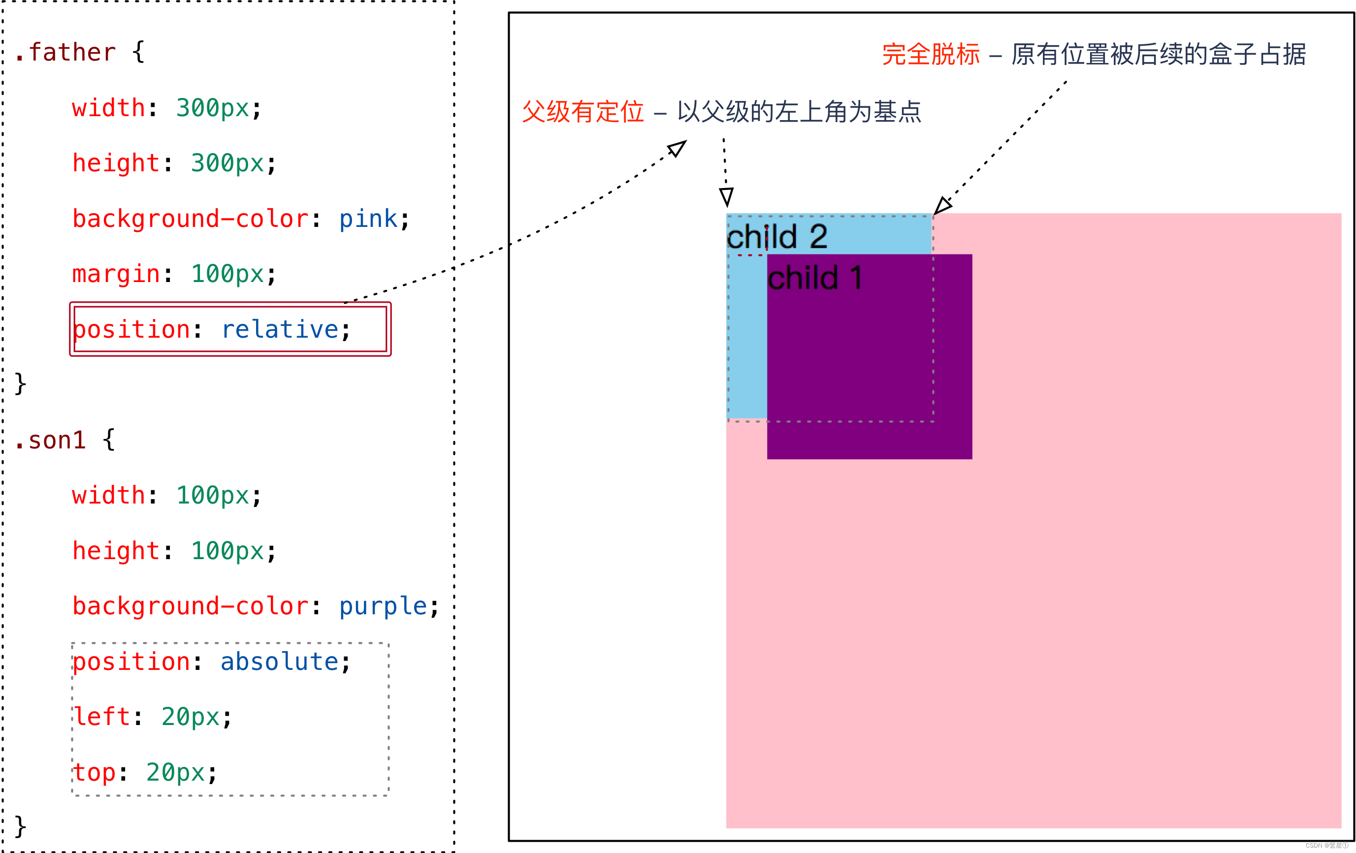
绝对定位是元素以带有定位的父级元素来移动位置
-
父元素无定位:
-
父元素有定位:
-
特点:
- 绝对是以带有定位的父级元素来移动位置,如果父级都没有定位,则以浏览器文档为准移动位置
- 不保留原来的位置,是完全脱标的
-
代码示例:
<style> .father { width: 350px; height: 350px; background-color: pink; position: absolute; } .son { width: 200px; height: 200px; background-color: purple; position: absolute; top: 50px; left: 50px; } </style><body> <div class="father"> <div class="son"></div> </div> </body> -
示例效果:
8.2.4. 固定定位
-
固定定位是绝对定位的一种特殊形式
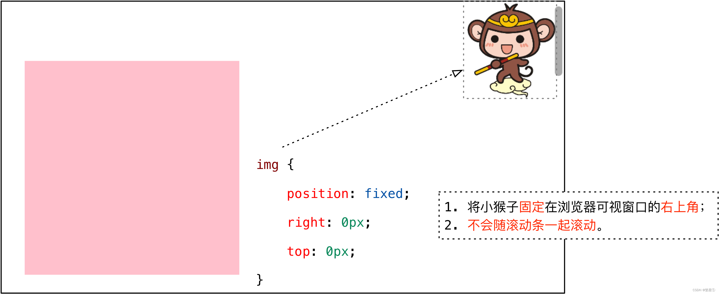
-
特点:
- 使用浏览器的可视窗口和边偏移属性来设置元素的位置
- 和父元素没有任何关系,单独使用
- 不随滚动条滚动
-
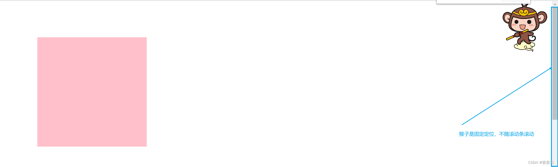
代码示例:
<style> body { height: 1500px; } .box { position: relative; width: 300px; height: 300px; background-color: pink; margin: 100px; } .box img { position: fixed; right: 0; top: 0; } </style><div class="box"> <img src="images/sun.jpg" alt="" width="150"> </div> -
示例效果:
8.2.5. 子绝父相
-
代码示例1:
<style> .up { position: relative; height: 90px; width: 1000px; background-color: pink; } .down { height: 100px; width: 1000px; background-color: #000; } .arr-l { position: absolute; top: 25px; left: 0; width: 40px; height: 40px; background-color: purple; } .arr-r { position: absolute; top: 25px; right: 0; width: 40px; height: 40px; background-color: purple; } </style><body> <div class="up"> <img src="images/img.jpg" alt=""> <div class="arr-l"></div> <div class="arr-r"></div> </div> <div class="down"></div> </body> -
示例效果1:
-
代码示例2:哈根达斯案例
<style> .box { position: relative; width: 310px; height: 190px; border: 2px solid #ccc; margin: 100px auto; padding: 10px; } .top { position: absolute; top: 0; left: 0; } .bottom { position: absolute; right: 0; bottom: 0; } </style><body> <div class="box"> <img src="images/adv.jpg" alt=""> <img src="images/top_tu.gif" alt="" class="top"> <img src="images/br.gif" alt="" class="bottom"> </div> </body> -
示例效果2:

8.3. 绝对定位的盒子居中
-
注意:绝对定位/固定定位的盒子不能通过设置
margin: auto设置水平居中 -
解决办法:
left: 50%;:让盒子的左侧移动到父级元素的水平中心位置;margin-left: 负向移动盒子一半;:让盒子向左移动自身宽度的一半。
-
代码示例:
<style> div { /* 绝对定位 margin 左右auto 不能让盒子水平居中 */ position: absolute; width: 200px; height: 200px; background-color: pink; left: 50%; margin-left: -100px; top: 50%; margin-top: -100px; } </style><body> <div></div> </body> -
示例效果:
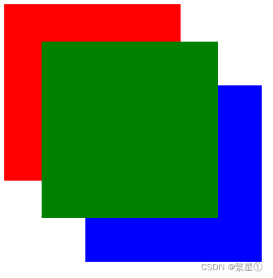
8.4. 堆叠顺序
-
使用定位时,可能会出现重叠的情况,使用
z-index可以修改盒子的堆叠顺序 -
特点:
- 属性值:正整数、负整数或 0,默认值是 0,数值越大,盒子越靠上
- 如果属性值相同,则按照书写顺序,后来居上
- 数字后面不能加单位
z-index只能应用于相对定位、绝对定位和固定定位的元素
-
代码示例:
<style> .damao, .ermao, .sanmao { /* 绝对定位 */ position: absolute; width: 200px; height: 200px; background-color: red; } .damao { z-index: 1; } .ermao { top: 50px; left: 50px; z-index: 2; background-color: green; } .sanmao { top: 100px; left: 100px; background-color: blue; } </style><body> <div class="damao"></div> <div class="ermao"></div> <div class="sanmao"></div> </body> -
示例特效:
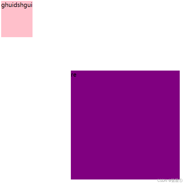
8.5. 定位改变display属性
-
一个行内的盒子,如果加了浮动、固定定位和绝对定位,不用转换,就可以给这个盒子直接设置宽度和高度等
-
代码示例:
<style> div { /* 1.display: inline-block; */ /* 2.float: left; */ /* 3.绝对定位 */ position: absolute; height: 100px; background-color: pink; } span { position: absolute; top: 200px; left: 200px; width: 300px; height: 300px; background-color: purple; } </style><body> <div>ghuidshgui</div> <span>re</span> </body> -
示例效果:
8.6. 定位总结
| 定位模式 | 是否脱标占有位置 | 移动位置基准 | 模式转换(行内块) | 使用情况 |
|---|---|---|---|---|
| 静态static | 不脱标,正常模式 | 正常模式 | 不能 | 几乎不用 |
| 相对定位relative | 不脱标,占有位置 | 相对自身位置移动 | 不能 | 基本单独使用 |
| 绝对定位absolute | 完全脱标,不占有位置 | 相对于定位父级移动位置 | 能 | 要和定位父级元素搭配使用 |
| 固定定位fixed | 完全脱标,不占有位置 | 相对于浏览器移动位置 | 能 | 单独使用,不需要父级 |
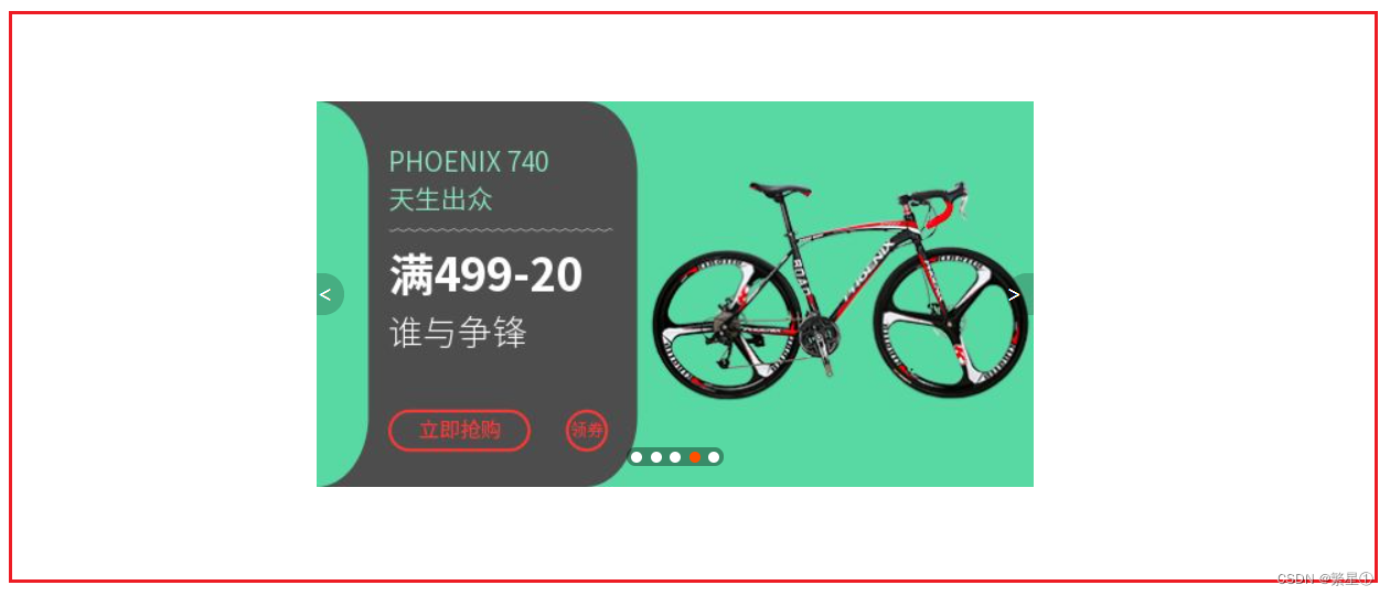
8.7. 综合案例
-
代码示例:
<!DOCTYPE html> <html lang="en"> <head> <meta charset="UTF-8"> <meta http-equiv="X-UA-Compatible" content="IE=edge"> <meta name="viewport" content="width=device-width, initial-scale=1.0"> <title>淘宝轮播图</title> <style> * { margin: 0; padding: 0; } li { list-style: none; } .taobao { position: relative; width: 520px; height: 280px; background-color: pink; margin: 100px auto; } .arrow-l, .arrow-r { /* 只能用定位来做 才能压住盒子,只能使用绝对定位*/ position: absolute; /* 父级高度的50% */ top: 50%; margin-top: -15px; /* 绝对定位的盒子无需转换 */ height: 30px; width: 20px; /* background-color: pink; */ background-color: rgba(0, 0, 0, .2); text-decoration: none; color: white; line-height: 30px; } .arrow-l:hover, .arrow-r:hover { background-color: rgba(0, 0, 0, .4); } .arrow-l { left: 0; /* 右上圆角 */ border-top-right-radius: 15px; /* 右下圆角 */ border-bottom-right-radius: 15px; } .arrow-r { right: 0; /* 右上圆角 */ /* border-top-left-radius: 15px; */ /* 右下圆角 */ /* border-bottom-left-radius: 15px; */ border-radius: 15px 0 0 15px; } .circle { position: absolute; bottom: 15px; width: 70px; height: 14px; background:rgba(0, 0, 0, .2); border-radius: 7px; left: 50%; margin-left: -35px; } .circle li { float: left; width: 8px; height: 8px; background-color: #fff; border-radius: 50%; margin: 3px; } .circle .current { background-color: #ff5000; } </style> </head> <body> <div class="taobao"> <a href="#" class="arrow-l"> < </a> <img src="images/taobao.jpg" alt=""> <a href="#" class="arrow-r"> > </a> <div class="circle"></div> <ul class="circle"> <li></li> <li></li> <li></li> <li class="current"></li> <li></li> </ul> </div> </body> </html> -
示例效果:


 1871
1871


 被折叠的 条评论
为什么被折叠?
被折叠的 条评论
为什么被折叠?
 到【灌水乐园】发言


