


CSS Display(显示) 与 Visibility(可见性)
display属性设置一个元素应如何显示,visibility属性指定一个元素应可见还是隐藏。
隐藏元素 - display:none或visibility:hidden
隐藏一个元素可以通过把display属性设置为"none",或把visibility属性设置为"hidden"。但是请注意,这两种方法会产生不同的结果。
visibility:hidden可以隐藏某个元素,但隐藏的元素仍需占用与未隐藏之前一样的空间。也就是说,该元素虽然被隐藏了,但仍然会影响布局。
    <!DOCTYPE html>
    <html lang="en" xmlns="http://www.w3.org/1999/html">
    <head>
        <meta charset="UTF-8">
        <title>Title</title>
        <style>
            h1.hidden{visibility: hidden}
        </style>
    </head>
    </body>
        <h1>这是个可见标题</h1>
    <h1 class="hidden">这是个皇帝的新标题</h1>
    <p>虽然有一个标题看不见,但是仍然占用扣扣你空间</p>
    </body>
    </html>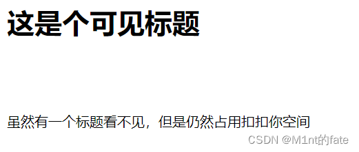
    <!DOCTYPE html>
    <html lang="en" xmlns="http://www.w3.org/1999/html">
    <head>
        <meta charset="UTF-8">
        <title>Title</title>
        <style>
            h1.hidden{display: none}
        </style>
    </head>
    </body>
        <h1>这是个可见标题</h1>
    <h1 class="hidden">这是个皇帝的新标题</h1>
    <p>虽然有一个标题看不见,但是仍然占用扣扣你空间</p>
    </body>
    </html>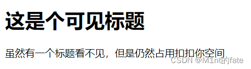
CSS Display - 块和内联元素
块元素是一个元素,占用了全部宽度,在前后都是换行符。
块元素的例子:
- <h1>
- <p>
- <div>
内联元素只需要必要的宽度,不强制换行。
内联元素的例子:
- <span>
- <a>
    <!DOCTYPE html>
    <html lang="en" xmlns="http://www.w3.org/1999/html">
    <head>
        <meta charset="UTF-8">
        <title>Title</title>
        <style>
            a{display: inline}
        </style>
    </head>
    </body>
        <a href="https://www.csdn.net/">CSDN</a>
        <a href="https://www.runoob.com/">菜鸟教程</a>
    </body>
    </html>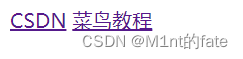
CSS Position定位
position 属性指定了元素的定位类型。
position 属性的五个值:
- static
- relative
- fixed
- absolute
- sticky
元素可以使用的顶部,底部,左侧和右侧属性定位。然而,这些属性无法工作,除非是先设定position属性。他们也有不同的工作方式,这取决于定位方法。
static 定位
HTML 元素的默认值,即没有定位,遵循正常的文档流对象。
静态定位的元素不会受到 top, bottom, left, right影响。
fixed 定位
元素的位置相对于浏览器窗口是固定位置。
即使窗口是滚动的它也不会移动:
    <!DOCTYPE html>
    <html lang="en" xmlns="http://www.w3.org/1999/html">
    <head>
        <meta charset="UTF-8">
        <title>Title</title>
        <style>
            p.fixed{
                position: fixed;
                top: 30px;
                right: 5px;
            }
        </style>
    </head>
    </body>
        <P class="fixed">fixed</P>
    <p>Some text</p><p>Some text</p><p>Some text</p><p>Some text</p><p>Some text</p><p>Some text</p><p>Some text</p><p>Some text</p><p>Some text</p><p>Some text</p><p>Some text</p><p>Some text</p><p>Some text</p><p>Some text</p><p>Some text</p><p>Some text</p>
    <p>Some text</p><p>Some text</p><p>Some text</p><p>Some text</p><p>Some text</p><p>Some text</p><p>Some text</p><p>Some text</p><p>Some text</p><p>Some text</p><p>Some text</p><p>Some text</p><p>Some text</p><p>Some text</p><p>Some text</p><p>Some text</p>
    <p>Some text</p><p>Some text</p><p>Some text</p><p>Some text</p><p>Some text</p><p>Some text</p><p>Some text</p><p>Some text</p><p>Some text</p><p>Some text</p><p>Some text</p><p>Some text</p><p>Some text</p><p>Some text</p><p>Some text</p><p>Some text</p>
    </body>
    </html>
无论怎么滑动屏幕,fixed永远都固定在一个位置
Fixed定位使元素的位置与文档流无关,因此不占据空间。
Fixed定位的元素和其他元素重叠。
    <!DOCTYPE html>
    <html lang="en" xmlns="http://www.w3.org/1999/html">
    <head>
        <meta charset="UTF-8">
        <title>Title</title>
        <style>
            h2.pos_left
            {
                position:relative;
                left:-20px;
            }
            h2.pos_right
            {
                position:relative;
                left:20px;
            }
        </style>
    </head>
    </body>
    <h2>这是位于正常位置的标题</h2>
    <h2 class="pos_left">这个标题相对于其正常位置向左移动</h2>
    <h2 class="pos_right">这个标题相对于其正常位置向右移动</h2>
    </body>
</html> 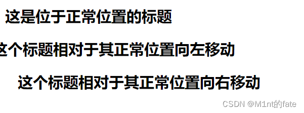
块级元素(block)特性:
- 总是独占一行,表现为另起一行开始,而且其后的元素也必须另起一行显示;
- 宽度(width)、高度(height)、内边距(padding)和外边距(margin)都可控制;
内联元素(inline)特性:
- 和相邻的内联元素在同一行;
- 宽度(width)、高度(height)、内边距的top/bottom(padding-top/padding-bottom)和外边距的top/bottom(margin-top/margin-bottom)都不可改变,就是里面文字或图片的大小;
块级元素主要有:
- address , blockquote , center , dir , div , dl , fieldset , form , h1 , h2 , h3 , h4 , h5 , h6 , hr , isindex , menu , noframes , noscript , ol , p , pre , table , ul , li
内联元素主要有:
- a , abbr , acronym , b , bdo , big , br , cite , code , dfn , em , font , i , img , input , kbd , label , q , s , samp , select , small , span , strike , strong , sub , sup ,textarea , tt , u , var
可变元素(根据上下文关系确定该元素是块元素还是内联元素):
- applet ,button ,del ,iframe , ins ,map ,object , script
CSS中块级、内联元素的应用:
利用CSS我们可以摆脱上面表格里HTML标签归类的限制,自由地在不同标签/元素上应用我们需要的属性。
主要用的CSS样式有以下三个:
- display:block -- 显示为块级元素
- display:inline -- 显示为内联元素
- display:inline-block -- 显示为内联块元素,表现为同行显示并可修改宽高内外边距等属性
我们常将所有<li>元素加上display:inline-block样式,原本垂直的列表就可以水平显示了。
移动相对定位元素,但它原本所占的空间不会改变。
absolute 定位
绝对定位的元素的位置相对于最近的已定位父元素,如果元素没有已定位的父元素,那么它的位置相对于<html>:
<!DOCTYPE html>
<html lang="en">
<head>
    <meta charset="UTF-8">
    <title>Title</title>
    <style>
        h2{
            position: absolute;
            left: 5px;
            top: 5px;
        }
    </style>
</head>
<body>
<h2>这是一个绝对定位了的标题</h2>

<p>用绝对定位,一个元素可以放在页面上的任何位置。标题下面放置距离左边的页面5 px和距离页面的顶部5 px的元素。.</p>
</body>
</html>
absolute 定位使元素的位置与文档流无关,因此不占据空间。
absolute 定位的元素和其他元素重叠。
sticky 定位
sticky 英文字面意思是粘,粘贴,所以可以把它称之为粘性定位。
position: sticky; 基于用户的滚动位置来定位。
粘性定位的元素是依赖于用户的滚动,在 position:relative 与 position:fixed 定位之间切换。
它的行为就像 position:relative; 而当页面滚动超出目标区域时,它的表现就像 position:fixed;,它会固定在目标位置。
元素定位表现为在跨越特定阈值前为相对定位,之后为固定定位。
这个特定阈值指的是 top, right, bottom 或 left 之一,换言之,指定 top, right, bottom 或 left 四个阈值其中之一,才可使粘性定位生效。否则其行为与相对定位相同。
<!DOCTYPE html>
<html lang="en">
<head>
    <meta charset="UTF-8">
    <title>Title</title>
    <style>
        div.sticky{
            position: -webkit-sticky;
            position: sticky;
            top: 0;
            padding: 10px;
            background-color: gray;
            border: 2px solid gray;
        }
    </style>
</head>
<body>
<p>尝试滚动页面。</p>
<div class="sticky">this is sticky</div>
<div style="padding-bottom: 2000px;">
    <p>滚动我</p>
    <p>来回滚动我</p>
    <p>滚动我</p>
    <p>来回滚动我</p>
    <p>滚动我</p>
    <p>来回滚动我</p>
</div>
</body>
</html>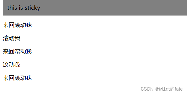
重叠的元素
元素的定位与文档流无关,所以它们可以覆盖页面上的其它元素
z-index属性指定了一个元素的堆叠顺序(哪个元素应该放在前面,或后面)
一个元素可以有正数或负数的堆叠顺序:
<!DOCTYPE html>
<html lang="en">
<head>
    <meta charset="UTF-8">
    <title>Title</title>
    <style>

        img
        {
            position:absolute;
            left:0px;
            top:0px;
            z-index:-1;        /*如果这儿改为1,则<h1>标签的内容会被覆盖*/
        }

    </style>
</head>
<body>
<img src="image/color.jpg">
<h1>this is heading</h1>
</div>
</body>
</html>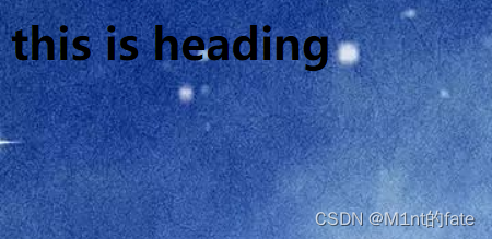
具有更高堆叠顺序的元素总是在较低的堆叠顺序元素的前面。
注意: 如果两个定位元素重叠,没有指定z - index,最后定位在HTML代码中的元素将被显示在最前面。
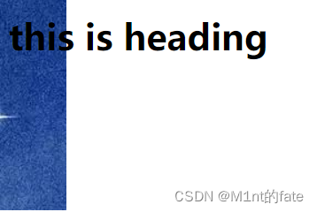
对元素进行裁剪
<!DOCTYPE html>
<html lang="en">
<head>
    <meta charset="UTF-8">
    <title>Title</title>
    <style>

        img
        {
            position:absolute;
            clip:rect(0px,60px,200px,0px);
            left:0px;
            top:0px;
            z-index:-1;
        }

    </style>
</head>
<body>
<img src="image/color.jpg">
<h1>this is heading</h1>
</div>
</body>
</html>
【clip 修剪,rect(rectangular的缩写)矩形】
改变光标
<!DOCTYPE html>
<html lang="en">
<head>
</head>
<body>
<p>请把鼠标移动到单词上,可以看到鼠标指针发生变化:</p>
<span style="cursor:auto">auto</span><br>
<span style="cursor:crosshair">crosshair</span><br>
<span style="cursor:default">default</span><br>
<span style="cursor:e-resize">e-resize</span><br>
<span style="cursor:help">help</span><br>
<span style="cursor:move">move</span><br>
<span style="cursor:n-resize">n-resize</span><br>
<span style="cursor:ne-resize">ne-resize</span><br>
<span style="cursor:nw-resize">nw-resize</span><br>
<span style="cursor:pointer">pointer</span><br>
<span style="cursor:progress">progress</span><br>
<span style="cursor:s-resize">s-resize</span><br>
<span style="cursor:se-resize">se-resize</span><br>
<span style="cursor:sw-resize">sw-resize</span><br>
<span style="cursor:text">text</span><br>
<span style="cursor:w-resize">w-resize</span><br>
<span style="cursor:wait">wait</span><br></body>
</html>
层级问题(谁高)
总结:标准流盒子,低于浮动的盒子,浮动的盒子又低于定位的盒子。
定位高于浮动,浮动高于标准流。(高低和占不占位置无关)
用法:
1、必须有定位。(除去static之外)。
2、给定 z-index 的值为层级的值。(不给默认为0)
- a. 层级为0的盒子,也比标准流和浮动高。
- b. 层级为负数的盒子,比标准流和浮动低。
- c. 层级不取小数)
- d. 层级一样,后面的盒子比前面的层级高。
- e. 浮动或者标准流的盒子,后面的盒子比前面的层级高。
- f. abselute是不占位置的,relative是站位的的。而层级的高低,是和占不占位置没有关系的。


 被折叠的 条评论
为什么被折叠?
被折叠的 条评论
为什么被折叠?
 到【灌水乐园】发言


