


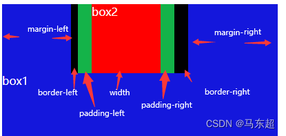
垂直和水平方布局
水平布局从左到右由 margin-left border-left paddin-left width padding-right border-right margin-right 决定
垂直布局和水平布局相同,只是方向有左右变为上下。
这7个值相加会等于其父元素的宽度。若只设置其中个别值,其他值没设置,使等式不成立,则浏览器会自动调整使等式成立,这个叫过度约束
-浏览器调整
1:如果七个值没有auto ,那么浏览器会自动调整margin-right使我们等式满足
2:这七个值,width,margin-left,margin-right 可以设置auto
如果有设置auto,浏览器会自动调整auto的值
3:如果同时设置width margin 为auto,只调整width宽度
4:如果设置宽度固定,设置margin为auto
则两边的外边距会设置为相同的值,让元素在父元素中居中
元素溢出
overflow 处理溢出内容
可选值:
visible 溢出的内容会正常显示
hidden 溢出的内容会被裁减,不会显示
scroll 出现双侧滚动条
auto 根据溢出内容,出现滚动条
外边距重叠
在网页中相邻元素的垂直方向的外边距,会发生重叠
-兄弟之间的重叠,会取最大值,不会取和,谁大听谁的、
例:下方两个盒子蓝色盒子的下外边距为50px,绿色盒子的上外边距为100px,但是两个盒子并没有距离150px,而是100p。
    <style>
        .box1{
            width: 200px;
            height: 200px;
            background-color: rgb(20, 23, 220);
            margin-bottom: 50px;
        }
        .box2{
            height: 200px;
            background-color: rgb(20, 179, 73);
            width: 200px;
            margin-top: 100px;
        }

    </style>
<body>
<div class="box1">
</div>
<div class="box2">
</div>
</body>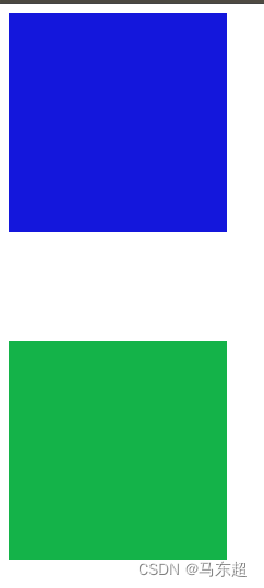
特殊情况
1:如果一正一负,取两者之和
2:如果两负,则取绝对值最大的
-父子之间的外边距重叠
如果父子元素的垂直外边距相邻了,则子元素的外边距会传递给父元素
<body>
    <div class="box1">
     <div class="box2">     </div>
    </div>
   </body>
.box1{
width: 200px;
height: 200px;
background-color: rgb(20, 23, 220);}
.box2{
height: 100px;
background-color: rgb(20, 179, 73);
width: 100px;
margin-top: 100px;} 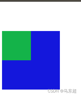


 1089
1089


 被折叠的 条评论
为什么被折叠?
被折叠的 条评论
为什么被折叠?
 到【灌水乐园】发言


