


用vue封装一个单选按钮组件
实际开发中根据需求和UI图 这种简单的封装一个单选按钮还是很有必要的
<template>
    <div class="radio-group">
        <a href="#"
          v-for="(item,index) in options"
          :key="index"
          class="radioLink">
          <div class="radioList">
              <span :class="item===selectedValue?'select':'noselect'">{{item}}</span>
              <span class="radio-select">
                  <input type="radio"
                         :value="item"
                         v-model="selectedValue"
                         :checked='checked===selectedValue'
                  >
                  <img v-show="item!==selectedValue" src="~@/assets/income/noSelected.png" >
                  <img v-show="item===selectedValue" src="~@/assets/income/selected.png" >
              </span>
          </div>
        </a>
    </div>
</template>
<script>
export default {
    name:'Radio',
    data(){
        return{
            selectedValue:''
        }
    },
    props:{
        options:[Array],
        checked:String   //初始选中的值
    },
    watch:{
        checked:{
            immediate: true,  //初始进来加载一次
            handler(){
                this.selectedValue=this.checked
            }
        },
        selectedValue:{
            immediate: true,
            handler(){
                this.$emit('input',this.selectedValue)
            }
        }
    },

}
</script>
<style  scoped>
.radio-group{
    height: 23vw;
    display: flex;
    flex-direction: column;
    justify-content: space-around;
}
.radioList{
    width: 50vw;
    font-size:28px;
    font-family:Source Han Sans CN;
    font-weight:400;
    display: flex;
    justify-content:space-between;
    align-items: center;

}
.select{
    color:rgba(227,139,0,1);
}
.noselect{
    color:#666666;
}
.radio-select{
    display: flex;
    justify-content: center;
    width: 24px;
    height: 24px;
    position: relative;
}
.radio-select img{
    width: 100%;
    height: 100%;
}
.radio-select input{
    width: 100%;
    height: 100%;
   position:absolute;
   opacity: 0;
}
</style>
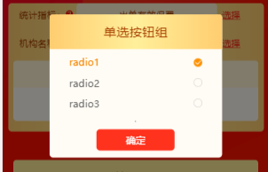
使用
        <div class="popup-inner-wrapper">
            <div class="indicator-popup">
                <div class="title">单选按钮组</div>
                  <Radio
                    v-model="target"
                    :options="options"
                    :checked='targetChecked'
                  ></Radio>
                  <hr>
                <div class="button-wrapper">
                    <button @click="handleConfirmClick">确定</button>
                </div>
            </div>
        </div>


 930
930


 被折叠的 条评论
为什么被折叠?
被折叠的 条评论
为什么被折叠?
 到【灌水乐园】发言


