


原文
https://blog.csdn.net/qq_23205911/article/details/73430979
本文目录.png
当开始一个新项目的时候,有一个很重要的步骤就是确定我们的APP首页框架,也就是用户从桌面点击APP 图标,进入APP 首页的时候展示给用户的框架,比如微信,展示了有四个Tab,分别对应不同的板块(微信、通讯录、发现、我),现在市面出了少部分的Material Design 风格的除外,大部分都是这样的一个框架,称之为底部导航栏,分为3-5个Tab不等。前段时间开始了一个新项目,在搭建这样一个Tab 框架的时候遇到了一些坑,前后换了好几种方式来实现。因此,本文总结了通常实现这样一个底部导航栏的几种方式,以及它各自一些需要注意的地方。本文以实现如下一个底部导航栏为例:
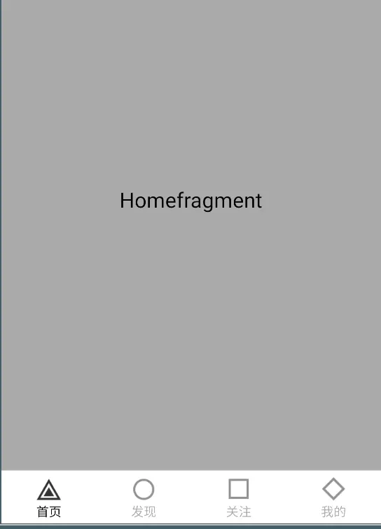
本文实现示例.png
1 . TabLayout + Fragment
要实现这样一个底部导航栏,大家最容易想到的当然就是TabLayout,Tab 切换嘛,TabLayout 就是专门干这个事的,不过TabLayout 默认是带有Indicator的,我们是不需要的,因此需要把它去掉,看一下布局文件:
-
<?xml version="1.0" encoding="utf-8"?> -
<LinearLayout xmlns:android="http://schemas.android.com/apk/res/android" -
xmlns:app="http://schemas.android.com/apk/res-auto" -
android:orientation="vertical" -
android:layout_width="match_parent" -
android:layout_height="match_parent"> -
<FrameLayout -
android:id="@+id/home_container" -
android:layout_width="match_parent" -
android:layout_height="0dp" -
android:layout_weight="1" -
> -
</FrameLayout> -
<View android:layout_width="match_parent" -
android:layout_height="0.5dp" -
android:alpha="0.6" -
android:background="@android:color/darker_gray" -
/> -
<android.support.design.widget.TabLayout -
android:id="@+id/bottom_tab_layout" -
android:layout_width="match_parent" -
app:tabIndicatorHeight="0dp" -
app:tabSelectedTextColor="@android:color/black" -
app:tabTextColor="@android:color/darker_gray" -
android:layout_height="50dp"> -
</android.support.design.widget.TabLayout> -
</LinearLayout>
整个布局分为三个部分,最上面是一个Framelayout 用做装Fragment 的容器,接着有一根分割线,最下面就是我们的TabLayout,去掉默认的Indicator直接设置app:tabIndicatorHeight属性的值为0就行了。
布局文件写好之后,接下来看一下Activity的代码:
-
public class BottomTabLayoutActivity extends AppCompatActivity { -
private TabLayout mTabLayout; -
private Fragment []mFragmensts; -
@Override -
protected void onCreate(@Nullable Bundle savedInstanceState) { -
super.onCreate(savedInstanceState); -
setContentView(R.layout.bottom_tab_layout_ac); -
mFragmensts = DataGenerator.getFragments("TabLayout Tab"); -
initView(); -
} -
private void initView() { -
mTabLayout = (TabLayout) findViewById(R.id.bottom_tab_layout); -
mTabLayout.addOnTabSelectedListener(new TabLayout.OnTabSelectedListener() { -
@Override -
public void onTabSelected(TabLayout.Tab tab) { -
onTabItemSelected(tab.getPosition()); -
//改变Tab 状态 -
for(int i=0;i< mTabLayout.getTabCount();i++){ -
if(i == tab.getPosition()){ -
mTabLayout.getTabAt(i).setIcon(getResources().getDrawable(DataGenerator.mTabResPressed[i])); -
}else{ -
mTabLayout.getTabAt(i).setIcon(getResources().getDrawable(DataGenerator.mTabRes[i])); -
} -
} -
} -
@Override -
public void onTabUnselected(TabLayout.Tab tab) { -
} -
@Override -
public void onTabReselected(TabLayout.Tab tab) { -
} -
}); -
mTabLayout.addTab(mTabLayout.newTab().setIcon(getResources().getDrawable(R.drawable.tab_home_selector)).setText(DataGenerator.mTabTitle[0])); -
mTabLayout.addTab(mTabLayout.newTab().setIcon(getResources().getDrawable(R.drawable.tab_discovery_selector)).setText(DataGenerator.mTabTitle[1])); -
mTabLayout.addTab(mTabLayout.newTab().setIcon(getResources().getDrawable(R.drawable.tab_attention_selector)).setText(DataGenerator.mTabTitle[2])); -
mTabLayout.addTab(mTabLayout.newTab().setIcon(getResources().getDrawable(R.drawable.tab_profile_selector)).setText(DataGenerator.mTabTitle[3])); -
} -
private void onTabItemSelected(int position){ -
Fragment fragment = null; -
switch (position){ -
case 0: -
fragment = mFragmensts[0]; -
break; -
case 1: -
fragment = mFragmensts[1]; -
break; -
case 2: -
fragment = mFragmensts[2]; -
break; -
case 3: -
fragment = mFragmensts[3]; -
break; -
} -
if(fragment!=null) { -
getSupportFragmentManager().beginTransaction().replace(R.id.home_container,fragment).commit(); -
} -
} -
}
Activity的代码如上,很简单,就是一个TabLayout,添加监听器,然后向TabLayout中添加4个Tab,在addOnTabSelectedListener 中切换各个Tab对应的Fragment 。其中用到的一些数据放在了一个单独的类中, DataGenerator,代码如下:
-
public class DataGenerator { -
public static final int []mTabRes = new int[]{R.drawable.tab_home_selector,R.drawable.tab_discovery_selector,R.drawable.tab_attention_selector,R.drawable.tab_profile_selector}; -
public static final int []mTabResPressed = new int[]{R.drawable.ic_tab_strip_icon_feed_selected,R.drawable.ic_tab_strip_icon_category_selected,R.drawable.ic_tab_strip_icon_pgc_selected,R.drawable.ic_tab_strip_icon_profile_selected}; -
public static final String []mTabTitle = new String[]{"首页","发现","关注","我的"}; -
public static Fragment[] getFragments(String from){ -
Fragment fragments[] = new Fragment[4]; -
fragments[0] = HomeFragment.newInstance(from); -
fragments[1] = DiscoveryFragment.newInstance(from); -
fragments[2] = AttentionFragment.newInstance(from); -
fragments[3] = ProfileFragment.newInstance(from); -
return fragments; -
} -
/** -
* 获取Tab 显示的内容 -
* @param context -
* @param position -
* @return -
*/ -
public static View getTabView(Context context,int position){ -
View view = LayoutInflater.from(context).inflate(R.layout.home_tab_content,null); -
ImageView tabIcon = (ImageView) view.findViewById(R.id.tab_content_image); -
tabIcon.setImageResource(DataGenerator.mTabRes[position]); -
TextView tabText = (TextView) view.findViewById(R.id.tab_content_text); -
tabText.setText(mTabTitle[position]); -
return view; -
} -
}
接下来,我们看一下效果:
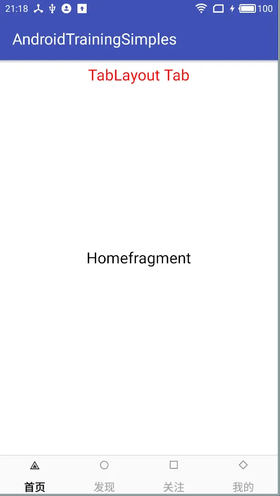
Layout常规实现效果.png
运行之后,效果如上图,What ? 图标这么小?图标和文字之间的间距这么宽?这当然不是我们想要的,试着用TabLayout的属性调整呢?TabLayout 提供了设置Tab 图标、tab 文字颜色,选中颜色,文字大小的属性,但是很遗憾,图标Icon和图标与文字之间的间距是没办法调整的。
那么就没有办法了吗?在仔细查了一下TabLayout的API 后,找到了一个方法,Tab 中有一个setCustomView(View view)方法,也就是我们不用常规的方式创建Tab,我们可以提供一个自己定义的View 来创建Tab,这不就行了嘛,既然可以自定义,那么icon的大小,icon和文字之间的间距,我们想怎样就怎样拉。于是我们自定义一个布局:
-
<?xml version="1.0" encoding="utf-8"?> -
<LinearLayout xmlns:android="http://schemas.android.com/apk/res/android" -
android:orientation="vertical" -
android:gravity="center" -
android:layout_width="match_parent" -
android:layout_height="match_parent"> -
<ImageView -
android:id="@+id/tab_content_image" -
android:layout_width="wrap_content" -
android:layout_height="wrap_content" -
android:scaleType="centerCrop" -
/> -
<TextView -
android:id="@+id/tab_content_text" -
android:layout_width="wrap_content" -
android:layout_height="wrap_content" -
android:textSize="10sp" -
android:textColor="@android:color/darker_gray" -
/> -
</LinearLayout>
添加tab 的时候,用这个自定义的布局,改造后的Activity中的代码如下这样:
-
public class BottomTabLayoutActivity extends AppCompatActivity { -
private TabLayout mTabLayout; -
private Fragment []mFragmensts; -
@Override -
protected void onCreate(@Nullable Bundle savedInstanceState) { -
super.onCreate(savedInstanceState); -
setContentView(R.layout.bottom_tab_layout_ac); -
mFragmensts = DataGenerator.getFragments("TabLayout Tab"); -
initView(); -
} -
private void initView() { -
mTabLayout = (TabLayout) findViewById(R.id.bottom_tab_layout); -
mTabLayout.addOnTabSelectedListener(new TabLayout.OnTabSelectedListener() { -
@Override -
public void onTabSelected(TabLayout.Tab tab) { -
onTabItemSelected(tab.getPosition()); -
// Tab 选中之后,改变各个Tab的状态 -
for (int i=0;i<mTabLayout.getTabCount();i++){ -
View view = mTabLayout.getTabAt(i).getCustomView(); -
ImageView icon = (ImageView) view.findViewById(R.id.tab_content_image); -
TextView text = (TextView) view.findViewById(R.id.tab_content_text); -
if(i == tab.getPosition()){ // 选中状态 -
icon.setImageResource(DataGenerator.mTabResPressed[i]); -
text.setTextColor(getResources().getColor(android.R.color.black)); -
}else{// 未选中状态 -
icon.setImageResource(DataGenerator.mTabRes[i]); -
text.setTextColor(getResources().getColor(android.R.color.darker_gray)); -
} -
} -
} -
@Override -
public void onTabUnselected(TabLayout.Tab tab) { -
} -
@Override -
public void onTabReselected(TabLayout.Tab tab) { -
} -
}); -
// 提供自定义的布局添加Tab -
for(int i=0;i<4;i++){ -
mTabLayout.addTab(mTabLayout.newTab().setCustomView(DataGenerator.getTabView(this,i))); -
} -
} -
private void onTabItemSelected(int position){ -
Fragment fragment = null; -
switch (position){ -
case 0: -
fragment = mFragmensts[0]; -
break; -
case 1: -
fragment = mFragmensts[1]; -
break; -
case 2: -
fragment = mFragmensts[2]; -
break; -
case 3: -
fragment = mFragmensts[3]; -
break; -
} -
if(fragment!=null) { -
getSupportFragmentManager().beginTransaction().replace(R.id.home_container,fragment).commit(); -
} -
} -
}
改造完成之后,效果如下:

TabLayout自定义Tab布局后的效果.gif
总结:TayoutLayout 实现底部导航栏较为简单,只需几步就能实现,能配合Viewpager使用。但是,就像上文说的,不能设置Icon大小和调整Icon和文字之间的间距。但是可以通过设置自定义布局的方式来实现我们想要的效果。需要我们自己来改变Tab切换的状态。还有一点需要注意:设置OnTabChangeListener 需要在添加Tab之前,不然第一次不会回调
onTabSelected()方法,前面写过一片文章,从源码的角度分析这个坑,请看 TabLayout 踩坑之 onTabSelected没有被回调的问题
2 . BottomNavigationView + Fragment
除了用上面的TabLayout来实现底部导航栏,Google 也发布了专门用来实现底部导航的控件,那就是BottomNavigationView,BottomNavigationView符合Material 风格,有着炫酷的切换动画,我们来具体看一下。
布局和前面TabLayout 实现的布局长得差不多,把TabLayout换成 NavigationView 就行。这里就不贴布局文件了。BottomNavigationView 的Tab是通过menu 的方式添加的,看一下menu文件:
-
<?xml version="1.0" encoding="utf-8"?> -
<menu xmlns:android="http://schemas.android.com/apk/res/android"> -
<item -
android:id="@+id/tab_menu_home" -
android:icon="@drawable/ic_play_circle_outline_black_24dp" -
android:title="首页" -
/> -
<item -
android:id="@+id/tab_menu_discovery" -
android:icon="@drawable/ic_favorite_border_black_24dp" -
android:title="发现" -
/> -
<item -
android:id="@+id/tab_menu_attention" -
android:icon="@drawable/ic_insert_photo_black_24dp" -
android:title="关注" -
/> -
<item -
android:id="@+id/tab_menu_profile" -
android:icon="@drawable/ic_clear_all_black_24dp" -
android:title="我的" -
/> -
</menu>
Activity 代码如下:
-
public class BottomNavigationViewActivity extends AppCompatActivity { -
private BottomNavigationView mBottomNavigationView; -
private Fragment []mFragments; -
@Override -
protected void onCreate(@Nullable Bundle savedInstanceState) { -
super.onCreate(savedInstanceState); -
setContentView(R.layout.bottom_navigation_view_ac); -
mFragments = DataGenerator.getFragments("BottomNavigationView Tab"); -
initView(); -
} -
private void initView() { -
mBottomNavigationView = (BottomNavigationView) findViewById(R.id.bottom_navigation_view); -
//mBottomNavigationView.getMaxItemCount() -
mBottomNavigationView.setOnNavigationItemSelectedListener(new BottomNavigationView.OnNavigationItemSelectedListener() { -
@Override -
public boolean onNavigationItemSelected(@NonNull MenuItem item) { -
onTabItemSelected(item.getItemId()); -
return true; -
} -
}); -
// 由于第一次进来没有回调onNavigationItemSelected,因此需要手动调用一下切换状态的方法 -
onTabItemSelected(R.id.tab_menu_home); -
} -
private void onTabItemSelected(int id){ -
Fragment fragment = null; -
switch (id){ -
case R.id.tab_menu_home: -
fragment = mFragments[0]; -
break; -
case R.id.tab_menu_discovery: -
fragment = mFragments[1]; -
break; -
case R.id.tab_menu_attention: -
fragment = mFragments[2]; -
break; -
case R.id.tab_menu_profile: -
fragment = mFragments[3]; -
break; -
} -
if(fragment!=null) { -
getSupportFragmentManager().beginTransaction().replace(R.id.home_container,fragment).commit(); -
} -
} -
}
代码比TabLayout 还简单,不用添加tab ,直接在xml 文件中设置menu属性就好了。效果如下:

bottom_navigaiton_view 效果.gif
效果如上,切换的时候会有动画,效果还是不错的,除此之外,每个tab还可以对应不同的背景色,有兴趣的可以去试一下。但是有一点值得吐槽,动画好像还不能禁止,要是设计成可以禁止动画和使用切换动画这两种模式,随意切换就好了。
总结:BottomNavigationView 实现底部导航栏符合Material风格,有炫酷的切换动画,且动画还不能禁止,如果App 需要这种风格的底部导航栏的,可以用这个,实现起来比较简单。但是需要注意:BottomNavigatonView 的tab 只能是3-5个,多了或者少了是会报错。还有一点,第一次进入页面的时候不会调用onNavigationItemSelected 方法(不知道是不是 哪儿没有设置对?如果有同学发现可以,评论区告诉我一下),因此第一次需要手动调用 添加fragment的方法。
3 . FragmentTabHost + Fragment
FragmentTab Host 可能是大家实现底部导航栏用得最多的一种方式,特别是在TabLayout 和 BottomNavigation 出来之前,是比较老牌的实现底部导航栏的方式,相比前两个,FragmentTabHost 的实现稍微复杂一点,具体请看代码,
-
<?xml version="1.0" encoding="utf-8"?> -
<LinearLayout xmlns:android="http://schemas.android.com/apk/res/android" -
android:orientation="vertical" -
android:layout_width="match_parent" -
android:layout_height="match_parent"> -
<FrameLayout -
android:id="@+id/home_container" -
android:layout_width="match_parent" -
android:layout_height="0dp" -
android:layout_weight="1" -
> -
</FrameLayout> -
<View android:layout_width="match_parent" -
android:layout_height="0.5dp" -
android:alpha="0.6" -
android:background="@android:color/darker_gray" -
/> -
<android.support.v4.app.FragmentTabHost -
android:id="@android:id/tabhost" -
android:layout_width="match_parent" -
android:layout_marginTop="3dp" -
android:layout_height="50dp"> -
<FrameLayout -
android:id="@android:id/tabcontent" -
android:layout_width="0dp" -
android:layout_height="0dp" -
> -
</FrameLayout> -
</android.support.v4.app.FragmentTabHost> -
</LinearLayout>
布局文件需要注意的地方:1,FragmentTabHost 里需要有一个id为@android:id/tabcontent的布局。2,FragmentTabHost的id 也是系统提供的id ,不能随便起。
Activity 代码如下:
-
public class FragmentTabHostActivity extends AppCompatActivity implements TabHost.OnTabChangeListener{ -
private Fragment []mFragments; -
private FragmentTabHost mTabHost; -
@Override -
protected void onCreate(@Nullable Bundle savedInstanceState) { -
super.onCreate(savedInstanceState); -
setContentView(R.layout.fragment_tab_host_ac_layout); -
mFragments = DataGenerator.getFragments("FragmentTabHost Tab"); -
initView(); -
} -
private void initView(){ -
mTabHost = (FragmentTabHost) findViewById(android.R.id.tabhost); -
// 关联TabHost -
mTabHost.setup(this,getSupportFragmentManager(),R.id.home_container); -
//注意,监听要设置在添加Tab之前 -
mTabHost.setOnTabChangedListener(this); -
//添加Tab -
for (int i=0;i<4;i++){ -
//生成TabSpec -
TabHost.TabSpec tabSpec = mTabHost.newTabSpec(mTabTitle[i]).setIndicator(DataGenerator.getTabView(this,i)); -
// 添加Tab 到TabHost,并绑定Fragment -
Bundle bundle = new Bundle(); -
bundle.putString("from","FragmentTabHost Tab"); -
mTabHost.addTab(tabSpec,mFragments[i].getClass(),bundle); -
} -
//去掉Tab 之间的分割线 -
mTabHost.getTabWidget().setDividerDrawable(null); -
// -
mTabHost.setCurrentTab(0); -
} -
@Override -
public void onTabChanged(String tabId) { -
updateTabState(); -
} -
/** -
* 更新Tab 的状态 -
*/ -
private void updateTabState(){ -
TabWidget tabWidget = mTabHost.getTabWidget(); -
for (int i=0;i<tabWidget.getTabCount();i++){ -
View view = tabWidget.getChildTabViewAt(i); -
ImageView tabIcon = (ImageView) view.findViewById(R.id.tab_content_image); -
TextView tabText = (TextView) view.findViewById(R.id.tab_content_text); -
if(i == mTabHost.getCurrentTab()){ -
tabIcon.setImageResource(DataGenerator.mTabResPressed[i]); -
tabText.setTextColor(getResources().getColor(android.R.color.black)); -
}else{ -
tabIcon.setImageResource(mTabRes[i]); -
tabText.setTextColor(getResources().getColor(android.R.color.darker_gray)); -
} -
} -
} -
}
FragmentTabHost 的实现就比前两个稍微复杂点。首先要通过setup()方法建立FragmentTabHost 与Fragment container的关联。然后设置Tab切换监听,添加Tab。需要主要一点,FragmentTabHost 默认在每个Tab之间有一跟竖直的分割先,调用下面这行代码去掉分割线:
-
//去掉Tab 之间的分割线 -
mTabHost.getTabWidget().setDividerDrawable(null);
在onTabChanged 回调中需要手动设置每个Tab切换的状态。从
TabWidget 中取出每个子View 来设置选中和未选中的状态(跟前面的TabLayout 通过自定义布局添加Tab是一样的)。
效果如下:

FragmentTabHost.gif
注意:有2点需要注意,1,通过FragmentTabHost添加的Fragment 里面收不到通过 setArgment() 传递的参数,要传递参数,需要在添加Tab 的时候通过Bundle 来传参,代码如下:
-
// 添加Tab 到TabHost,并绑定Fragment -
Bundle bundle = new Bundle(); -
bundle.putString("from","FragmentTabHost Tab");
2,同前面说的TabLayout一样,要在添加Tab之前设置OnTabChangeListener 监听器,否则第一次收不到onTabChange回调。
总结:FragmentTabHost 实现底部导航栏比前面两种方式稍微复杂一点,需要注意的地方有点多,不然容易踩坑,但是它的稳定性和兼容性很好,在Android 4.x 时代就大量使用了。能配合Viewpager使用。
4 . RadioGroup + RadioButton + Fragment
RadioGroup +RadioButtom 是做单选的,RadioGroup 里面的View 只能选中一个。想一下我们要做的底部导航栏,是不是就是一个单选模式呢?当然是,每次只能选中一个页面嘛,因此用RadioGroup + RadioButton 来实现底部导航栏也是一种方式。
RadioButton 有默认的选中与非选中的样式,默认颜色是colorAcent,效果是这样的:

RadioGroup效果.png
因此我们要用RadioGroup+RadioButton 实现底部导航栏,首先,就是去掉它的默认样式,因此,我们来自定义一个style:
-
<style name="RadioGroupButtonStyle" > -
<!-- 这个属性是去掉button 默认样式--> -
<item name="android:button">@null</item> -
<item name="android:gravity">center</item> -
<item name="android:layout_width">0dp</item> -
<item name="android:layout_height">wrap_content</item> -
<item name="android:layout_weight">1</item> -
<item name="android:textSize">12sp</item> -
<item name="android:textColor">@color/color_selector</item> -
</style>
style 里面定义了RadioButton 的属性,现在我们直接给RadioButton 设置style 就好了,看先页面的布局文件:
-
<?xml version="1.0" encoding="utf-8"?> -
<LinearLayout xmlns:android="http://schemas.android.com/apk/res/android" -
android:orientation="vertical" -
android:layout_width="match_parent" -
android:layout_height="match_parent"> -
<FrameLayout -
android:id="@+id/home_container" -
android:layout_width="match_parent" -
android:layout_height="0dp" -
android:layout_weight="1" -
> -
</FrameLayout> -
<View android:layout_width="match_parent" -
android:layout_height="0.5dp" -
android:alpha="0.6" -
android:background="@android:color/darker_gray" -
/> -
<RadioGroup -
android:id="@+id/radio_group_button" -
android:layout_width="match_parent" -
android:layout_height="50dp" -
android:orientation="horizontal" -
android:gravity="center" -
android:background="@android:color/white" -
> -
<RadioButton -
android:id="@+id/radio_button_home" -
android:layout_width="wrap_content" -
android:layout_height="wrap_content" -
android:text="首页" -
android:drawableTop="@drawable/tab_home_selector" -
style="@style/RadioGroupButtonStyle" -
/> -
<RadioButton -
android:id="@+id/radio_button_discovery" -
android:layout_width="wrap_content" -
android:layout_height="wrap_content" -
android:text="发现" -
android:drawableTop="@drawable/tab_discovery_selector" -
style="@style/RadioGroupButtonStyle" -
/> -
<RadioButton -
android:id="@+id/radio_button_attention" -
android:layout_width="wrap_content" -
android:layout_height="wrap_content" -
android:text="关注" -
android:drawableTop="@drawable/tab_attention_selector" -
style="@style/RadioGroupButtonStyle" -
/> -
<RadioButton -
android:id="@+id/radio_button_profile" -
android:layout_width="wrap_content" -
android:layout_height="wrap_content" -
android:text="我的" -
android:drawableTop="@drawable/tab_profile_selector" -
style="@style/RadioGroupButtonStyle" -
/> -
</RadioGroup> -
</LinearLayout>
很简单,添加一个RadioGroup 和 四个 RadioButton ,因为去掉了原来的样式,因此要设置我们每个RadioButton 显示的图标。
布局文件定义好了之后,看一下Activity 中的代码:
-
public class RadioGroupTabActivity extends AppCompatActivity { -
private RadioGroup mRadioGroup; -
private Fragment []mFragments; -
private RadioButton mRadioButtonHome; -
@Override -
protected void onCreate(@Nullable Bundle savedInstanceState) { -
super.onCreate(savedInstanceState); -
setContentView(R.layout.radiogroup_tab_layout); -
mFragments = DataGenerator.getFragments("RadioGroup Tab"); -
initView(); -
} -
private void initView() { -
mRadioGroup = (RadioGroup) findViewById(R.id.radio_group_button); -
mRadioButtonHome = (RadioButton) findViewById(R.id.radio_button_home); -
mRadioGroup.setOnCheckedChangeListener(new RadioGroup.OnCheckedChangeListener() { -
Fragment mFragment = null; -
@Override -
public void onCheckedChanged(RadioGroup group, @IdRes int checkedId) { -
switch (checkedId){ -
case R.id.radio_button_home: -
mFragment = mFragments[0]; -
break; -
case R.id.radio_button_discovery: -
mFragment = mFragments[1]; -
break; -
case R.id.radio_button_attention: -
mFragment = mFragments[2]; -
break; -
case R.id.radio_button_profile: -
mFragment = mFragments[3]; -
break; -
} -
if(mFragments!=null){ -
getSupportFragmentManager().beginTransaction().replace(R.id.home_container,mFragment).commit(); -
} -
} -
}); -
// 保证第一次会回调OnCheckedChangeListener -
mRadioButtonHome.setChecked(true); -
} -
}
Activity 的代码就很简单了,在onCheckedChanged 回调里面切换Fragment 就行了。这种方式的Activity 代码是最简洁的,因为RadioButton 有check 和 unCheck 状态,直接用seletor 就能换状态的图标和check 文字的颜色,不用手动来设置状态。
效果如下,一步到位:

RadioGroup 实现底部Tab效果
总结:RadioGroup + RadioButton 实现底部导航栏步骤有点多,需要配置style 文件,各个Tab 的 drawable selector 文件,color 文件,但是,配置完了这些之后,代码是最简洁的。这也是有好处的,以后要换什么图标啊,颜色,只需要改xml 文件就好,是不需要改代码逻辑的,因此这样方式来实现底部导航栏是个不错的选择。
5 . 自定义 CustomTabView + Fragment
除了上面的几种方式之外,还有一种方式来实现底部导航栏,那就是我们通过自定义View来实现,自定义View的好处是我们可以按照我们想要的高度定制,缺点是:比起这些现有的控件还是有点麻烦。下面就通过自定义一个CustomTabView 为例子,来实现一个底部导航栏。
CustomTabView 代码下:
-
public class CustomTabView extends LinearLayout implements View.OnClickListener{ -
private List<View> mTabViews;//保存TabView -
private List<Tab> mTabs;// 保存Tab -
private OnTabCheckListener mOnTabCheckListener; -
public void setOnTabCheckListener(OnTabCheckListener onTabCheckListener) { -
mOnTabCheckListener = onTabCheckListener; -
} -
public CustomTabView(Context context) { -
super(context); -
init(); -
} -
public CustomTabView(Context context, @Nullable AttributeSet attrs) { -
super(context, attrs); -
init(); -
} -
public CustomTabView(Context context, @Nullable AttributeSet attrs, int defStyleAttr) { -
super(context, attrs, defStyleAttr); -
init(); -
} -
@RequiresApi(api = Build.VERSION_CODES.LOLLIPOP) -
public CustomTabView(Context context, AttributeSet attrs, int defStyleAttr, int defStyleRes) { -
super(context, attrs, defStyleAttr, defStyleRes); -
init(); -
} -
private void init(){ -
setOrientation(HORIZONTAL); -
setGravity(Gravity.CENTER); -
mTabViews = new ArrayList<>(); -
mTabs = new ArrayList<>(); -
} -
/** -
* 添加Tab -
* @param tab -
*/ -
public void addTab(Tab tab){ -
View view = LayoutInflater.from(getContext()).inflate(R.layout.custom_tab_item_layout,null); -
TextView textView = (TextView) view.findViewById(R.id.custom_tab_text); -
ImageView imageView = (ImageView) view.findViewById(R.id.custom_tab_icon); -
imageView.setImageResource(tab.mIconNormalResId); -
textView.setText(tab.mText); -
textView.setTextColor(tab.mNormalColor); -
view.setTag(mTabViews.size()); -
view.setOnClickListener(this); -
mTabViews.add(view); -
mTabs.add(tab); -
addView(view); -
} -
/** -
* 设置选中Tab -
* @param position -
*/ -
public void setCurrentItem(int position){ -
if(position>=mTabs.size() || position<0){ -
position = 0; -
} -
mTabViews.get(position).performClick(); -
updateState(position); -
} -
/** -
* 更新状态 -
* @param position -
*/ -
private void updateState(int position){ -
for(int i= 0;i<mTabViews.size();i++){ -
View view = mTabViews.get(i); -
TextView textView = (TextView) view.findViewById(R.id.custom_tab_text); -
ImageView imageView = (ImageView) view.findViewById(R.id.custom_tab_icon); -
if(i == position){ -
imageView.setImageResource(mTabs.get(i).mIconPressedResId); -
textView.setTextColor(mTabs.get(i).mSelectColor); -
}else{ -
imageView.setImageResource(mTabs.get(i).mIconNormalResId); -
textView.setTextColor(mTabs.get(i).mNormalColor); -
} -
} -
} -
@Override -
public void onClick(View v) { -
int position = (int) v.getTag(); -
if(mOnTabCheckListener!=null){ -
mOnTabCheckListener.onTabSelected(v, position); -
} -
updateState(position); -
} -
public interface OnTabCheckListener{ -
public void onTabSelected(View v,int position); -
} -
public static class Tab{ -
private int mIconNormalResId; -
private int mIconPressedResId; -
private int mNormalColor; -
private int mSelectColor; -
private String mText; -
public Tab setText(String text){ -
mText = text; -
return this; -
} -
public Tab setNormalIcon(int res){ -
mIconNormalResId = res; -
return this; -
} -
public Tab setPressedIcon(int res){ -
mIconPressedResId = res; -
return this; -
} -
public Tab setColor(int color){ -
mNormalColor = color; -
return this; -
} -
public Tab setCheckedColor(int color){ -
mSelectColor = color; -
return this; -
} -
} -
@Override -
protected void onDetachedFromWindow() { -
super.onDetachedFromWindow(); -
if(mTabViews!=null){ -
mTabViews.clear(); -
} -
if(mTabs!=null){ -
mTabs.clear(); -
} -
} -
@Override -
protected void onAttachedToWindow() { -
super.onAttachedToWindow(); -
// 调整每个Tab的大小 -
for(int i=0;i<mTabViews.size();i++){ -
View view = mTabViews.get(i); -
int width = getResources().getDisplayMetrics().widthPixels / (mTabs.size()); -
LinearLayout.LayoutParams params = new LinearLayout.LayoutParams(width, ViewGroup.LayoutParams.MATCH_PARENT); -
view.setLayoutParams(params); -
} -
} -
}
还是比较简单,继承LinearLayout,有一个Tab 类来保存每个tab 的数据,比如图标,颜色,文字等等,有注释,就不一一解释了。
布局文件差不多,其他控件换成CustomTabView 就行,看一下Activity中的代码:
-
public class CustomTabActivity extends AppCompatActivity implements CustomTabView.OnTabCheckListener{ -
private CustomTabView mCustomTabView; -
private Fragment []mFragmensts; -
@Override -
protected void onCreate(@Nullable Bundle savedInstanceState) { -
super.onCreate(savedInstanceState); -
setContentView(R.layout.custom_tab_ac_layout); -
mFragmensts = DataGenerator.getFragments("CustomTabView Tab"); -
initView(); -
} -
private void initView() { -
mCustomTabView = (CustomTabView) findViewById(R.id.custom_tab_container); -
CustomTabView.Tab tabHome = new CustomTabView.Tab().setText("首页") -
.setColor(getResources().getColor(android.R.color.darker_gray)) -
.setCheckedColor(getResources().getColor(android.R.color.black)) -
.setNormalIcon(R.drawable.ic_tab_strip_icon_feed) -
.setPressedIcon(R.drawable.ic_tab_strip_icon_feed_selected); -
mCustomTabView.addTab(tabHome); -
CustomTabView.Tab tabDis = new CustomTabView.Tab().setText("发现") -
.setColor(getResources().getColor(android.R.color.darker_gray)) -
.setCheckedColor(getResources().getColor(android.R.color.black)) -
.setNormalIcon(R.drawable.ic_tab_strip_icon_category) -
.setPressedIcon(R.drawable.ic_tab_strip_icon_category_selected); -
mCustomTabView.addTab(tabDis); -
CustomTabView.Tab tabAttention = new CustomTabView.Tab().setText("管制") -
.setColor(getResources().getColor(android.R.color.darker_gray)) -
.setCheckedColor(getResources().getColor(android.R.color.black)) -
.setNormalIcon(R.drawable.ic_tab_strip_icon_pgc) -
.setPressedIcon(R.drawable.ic_tab_strip_icon_pgc_selected); -
mCustomTabView.addTab(tabAttention); -
CustomTabView.Tab tabProfile = new CustomTabView.Tab().setText("我的") -
.setColor(getResources().getColor(android.R.color.darker_gray)) -
.setCheckedColor(getResources().getColor(android.R.color.black)) -
.setNormalIcon(R.drawable.ic_tab_strip_icon_profile) -
.setPressedIcon(R.drawable.ic_tab_strip_icon_profile_selected); -
mCustomTabView.addTab(tabProfile); -
//设置监听 -
mCustomTabView.setOnTabCheckListener(this); -
// 默认选中tab -
mCustomTabView.setCurrentItem(0); -
} -
@Override -
public void onTabSelected(View v, int position) { -
Log.e("zhouwei","position:"+position); -
onTabItemSelected(position); -
} -
private void onTabItemSelected(int position){ -
Fragment fragment = null; -
switch (position){ -
case 0: -
fragment = mFragmensts[0]; -
break; -
case 1: -
fragment = mFragmensts[1]; -
break; -
case 2: -
fragment = mFragmensts[2]; -
break; -
case 3: -
fragment = mFragmensts[3]; -
break; -
} -
if(fragment!=null) { -
getSupportFragmentManager().beginTransaction().replace(R.id.home_container,fragment).commit(); -
} -
} -
}
用法很简单,直接添加Tab ,设置Tab 变换的监听器和默认选中的Tab 就行。
效果如下:

自定义View CustomTabView 效果.gif
总结:自定义Tab 相比于其他几种方案还是显得有些麻烦,但是可以高度定制,喜欢折腾的可以用自定义View 试试。
6 . 总结
本文总结了实现底部导航栏的5种方式,其中TabLayout 和 BottomNavigationView 是Android 5.0 以后添加的新控件,符合Material 设计规范,如果是Materail 风格的,可以考虑用这两种实现(TabLayout 使用更多的场景其实是顶部带Indicator的滑动页卡),其他两种方式FragmentTabHost 和RadioGroup 也是比较老牌的方式了,在4.x 时代就大量使用,是一般底部导航栏的常规实现。最后就是自定义View来实现了,自定义View稍显麻烦,但是可定制度高,如果有一些特殊的需求,可以用这种方式来实现。


 扫一扫
扫一扫
 2395
2395

 被折叠的 条评论
为什么被折叠?
被折叠的 条评论
为什么被折叠?
 到【灌水乐园】发言


