


CSS3之多列布局columns学习
- 基本属性如下:
- 1. columns: column-width column-count
- 2. column-width:length | auto
- 3. column-count:number | auto
- 4. column-gap: normal | length
- 5. column-rule:column-rule-width column-rule-style column-rule-color
- 6. column-span:none | all
- 7. column-fill:auto | balance
- 8. column-break-before:auto | always | avoid | left | right | page | column | avoid-page | avoid-column
- 9. column-break-after:auto | always | avoid | left | right | page | column | avoid-page | avoid-column
- 10. column-break-inside:auto | avoid | avoid-page | avoid-column
- 浏览器支持:
- DEMO:
CSS3提供了个新属性columns用于多列布局。
基本属性如下:
1. columns: column-width column-count
复合属性:设置对象的列数和每列的宽度。
/*列数及列宽固定*/
-moz-columns: 200px 3;
-webkit-columns: 200px 3;
columns: 200px 3;

/*列宽固定,根据容器宽度液态分布列数*/
-moz-columns: 200px;
-webkit-columns: 200px;
columns: 200px;
2. column-width:length | auto
设置对象的宽度;使用像素表示。
- auto:根据column-count自定分配宽度。
/*列宽固定,根据容器宽度液态分布列数*/
-moz-column-width: 200px;
-webkit-column-width:  200px;
column-width: 200px;
3. column-count:number | auto
用来定义对象中的列数,使用数字 1-10表示。
- auto:根据column-width自定分配宽度。
/*列数固定,根据容器宽度液态分布列宽*/
-moz-column-count: 5;
-webkit-column-count: 5;
column-count: 5;
4. column-gap: normal | length
设置列之间的像素差距。
- normal:是默认值,为1em;
- length:是用来设置列与列之间的间距。
/* 固定列间隙为40px */
-moz-column-gap: 40px;
-webkit-column-gap: 40px;
column-gap: 40px;

/* 列间隙column-gap: normal;font-size为14px时,列间隙column-gap:normal的计算值也为14px */
-moz-column-gap: normal;
-webkit-column-gap: normal;
column-gap: normal;
5. column-rule:column-rule-width column-rule-style column-rule-color
复合属性:设置对象的列与列之间的边框。
- column-rule-width:设置列中之间的宽度规则(column-rule-width: thin | medium | thick | length;);
- column-rule-style:设置列中之间的样式规则(column-rule-style: none | hidden | dotted | dashed | solid | double | groove | ridge | inset | outset;);
- column-rule-color:设置列中之间的颜色规则P(column-rule-color: color;)。
注:column-rule与border同理,这三个属性里,除style不能省略,width和color都可以省略其中之一或都省略,浏览器会使用默认的width或color。
/* 在列与列之间设置绿色间隔线 */
-moz-column-rule: 10px solid #090;
-webkit-column-rule: 10px solid #090;
column-rule: 10px solid #090;
6. column-span:none | all
设置或检索对象元素是否横跨所有列。
- 1/none: 元素应跨越一列;
- all: 该元素应该跨越所有列。
注:火狐浏览器不支持;
7. column-fill:auto | balance
设置对象所有列的高度是否统一。
- auto: 列高度自适应内容;
- balance: 所有列的高度以其中最高的一列统一。
注:主流浏览器都不支持 column-fill 属性。
8. column-break-before:auto | always | avoid | left | right | page | column | avoid-page | avoid-column
设置对象之前是否断行。
- auto: 既不强迫也不禁止在元素之前断行并产生新列;
- always: 总是在元素之前断行并产生新列;
- avoid:避免在元素之前断行并产生新列。
9. column-break-after:auto | always | avoid | left | right | page | column | avoid-page | avoid-column
设置对象之后是否断行。
10. column-break-inside:auto | avoid | avoid-page | avoid-column
设置对象内部是否断行。
- auto:既不强迫也不禁止在元素内部断行并产生新列;
- avoid:避免在元素内部断行并产生新列;
- column-span: none(默认值)|| all,none是不跨越任何列。all 是元素跨越所有列,并定位在列的Z轴之上。
浏览器支持:
Internet Explorer 10+ 和 Opera 支持 column-width 属性。
Firefox 支持替代的 -moz-column-width 属性。
Safari 和 Chrome 支持替代的 -webkit-column-width 属性。
注:Internet Explorer 9 以及更早版本的浏览器不支持 column-width 属性。
DEMO:
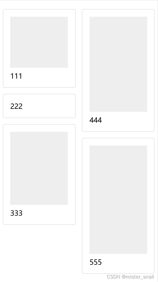
1.列表瀑布流排版
<!DOCTYPE html>
<html>
  <head>
    <meta http-equiv="Content-Type" content="text/html; charset=utf-8" />
    <meta name="viewport" content="width=device-width,initial-scale=1,user-scalable=no">
    <title>测试</title>
    <style type="text/css">
      * {
        margin: 0;
        padding: 0;
      }
      .container {
        width: 96%;
        margin: 20px auto 20px;
      }
      .waterfall {
        column-count: 2;
        -webkit-column-count: 2;
        -moz-column-count: 2;
        -ms-column-count: 2;
        -o-column-count: 2;

        column-gap: 15px;
        -webkit-column-gap: 15px;
        -moz-column-gap: 15px;
        -ms-column-gap: 15px;
        -o-column-gap: 15px;
      }
      .item {
        display: inline-block;
        width: 100%;
        box-sizing: border-box;
        padding: 1em;
        background-color: white;
        border: 1px solid #ccc;

        border-radius: 4px;
        margin-bottom: 10px;

        /*
          避免多列样式column-width布局时内容被截断、错乱
          1. height: 100%; overflow: auto;
          2. height: auto; column-break-inside: avoid;
        */
        height: 100%;
        overflow: auto;
      }
      .item .box {
        width: 100%;
        padding-bottom: 1em;
        margin-bottom: 0.5em;
        background-color: #eee;
      }
      .h222 {
        height: 100px;
      }
      .h333 {
        height: 150px;
      }
      .h444 {
        height: 200px;
      }
      .h555 {
        height: 230px;
      }
    </style>
  </head>
  <body>
    <div class="container">
      <div class="waterfall">
        <div class="item">
          <div class="box h222"></div>
          <p>111</p>
        </div>
        <div class="item">222</div>
        <div class="item">
          <div class="box h333"></div>
          <p>333</p>
        </div>
        <div class="item">
          <div class="box h444"></div>
          <p>444</p>
        </div>
        <div class="item">
          <div class="box h555"></div>
          <p>555</p>
        </div>
      </div>
    </div>
  </body>
</html>
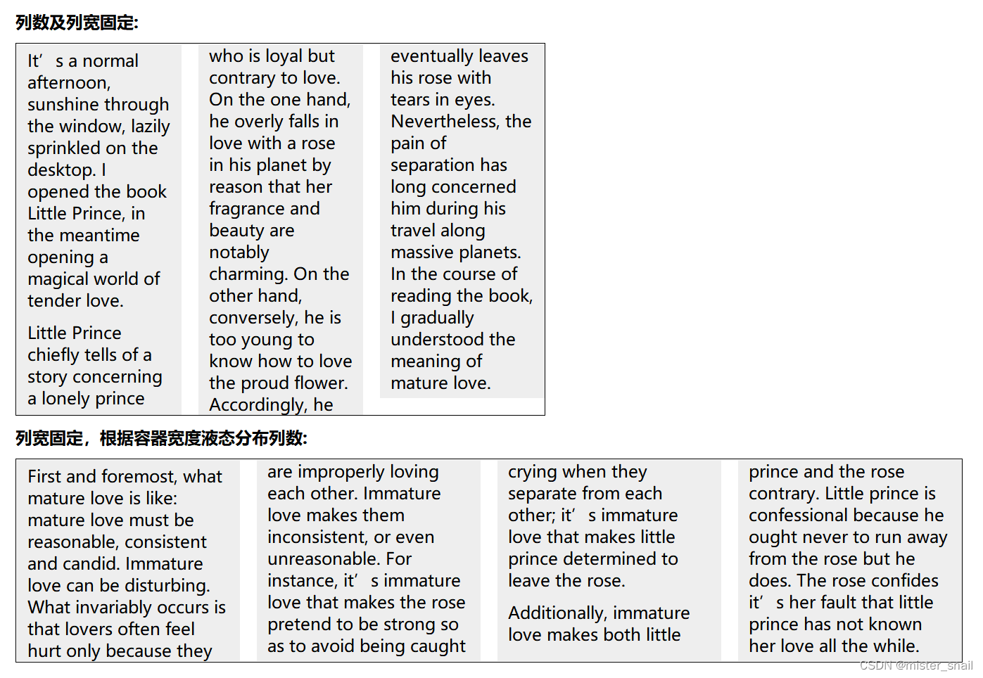
2.文字瀑布流排版
<!DOCTYPE html>
<html>
  <head>
    <meta http-equiv="Content-Type" content="text/html; charset=utf-8" />
    <meta name="viewport" content="width=device-width,initial-scale=1,user-scalable=no">
    <title>测试</title>
    <style type="text/css">
      * {
        padding: 0;
        margin: 0;
      }
      body {
        padding: 20px;
      }
      p { padding: 5px 10px; background: #eee; }
      h1 { margin: 10px 0; font-size: 16px; }
      .test {
        width: 500px;
        border: 1px solid #000;
        -moz-columns: 100px 3;
        -webkit-columns: 100px 3;
        columns: 100px 3;
      }
      .test2 {
        border: 1px solid #000;
        -moz-columns: 200px;
        -webkit-columns: 200px;
        columns: 200px;
      }
    </style>
  </head>
  <body>
    <h1>列数及列宽固定:</h1>
    <div class="test">
      <p>
        It’s a normal afternoon, sunshine through the window, lazily sprinkled on the desktop. I opened the book Little Prince, in the meantime opening a magical world of tender love.
      </p>
      <p>
        Little Prince chiefly tells of a story concerning a lonely prince who is loyal but contrary to love. On the one hand, he overly falls in love with a rose in his planet by reason that her fragrance and beauty are notably charming. On the other hand, conversely, he is too young to know how to love the proud flower. Accordingly, he eventually leaves his rose with tears in eyes. Nevertheless, the pain of separation has long concerned him during his travel along massive planets. In the course of reading the book, I gradually understood the meaning of mature love.
      </p>
    </div>

    <h1>列宽固定,根据容器宽度液态分布列数:</h1>
    <div class="test2">
      <p>
        First and foremost, what mature love is like: mature love must be reasonable, consistent and candid. Immature love can be disturbing. What invariably occurs is that lovers often feel hurt only because they are improperly loving each other. Immature love makes them inconsistent, or even unreasonable. For instance, it’s immature love that makes the rose pretend to be strong so as to avoid being caught crying when they separate from each other; it’s immature love that makes little prince determined to leave the rose.
      </p>
      <p>
        Additionally, immature love makes both little prince and the rose contrary. Little prince is confessional because he ought never to run away from the rose but he does. The rose confides it’s her fault that little prince has not known her love all the while.
      </p>
    </div>
  </body>
</html>


 3187
3187


 被折叠的 条评论
为什么被折叠?
被折叠的 条评论
为什么被折叠?
 到【灌水乐园】发言


