


ElementUi组件库: el-progress 进度条Bug及样式调整
👉 前言
在 Vue + elementUi 开发中,在使用 Progress 进度条时,往往会因为需求原型太过花里胡哨而烦恼(原本的样式并不能满足需求)。
为什么呢? 因为这个组件elementUi并没有提供过多的自定义属性及插槽,对的,插槽也没有,不能自定义进度条文本样式。即使在elementUi 的文档里面写了属性,但是实际使用并未生效(怀疑是bug)。
Tips: 基于 elementUi来说,好像elementUi - Plus升级了,修复了bug,也增加了对应的属性、开放了插槽!
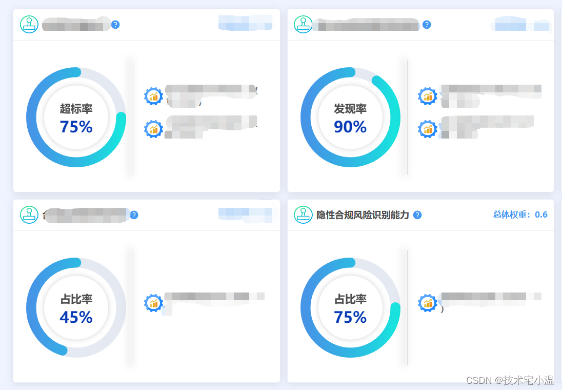
所以,在这个时候,我们就需要用到样式覆盖来对 Progress 进度条 进行个性化样式设置了! 首先,给小伙伴们看看,经过定义样式后,使用进度条实现的样式!
接下来,进入主题!
👉 一、实现原理
> 修改 el-progress 进度条样式 及 渐变进度条样式
我们可以通过 /deep/、>>>、v-deep 来对 elementUI 中给 el-progress 定义的原样式进行深度覆盖。
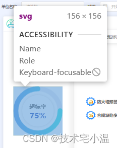
并且我们可以通过控制台看见,进度条是由svg标签渲染出来的,如果需要更改进度条样式,可以通过修改原先svg标签的渲染路径即可,若只需要单色,可以直接在elementUi提供的属性 或者 自行进行样式覆盖!
具体内容如下:
> HTML
<div class="progressName">
    <el-progress :width="60" :hidden="60" type="circle" :percentage="50"></el-progress>
</div>
<!-- 定义修改svg -->
<div style="width:0px; height: 0px;">
    <svg width="100%" height="100%">
        <defs>
            <linearGradient id="write" x1="0%" y1="0%" x2="100%" y2="0%">
                <stop offset="0%" style="stop-color:#0299E2" stop-opacity="0.8"></stop> // offset 设置起始 stop-color 设置起始位置的颜色
                <stop offset="100%" style="stop-color:#02E4DC" stop-opacity="1"></stop> // offset 设置起始 stop-color 设置起始位置的颜色
            </linearGradient>
        </defs>
    </svg>
</div>
> CSS
// 此处使用的是scss语法
.progressName {
	// 这里可以用
	/deep/ {
	  .el-progress {
	    margin: 0 6px;
	    position: relative;
	    // 修改进度条文字提示颜色
	    .el-progress__text {}
	  }
	  // 设置渐变进度条,通过重新定义svg标签的url
	  svg>path:nth-child(2) {
	  	// #write 此处的id就是定义的svg标签id 做替换即可
	    stroke: url(#write);
	  }
	  // 修改进度条背景色
	  .el-progress path:first-child {
	    // stroke: #e1e1e1;
	  }
	  // 进度条的图形样式,控制翻转
	  .el-progress-circle {
	    transform: rotateY(180deg);
	  }
	}
}
👉 二、案例代码(前言效果图案例)
> HTML代码
<el-card
 class="item"
 v-for="(item, index) in viewOption"
 :key="index"
>
  <div slot="header" class="clearfix">
    <div class="titleBox">
      <img :src="headerIconSrc" />
      <span class="title">
        {{ item.name || '指标名称' }}
      </span>
      <el-popover
        placement="bottom-start"
        width="220"
        trigger="click">
        <strong>用途:</strong>{{ item.purpose || '暂无用途' }}
        <i class="el-icon-question" slot="reference"></i>
        <!-- <el-button slot="reference">hover 激活</el-button> -->
      </el-popover>
    </div>
    <strong>总体权重:{{ item.allWeight || 0 }}</strong>
  </div>
  <div
    class="viewInfo"
  >
    <div
      class="progressView"
      :style="{ width: progressWidth + 'px', height: progressWidth + 'px', }"
      @click="viewInfoClick(item.name)"
    >
      <el-progress
        type="circle"
        color="#8080bf"
        :width="progressWidth"
        :percentage="item.zbVal || 0"
        :stroke-width="progressWidth/10"
        :show-text="false"
      ></el-progress>
      <div class="formatText">
        <p class="label">{{ item.zbName }}</p>
        <p class="value">{{ item.zbVal || 0 }}%</p>
      </div>
    </div>
    <el-divider direction="vertical"></el-divider>
    <div class="Info">
      <div
        class="textItem"
        v-for="(item_1, index_1) in item.detailList"
        :key="index_1"
      >
        <img :src="viewIconSrc" />
        <span class="text">{{ item_1.name }}(权重:{{ item_1.value || 0 }} )</span>
      </div>
    </div>
  </div>
</el-card>

<!-- 定义svg,用于环形进度渐变 -->
<div style="width:0px; height: 0px;">
  <svg width="100%" height="100%">
    <defs>
      <linearGradient id="write" x1="0%" y1="0%" x2="100%" y2="0%">
        <stop offset="0%" style="stop-color:#02E4DC" stop-opacity="0.9"></stop> // offset 设置起始 stop-color 设置起始位置的颜色
        <stop offset="100%" style="stop-color:#0271e2" stop-opacity="0.7"></stop> // offset 设置起始 stop-color 设置起始位置的颜色
      </linearGradient>
    </defs>
  </svg>
</div>

// el-progress是不能动态调整大小的,这里通过获取可视窗口大小,配置需要的进度条大小(这里用于测量单位,包括内部文本圈圈大小)
progressWidth: window.innerWidth / 3 / 2 - 100
> CSS代码
.item {
  width: calc(100% / 3 - 12px);
  height: calc(50% - 12px);
  border-radius: 5px;
  margin: auto;
  .clearfix {
    width: 100%;
    display: flex;
    align-items: center;
    justify-content: space-between;
    strong {
      font-size: 13px;
      color: #4298F3;
    }
    .titleBox {
      width: auto;
      max-width: calc(100% - 85px);
      display: flex;
      align-items: center;
      img {
        width: 30px;
        height: 28px;
        margin-right: 5px;
      }
      .title {
        display: inline-block;
        width: auto;
        max-width: calc(100% - 39px);
        overflow: hidden;
        text-overflow: ellipsis;
        white-space: nowrap;
        font-size: 14.5px;
        font-weight: 700;
      }
      .el-icon-question {
        font-size: 15px;
        margin: 3px 0 0 5px;
        cursor: pointer;
        color: #4298F3;
      }
    }

    &::after, &::before {
      display: none;
      content: "";
      clear: both
    }
  }

  .viewInfo {
    height: 100%;
    display: flex;
    align-items: center;
    justify-content: space-around;
    .progressView {
      cursor: pointer;
      position: relative;
      .formatText {
        position: absolute;
        top: 50%;
        left: 50%;
        transform: translate(calc(-50% + 6px), -50%);
        width: calc(64%);
        height: calc(64%);
        display: flex;
        align-items: center;
        justify-content: center;
        align-content: center;
        flex-wrap: wrap;
        text-align: center;
        font-weight: bold;
        border-radius: 50%;
        -webkit-box-shadow: 0px 0px 8px 0px rgba(0,0,0,0.18);
        box-shadow: 0px 0px 8px 0px rgba(0,0,0,0.18);
        .label {
          width: 100%;
          font-size: clamp(12px, 1.1vw, 18px);
          font-weight: bold;
          margin-bottom: 10px;
        }
        .value {
          width: 100%;
          font-size: clamp(14px, 1.8vw, 24px);
          font-weight: bold;
          color: #083BB5 ;
        }
      }
    }
    .Info {
      width: 50%;
      .textItem {
        width: 100%;
        margin-bottom: 15px;
        display: flex;
        align-items: center;
        img {
          width: 30px;
          height: 28px;
          margin-right: 5px;
        }
        .text {
          width: calc(100% - 35px);
          font-size: 13px;
          color: #666;
          font-weight: 600;
        }
      }
    }
    /deep/ {
      .el-divider--vertical {
        width: 1px;
        height: calc(100% - 40px);
        background-color: #ddd;
        box-shadow: -4.5px 0 12px 3px rgba(0,0,0, .1);
      }
      .el-progress {
        margin: 0 6px;
        position: relative;
        // 修改进度条文字提示颜色
        .el-progress__text {}
      }
      svg>path:nth-child(2) {
        stroke: url(#write); // #write 此处的id就是定义的svg标签id 做替换即可
      }
      .el-progress path:first-child { // 修改进度条背景色
        // stroke: #e1e1e1;
      }
      .el-progress-circle {
        transform: rotateY(180deg);
      }
    }
  }
  /deep/ {
    .el-card__header {
      width: 100%;
      padding: 10px;
    }
    .el-card__body {
      padding: 10px;
      height: calc(100% - 64.8px);
    }
  }
}
案例较为粗浅,仅供参考!
👉 三、效果演示

往期内容 💨
🔥 < elementUi组件封装: 通过 el-tag、el-popover、vue动画等实现公告轮播 >
🔥 < element-Ui表格组件:表格多选功能回显勾选时因分页问题,导致无法勾选回显的全部数据 >
🔥 < 每日闲谈:你真的了解 “ ChatGPT ” 嘛 ? >
🔥 < 每日算法 - JavaScript解析:搜索旋转排序数组 >
🔥 < CSS小技巧:类似photoShop的混合模式(mix-blend-mode / background-blend-mode)使用 >


 5550
5550


 被折叠的 条评论
为什么被折叠?
被折叠的 条评论
为什么被折叠?
 到【灌水乐园】发言


