


以前没接触到shape的时候,做圆角,渐变等效果都是依赖图片效果;如果对PS不熟悉,光是做图就要花去大把时间。
废话不讲了,把总结的内容记录下来,算是做个笔记吧。
shape用法与selector类似:
1.在res-drawable文件夹新建一个.xml文件;(如btn_style.xml)
<?xml version="1.0" encoding="utf-8"?>
<shape
    xmlns:android="<a target=_blank href="http://schemas.android.com/apk/res/android">http://schemas.android.com/apk/res/android</a>"
    android:shape="oval">
     <!-- 渐变 -->
    <gradient
        android:startColor="#1E90FF"
        android:endColor="#EE82EE"
        android:angle="90"/>
     <!-- 描边 -->
    <stroke
        android:width="2dp"
        android:color="#FF8C00"
        android:dashWidth="5dp"
        android:dashGap="3dp"
        />
</shape>
效果图:

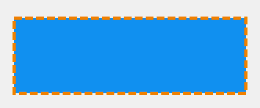
<?xml version="1.0" encoding="utf-8"?>
<shape
    xmlns:android="<a target=_blank href="http://schemas.android.com/apk/res/android">http://schemas.android.com/apk/res/android</a>"
    android:shape="rectangle">
     <!-- 渐变 -->
    <gradient
        android:startColor="#1E90FF"
        android:endColor="#EE82EE"
        android:angle="45"
        android:centerColor="#ffffff"
        />
     <!-- 描边 -->
    <stroke
        android:width="2dp"
        android:color="#FF8C00"
        android:dashWidth="5dp"
        android:dashGap="0dp"
        />
     <!-- 圆角 -->
    <corners
        android:radius="5dp"
        android:topLeftRadius="5dp"
        android:topRightRadius="5dp"
        android:bottomLeftRadius="5dp"
        android:bottomRightRadius="5dp"
        />
</shape>
效果图:

<?xml version="1.0" encoding="utf-8"?>
<shape
    xmlns:android="<a target=_blank href="http://schemas.android.com/apk/res/android">http://schemas.android.com/apk/res/android</a>"
    android:shape="ring"

    android:useLevel= "false"
    >
     <!-- 渐变 -->
    <gradient
        android:startColor="#1E90FF"
        android:endColor="#EE82EE"
         android:centerColor="#ffffff"
        android:angle="135"
         android:type="sweep"
        />
     <!-- 描边 -->
    <stroke
        android:width="1dp"
        android:color="#FF8C00"
        />
</shape>
效果图:

shape与selector组合使用:
<?xml version="1.0" encoding="utf-8"?>
 <selector
     xmlns:android="http://schemas.android.com/apk/res/android">
     <item android:state_pressed="true" >
         <shape>
             <!-- 渐变 -->
	        <gradient
	        android:startColor="#1E90FF"
	        android:endColor="#EE82EE"
	        android:angle="45"
	        android:centerColor="#ffffff"
	        />
             <!-- 描边 -->
	        <stroke
	        android:width="2dp"
	        android:color="#FF8C00"
	        android:dashWidth="5dp"
	        android:dashGap="0dp"
	        />
         	<!-- 圆角 -->
		    <corners
		        android:radius="5dp"
		        android:topLeftRadius="5dp"
		        android:topRightRadius="5dp"
		        android:bottomLeftRadius="5dp"
		        android:bottomRightRadius="5dp"
		        />

         </shape>
     </item>

    <item android:state_focused="true" >
         <shape>
             <!-- 渐变 -->
	        <gradient
	        android:startColor="#1E90FF"
	        android:endColor="#EE82EE"
	        android:angle="45"
	        android:centerColor="#ffffff"
	        />
             <!-- 描边 -->
	        <stroke
	        android:width="2dp"
	        android:color="#FF8C00"
	        android:dashWidth="5dp"
	        android:dashGap="0dp"
	        />
         	<!-- 圆角 -->
		    <corners
		        android:radius="5dp"
		        android:topLeftRadius="5dp"
		        android:topRightRadius="5dp"
		        android:bottomLeftRadius="5dp"
		        android:bottomRightRadius="5dp"
		        />

         </shape>
     </item>

    <item>
        <shape>
            <!-- 填充 -->
            <solid android:color="#1e90ff"/>
            <!-- 描边 -->
	        <stroke
	        android:width="2dp"
	        android:color="#FF8C00"
	        android:dashWidth="5dp"
	        android:dashGap="2dp"
	        />

         </shape>
     </item>
 </selector>
效果:
2.在控件中使用shape效果;
android:background="@drawable/btn_style"
3.shape常用功能属性说明;
	 <!--
 	android:shape=["rectangle" | "oval" | "line" | "ring"]
 	shape的形状,默认为矩形,可以设置为矩形(rectangle)、椭圆形(oval)、线性形状(line)、环形(ring)
  	   下面的属性只有在android:shape="ring时可用:
  	  android:innerRadius 		尺寸,内环的半径。
  	  android:innerRadiusRatio	浮点型,以环的宽度比率来表示内环的半径,
  	例如,如果android:innerRadiusRatio,表示内环半径等于环的宽度除以5,这个值是可以被覆盖的,默认为9.
  	android:thickness			尺寸,环的厚度
  	android:thicknessRatio		浮点型,以环的宽度比率来表示环的厚度,例如,如果android:thicknessRatio="2",
  	那么环的厚度就等于环的宽度除以2。这个值是可以被android:thickness覆盖的,默认值是3.
  	android:useLevel			boolean值,如果当做是LevelListDrawable使用时值为true,否则为false.
  	-->
<shape
    xmlns:android="http://schemas.android.com/apk/res/android"
    android:shape="rectangle"

    >

     <!--
     	渐变色
     	android:startColor  颜色值 		 起始颜色
        android:endColor    颜色值 		 结束颜色
        android:centerColor 整型   		 渐变中间颜色,即开始颜色与结束颜色之间的颜色
        android:angle       整型   		 渐变角度(PS:当angle=0时,渐变色是从左向右。 然后逆时针方向转,当angle=90时为从下往上。
        								 angle必须为45的整数倍)
        android:type        ["linear" | "radial" | "sweep"] 渐变类型(取值:linear、radial、sweep)
                            linear 线性渐变,这是默认设置
                            radial 放射性渐变,以开始色为中心。
                            sweep 扫描线式的渐变。
       android:useLevel   ["true" | "false"] 如果要使用LevelListDrawable对象,就要设置为true。设置为true无渐变。false有渐变色
       android:gradientRadius 整型 		  渐变色半径.当 android:type="radial" 时才使用。单独使用 android:type="radial"会报错。
       android:centerX    	整型   		  渐变中心X点坐标的相对位置
       android:centerY   	整型   		  渐变中心Y点坐标的相对位置
    -->
   <gradient
        android:startColor="#1E90FF"
        android:endColor="#EE82EE"
        android:angle="45"
        android:centerColor="#ffffff"
        />

    <!--
     	圆角
     	android:radius  			整型 半径
    	android:topLeftRadius  		整型 左上角半径
    	android:topRightRadius  	整型 右上角半径
    	android:bottomLeftRadius 	整型 左下角半径
    	android:bottomRightRadius 	整型 右下角半径
     -->
     <corners
        android:radius="5dp"
        android:topLeftRadius="5dp"
        android:topRightRadius="5dp"
        android:bottomLeftRadius="5dp"
        android:bottomRightRadius="5dp"
        />

    <!--
     	内边距,即内容与边的距离
     	android:left  	整型 左内边距
	    android:top   	整型 上内边距
	    android:right  	整型 右内边距
	    android:bottom 	整型 下内边距
      -->
     <padding
         android:left="10dp"
         android:top="10dp"
         android:right="10dp"
         android:bottom="10dp"
         />

    <!--
    	size 大小
    	android:width 	整型 宽度
    	android:height 	整型 高度
    -->
    <size
        android:width="200dp"
        android:height="50dp"
        />

    <!--
    	内部填充
    	android:color 	颜色值 填充颜色
    -->
    <solid
        android:color="#1e90ff"
        />

     <!--
     	描边
     	android:width 		整型 	描边的宽度
    	android:color 		颜色值 	描边的颜色
    	android:dashWidth 	整型 	表示描边的样式是虚线的宽度, 值为0时,表示为实线。值大于0则为虚线
    	android:dashGap  	整型 	表示描边为虚线时,虚线之间的间隔.
     -->
    <stroke
        android:width="2dp"
        android:color="#FF8C00"
        android:dashWidth="5dp"
        android:dashGap="0dp"
        />

</shape>


 扫一扫
扫一扫
 1787
1787

 被折叠的 条评论
为什么被折叠?
被折叠的 条评论
为什么被折叠?
 到【灌水乐园】发言


