


背景
继上一篇《Android Drawable Resources》,这里来分析shape的使用,值得注意的是此shape可以作为之前各Drawable里item的元素,所以可以让Drawable Resources更加多变。另外,shape所对应的java类是GradientDrawable,可通过线程动态改变其shape属性,实现绚丽的动画。
<?xml version="1.0" encoding="utf-8"?>
<shape
    xmlns:android="http://schemas.android.com/apk/res/android"
    android:shape=["rectangle" | "oval" | "line" | "ring"] >
    <corners
        android:radius="integer"
        android:topLeftRadius="integer"
        android:topRightRadius="integer"
        android:bottomLeftRadius="integer"
        android:bottomRightRadius="integer" />
    <gradient
        android:angle="integer"
        android:centerX="float"
        android:centerY="float"
        android:centerColor="integer"
        android:endColor="color"
        android:gradientRadius="integer"
        android:startColor="color"
        android:type=["linear" | "radial" | "sweep"]
        android:useLevel=["true" | "false"] />
    <padding
        android:left="integer"
        android:top="integer"
        android:right="integer"
        android:bottom="integer" />
    <size
        android:width="integer"
        android:height="integer" />
    <solid
        android:color="color" />
    <stroke
        android:width="integer"
        android:color="color"
        android:dashWidth="integer"
        android:dashGap="integer" />
</shape>
以上便是从官网摘来关于shape的所有属性,下面我们来一一介绍这些属性。
android:shape=["rectangle" | "oval" | "line" | "ring"]rectangle:shape的默认是一个矩形;
oval:椭圆形;
line:一条线;
ring:一个环型;
没有定义android:shape时,默认显示一个矩形:
<?xml version="1.0" encoding="utf-8"?>
<shape
    xmlns:android="http://schemas.android.com/apk/res/android">
    <stroke
        android:width="4dp"
        android:color="@color/colorAccent"/>
</shape>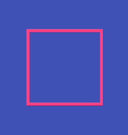
定义android:shape为oval时,是一个圆形:
<?xml version="1.0" encoding="utf-8"?>
<shape
    xmlns:android="http://schemas.android.com/apk/res/android"
    android:shape="oval">
    <stroke
        android:width="4dp"
        android:color="@color/colorAccent"/>
</shape>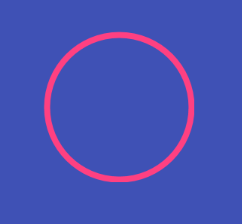
定义android:shape为line时,是一条line:
<?xml version="1.0" encoding="utf-8"?>
<shape
    xmlns:android="http://schemas.android.com/apk/res/android"
    android:shape="line">
    <stroke
        android:width="4dp"
        android:color="@color/colorAccent"/>
</shape>
在定义android:shape为ring时,还需要定义其他属性才能显示,如:
android:innerRadius=”50dp” 内环半径
android:innerRadiusRatio=”5” 内环半径比例
android:thickness=”10dp” 环的厚度
android:thicknessRatio=”5” 厚度比例
android:useLevel=”false” 如果不是用作LevelListDrawable,要设置为false,否则不能显示。
corner
只有shape是矩形rectangle才起作用,即可设置矩形的四个角为圆角
<corners
        android:radius="integer"
        android:topLeftRadius="integer"
        android:topRightRadius="integer"
        android:bottomLeftRadius="integer"
        android:bottomRightRadius="integer" />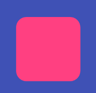
gradient
指定一个渐变的颜色,用于填充button的颜色,貌似使用它之后,solid就失效了。
  <gradient
        android:angle="integer"
        android:centerX="float"
        android:centerY="float"
        android:centerColor="integer"
        android:endColor="color"
        android:gradientRadius="integer"
        android:startColor="color"
        android:type=["linear" | "radial" | "sweep"]
        android:useLevel=["true" | "false"] />
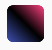
android:angle 这是颜色渐变的角度,值只能是
0:从左到右
45:从左下到右上
90:从下到上
-45:从右上到左下
-90:从上到下
180:从右到左
剩下就不举例了,反正所有值都是45的倍数。
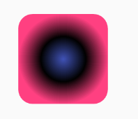
android:centerX=”0.1f”
android:centerY=”0.1f”
只针对android:type为sweep或radial才起作用,即设置开始渐变在整个形状内的位置,值为0~1之间。
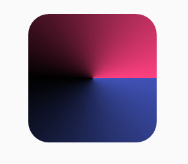
centerColor、startColor、endColor分别表示中间,开始、结尾的颜色。
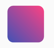
    <gradient
        android:angle="45"
        android:centerColor="@color/black"
        android:startColor="@color/colorPrimary"
        android:endColor="@color/colorAccent"
    />
android:type的三个属性分别是:
linear:线性渐变
radial:辐射性渐变
sweep:横扫性渐变
size
它是设置此shape的大小,如果在线程中改变此属性,shape会更趣,弄得我想写篇关于此动画的文章。
<size android:height="30dp"
      android:width="10dp"/>
solid
填充的颜色,就一个android:color属性,没有其他。
stroke
设置shape的边框样式:
 <stroke
        android:dashGap="10dp"
        android:dashWidth="5dp"
        android:color="@color/green"
        android:width="5dp"/>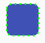


 3923
3923

 被折叠的 条评论
为什么被折叠?
被折叠的 条评论
为什么被折叠?
 到【灌水乐园】发言


