


错误/成功提示
H5内容,项目中有成功、错误的提示,并样式与使用组件不同,刚开始封装成组件的形式,但是使用的时候,需要设置v-model的值或者通过refs的方式来控制提示的显示,不方便,于是我想封装成像element-ui一样的通过this.$message的方式就可以调用,减少调用的复杂度。
1.首先修改组件,用于适应调用方式
参数说明:
type:提示类型,默认error,目前只支持error与successshowCancelButton:是否展示取消按钮showConfirmButton:是否展示确认按钮confirmButtonText:确认按钮文字cancelButtonText:q
<template>
    <van-overlay :show="visible" class="overlay column-flex center-flex" @click="handleOverlayClick">
        <div class="overlay-wrapper align-center column-flex" @click.stop>
            <img class="overlay-wrapper-error"
                :src="require(`@/assets/images/common/${type === 'error' ? 'error' : 'success'}.png`)" />
            <p class="color-main mgb-15 overlay-wrapper-tips flex-1">
                {{ message }}
            </p>
            <div class="w-100" v-if=" $slots.footer || showCancelButton || showConfirmButton">
                <slot name="footer">
                    <div class="footer-buttons">
                        <van-button v-if="showCancelButton" size="small" @click="handleAction('cancel')" class="confirm-btn" round type="default">
                            {{ cancelButtonText }}
                        </van-button>
                        <van-button v-if="showConfirmButton" size="small" @click="handleAction('confirm')" class="confirm-btn" round type="primary">
                            {{ confirmButtonText }}
                        </van-button>
                    </div>
                </slot>
            </div>
        </div>

        <i class="close-icon nm-icon" @click="handleAction('close')"> </i>
    </van-overlay>
</template>

<script>
export default {
    name: 'MessageTips',
    data() {
        return {
            visible: false, // 控制显示/隐藏
            message: '',    // 提示消息内容
            type: 'error',  // 提示类型,默认 error
            showCancelButton: false, // 是否显示取消按钮
            showConfirmButton: false, // 是否显示确认按钮
            confirmButtonText: '确认', // 确认按钮文本
            cancelButtonText: '取消', // 取消按钮文本
            distinguishCancelAndClose: false, // 是否区分取消和关闭
            resolve: null, // Promise resolve 函数
            reject: null  // Promise reject 函数
        };
    },
    methods: {
        // 处理按钮点击事件
        handleAction(action) {
            this.visible = false; // 关闭弹框
            if (action === 'confirm') {
                this.resolve && this.resolve();
            } else if (action === 'cancel') {
                this.reject && this.reject('cancel');
            } else if (action === 'close') {
                if (this.distinguishCancelAndClose) {
                    this.reject && this.reject('close');
                } else {
                    this.reject && this.reject('cancel');
                }
            }
        },
        // 处理遮罩层点击事件
        handleOverlayClick() {
            if (this.distinguishCancelAndClose) {
                this.handleAction('close');
            } else {
                this.handleAction('cancel');
            }
        },
        // 显示弹框
        show(options) {
            this.message = options.message || '';
            this.type = options.type || 'error';

            this.showCancelButton = options.showCancelButton || false;
            this.showConfirmButton = options.showConfirmButton || false;
            this.confirmButtonText = options.confirmButtonText || '确认';
            this.cancelButtonText = options.cancelButtonText || '取消';
            this.distinguishCancelAndClose = options.distinguishCancelAndClose || false;
            this.visible = true;


             // 自动关闭
        if (options.duration) {
           setTimeout(() => {
              this.handleAction('close');
           }, options.duration);
         }

            // 返回 Promise
            return new Promise((resolve, reject) => {
                this.resolve = resolve;
                this.reject = reject;
            });
        }
    }
};
</script>

<style lang="scss" scoped>
.overlay {
    z-index: 40;

    &-wrapper {
        min-height: 150px;
        max-width: 302px;
        border-radius: 16px;
        padding: 13px 21px 19px 21px;
        background: linear-gradient(180deg, rgba(255, 250, 222, 1) 0%, rgba(255, 253, 245, 1) 41.84%, rgba(255, 255, 255, 1) 72.6%);

        &-error {
            width: 70px;
            height: 70px;
            object-fit: contain;
            margin-bottom: 12px;
        }

        &-tips {
            font-size: 14px;
            line-height: 20px;
            display: flex;
            align-items: center;
        }
    }

    .close-icon {
        width: 40px;
        height: 40px;
        margin-top: 25px;
        background: url(~@/assets/images/common/border-close.png);
    }

    .footer-buttons {
        display: flex;
        justify-content: space-between;
        gap: 8px;

        .confirm-btn + .confirm-btn{
            margin-left:0;
        }
    }
}
</style>
- 将组件挂载到
this.$message,并在main.js中引入
import Vue from 'vue';
import MessageTips from '@/components/messageTips/indexJs.vue'; // 引入组件

// 创建插件对象
const messageTips = {
    install(Vue) {
        // 创建子类构造函数
        const MessageTipsConstructor = Vue.extend(MessageTips);

        // 定义全局方法 $message
        Vue.prototype.$message = function (options) {
            // 创建组件实例
            const instance = new MessageTipsConstructor({
                propsData: options // 传递 props
            });

            // 挂载到 DOM
            instance.$mount();
            document.body.appendChild(instance.$el);

            // 支持自定义 footer 插槽
            if (options.footerSlot) {
                instance.$slots.footer = [options.footerSlot];
                instance.$forceUpdate(); // 强制更新组件
            }

            // 显示弹框并返回 Promise
            return instance.show(options);
        };
    }
};

// 使用插件
Vue.use(messageTips);
3.使用方式:
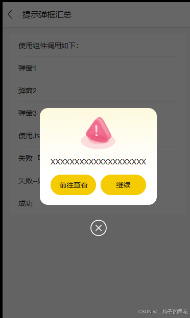
- 取消和确认按钮都显示
 this.$message({
                distinguishCancelAndClose: true,
                confirmButtonText: '继续录入',
                cancelButtonText: '前往查看',
                message: '提示',
                showCancelButton: true,
                showConfirmButton: true
            }).then(() => {
                console.log('点击保存')
            })
                .catch((action) => {
                    // action来区分是点击取消按钮还是关闭按钮
                    console.log('点击关闭', action)
                });
- 只显示确认按钮
 this.$message({
                message: '提示',
                showCancelButton: false,
                showConfirmButton: true
            }).then(() => {
                    console.log('点击保存')
                }).catch(() => {
                    console.log('点击关闭')

                });
- 成功提示
        handleSuccess() {
            this.$message({
                message: '工单处理结果已提交成功!',
                type: "success",
            }).catch(() => {
                console.log('点击关闭')
            })
        },
- 自定义底部内容及自动关闭
 const customFooter = this.$createElement('div', {
                class: 'custom-footer'
            }, [
                this.$createElement('van-button', {
                    props: {
                        type: 'primary',
                        size: 'small',
                        round: true
                    },
                    on: {
                        click: () => {
                            this.$message({ message: '你点击了自定义按钮', type: 'success' });
                        }
                    }
                }, '自定义按钮'),
                this.$createElement('van-button', {
                    props: {
                        type: 'primary',
                        size: 'small',
                        round: true
                    },
                    on: {
                        click: () => {
                            this.$message({ message: '你点击了自定义按钮', type: 'success' });
                        }
                    }
                }, '自定义按钮')
            ]);

            this.$message({
                message: '这是一个自定义 footer 的提示框',
                type: 'success',
                footerSlot: customFooter,
                duration: 3000
            }).catch(() => { });


 扫一扫
扫一扫


 2591
2591

 被折叠的 条评论
为什么被折叠?
被折叠的 条评论
为什么被折叠?
 到【灌水乐园】发言


