


前言
在“CSS盒子模型”中,页面中所有元素都可以看成一个盒子,并且占据着页面空间。
一个页面由很多这样的盒子组成,这些盒子之间会互相影响,因此掌握盒子模型需要从两个方面来理解:
- 单独一个盒子的内部结构
- 理解多个盒子之间的相互关系
盒子结构
如图为一个盒子的内部结构:
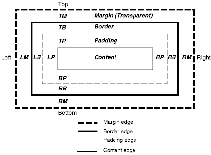
从上图我们可以得出盒子模型的属性如下表所示:
| 属性 | 说明 |
|---|---|
| content | 内容区域,可以是文字或者是图片 |
| padding | 内边距,用于定义内容与边框之间的距离 |
| border | 边框,元素边框 |
| margin | 外边距,用于定义页面中元素与元素之间的距离 |
1. 内容区域
内容区域是CSS盒子模型的中心,它呈现了盒子的主要信息内容。内容区域有三个属性:width、height、overflow。使用width和height属性可以指定盒子的宽度和高度。
注意: 这里的width和height是针对于内容区域而言的,并不包括padding部分。
当内容信息太多而超出内容区域所占范围时,可以使用overflow溢出属性来指定处理方法。
- 内边距
内边距的属性有五种,即padding-top、padding-bottom、padding-left、padding-right、以及综合了以上四个方向的简洁内边距属性:padding。使用这五种属性可以指定内容区域各个方向到边框的距离。
- 边框
边框属性有border-width、border-style、border-color以及综合了三类属性的快捷边框属性border。
其中border-width指定边框的宽度,border-style指定边框的类型,border-color指定border的颜色。
比如:border-width:1px; border-style:solid; border-color:gray;等价于border:1px solid gray;
- 外边距
外边距使得元素之间不必紧紧得凑在一起,是CSS布局的一个重要手段。
外边距的属性也有五种,即margin-top、margin-bottom、margin-left,margin-right和margin。
注意: margin可以为负值,这就是传说中的“负margin技术”,详情看后文!
用html+css制作盒子模型
<!DOCTYPE html>
<html lang="en">
<head>
    <meta charset="UTF-8">
    <meta name="viewport" content="width=device-width, initial-scale=1.0">
    <meta http-equiv="X-UA-Compatible" content="ie=edge">
    <title>display box module</title>
    <style type="text/css">
        #container{
            margin: 200px auto;
            width: 400px;
            height: 400px;
        }
        #margin{
            text-align: center;
            background: red;
            border: 1px solid black;
            margin: 0px auto;
            width: 400px;
            height: 400px;
        }
        #border{
           display: inline-block;
           position: absolute;
           left: 650px;
           top:248px;

        }
        #padding{
            margin: 30px auto;
            background-color: yellow;
            border: 20px solid darkgrey;
            width: 300px;
            height: 300px;
        }
        #content{
            margin: 30px auto;
            width: 200px;
            height: 200px;
            background-color:aquamarine;
            border: 1px solid black;
        }
    </style>
</head>
<body>
    <div id="container">
        <div id="margin">
            margin
            <div id="border">border</div>
            <div id="padding">
                padding
                <div id="content">content</div>
            </div>
        </div>
    </div>
</body>
</html>padding用法
possible values
| value | notes | example |
|---|---|---|
| [length] | should not be a negative value | 10px |
| [percentage] | Calculated as a percentage of the containing box’s width.Should not be a negative value. | 25% |
| inherit | ||
| initial | ||
| unset |
mutiple values
value |note|example
[value]|[top,right,bottom,left]|10px
[value] [value]|[top and bottom] [left and right]|10px 20px
[value] [value] [value]|[top] [right and left] [bottom]|10px 20px 30px
[value] [value] [value] [value] |[top] [right] [bottom] [left] |10px 20px 30px 40px
example
#gull { padding: 12px; }
/* Uniform padding of 12px on all four sides */

#swan { padding: 20% 40%; }
/* Top and bottom padding are each 20% of the containing box's width. Left and right padding are each 20% of the containing box's width. */

#tern { padding: 20% inherit 2.5em; }
/* Top padding is 20% of the containing box's width. Left and right padding are inherited. Bottom padding is 2.5em */

#grebe { padding: 10px 20px 30px 40px; }
/* Top padding is 10px. Right padding is 20px. Bottom padding is 30px. Left padding is 40px. */
margin
用法和padding基本一样,只是这里多了一些margin的其他特点。这里主要讲解外边距叠加和负margin技术。
外边距叠加
外边距叠加,又称“margin叠加”,指的是当两个垂直外边距相遇时,这两个外边距将会合并为一个外边距,叠加后的外边距距离等于叠加之前的两个外边距中的最大值。
对于外边距叠加,我们分为三种情况讨论:同级元素、父子元素和空元素
同级元素

父子元素

空元素

注意点:
- 水平外边距永远不会有叠加,水平外边距指的是margin-left和margin-right
- 外边距叠加针对的是block以及inline-block元素,不包括inline元素。因为inline元素的margin-top和margin-bottom设置无效。
- 在实际开发中,建议统一使用margin-top或者margin-bottom,不要混合使用
意义:
CSS定义外边距叠加的初衷就是为了更好地对文章进行排版。如果没有外边距合并,则段落之间的外边距是上外边距的两倍,否则段落之间的外边距就和上外边距相同。
负margin技术

如上图所示,负margin对普通文档流元素的影响,我们分为两种情况。
- 当元素的margin-top或者margin-left为负数时,“当前元素”会被拉向指定方向
- 当前元素margin-bottom或者margin-top为负数时,“后续元素”会被拉向指定方向。
example:
没有负margin:
<!DOCTYPE html>
<html lang="en">
<head>
    <meta charset="UTF-8">
    <meta name="viewport" content="width=device-width, initial-scale=1.0">
    <meta http-equiv="X-UA-Compatible" content="ie=edge">
    <title>normal case</title>
    <style type="text/css">
        #wrapper{
            width: 300px;
            height: 60px;
            line-height: 60px;
            font-size: 21px;
            font-weight: bold;
            text-align: center;
            color : white ;
        }
        #first{background-color: red;}
        #second{background-color: purple;}
        #third{background-color: blue;}
    </style>
</head>
<body>
    <div id="wrapper">
        <div id="first">1</div>
        <div id="second">2</div>
        <div id="third">3</div>
    </div>
</body>
</html>当在第二个div添加margin-top:-30px;时,第二个元素被往上拉,运行效果
当在第二个div添加margin-bottom:-30px;时,第三个元素被往上拉,运行效果
<!DOCTYPE html>
<html lang="en">
<head>
    <meta charset="UTF-8">
    <meta name="viewport" content="width=device-width, initial-scale=1.0">
    <meta http-equiv="X-UA-Compatible" content="ie=edge">
    <title>normal case</title>
    <style type="text/css">
        #wrapper div{
            display: inline-block;
            width: 100px;
            height: 60px;
            line-height: 60px;
            font-size: 21px;
            font-weight: bold;
            text-align: center;
            color : white ;
        }

        #first{background-color: red;}
        #second{background-color: purple;}
        #third{background-color: blue;}
    </style>
</head>
<body>
    <div id="wrapper">
        <div id="first">1</div>
        <div id="second">2</div>
        <div id="third">3</div>
    </div>
</body>
</html>当在第二个div添加margin-left:-30px;时,第二个元素被往左拉,运行效果
当在第二个div添加margin-right:30px;时,第三个元素被往左拉,运行效果
负margin技术的应用
- 图片与文字对齐
举例:
<!DOCTYPE html>
<html lang="en">
<head>
    <meta charset="UTF-8">
    <meta name="viewport" content="width=device-width, initial-scale=1.0">
    <meta http-equiv="X-UA-Compatible" content="ie=edge">
    <title>图片与文字对齐</title>
    <style type="text/css"></style>
</head>
<body>
    <img src="http://bpic.588ku.com/element_origin_min_pic/18/06/10/8309b090c143b0e19daa89317fa2600d.jpg" alt="" style="width:30px;height:30px;">百度LOGO
</body>
</html>从上面的运行效果可以看出,默认情况下图片与文字在底部水平方向上是不对齐的。我们在CSS中添加img{margin:0 3px -3px 0;}之后,在浏览器的预览效果如下
可以把img{margin:0 3px -3px 0;}看成一条公式般的东西,记住就行。
- 自适应两列布局
<!DOCTYPE html>
<html lang="en">

<head>
    <meta charset="UTF-8">
    <meta name="viewport" content="width=device-width, initial-scale=1.0">
    <meta http-equiv="X-UA-Compatible" content="ie=edge">
    <title>flexible sidebar</title>
    <style type="text/css">
        #wrap {
            position: relative;
        }

        #content {
            margin-right: 300px;
        }

        #sidebar {
            position: absolute;
            width: 300px;
            right: 0;
            top: 0;
        }
    </style>
</head>

<body>
    <div id="wrap">
        <div id="content" style="height:50px;background:#000;color:#fff;">我现在的结构是在前面</div>
        <div id="sidebar" style="height:50px;background:red;color:#fff;">固定宽度区</div>
    </div>

</body>

</html>- 元素垂直居中
语法:
父元素{
    position:relative;
}
子元素{
    position:absolute;
    top:50%;
    left:50%;
    margin-top:height的一半的负值
    margin-left:width的一半的负值
}
原理很简单,就是利用left:50%将盒子的左边先置于父容器的中点,然后再将盒子往左偏移盒子自身宽度的50%。top的远离也是一样。
<!DOCTYPE html>
<html lang="en">
<head>
    <meta charset="UTF-8">
    <meta name="viewport" content="width=device-width, initial-scale=1.0">
    <meta http-equiv="X-UA-Compatible" content="ie=edge">
    <title>垂直居中</title>
    <style type="text/css">
        #father{
            position: relative;
            width: 200px;
            height: 160px;
            border: 1px dashed gray;
        }
        #son{
            position: absolute;
            top: 50%;
            left: 50%;
            margin-top: -30px;
            margin-left:-50px;
            width: 100px;
            height: 60px;
            background-color: red;
        }
    </style>
</head>
<body>
    <div id="father">
        <div id="son"></div>
    </div>
</body>
</html>Reference
- http://htmldog.com
- 《html与css进阶教程》


 2203
2203


 被折叠的 条评论
为什么被折叠?
被折叠的 条评论
为什么被折叠?
 到【灌水乐园】发言


