


<!DOCTYPE html>
<html>
<head>
    <meta charset="UTF-8">
    <meta name="viewport" content="width=device-width, initial-scale=1.0">
    <title>css-gradient-buttons</title>
	<style type="text/css">
body {
  display: grid;
  place-items: center;
  background: #fff;
  text-align: center;
  padding: 20px 20px;
}

.container {
  width: 600px;
}
.box {
  float: left;
  margin: 30px 8px;
}
button {
  cursor: pointer;
}
.btn-grad-09 {background-image: linear-gradient(to right, #ED4264 0%, #FFEDBC  51%, #ED4264  100%)}
.btn-grad-09 {
   margin: 10px;
   padding: 15px 45px;
   text-align: center;
   text-transform: uppercase;
   transition: 0.5s;
   background-size: 200% auto;
   color: white;
   box-shadow: 0 0 20px #eee;
   border-radius: 10px;
   display: block;
 }

 .btn-grad-09:hover {
   background-position: right center; /* change the direction of the change here */
   color: #fff;
   text-decoration: none;
 }
    </style>
</head>

<body>
<div class="container">
	<div class="box">
    <button class="btn-grad-09" >button</button>
  </div>

 </div>
</body>
</html>
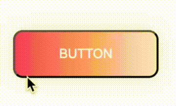
效果
此文为防丢失文章
原文地址
http://www.webkaka.com/tutorial/html/2021/0714129/


 2447
2447


 被折叠的 条评论
为什么被折叠?
被折叠的 条评论
为什么被折叠?
 到【灌水乐园】发言


