


 文章详细介绍了CSS中的display属性,展示了如何将行内元素转换为块元素以及块元素转换为行内元素。同时,探讨了盒模型,包括width、height、padding、margin和border的计算方式,以及如何影响元素的尺寸。此外,还讨论了定位技术,如相对定位、绝对定位、固定定位,以及z-index在确定元素堆叠顺序中的作用。最后,提到了通过CSS实现弹出登录窗口的效果。
display的使用
.c1{
	background: pink;
	display: inline-block;
	width: 100px;
	height: 50px;
	padding: 10px;
	margin: 10px;
}

.c2{
	background: pink;
	display: block;
	width: 100px;
	height: 50px;
	padding: 10px;
	margin: 10px;
}

.u1{
	display: inline;
}

.div2{
	display: none;
}
/* .div1:hover .div2{
	display: block;
} */
.c3:hover + .div2{
	display: block;
}
<!DOCTYPE html>
<html>
	<head>
		<meta charset="utf-8">
		<title></title>
		<link rel="stylesheet" href="css/index13.css"/>
	</head>
	<body>
		<!-- 对于行内标签,必须要设置为块标签,才能改变宽度和高度 -->
		<span class="c1">行内标签转为块标签</span>
		<span class="c1">222222222</span>
		<span class="c1">333333333</span>

		<span class="c2">111111111</span>
		<span class="c2">222222222</span>
		<span class="c2">333333333</span>

		<ul >
			<li class="u1">块标签转为行内标签</li>
			<li class="u1">22222222</li>
			<li class="u1">33333333</li>
		</ul>

		<div class="div1">
			<span class="c3">鼠标经过下拉列表</span>
			<div class="div2">
				列表1
				列表2
			</div>
		</div>
	</body>
</html>
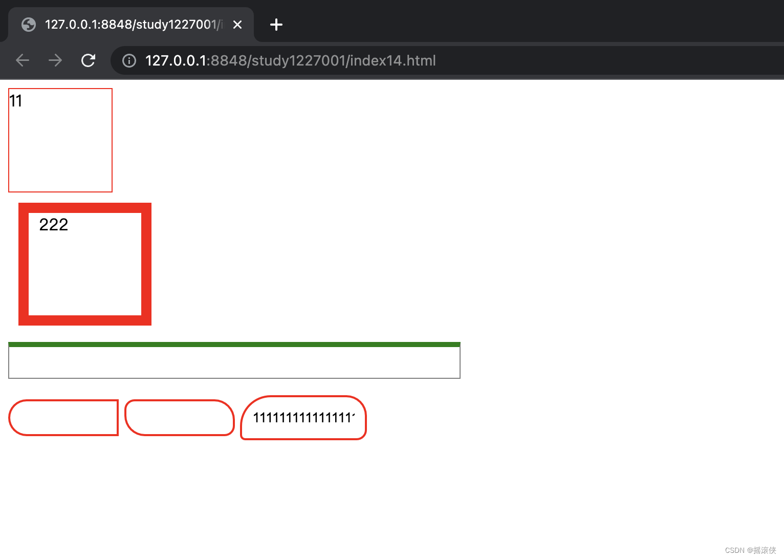
盒模型
.div1{
	width: 100px;
	height: 100px;
	border: 1px solid red;
}
.div2{
	width: 100px;/*可以存放的内容的宽度,不包含padding*/
	height: 100px;
	border: 10px solid red;/*边框*/
	padding-left: 10px;/*内间距*/
	margin-left: 10px;/*外间距*/
	margin-top: 10px ;
}
/*div2的实际宽度为100+10+10+10+10=140px*/
.ul1{
	width: 400px;
	height: 30px;
	border-top: 5px solid green;
	border-bottom: 1px solid gray;
	border-left: 1px solid gray;
	border-right: 1px solid gray;
}
.input1{
	border: 2px solid red;
	width: 100px;
	height: 30px;
	border-radius: 0px;/*角度*/
	border-top-left-radius: 30px;
	border-bottom-left-radius: 30px;
}
.input2{
	border: 2px solid red;
	width: 100px;
	height: 30px;
	border-radius: 10px 20px;/*角度 左上右下   右上左下*/
	/* border-top-left-radius: 30px;
	border-bottom-left-radius: 30px; */
}
.input3{
	border: 2px solid red;
	width: 100px;
	height: 30px;
	border-radius: 30px 20px 10px 5px;/*角度 左上 右上 右下 左下*/
	padding: 5px 10px 5px 10px;上 右 下 左
	/* border-top-left-radius: 30px;
	border-bottom-left-radius: 30px; */
}
<!DOCTYPE html>
<html>
	<head>
		<meta charset="utf-8">
		<title></title>
		<link rel="stylesheet" href="css/index14.css">
	</head>
	<body>
		<div class="div1">
			11
		</div>
		<div class="div2">
			222
		</div>
		<ul class="ul1">

		</ul>
		<input type="text" class="input1"/>
		<input type="text" class="input2"/>
		<input type="text" class="input3" value="1111111111111111"/>
	</body>
</html>
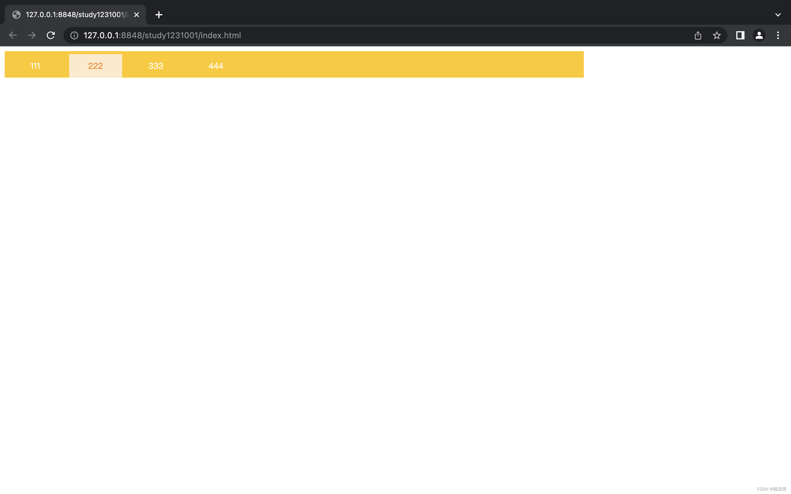
导航条
.nav{
	width: 984px;
	height: 45px;
	background: url(../img/bmg1.png);
}
.nav>a{
	display: inline-block;
	width: 90px;
	height: 40px;
	color: #fff;
	font: 14px/40px "微软雅黑";
	text-decoration: none;
	text-align: center;
	margin-top: 5px;
	margin-left: 7px;
}

a:hover{
	color: #f78102;
	background-color: #ffeac9;
}
<!DOCTYPE html>
<html>
	<head>
		<meta charset="utf-8" />
		<title></title>
		<link rel="stylesheet" href="css/index.css"/>
	</head>
	<body>
		<nav class="nav">
			<a>111</a>
			<a>222</a>
			<a>333</a>
			<a>444</a>
		</nav>
	</body>
</html>
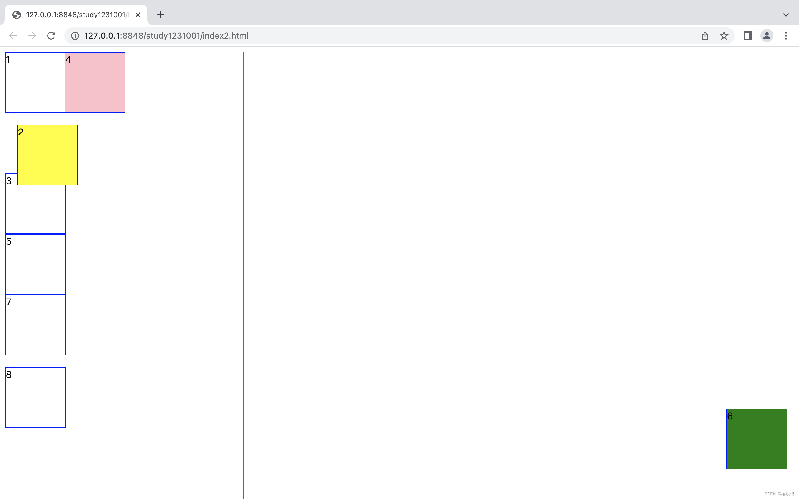
盒子如何定位
.parent{
	width: 400px;
	height: 800px;
	border: 1px solid red;
	position: relative;/*会影响到里层元素的绝对定位*/
}
.parent>div{
	width: 100px;
	height: 100px;
	border: 1px solid blue;
}
div.div2{
	/* 相对定位,相对于自己本来的位置,在文档流中 */
	position: relative;
	top: 20px;
	left: 20px;
	background-color: yellow;
}

div.div4{
	/* 绝对定为,绝对于body,脱离正常文档流。如果外面的盒子做了相对定位,则它绝对于外面的盒子 */
	position: absolute;
	background-color: pink;
	left:100px;
	top:0px;
}

div.div6{
	/*固定定位,脱离文档流,不会随着滚动条滚动*/
	position: fixed;
	bottom: 50px;
	right: 20px;
	background-color: green;
}
div.div7{
	/* 默认定位,等于没有定位,会忽略top right bottom left */
	position: static;
	left: 20px;
	top: 20px;
}
div.div8{
	/* 继承父级元素的定位方式 */
	position: inherit;
	top: 20px;
}
<!DOCTYPE html>
<html>
	<head>
		<meta charset="utf-8">
		<title></title>
		<link rel="stylesheet" href="css/index2.css"/>
	</head>
	<body>
		<div class="parent">
			<div class="div1">1</div>
			<div class="div2">2</div>
			<div class="div3">3</div>
			<div class="div4">4</div>
			<div class="div5">5</div>
			<div class="div6">6</div>
			<div class="div7">7</div>
			<div class="div8">8</div>


		</div>
	</body>
</html>
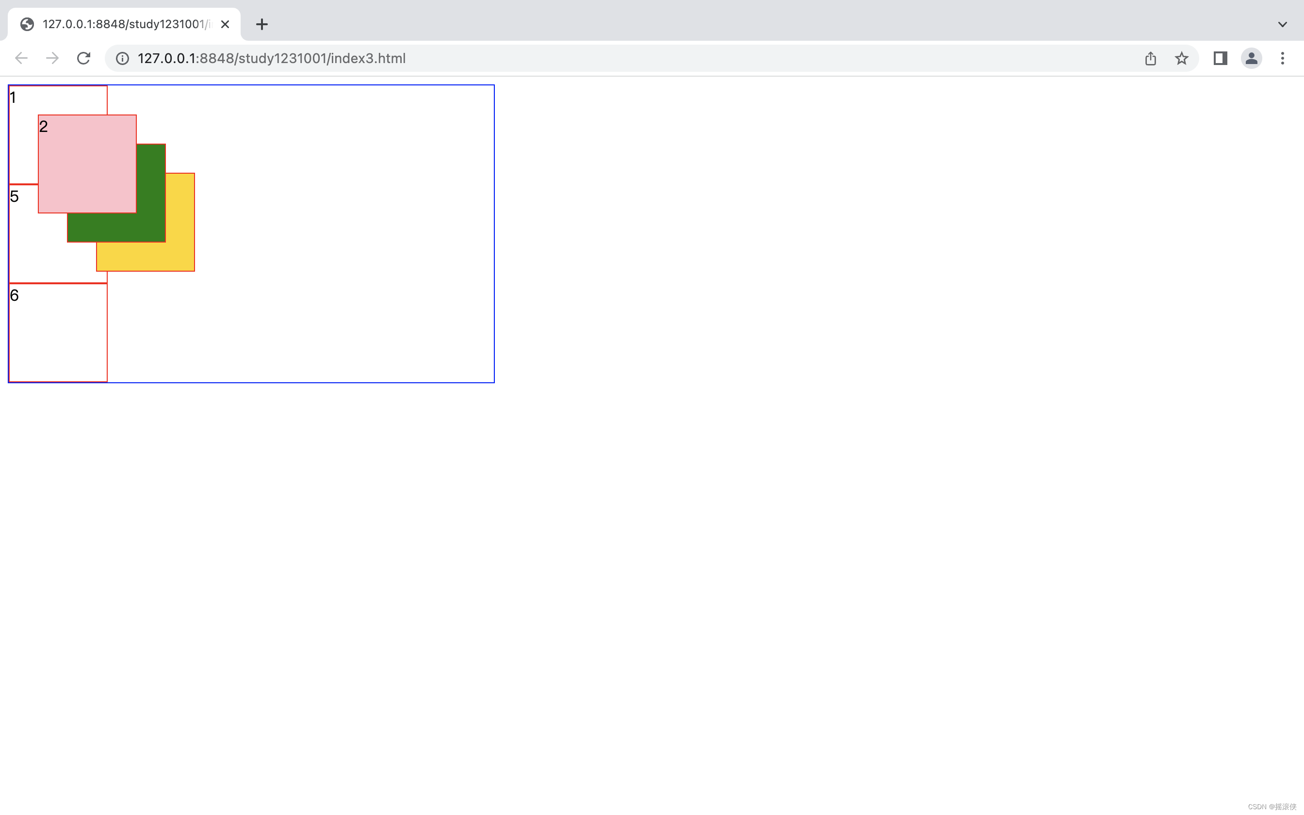
z-index
.parent{
	width: 500px;
	position: relative;
	border: 1px solid blue;
}
.parent>div{
	width: 100px;
	height: 100px;
	border: 1px solid red;
}

.div2{
	position: absolute;
	top: 30px;
	left: 30px;
	background-color: pink;
	z-index: 4 ;
}
.div3 {
	position: absolute;
	top: 60px;
	left: 60px;
	background-color: green;
	z-index: 3;
}

.div4 {
	position: absolute;
	top: 90px;
	left: 90px;
	background-color: gold;
}
.parent>div:hover{
	z-index: 99;
}
<!DOCTYPE html>
<html>
	<head>
		<meta charset="utf-8">
		<title></title>
		<link rel="stylesheet" href="css/index3.css"/>
	</head>
	<body>
		<div class="parent">
			<div class="div1">1</div>
			<div class="div2">2</div>

			<div class="div3">3</div>

			<div class="div4">4</div>

			<div class="div5">5</div>

			<div class="div6">6</div>


		</div>
	</body>
</html>
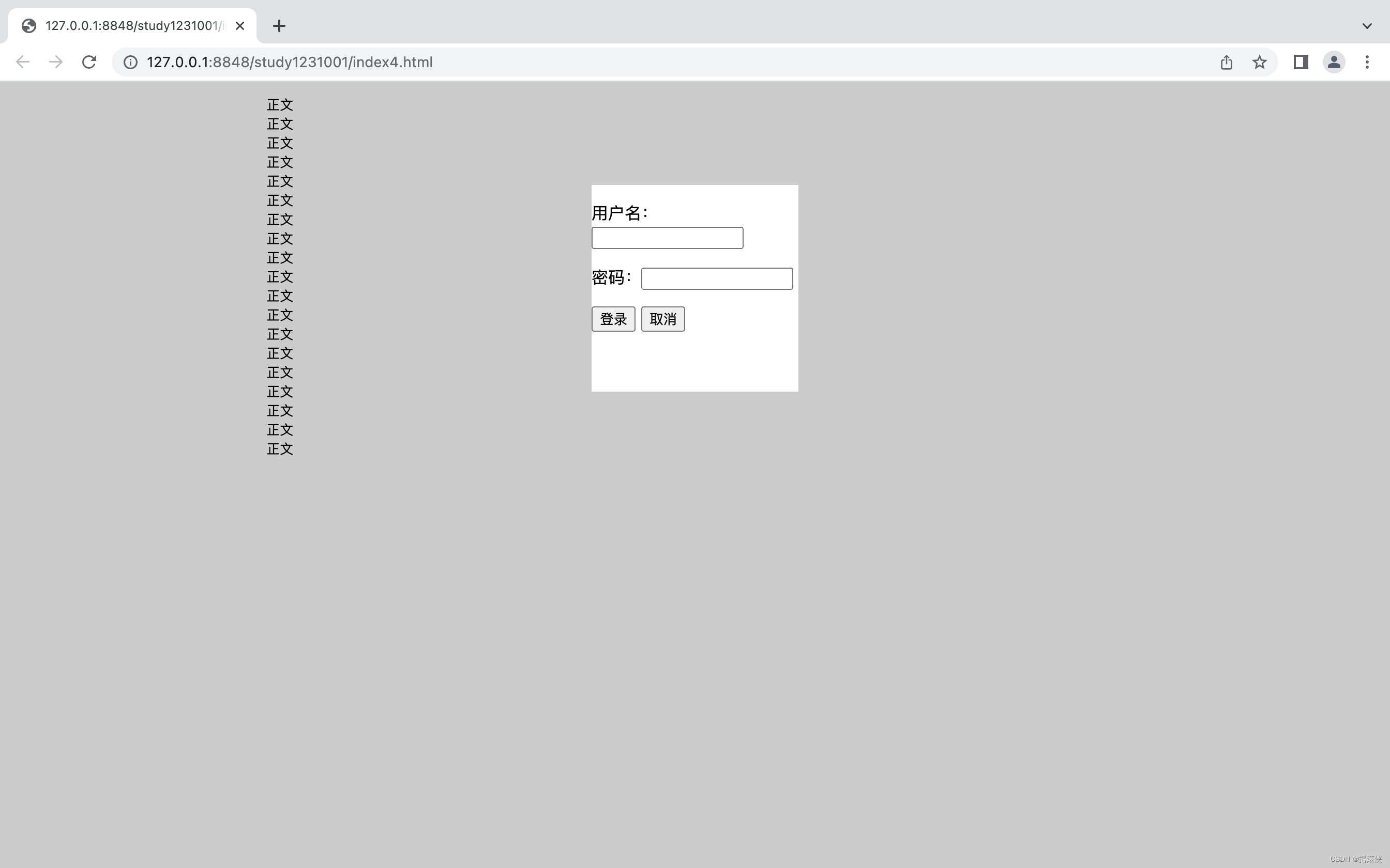
弹出登录窗口效果的实现
.bg{
	position: fixed;
	top: 0;
	left: 0;
	width: 100%;
	height: 100%;
	background-color: rgba(0, 0, 0, 0.2);
}
.login{
	position: fixed;
	width: 200px;
	height: 200px;
	top: 100px;
	left: 50%;
	margin-left: -100px;
	background-color: white;
}
<!DOCTYPE html>
<html>
	<head>
		<meta charset="utf-8">
		<title></title>
		<link rel="stylesheet" href="css/index4.css"/>
	</head>
	<body>
		<div class="bg"></div>
		<div class="login">
			<form action="" method="post">
				<p>用户名:<input type="text"/></p>
				<p>密码:<input type="password"/></p>
				<p>
					<input type="submit" value="登录"/>
					<input type="reset" value="取消"/>
				</p>

			</form>
		</div>
		<div class="content">
			<pre>
				正文
				正文
				正文
				正文
				正文
				正文
				正文
				正文
				正文
				正文
				正文
				正文
				正文
				正文
				正文
				正文
				正文
				正文
				正文


			</pre>
		</div>
	</body>
</html>


 扫一扫
扫一扫


 被折叠的 条评论
为什么被折叠?
被折叠的 条评论
为什么被折叠?
 到【灌水乐园】发言


