


1)按钮的种类
显示加上btn这个类,然后再后面加上按钮的样式的名字。
<!doctype html>
<html lang="en">
<head>
    <meta charset="UTF-8">
    <title>定制风格</title>
    <link rel="stylesheet" href="//netdna.bootstrapcdn.com/bootstrap/3.1.1/css/bootstrap.min.css">
</head>
<body>
   <button class="btn" type="button">基础按钮.btn</button>
   <button class="btn btn-default" type="button">默认按钮.btn-default</button>
   <button class="btn btn-primary" type="button">主要按钮.btn-primary</button>
   <button class="btn btn-success" type="button">成功按钮.btn-success</button>
   <button class="btn btn-info" type="button">信息按钮.btn-info</button>
   <button class="btn btn-warning" type="button">警告按钮.btn-warning</button>
   <button class="btn btn-danger" type="button">危险按钮.btn-danger</button>
   <button class="btn btn-link" type="button">链接按钮.btn-link</button>
</body>
</html>
2)控制按钮大小的类
btn-xs btn-sm btn-lg
块状按钮:
加上类名btn-block”。按钮使用这个类名就可以让按钮充满整个容器,并且这个按钮不会有任何的padding和margin值。在实际当中,常把这种按钮称为块状按钮。
禁用按钮
在Bootstrap框架中,要禁用按钮有两种实现方式:
方法1:在标签中添加disabled属性
方法2:在元素标签中添加类名“disabled”
就是不能让人点击。
3)图像
图像在网页制作中也是常要用到的元素,在Bootstrap框架中对于图像的样式风格提供以下几种风格:
1、img-responsive:响应式图片,主要针对于响应式设计
2、img-rounded:圆角图片
3、img-circle:圆形图片
4、img-thumbnail:缩略图片
使用方法:
使用方法非常简单,只需要在标签上添加对应的类名,如下代码:
<img  alt="140x140" src="http://placehold.it/140x140">
<img  class="img-rounded" alt="140x140" src="http://placehold.it/140x140">
<img  class="img-circle" alt="140x140" src="http://placehold.it/140x140">
<img  class="img-thumbnail" alt="140x140" src="http://placehold.it/140x140">
<img  class="img-responsive" alt="140x140" src="http://placehold.it/140x140">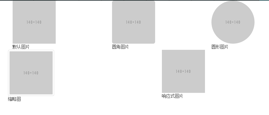
图标(一)
Bootstrap框架中的图标都是字体图标,其实现原理就是通过@font-face属性加载了字体。
自定义完字体之后,需要对icon设置一个默认样式,在Bootstrap框架中是通过给元素添加“glyphicon”类名来实现,然后通过伪元素“:before”的“content”属性调取对应的icon编码:
<!doctype html>
<html lang="en">
<head>
    <meta charset="UTF-8">
    <title>图标</title>
    <link rel="stylesheet" href="//netdna.bootstrapcdn.com/bootstrap/3.1.1/css/bootstrap.min.css">
</head>
<body>
    <span class="glyphicon glyphicon-search"></span>
    <span class="glyphicon glyphicon-asterisk"></span>
    <span class="glyphicon glyphicon-plus"></span>
    <span class="glyphicon glyphicon-cloud"></span>
    </body>
</html>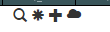
图标的类名的地址请查看:http://getbootstrap.com/components/
先加类名glyphicon,然后再后面加上icon对应的类名,所有icon都是以”glyphicon-”前缀的类名开始


 扫一扫
扫一扫

 被折叠的 条评论
为什么被折叠?
被折叠的 条评论
为什么被折叠?
 到【灌水乐园】发言


