


基于网上各路大神所做的css机器猫的各种基础数据(各部位大小和颜色),自己也做了一个机器猫。这里做个总结和记录,以供参考。
给出效果图:
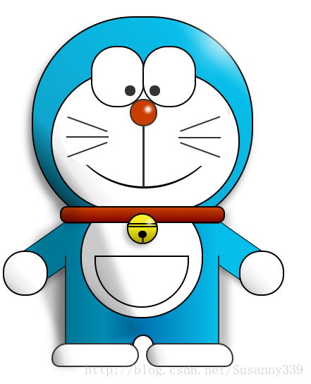
一 分析结构-html
根据原图,将机器猫分为头部/颈部/身体三部分,然后再分解其他部位。
相关HTML代码
如下:
<div id="doraemon">
      <div class="head">
        <div class="eye-left"></div>
        <div class="eye-right"></div>

        <div class="face"></div>
        <div class="nose"> </div>
        <div class="philtrum"></div>
        <div class="mouth"></div>

        <div class="whiskers-top"></div>
        <div class="whiskers-middle"></div>
        <div class="whiskers-bottom"></div>
      </div>

      <div class="choker">
        <div class="belt"></div>
        <div class="bell">
          <div class="bell-line"></div>
          <div class="bell-circle"></div>
        </div>
      </div>

      <div class="body">
        <div class="belly"></div>
        <div class="pocket"></div>

        <div class="arm-left"></div>
        <div class="hand-left"></div>
        <div class="arm-right"></div>
        <div class="hand-right"></div>

        <div class="foot-left"></div>
        <div class="foot-right"></div>
      </div>
二 修改样式-css
【基础部分】
画出各部分的形状和颜色,然后使用绝对定位(absolute)和相对定位(relative)改变其位置。
- 各种带弧度形状,使用border-radius属性实现。
- 倾斜角度,使用transform属性实现。
- 使用background属性的-webkit-gradient() / -moz-linear-gradient() 画出身体部分的线性色彩变化。
【光亮/阴影部分】
- 使用box-shadow属性画出形状自带阴影。
- 使用单个块状元素的阴影画出大块阴影/光亮。
【其他】
- 尽量使用::after伪元素,减少多余代码。
- 使用calc()方法,减少计算量。
- 注意使用了transform倾斜度的元素,其box-shadow以及对应伪元素的形状和方位也是倾斜的。
- 注意各元素之间的层次关系。
相关CSS代码
如下:
 <style>
      *{
   margin: 0;padding: 0;}
      #doraemon{
        position:fixed;
        margin:50px;
        float:left;
        width:500px;
      }
      .head{
        position:relative;
        width:310px;
        height:300px;
        border-radius:146px;
        background:#07beea;
        border: 2px solid;
        box-shadow:-5px 10px 15px rgba(0,0,0,0.45);
        background: -webkit-gradient(linear, right top, left bottom, from(#fff) ,color-stop(0.20, #07beea), color-stop(0.73, #10a6ce),color-stop(0.95, #000), to(#444));
        background: -moz-linear-gradient(right top, #fff,#07beea 20%, #10a6ce 73% ,#000 95% ,#000 155%);
      }
      .head::after{
        content:"";
        width:60px;
        height:60px;
        box-shadow:-60px 60px 60px #fff;
        border-radius:50px;
        position:absolute;
        top:-60px;
        left:300px;
        opacity:0.7;
      }
      .eye-left {
        position: absolute;
        top:calc(25% - 35px);
        width:72px;
        height:83px;
        border-radius:35px;
        border:2px solid #000;
        background-color: #fff;
        z-index: 6;
        left: calc(50% - 73px);
      }
      .eye-left::after {
        content:"";
        width: 15px;
        height: 15px;
        background-color: #333;
        border-radius:10px;
        position: absolute;
        top: calc(25% + 33px);
        left:
最低0.47元/天 解锁文章


 扫一扫
扫一扫
 888
888

 被折叠的 条评论
为什么被折叠?
被折叠的 条评论
为什么被折叠?
 到【灌水乐园】发言


