


 这篇博客介绍了一种利用CSS的`background-clip:text`属性和渐变背景来创建动态镂空字体的方法。通过设置动画使背景颜色渐变并移动,实现了文字的彩色动态效果。代码示例中展示了如何配置CSS样式以达到这一视觉效果。
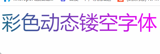
主要属性为 background-clip: text; 字体镂空
配合渐变色在背后移动来实现
具体代码如下
<!DOCTYPE html>
<html lang="en">

<head>
    <meta charset="UTF-8" />
</head>

<body>
    <div class="font">彩色动态镂空字体</div>
</body>
<style>
    .font {
        font-size:50px ;
        color: transparent;
        background: -webkit-linear-gradient(10deg,#7c3226 1%, #e57d6d 25%, #1b6788 50%, #ef00f7 75%, #7c3226 100%);
        background-clip: text;
        -webkit-background-clip: text;
        -webkit-text-fill-color: transparent;
        background-size: auto;
    }
        /* 滚动徐恰到好处,不然会顿一下,建议拉大position距离循环时间延长 */
    @keyframes fontline {
        0% {
            background-position: 0px;
        }

        100% {
            background-position: 2000px;
        }
    }

    .font {
        animation: fontline 10s infinite linear;
        -webkit-animation: fontline 10s infinite linear;
    }
</style>

</html>


 扫一扫
扫一扫


 被折叠的 条评论
为什么被折叠?
被折叠的 条评论
为什么被折叠?
 到【灌水乐园】发言


