


目录
一、CSS引入方式
1.行内式
(1)格式
行内式,通过元素开始标签的style属性引入, 样式语法为 样式名:样式值; 样式名:样式值;
(2)代码
  <input type="button" value="按钮"
     style="
        width: 60px;
        height: 40px;
        background-color: rgb(168, 251, 223);
        color: white;
        font-size: 20px;
        font-family: '楷书';
        border: 5px solid rgb(141, 141, 234);
        border-radius: 5px;
        "
    >
(3)效果图
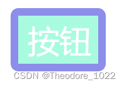
(图1 行内式效果图)
(4)说明
- html代码和css样式代码交织在一起,增加阅读难度和维护成本
- css样式代码仅对当前元素有效,代码重复量高,复用度低
2.内嵌式
(1)代码
<head>
    <meta charset="UTF-8">
    <meta name="viewport" content="width=device-width, initial-scale=1.0">
    <title>Document</title>

    <style>
        /*元素选择器,通过标签名确定样式的作用元素*/
        input {
        width: 60px;
        height: 40px;
        background-color: rgb(168, 251, 223);
        color: rgb(88, 129, 242);
        font-size: 20px;
        font-family: '隶书';
        border: 2px solid rgb(32, 245, 32);
        border-radius: 5px;
        }
    </style>
</head>

<body>
    <input type="button" value="按钮">
    <input type="button" value="按钮">
    <input type="button" value="按钮">
    <input type="button" value="按钮">
    <input type="button" value="按钮">
</body>
(2)效果图
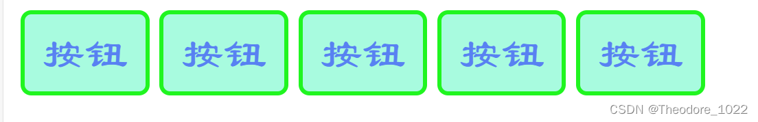
(图2 内嵌式效果图)
(3)说明
- 内嵌式样式需要在head标签中,通过一对style标签定义CSS样式
- CSS样式的作用范围控制要依赖选择器
- CSS的样式代码中注释的方式为 /* */
- 内嵌式虽然对样式代码做了抽取,但是CSS代码仍然在html文件中
- 内嵌样式仅仅能作用于当前文件,代码复用度还是不够,不利于网站风格统一
3.连接式/外部样式表
(1)介绍
- 可以在项目单独创建css样式文件,专门用于存放CSS样式代码
- 在head标签中,通过link标签引入外部CSS样式即可
(2)代码
/*btn.css*/
input {
    width: 60px;
    height: 40px;
    background-color: rgb(168, 251, 223);
    color: rgb(88, 129, 242);
    font-size: 20px;
    font-family: '隶书';
    border: 2px solid rgb(32, 245, 32);
    border-radius: 5px;
    }

/*连接式.html*/
<!DOCTYPE html>
<html lang="en">
<head>
    <meta charset="UTF-8">
    <meta name="viewport" content="width=device-width, initial-scale=1.0">
    <title>Document</title>

    <link href="css/btn.css" rel="stylesheet">
</head>
<body>
    <input type="button" value="按钮">
    <input type="button" value="按钮">
    <input type="button" value="按钮">
    <input type="button" value="按钮">
    <input type="button" value="按钮">
</body>
</html>
(3)效果图
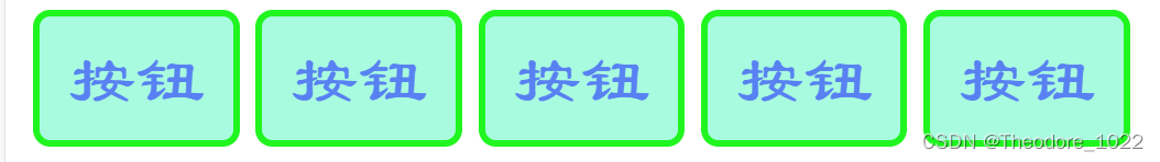
(图3 连接式效果图)
(4)效果图
- CSS样式代码从html文件中剥离,利于代码的维护
- CSS样式文件可以被多个不同的html引入,利于网站风格统一
二、CSS选择器
1.元素选择器
(1)代码
<head>
<meta charset="UTF-8">
<style>
input{
width: 80px;
height: 40px;
background-color: rgb(179, 114, 240);
color: white;
border: 3px solid rgb(49, 228, 241);
font-size: 22px;
font-family: '楷书';
line-height: 30px;
border-radius: 5px;
}
</style>
</head>
<body>
<input id="btn1" type="button" value="按钮">
<input id="btn2" type="button" value="按钮">
<input id="btn3" type="button" value="按钮">
<input id="btn4" type="button" value="按钮">
<button id="btn5">按钮</button>
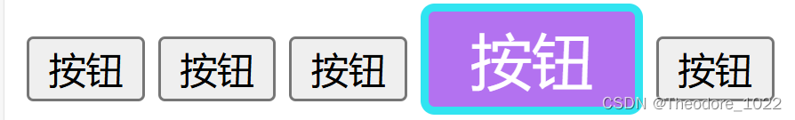
</body>(2)效果图

(图4 元素选择器效果图)
(3)说明
- 根据标签名确定样式的作用范围
- 语法为 元素名 {}
- 样式只能作用到同名标签上,其他标签不可用
- 相同的标签未必需要相同的样式,会造成样式的作用范围太大
2.id选择器
(1)代码
<head>
    <meta charset="UTF-8">
   <style>
        #btn4{
            width: 80px;
            height: 40px;
            background-color: rgb(179, 114, 240);
            color: white;
            border: 3px solid rgb(49, 228, 241);
            font-size: 22px;
            font-family: '楷书';
            line-height: 30px;
            border-radius: 5px;
        }
   </style>
</head>
<body>
    <input id="btn1" type="button" value="按钮">
    <input id="btn2" type="button" value="按钮">
    <input id="btn3" type="button" value="按钮">
    <input id="btn4" type="button" value="按钮">
    <button id="btn5">按钮</button>
</body>
(2)效果图
(图5 id选择器代码图)
(3)说明
- 根据元素id属性的值确定样式的作用范围
- 语法为 #id值 {}
- id属性的值在页面上具有唯一性,所有id选择器也只能影响一个元素的样式
- 因为id属性值不够灵活,所以使用该选择器的情况较少
3.class选择器
(1)代码
<head>
    <meta charset="UTF-8">
   <style>
        .shapeClass{
            width: 80px;
            height: 40px;
            border-radius: 5px;
        }

        .colorClass{
            background-color: rgb(242, 33, 33);
            color: white;
            border: 3px solid rgba(108, 204, 241, 0.359);
        }
        .fontClass{
            font-size: 24px;
            font-family: '楷书';
            line-height: 30px;
        }
   </style>
</head>
<body>
    <input id="btn1" class="shapeClas colorClass fontClass" type="button" value="按钮">
    <input id="btn2" type="button" value="按钮">
    <input id="btn3" type="button" value="按钮">
    <input id="btn4" type="button" value="按钮">
    <button id="btn5">按钮</button>
</body>
(2)效果

(图6 class选择器效果图)
(3)说明
- 根据元素class属性的值确定样式的作用范围
- 语法为 .class值 {}
- class属性值可以有一个,也可以有多个,多个不同的标签也可以是使用相同的class值
- 多个选择器的样式可以在同一个元素上进行叠加
- 因为class选择器非常灵活,所以在CSS中,使用该选择器的情况较多
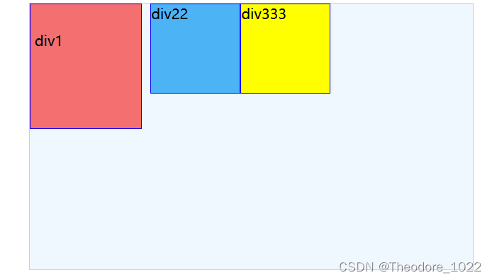
三、CSS浮动
1.介绍
- CSS 的 Float(浮动)使元素脱离文档流,按照指定的方向(左或右发生移动),直到它的外边缘碰到包含框或另一个浮动框的边框为止。
- 浮动设计的初衷为了解决文字环绕图片问题,浮动后一定不会将文字挡住,这是设计初衷。
- 文档流是是文档中可显示对象在排列时所占用的位置/空间,而脱离文档流就是在页面中不占位置了。
2.原理
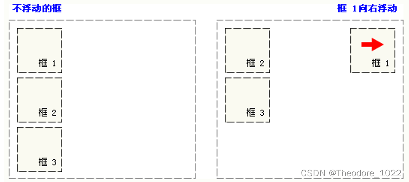
- 当把框 1 向右浮动时,它脱离文档流并且向右移动,直到它的右边缘碰到包含框的右边缘。
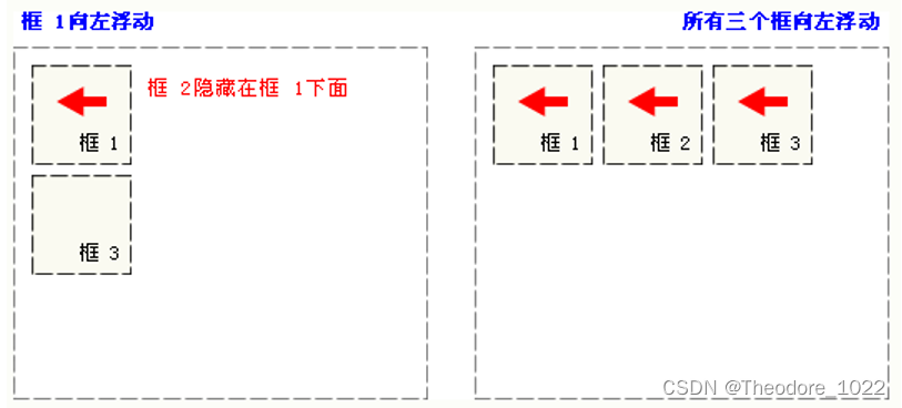
- 当框 1 向左浮动时,它脱离文档流并且向左移动,直到它的左边缘碰到包含框的左边缘。因为它不再处于文档流中,所以它不占据空间,实际上覆盖住了框 2,使框 2 从视图中消失。如果把所有三个框都向左移动,那么框 1 向左浮动直到碰到包含框,另外两个框向左浮动直到碰到前一个浮动框。
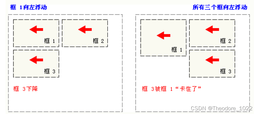
- 如果包含框太窄,无法容纳水平排列的三个浮动元素,那么其它浮动块向下移动,直到有足够的空间。如果浮动元素的高度不同,那么当它们向下移动时可能被其它浮动元素“卡住”。
3.格式
float:方向(可没有)
- 浮动的样式名:float
- left 元素向左浮动。
- right 元素向右浮动。
- null 默认值。元素不浮动,并会显示在其在文本中出现的位置。
4.代码
<!DOCTYPE html>
<html lang="en">
<head>
    <meta charset="UTF-8">
    <meta name="viewport" content="width=device-width, initial-scale=1.0">
    <title>Document</title>
    <style>
        .outerDiv{
            width: 500px;
            height: 300px;
            border:1px solid greenyellow;
            background-color: aliceblue;
        }
        .innerDiv{
            width: 100px;
            height:100px;
            border:1px solid blue;
            /* display: inline; bolck块 inline:行内元素 */
        }
        .d1{
            background-color: rgba(244, 78, 78, 0.807);
            float: right;
        }
        .d2{
            background-color: rgb(76, 179, 244);
            float: right;
        }
        .d3{
            background-color: yellow;
            float: right;
        }
    </style>
</head>
<body>
    <div class="outerDiv">
        <div class="innerDiv d1">div1</div>
        <div class="innerDiv d2">div22</div>
        <div class="innerDiv d3">div333</div>
    </div>
</body>
</html>
5.效果图
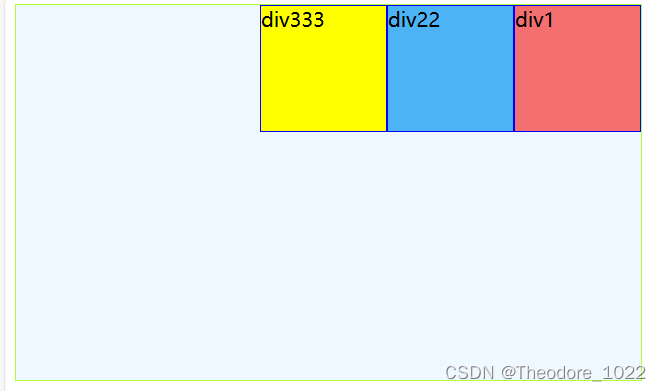
(图7 浮动效果图)
四、CSS定位
1.介绍
- position 属性指定了元素的定位类型。
- 这个属性定义建立元素布局所用的定位机制。任何元素都可以定位,不过绝对或固定元素会生成一个块级框,而不论该元素本身是什么类型。相对定位元素会相对于它在正常流中的默认位置偏移。
- 元素可以使用的顶部,底部,左侧和右侧属性定位。然而,这些属性无法工作,除非是先设定position属性。他们也有不同的工作方式,这取决于定位方法。
- absolute 生成绝对定位的元素,相对于static定位以外的第一个交元素进行定位。 元素的位置通过"eft", "top","right"以及"bottom"属性进行规定。
- fixed 生成绝对定位的元素,相对于浏览器窗口进行定位。 元素的位置通过"eft","top","right"以及"bottom"属性进行规定。
- relative 生成相对定位的元素,相对于其正常位置进行定位。 因此,"left:20"会向元素的LEFT位置添加20像素。
- static 默认值。没有定位,元素出现在正常的流中(忽略top, bottom,left,right或者z-index声明).
2.static静态定位
(1)代码
/*
position:
    static 默认
    absolute 绝对,根据页面边缘移动
    relative 相对,根据元素原本的位置移动
    fixed 相对,相对浏览器窗口的位置
left
right
top
bottom
*/

<!DOCTYPE html>
<html lang="en">
<head>
    <meta charset="UTF-8">
    <meta name="viewport" content="width=device-width, initial-scale=1.0">
    <title>Document</title>
    <style>
        .innerDiv{
            width: 100px;
            height:100px;
            border:1px solid blue;
            /* display: inline; bolck块 inline:行内元素 */
        }
        .d1{
            background-color: rgba(244, 78, 78, 0.807);
            position:static;
            top:30px;
            left: 30px;

        }
        .d2{
            background-color: rgb(76, 179, 244);

        }
        .d3{
            background-color: yellow;

        }

    </style>
</head>
<body>
        <div class="innerDiv d1">div1</div>
        <div class="innerDiv d2">div22</div>
        <div class="innerDiv d3">div333</div>
</body>
</html>
(2)效果图
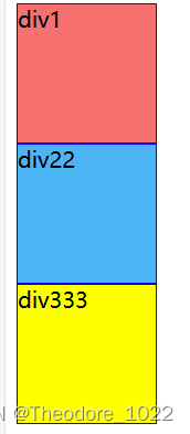
(图8 static定位效果图)
(3)说明
- 不设置的时候的默认值就是static,静态定位,没有定位,元素出现在该出现的位置,块级元素垂直排列,行内元素水平排列
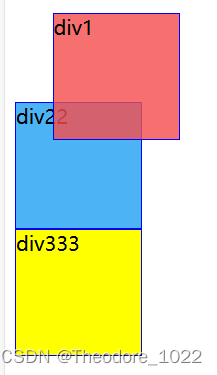
3.absolute绝对定位
(1)代码
position:absolute;
/*其余同上*/
(2)效果图

(图9 absolute定位效果图)
(3)说明
- absolute ,通过 top left right bottom 指定元素在页面上的固定位置
- 定位后元素会让出原来位置,其他元素可以占用
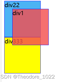
4.relative相对定位
(1)代码
position:relative;
/*其余同上*/
(2)效果图
(图9 relative定位效果图)
(3)说明
- relative 相对于自己原来的位置进行地位
- 定位后保留原来的站位,其他元素不会移动到该位置
5.fixed固定定位
(1)代码
position: fixed;
/*其余同上*/
(2)效果图
(图11 fixed定位效果图)
(3)说明
- fixed 失踪在浏览器窗口固定位置,不会随着页面的上下移动而移动
- 元素定位后会让出原来的位置,其他元素可以占用
五、CSS盒子模型
1.介绍
- 所有HTML元素可以看作盒子,在CSS中,"box model"这一术语是用来设计和布局时使用。
- CSS盒模型本质上是一个盒子,封装周围的HTML元素,它包括:边距(margin),边框(border),填充(padding),和实际内容(content)
- Margin(外边距) - 清除边框外的区域,外边距是透明的。
- Border(边框) - 围绕在内边距和内容外的边框。
- Padding(内边距) - 清除内容周围的区域,内边距是透明的。
- Content(内容) - 盒子的内容,显示文本和图像。
2.代码
<!DOCTYPE html>
<html lang="en">
<head>
    <meta charset="UTF-8">
    <meta name="viewport" content="width=device-width, initial-scale=1.0">
    <title>Document</title>
    <style>
        .outerDiv{
            width: 500px;
            height: 300px;
            border:1px solid greenyellow;
            background-color: aliceblue;
            margin: 0px auto;
        }
        .innerDiv{
            width: 100px;
            height:100px;
            border:1px solid blue;
            /* display: inline; bolck块 inline:行内元素 */
            float: left;
        }
        /*
        padding
        margin 外边距

        */

        .d1{
            background-color: rgba(244, 78, 78, 0.807);
            /* margin-right: 10px;
            margin-top: 10px;
            margin-left: 10px;
            padding-left: 20px;
            padding-right: 20px;
            padding-top: 20px;
            padding-bottom: 20px; */
            /* margin: 10px 20px 30px 40px; 顺时针:上右下左*/
            padding: 30px 20px 10px 5px;


        }
        .d2{
            background-color: rgb(76, 179, 244);
            margin-left: 10px;
        }
        .d3{
            background-color: yellow;
        }
    </style>
</head>
<body>
    <div class="outerDiv">
        <div class="innerDiv d1">div1</div>
        <div class="innerDiv d2">div22</div>
        <div class="innerDiv d3">div333</div>
    </div>
</body>
</html>
3.效果图
(图12 盒子模型效果图)
总结
本篇为大家介绍了JavaWeb中有关CSS的基础知识,便于调用和复习。部分内容源于网络,如有侵权,请联系作者删除,谢谢!


 551
551

 被折叠的 条评论
为什么被折叠?
被折叠的 条评论
为什么被折叠?
 到【灌水乐园】发言


