


内容循环,标题固定,通过滑动scroll方法动态获取滑动的像素,然后给title动态添加偏移px
html
<div class="box-background">
<div class="box-side" ref="boxSide"> 侧边title
<div v-for="(item, index) in QueryTomb" :key="index">{{ item.Name }}</div>
</div>
<div class="box-title" ref="boxTitle"> 顶部title
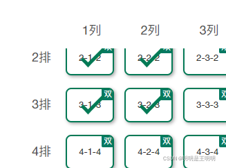
<div v-for="(item, index) in QueryTomb[0].Tombs" :key="index">{{ index + 1 }}列</div>
</div>
<div class="block"></div> 左上角留白 用div块盖起来
<div class="box" @scroll="boxScroll"> 滑动方法
<el-checkbox-group v-model="checkList"> 实现多选
<div style="display: flex" v-for="(item, index) in QueryTomb" :key="`a${index}`"> active点击选中样式
<div
:class="[
'box-item',
'status' + items.Status,
activeId[0] == item.Id && activeId[1] == items.Id ? 'active' : ''
]"
v-for="(items, indexs) in item.Tombs"
:key="`b${indexs}`"
@click="active(item.Id, items)"
>
<p>{{ item.Row }}-{{ items.Columns }}-{{item.Row}}</p>
<span v-if="items.Points == 2" class="tomb-num">双</span>
<el-checkbox v-if="isAllEdit" :label="items.Id"></el-checkbox> 实现多选
</div>
</div>
</el-checkbox-group>
</div>
</div>
js
 data() {
    return {
      checkList: [], // 批量修改的多选项
      activeId: [], // 选中的
      styleList: ['status0', 'status1', 'status6', 'status7', 'status4', 'status5'],
      isAllEdit: false // 是否批量操作
    }
  },
   methods: {
 boxScroll(e) { //动态设置偏移
      this.$refs.boxSide.style.top = '-' + e.target.scrollTop + 'px'
      this.$refs.boxTitle.style.left = '-' + e.target.scrollLeft + 'px'
    },
    allEdit() {  //批量选择 多选
      this.activeId = []
      this.checkList = []
      this.isAllEdit = true
    },

}
css
.box-background {
  display: flex;
  overflow: hidden;
  height: 600px;
  position: relative;
  .block {
    position: absolute;
    width: 55px;
    height: 50px;
    background-color: #fff;
    top: 0;
    left: 0;
  }
}

.box {
  margin: 50px 0 0px 50px;
  width: 100%;
  height: calc(100% - 50px);
  overflow: auto;
  padding-top: 5px;
}

.box-item:hover {
  cursor: pointer;
}

.box-item {
  margin: 0 0 18px 15px;
  flex: 0 0 70px;
  height: 50px;
  display: flex;
  align-items: center;
  word-break: break-all;
  word-wrap: break-word;
  justify-content: center;
  font-size: 13px;
  letter-spacing: normal;
  color: #333333;
  box-shadow: 2px 2px 5px rgba(0, 0, 0, 0.35);
  box-sizing: border-box;
  border-radius: 8px;
  position: relative;
  overflow: hidden;
  span {
    display: block;
    width: 100%;
    text-align: center;
  }
  .tomb-num {
    position: absolute;
    top: -2px;
    right: -2px;
    display: inline-block;
    width: 18px;
    font-size: 8px;
    height: 18px;
    border-radius: 2px;
    background: #077962;
    color: #fff;
  }
  /deep/ .el-checkbox {
    position: absolute;
    top: 0;
    left: 0;
    .el-checkbox__label {
      display: none;
    }
    .el-checkbox__input.is-checked .el-checkbox__inner,
    .el-checkbox__input.is-indeterminate .el-checkbox__inner {
      background-color: transparent;
    }
    .el-checkbox__inner {
      width: 60px;
      height: 50px;
      background-color: transparent;
      border: none;
      &::after {
        border-width: 5px;
        height: 30px;
        left: 30px;
        top: 0x;
        width: 10px;
        border-color: rgba(4, 122, 86, 1);
      }
    }
  }
}

.active {
  position: relative;
  box-shadow: 0px 5px 15px rgba(39, 28, 28, 0.6);
  top: -3px;
}
.box-item.active {
  border: 3px solid #047a56;
}
.box-side {
  position: absolute;
  margin-top: 10px;
  left: 0;
  top: 0;
  padding-top: 45px;
  div {
    width: 60px;
    height: 68px;
    text-align: center;
    font-weight: 400;
    font-style: normal;
    font-size: 18px;
    color: #555555;
    line-height: 48px;
  }
}

.box-title {
  position: absolute;
  white-space: nowrap;
  left: 0;
  padding-left: 60px;
  div {
    width: 85px;
    text-align: center;
    font-weight: 400;
    font-style: normal;
    font-size: 18px;
    color: #555555;
    line-height: 48px;
    display: inline-block;
  }
}
效果图


 6240
6240


 被折叠的 条评论
为什么被折叠?
被折叠的 条评论
为什么被折叠?
 到【灌水乐园】发言


