


5.1盒模型的定义
盒模型是CSS中一个非常重要的概念,它定义了一个HTML元素在页面中所占据的空间。 盒模型决定了元素的尺寸、边距和边框的大小,以及元素的内部内容的布局。
它由四个部分组成:内容区域、内边距、边框和外边距,这四个部分相互嵌套,形成了一个矩形的盒子,用来包裹HTML元素。
5.2 CSS元素的高度和宽度
<!DOCTYPE html>
<html>
	<head>
		<meta charset="utf-8">
		<title>示例5.1</title>
		<style type="text/css">
			*{
				margin: 0;
				padding: 0;
			}
			div{
				width: 100px;
				border: 10px solid red;
				padding: 30px;
				margin: 10px;
				float: left;
			}
			img{
				width: 100px;
			}
		</style>
	</head>
	<body>
		<h1>盒模型示例</h1>
		<p>CSS盒模型本质上是一个盒子,外边距是10px;内边距30px;边框10px的红色实线;盒子左浮动在同一行处。</p>
		<div><img src="../img/flower.jpg"/></div>
		<div><img src="../img/flower.jpg"/></div>
	</body>
</html>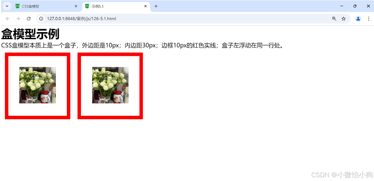
5.2.1 盒模型的宽度
盒模型的宽度计算涉及多个组成部分,包括内容宽度、内边距、边框和外边距。 盒模型的宽度计算可以通过以下公式得出:盒子的总宽度 = 内容宽度 + 左右内边距 + 左右边框。
盒模型的宽度计算还包括外边距,但外边距并不包含在盒模型的计算之内。外边距是指盒子与其他元素之间的空间,它不影响盒子的实际尺寸,但会影响盒子与其他元素的间距。
盒模型的宽度计算是一个综合了内容宽度、内边距、边框和外边距的考量,具体采用哪种计算方式(content-box或border-box)会影响到最终盒子的显示效果。
5.1.2 盒模型的高度
<!DOCTYPE html>
<html>
	<head>
		<meta charset="utf-8">
		<title>示例5.2</title>

		<style type="text/css">
			.ap{
				width: 200px;
				height: 100px;
				border: 2px solid red;
				margin: 10px;
				background-color: lightblue;
			}
		</style>
	</head>
	<body>
		<div class="ap">这是div块级元素,可设置高度和宽度</div>
		<span class="ap">这是span行集元素,不能设置宽度和高度</span>
	</body>
</html>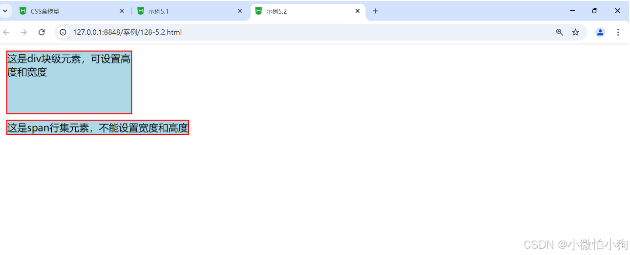
5.3 边距设置和边框设置
5.3.1 外边距设置
在CSS中,外边距(margin)是元素边界外与其他元素边界之间的空间。可以使用margin属性来设置元素的外边距。
margin属性可以有以下几种设置方法:
-
使用margin的四个值:
margin: top right bottom left; -
使用margin的三个值:
margin: top left/right bottom; -
使用margin的两个值:
margin: top/bottom left/right; -
使用margin的一个值:
margin: all;所有四个方向的外边距都会设置为这个值。
5.3.1.1 上外边距
CSS中的margin属性用于控制元素的外边距。margin-top属性用于设置元素的上外边距。
.element {
  margin-top: 10px; /* 设置上外边距为10px */
}
5.3.1.2 右外边距
使用margin属性的简写形式分别设置上下左右外边距,并且允许其中某个值为auto
.element {
  margin: 10px 0 auto; /* 上外边距设置为10px,下外边距设置为0,左右外边距自动调整 */
}
5.3.1.3 下外边距
使用margin属性的简写形式只设置上外边距
.element {
  margin: 10px 0; /* 上外边距设置为10px,下外边距设置为0 */
}
5.3.1.4 左外边距
<!DOCTYPE html>
<html>
	<head>
		<meta charset="utf-8">
		<title>示例5.3</title>
		<style type="text/css">
			#big{
				width: 450px;
				height: 200px;
				margin: 0;
				background-color: #fff;
			}
			#small1,#small2,#small3,#small4{
				width: 200px;
				height: 50px;
				text-align: center;
				background-color: #0FF;
			}
			#small1{
				margin-left: 20px;
				margin-left: 30px;
			}
			#small2{
				margin-right: 20px;
				margin-top: 10px;
				float: right;
			}
			#small3{
				margin-bottom: 5px;
			}
			#small4{
				margin-left: 10px;
				margin-top: 15px;
			}
		</style>
	</head>
	<body>
		<div id="big">
		<div id="small1">A:左外边距20像素,下外边距30像素</div>
		<div id="small2">B:右外边距20像素,上外边距10像素,右浮动</div>
		<div id="small3">C:下外边距5像素</div>
		<div id="small4">D:左外边距10像素,上外边距15像素</div>
		</div>
	</body>
</html>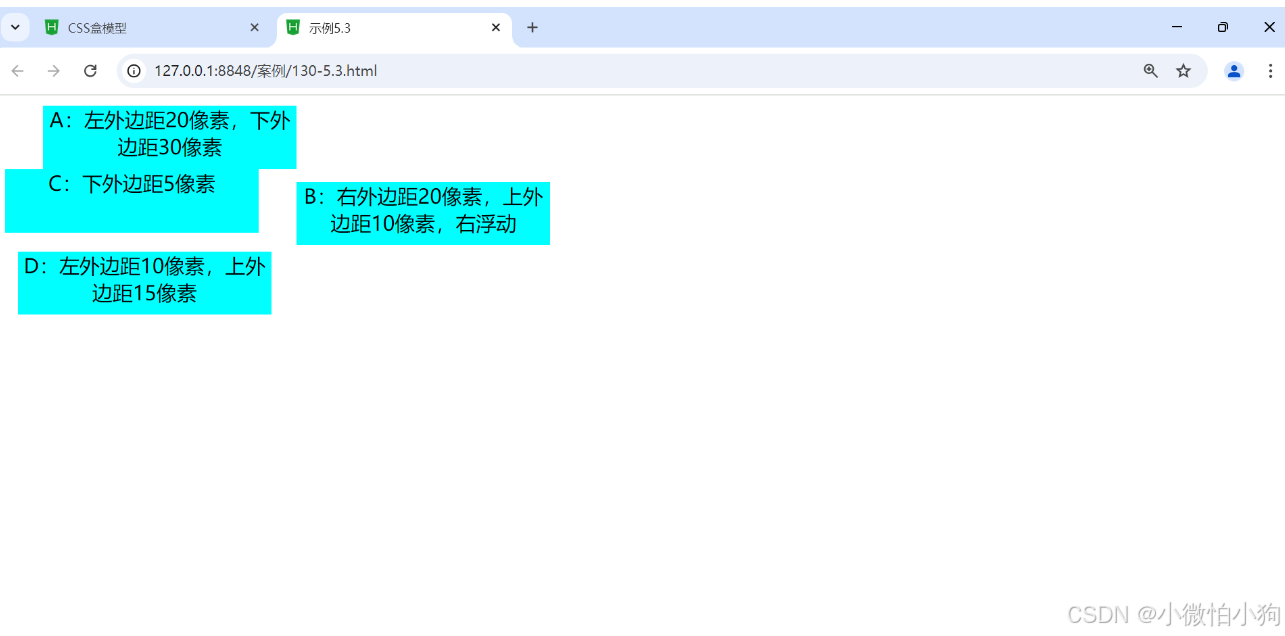
5.3.1.5 外边距
<!DOCTYPE html>
<html>
	<head>
		<meta charset="utf-8">
		<title>示例5.4</title>
		<style type="text/css">
			div{border: solid #0000ff 1px;
			width: auto;
			margin: 5px;
			float: left;
			}
			.margin1{
				background-color: #9f6;
				border: none;
				width: 200px;
				height: 80px;
				margin: 0px 15px 5px 30px;
			}
			.margin2{
				background-color: yellow;
				border: none;
				width: 200px;
				height: 80px;
				margin: 5px  30px 15px;
			}
			.margin3{
				background-color: lightgreen;
				border: none;
				width: 200px;
				height: 80px;
				margin:10px 30px;
			}
			.margin4{
				background-color: #fc0;
				border: none;
				width: 200px;
				height: 80px;
				margin: 15px;
			}
		</style>
	</head>
	<body>
		<div>
			<div class="margin1">上、右、下、左外边距分别为:0px、15px、5px、30px</div>
		</div>
		<div>
			<div class="margin2">上外边距为:5px,下外边距为:15px,左右外边距为:30px</div>
		</div>
		<div>
			<div class="margin3">上、下外边距为10px,左、右外边距为30px</div>
		</div>
		<div>
			<div class="margin4">上、下、左、右外边距为15px</div>
		</div>
	</body>
</html>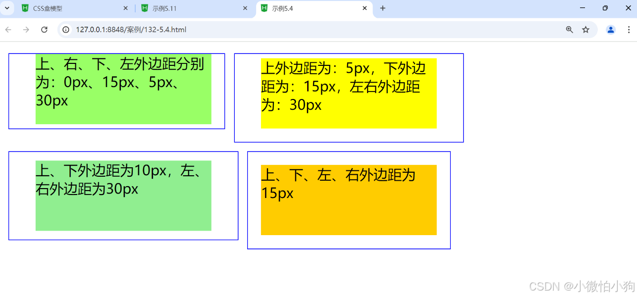
5.3.2 外边距的合并
5.3.2.1 行级元素外边距合并
<!DOCTYPE html>
<html>
	<head>
		<meta charset="utf-8">
		<title>示例5.5</title>
		<style type="text/css">
			*{
				margin: 50px;
			}
			.hb1{
				background-color: yellow;
				margin-right: 20px;
				padding: 30px;
			}
			.hb2{
				background-color: lightpink;
				margin-left: 30px;
				padding: 30px;
			}
		</style>
	</head>
	<body>
		<span class="hb1">黄色span</span><span class="hb2">粉红色span</span>
	</body>
</html>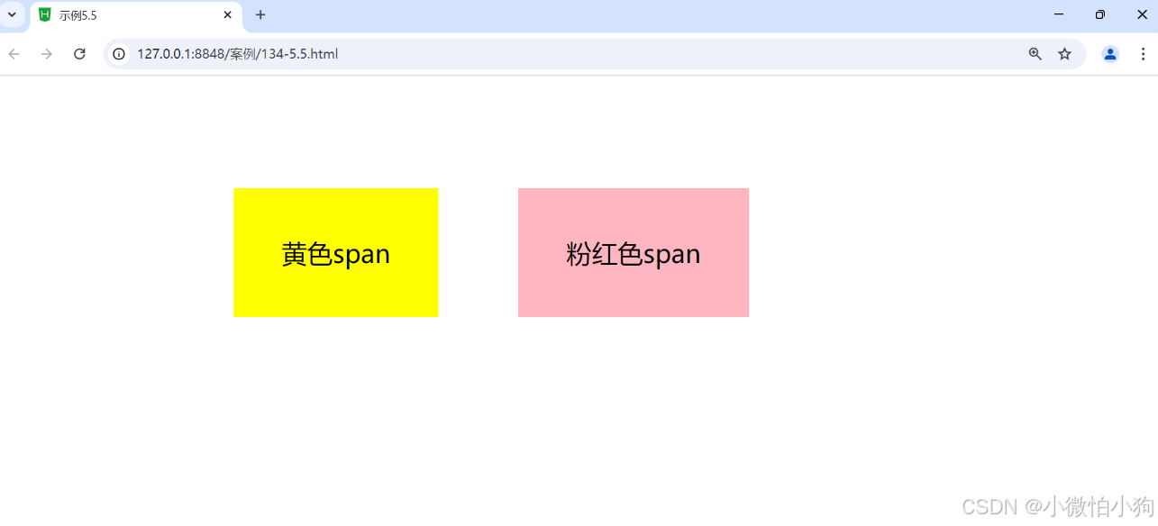
5.3.2.2 块级元素外边距合并
<!DOCTYPE html>
<html>
	<head>
		<meta charset="utf-8">
		<title>示例5.6</title>
		<style type="text/css">
			*{
				margin: 50px;
			}
			.div1{
				background-color: yellow;
				margin-bottom: 30px;
				padding: 30px;
			}
			.div2{
				background-color: lightpink;
				margin-top: 30px;
				padding: 30px;
			}
		</style>
	</head>
	<body>
		<div class="div1">黄色div</div>
		<div class="div2">粉红色div</div>
	</body>
</html>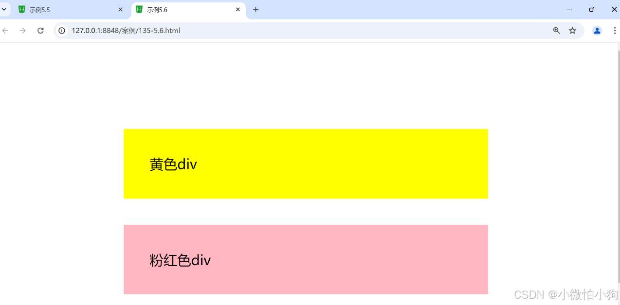
5.3.3 内边距设置
<!DOCTYPE html>
<html>
	<head>
		<meta charset="utf-8">
		<title>示例5.7</title>
		<style type="text/css">
			span{
				background-color: #ffff99;
			}
			div{
				width: auto;
				height: auto;
				margin: 15px;
				float: left;
			}
			.padding1{
				padding-top: 30px;
				padding-left: 15px;
			}
			.padding2{
				padding-bottom: 30px;
				padding-right: 30px;
			}
			.padding3{
				padding: 5px 30px;
			}
			.padding4{
				padding: 20px;
			}
		</style>
	</head>
	<body>
		<div class="padding1">
			<span>文字元素的上内边距为30px,左内边距为15px</span>
		</div>
		<div class="padding2">
			<span>文字元素的下内边距为30px,右内边距为30px</span>
		</div>
		<div class="padding3">
			<span>文字元素的上、下内边距为5px,左、右内边距为30px</span>
		</div>
		<div class="padding4">
			<span>文字元素的上、右、下、左内边距均为20px</span>
		</div>
	</body>
</html>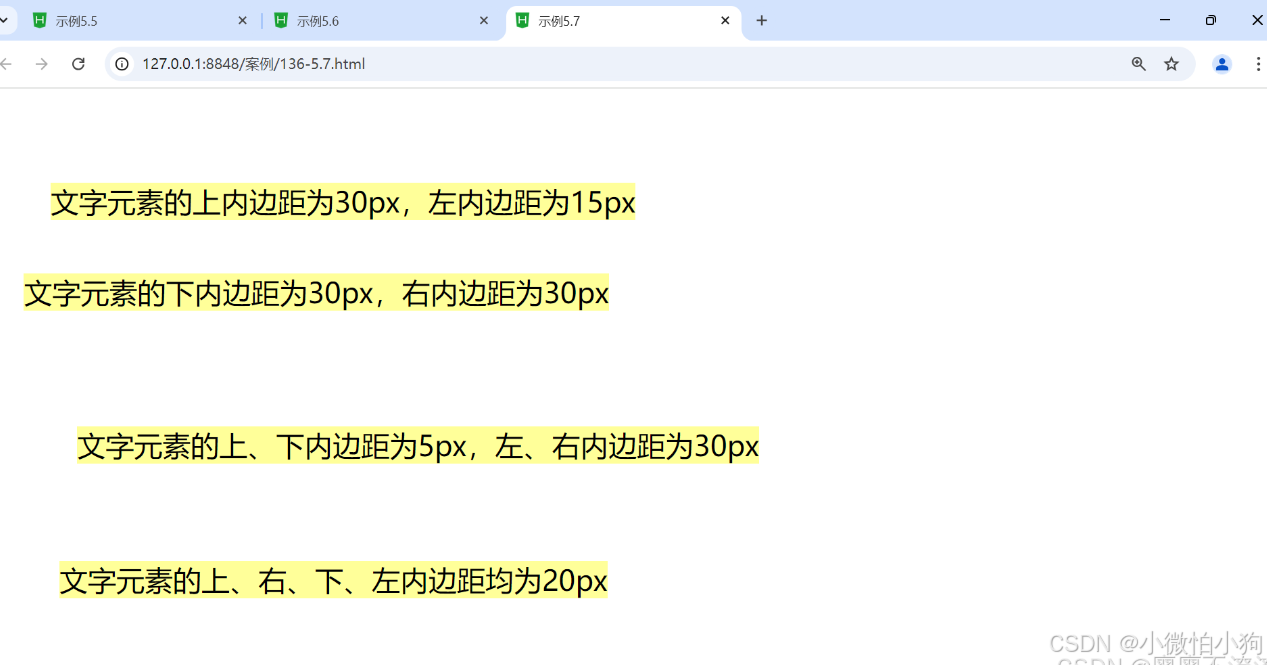
5.3.4 边框设置
元素外边距内就是元素的边框(border),它是围绕内边距和元素内容的一条或多条线在内边距和外边距之间。边框的四条边分别用border-top、border-right、border-bottomborder-left表示,它们的属性与内外边距的属性也是类似的,既可以使用复合属性,也可以使用单边属性。
边框作为盒模型的某个组成部分,边框的CSS样式设置将直接影响到盒子的尺寸和外观。而通过使用border属性,可以创建出更佳的边框效果,还可以应用于任何元素。bonde属性设置通常有3种:样式(border-style)、宽度(border-width)和颜色(border-color)。
5.3.4.1上边框
要在CSS中创建上边框,您可以使用border-top属性。这个属性可以设置边框的宽度、样式和颜色。
.element {
  border-top: 1px solid red;
}
5.3.4.2右边框
要在CSS中设置元素的右边框,可以使用 border-right 属性。这个属性可以设置边框的宽度、样式和颜色。
.element {
  border-right: 1px solid red;
}
5.3.4.3下边框
要在CSS中添加下边框,您可以使用 border-bottom 属性
p {
  border-bottom: 1px solid black;
}
5.3.4.4 左边框
要在CSS中为元素添加左边框,可以使用border-left属性。以下是一个简单的例子,演示如何为一个<div>元素添加左边框:
.div-with-left-border {
  border-left: 2px solid blue; /* 左边框宽度为2px,样式为实线,颜色为蓝色 */
}
5.3.4.5 边框样式
<!DOCTYPE html>
<html>
	<head>
		<meta charset="utf-8" />
		<title>CSS盒模型</title>
			<style>
				*{
					margin: 0px;
					padding: 0px;
				}
				img{
					width: 80px;
					height: 80px;
				}
				div{
					width: 80px;
					height: 80px;
					border: 20px #ff0000 solid;
					margin: 30px;
					display: block;
					padding: 30px;
					border-top:  10px #ff0000 solid;
					border-bottom: thick  #00ff00 double ;
					border-left: medium #ff00ff dotted;
					border-right: thin #cb00ff dashed;

				}
			</style>
	</head>
	<body>
		<div><img src="img/flower.jpg"/></div>
		<div><img src="img/flower.jpg"/></div>
	</body>
</html>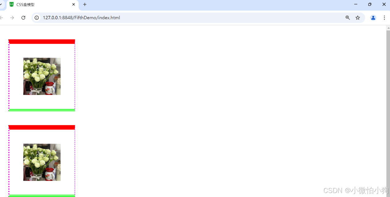
5.3.4.6 边框宽度
<!DOCTYPE html>
<html>
	<head>
		<meta charset="utf-8" />
		<title>CSS盒模型</title>
			<style>
				*{
					margin: 0px;
					padding: 0px;
				}
				img{
					width: 80px;
					height: 80px;
				}
				div{
					width: 80px;
					height: 80px;
					border: 20px #ff0000 solid;
					margin: 30px;
					display: block;
					padding: 30px;
					border-top:  10px #ff0000 solid;
					border-bottom: thick  #00ff00 double ;
					border-left: medium #ff00ff dotted;
					border-right: thin #cb00ff dashed;

				}
			</style>
	</head>
	<body>
		<div><img src="img/flower.jpg"/></div>
		<div><img src="img/flower.jpg"/></div>
	</body>
</html>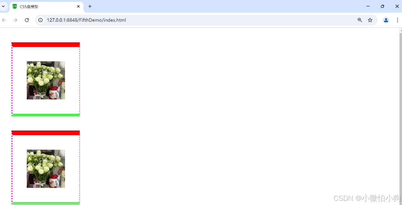
5.3.4.7 边框颜色
<!DOCTYPE html>
<html>
	<head>
		<meta charset="utf-8">
		<title>示例5.8</title>
		<style type="text/css">
			h2{
				text-align: center;
				border-bottom: dashed 5px red;
			}
			p{
				font-family: "楷体";
				border-top: solid thin purple;
				border-right: dashed 5px #99ff66;
				border-bottom: double thick purple;
				border-left: dashed 5px #ff9999;
			}
			div{
				border-style: solid dashed double;
				border-width: 10px;
				border-color: deepskyblue;
			}
		</style>
	</head>
	<body>
		<h2>边框的实现</h2>
		<p>这个页面主要显示边框的不同样式、宽度和颜色。以实现对象的美观化。</p>
		<div>1.h2处所用边框CSS是5像素红色虚线的下边框;<br/>
		2.p处所用边框CSS是细的紫色实线上边框、5像素水绿色虚线右边框、粗的紫色双实线下边框、5像素粉红色虚线左边框;<br/>
		3.div处所用边框CSS是10像素蓝色实线、虚线、双实线。
		</div>
	</body>
</html>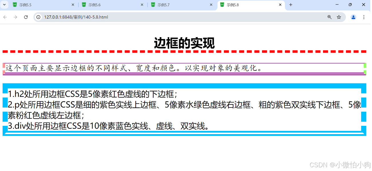
5.3.5 新增边框属性
单独设置各边的边框
可以分别为元素的四条边设置不同的边框属性:
bordertop
borderright
borderbottom
borderleft
/ 设置上边框为红色实线,宽度为3px /

bordertop: 3px solid red;


/ 为四条边设置不同的颜色 /

bordertopcolor: red;

borderrightcolor: blue;

borderbottomcolor: green;

borderleftcolor: yellow;
5.3.5.1圆角边框
<!DOCTYPE html>
<html>
	<head>
		<meta charset="utf-8" />
		<title>CSS盒模型</title>
			<style>
				*{
					margin: 0px;
					padding: 0px;
				}
				img{
					width: 80px;
					height: 80px;
				}
				div{
					width: 80px;
					height: 80px;
					border: 20px #ff0000 solid;
					margin: 30px;
					display: block;
					padding: 30px;
					border-top:  10px #ff0000 solid;
					border-bottom: thick  #00ff00 double ;
					border-left: medium #ff00ff dotted;
					border-right: thin #cb00ff dashed;
					border-radius: 100px;
				}
			</style>
	</head>
	<body>
		<div><img src="img/flower.jpg"/></div>
		<div><img src="img/flower.jpg"/></div>
	</body>
</html>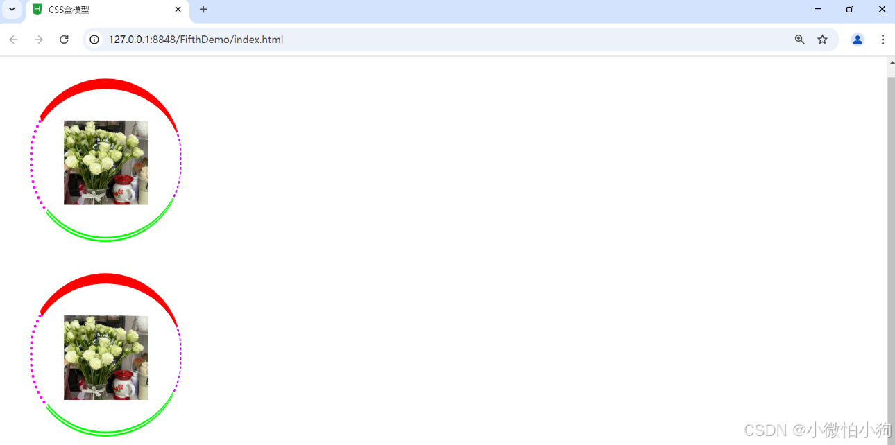
5.3.5.2阴影边框
<!DOCTYPE html>
<html>
	<head>
		<meta charset="utf-8" />
		<title>CSS盒模型</title>
			<style>
				*{
					margin: 0px;
					padding: 0px;
				}
				img{
					width: 80px;
					height: 80px;
				}
				div{
					width: 80px;
					height: 80px;
					border: 20px #ff0000 solid;
					margin: 30px;
					display: block;
					padding: 30px;
					border-top:  10px #ff0000 solid;
					border-bottom: thick  #00ff00 double ;
					border-left: medium #ff00ff dotted;
					border-right: thin #cb00ff dashed;
					border-radius: 100px;
					box-shadow: -20px 10px 20px #cb00ff;
				}
			</style>
	</head>
	<body>
		<div><img src="img/flower.jpg"/></div>
		<div><img src="img/flower.jpg"/></div>
	</body>
</html>
5.3.5.3图片绘制边框
<!DOCTYPE html>
<html>
	<head>
		<meta charset="utf-8">
		<title>示例5.11</title>
		<style type="text/css">
			div{
				margin: 100px;
				border: 50px solid blue;
				border-image: url(img/border.jpg)5 10 round;
			}
		</style>
	</head>
	<body>
		<div>利用border-image属性设置图片边框铺满效果。上下内偏移5像素,左右内偏移10像素。</div>
	</body>
</html>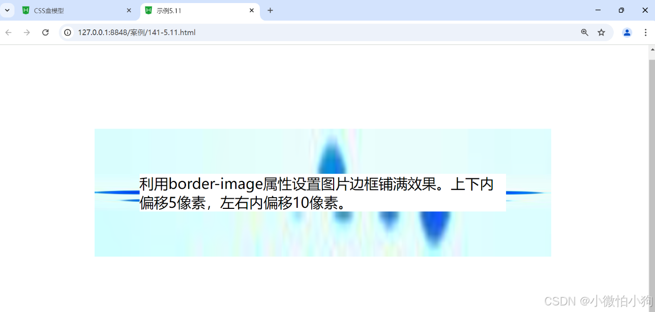
5.4 CSS元素的定位
<!DOCTYPE html>
<html>
	<head>
		<meta charset="utf-8">
		<title>示例5.12</title>
		<style type="text/css">
			.father{
				border: 2px solid red;
				width: 300px;
				height: 250px;
			}
			.son1{
				border: 2px double red;
				background-color: yellow;
				width: 200px;
				height: 80px;
			}
			.son2{
				border: 2px double red;
				width: 200px;
				height: 25px;
				margin-top: 50px;
			}
		</style>
	</head>
	<body>
		<div class="father">父盒子:无定位
		<div class="son1">子盒子1:无定位的盒子
		<h2>静态定位的盒子</h2>
		</div>
		<div class="son2">子盒子2:无定位的盒子</div></div>
	</body>
</html>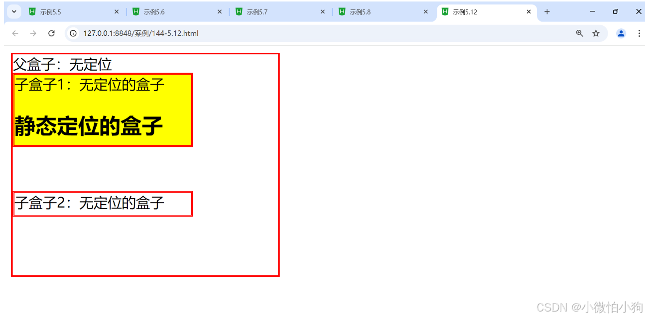
5.4.1 static 定位
默认值,元素按照正常的文档流进行排列。
静态定位的元素不受 top、right、bottom 和 left 属性的影响。
div {

  position: static; / 默认值 /

}
5.4.2 relative定位
<!DOCTYPE html>
<html>
	<head>
		<meta charset="utf-8">
		<title>示例5.12</title>
		<style type="text/css">
			.father{
				border: 2px solid red;
				width: 300px;
				height: 250px;
			}
			.son1{
				border: 2px double red;
				background-color: yellow;
				width: 200px;
				height: 80px;
				position: relative;
				top: 10px;left: 30px;
			}
			.son2{
				border: 2px double red;
				width: 200px;
				height: 25px;
				margin-top: 50px;
			}
		</style>
	</head>
	<body>
		<div class="father">父盒子:无定位
		<div class="son1">子盒子1:无定位的盒子
		<h2>静态定位的盒子</h2>
		</div>
		<div class="son2">子盒子2:无定位的盒子</div></div>
	</body>
</html>
5.4.3 absolute定位
absolute脱离原来文档流的布局,浮在其他盒子上面,独立出来。子盒子原来位置的空间由后面的盒子填充。绝对定位的起始位置为最近已定位的父盒子,如果父盒子没有定位,那么子盒子的起始位置为浏览器,并随着滚动条的移动而改变位置。
5.4.3.1 相对浏览器绝对定位
相对定位有2个作用:
(1)自己位置的微调。相对定位,就是微调元素位置的。让元素相对自己原来的位置,进行位置调整。
(2)子绝父相
<!DOCTYPE html>
<html lang="en">
<head>
<meta charset="UTF-8">
<meta name="viewport" content="width=device-width, initial-scale=1.0">
<meta http-equiv="X-UA-Compatible" content="ie=edge">
<title>Document</title>
<style>
*{
margin: 0;
padding: 0;
}
.box{
width: 220px;
height: 220px;

}
.parent{
width: 800px;
height: 800px;
margin: 0 auto;
outline:1px dashed yellow;
}
.box1{
background-color: blue;

}
.box2{
background-color: red;
/* 相对定位 ----自己位置的微调 */
position:relative;
/* 右下 */
/* 距离左侧坐标原点 100px */
left:100px;
/* 距离顶部坐标原点 200px */
top:200px;

}
.box3{
background-color: green;
}
</style>
</head>
<body>
<div class="parent">

<div class="box box1"></div>
<div class="box box2"></div>
<div class="box box3"></div>
</div>
</body>
</html>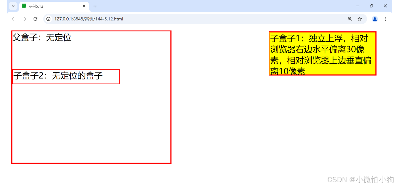
5.4.3.2 相对父盒子绝对定位
<!DOCTYPE html>
<html>
	<head>
		<meta charset="utf-8">
		<title>示例5.12</title>
		<style type="text/css">
			.father{
				border: 2px solid red;
				width: 300px;
				height: 250px;
				position: relative;
			}
			.son1{
				border: 2px double red;
				background-color: yellow;
				width: 200px;
				height: 80px;
				position: absolute;
				top: 30px;
				right: 10px;
			}
			.son2{
				border: 2px double red;
				width: 200px;
				height: 25px;
				margin-top: 50px;
			}
		</style>
	</head>
	<body>
		<div class="father">父盒子:无定位
		<div class="son1">子盒子1:独立上浮,相对浏览器右边水平偏离10像素,相对浏览器上边垂直偏离30像素
		</div>
		<div class="son2">子盒子2:无定位的盒子</div></div>
	</body>
</html>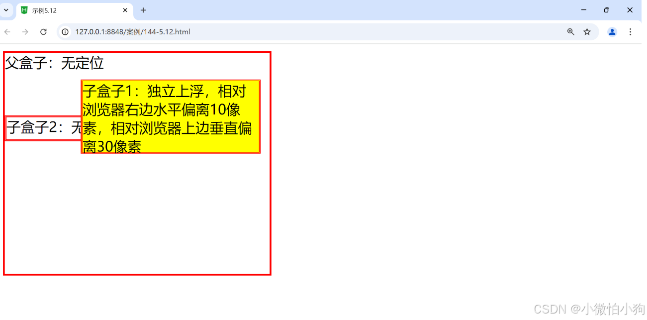
5.4.4 fixed定位
fixed类似于absolute,但在固定定位中,盒子的位置不随着滚动条的移动而改变位置,相对于浏览器窗口是固定不变的。(若添加多个<br/>会显示滚动条,但是盒子的位置保持不变。)
<!DOCTYPE html>
<html>
	<head>
		<meta charset="utf-8">
		<title>示例5.12</title>
		<style type="text/css">
			.father{
				border: 2px solid red;
				width: 300px;
				height: 250px;
			}
			.son1{
				border: 2px double red;
				background-color: yellow;
				width: 200px;
				height: 80px;
				position: fixed;
				top: 30px;
				right: 10px;
			}
			.son2{
				border: 2px double red;
				width: 200px;
				height: 25px;
				margin-top: 50px;
			}
		</style>
	</head>
	<body>
		<div class="father">父盒子:无定位
		<div class="son1">子盒子1:独立上浮,相对浏览器右边水平偏离10像素,相对浏览器上边垂直偏离30像素
		</div>
		<div class="son2">子盒子2:无定位的盒子</div></div>
	</body>
</html>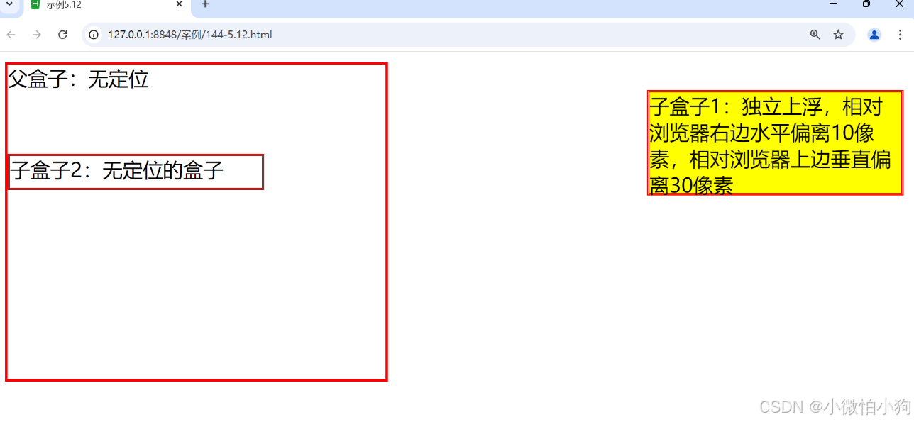
5.5 CSS元素的浮动
在CSS中,浮动(float)是一种用于控制元素布局的技术,最初用于使文本环绕图像。浮动元素会脱离正常的文档流,允许其他元素在其旁边排列。以下是关于浮动的详细介绍。
5.5.1 盒子的浮动添加
一般情况下,页面中的块状元素在水平方向上宽度会自动延伸,直到父元素的边界;而在垂直方向上会按照元素在页面中出现的先后次序依次排列,即所说的标准流排列。
语法:float: left I right I none
参数:left元素浮动到左边,即向左侧靠拢,则右边可以有文字环绕;right元素浮动到右边,即向右侧靠拢,左边可以有文字环绕;默认值none就是标准流通常的显示状态。
<!DOCTYPE html>
<html>
	<head>
		<meta charset="utf-8">
		<title>示例5.17</title>
		<style type="text/css">
			.father{
				background-color: #ffccff;
				border: 2px solid red;
				padding: 5px;
			}
			.father div{
				width: 100px;
				height: 20px;
				padding: 10px;
				margin: 10px;
				border: 2px dashed blue;
				background-color: #ccffff;
			}
			.father p{
				border: 20px dotted green;
				background-color: #ffff99;
			}
		</style>
	</head>
	<body>
		<div class="father">
			<h2>父盒子</h2>
			<div style="float:right">右浮动盒子1</div>
			<div>标准流盒子2</div>
			<div>标准流盒子3</div>
			<p>css中, 有一个float 属性, 默认为 none, 也就是标准流通常的情况。若果将 float 属性的值设置为left 或 right, 元素就会向其父级元素的左侧或右侧靠近,同时默认的情况下,盒子的宽度不再伸展,而是根据盒子里面的内容的宽度确定。</p>
		</div>
	</body>
</html>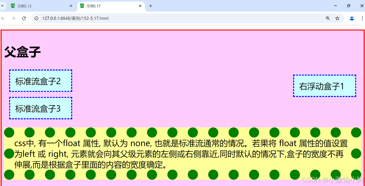
5.5.2 盒子的浮动清除
元素浮动后,下面的元素内容会自动上移,结果就会受到上面浮动元素的影响,如果想要清除这种影响,需要使用clear属性完成。
由于浮动元素可以清除,是相对定位属性的优势,因而浮动属性成为控制分栏布局的最好工具。
语法:clear:left I right I both I none
参数:left清除左边浮动元素,即不允许左边有浮动对象;right清除右边浮动元素,即不允许右边有浮动对象;Both同时清除左右两边的浮动元素,即不允许左右两边有浮动对象;默认值none。
<!DOCTYPE html>
<html>
	<head>
		<meta charset="utf-8">
		<title>示例5.17</title>
		<style type="text/css">
			.father{
				width: 500px;
				background-color: #ffccff;
				border: 2px solid red;
				padding: 5px;
			}
			.father div{
				width: 100px;
				height: 20px;
				padding: 10px;
				margin: 10px;
				border: 2px dashed blue;
				background-color: #ccffff;
			}
			.father p{
				border: 20px dotted green;
				background-color: #ffff99;
				clear: both;
			}
		</style>
	</head>
	<body>
		<div class="father">
			<h2>父盒子</h2>
			<div style="float:right">右浮动盒子1</div>
			<div style="float: right;">右浮动盒子2</div>
			<div style="float: right;">右浮动盒子3</div>
			<p>css中,有一个float属性,默认为none,也就是标准流通常的情况。若果将float属性的值设置为 left 或 right, 元素就会向其父级元素的左侧或右侧靠近,同时默认的情况下, 盒子的宽度不再伸展,而是根据盒子里面的内容的宽度确定。</p>
		</div>
	</body>
</html>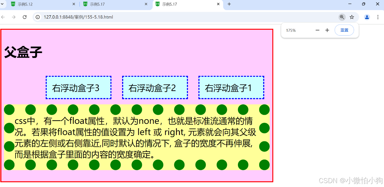
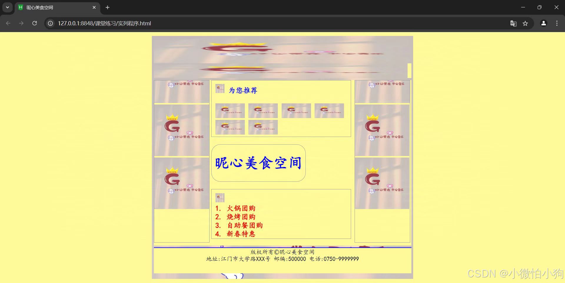
5.6 综合案例——昵心美食空间
<!DOCTYPE html>
<html lang="en">
<head>
<meta charset="UTF-8">
<meta name="viewport" content="width=device-width, initial-scale=1.0">
<title>昵心美食空间</title>
<style type="text/css">
* {
margin: 0;
padding: 0;
background-color: #fff999;
}
a {
color: red;
text-decoration: none;
}
.all {
width: 700px;
height: 650px;
margin: 10px auto;
padding: 5px;
background-image: url('img/11.jpg');
background-size: cover;
}
.banner, .menu, .bottom {
width: 100%;
height: 70px;
}
.menu {
height: 40px;
}
.main {
width: 700px;
height: 450px;
margin: 5px 0;
position: relative;
overflow: hidden;
}
.left, .right {
width: 150px;
height: 440px;
border: 1px solid #999;
float: left;
overflow: hidden;
}
.middle {
width: 384px;
height: 450px;
margin: 0 5px;
float: left;
font-size: 20px;
font-family: "楷体";
font-weight: 700;
color: #0000ff;
}
.one {
width: 380px;
height: 155px;
border: 1px solid #999;
padding: 10px;
box-sizing: border-box;
}
.two {
width: 255px;
height: 100px;
border: 1px solid #999;
margin: 20px 0;
border-radius: 25px;
display: flex;
align-items: center;
justify-content: center;
}
.three {
width: 380px;
height: 135px;
border: 1px solid #999;
padding: 10px;
box-sizing: border-box;
}
.bottom {
width: 700px;
height: 70px;
text-align: center;
font-family: "楷体";
}
</style>
</head>
<body>
<div class="all">
<div class="banner">
<img src="img/11.jpg" width="700" height="70" alt="Banner"/>
</div>
<div class="menu">
<img src="img/11.jpg" width="690" height="40" alt="Menu"/>
</div>
<div class="main">
<div class="left">
<marquee direction="up">
<img src="img/11.jpg" width="150" height="140" alt="Image"/>
<img src="img/11.jpg" width="150" height="140" alt="Image"/>
<img src="img/11.jpg" width="150" height="140" alt="Image"/>
</marquee>
</div>
<div class="middle">
<div class="one">
<img src="img/11.jpg" width="25" height="25" alt="Icon"/> 为您推荐
<br/><br/>
<img src="img/11.jpg" width="80" height="40" alt="Recommendation"/>
<img src="img/11.jpg" width="80" height="40" alt="Recommendation"/>
<img src="img/11.jpg" width="80" height="40" alt="Recommendation"/>
<img src="img/11.jpg" width="80" height="40" alt="Recommendation"/>
<img src="img/11.jpg" width="80" height="40" alt="Recommendation"/>
<img src="img/11.jpg" width="80" height="40" alt="Recommendation"/>
</div>
<div class="two">
<h1>昵心美食空间</h1>
</div>
<div class="three">
<img src="img/11.jpg" width="25" height="25" alt="Icon"/>
<br/>
<a href="#">1. 火锅团购</a><br/>
<a href="#">2. 烧烤团购</a><br/>
<a href="#">3. 自助餐团购</a><br/>
<a href="#">4. 新春特惠</a><br/>
</div>
</div>
<div class="right">
<marquee direction="up">
<img src="img/11.jpg" width="150" height="140" alt="Image"/>
<img src="img/11.jpg" width="148" height="140" alt="Image"/>
<img src="img/11.jpg" width="148" height="140" alt="Image"/>
</marquee>
</div>
</div>
<div class="bottom">
<hr color="#0000ff">
版权所有©昵心美食空间<br/>
地址:江门市大学路XXX号 邮编:500000 电话:0750-9999999
</div>
</div>
<div align="center">Copyright ©2024 小微怕小狗</div>
</body>
</html>


 扫一扫
扫一扫


 2万+
2万+

 被折叠的 条评论
为什么被折叠?
被折叠的 条评论
为什么被折叠?
 到【灌水乐园】发言


