


从零开始实现Element Plus--组件开发
在当今信息化飞速发展的时代,前端开发已经成为软件开发中不可或缺的一部分。作为提升开发效率、保证项目质量的关键工具,组件库一直备受关注。随着GPT-3.5模型的迅猛发展,普通的CRUD程序员被AI取代正在逐渐成为一种明显的趋势。因此,个人认为除了需要更加复杂的项目经验外,还需要架构设计能力,才能避免过早地被AI“抢走饭碗”。在这样的背景下,前端开发者需要不断强化自身的技术能力,以适应这个快速变化的环境。同时,注重项目经验积累和架构设计能力的提升也势在必行,这将是抵御AI替代的重要策略之一。
nvm
nvm(Node Version Manager)是一个命令行工具,用于在不同的项目之间轻松地管理和切换不同的Node.js版本。
nvm-windows
nvm的作用:
1、多版本共存:允许在同一台机器上安装和切换多个Node.js版本。
2、便捷切换:在不同项目需要不同Node.js版本时,可以快速在这些版本间切换。
3、隔离环境:每个Node.js版本都有自己的全局模块路径,避免版本间的冲突。
4、控制环境:可以轻松安装、卸载、查看和管理Node.js的版本。
5、提高效率:避免了反复手动安装和卸载Node.js的繁琐过程。
nvm的使用方法
1、安装Node.js版本:nvm install <version>
2、切换Node.js版本: nvm use <version>
3、查看已安装的版本:nvm list
4、卸载Node.js版本:nvm uninstall <version>
需求分析
我们可以使用大模型工具,帮助我们完成
ChatGPT
Poe
如果你不会魔法的话,可以使用下面两个
Chandler
Kimi **
提示词
三板斧 “身份定位,前提条件,输出限定”
Kimi 生成产品需求文档
# 身份定位

- **角色**:互联网产品经理
- **目标**:产品需求分析和功能点设计

# 需求

以"[XXX]"形式定义变量用于对话中不同任务的触发指令
以"/help" 为触发关键词,列出所有定义的变量`**XXX**`以及代表的任务

对话过程用中文交流,专业术语可用英文或缩写。

- [XQFX]:(需求分析) 根据给出的内容输出需求分析文档(md)
- [GNSJ]:(功能设计) 以上文中的 "需求分析文档" 为依据

# 背景
首次可补充提问来完善背景

# 输出规范

- **需求分析**[XQFX]
  - **格式**:用户调研摘要、竞品对比报告、市场趋势分析。
  - **内容**:用户痛点、期望功能、安全性需求。
- **功能点设计**[GNSJ]
  - **格式**:功能描述、api 设计、交互关系。
  - **内容**:功能实现细节、用户操作流程、异常处理。

# 示例指令

- **需求分析**:[XQFX]组件库按钮组件。
- **功能点设计**:[GNSJ]

请在后续对话中使用上述结构和示例指令来指导任务执行。
Kimi 给我们生成完毕后,我们可以叫它直接 给我 md 源码,将生成的 md 源码 直接复制,在Button 组件下 新建一个doc.md 文件 拷贝进去
# 需求分析[XQFX]

## 用户调研摘要
根据提供的项目文档,按钮组件是前端开发中常用的UI元素,用户需要一个既美观又实用的按钮组件来提升界面的交互体验。用户期望按钮组件能够支持多种样式、尺寸、状态以及图标,以适应不同的设计需求和场景。

### 用户痛点
- 缺乏统一的按钮样式和尺寸规范,导致界面风格不一致。
- 现有按钮组件不支持丰富的交互状态,如加载状态、禁用状态等。
- 缺少灵活的图标支持,限制了按钮的表达能力。

### 期望功能
- 支持多种按钮样式,如基础、朴素、圆角、圆形等。
- 提供多种按钮尺寸,以适应不同布局需求。
- 能够自定义按钮图标,增强按钮的可读性和美观性。
- 支持按钮的加载状态和禁用状态,以适应不同的交互场景。

### 安全性需求
- 按钮组件应避免不必要的安全漏洞,如XSS攻击等。
- 应支持对按钮的访问控制,确保只有授权用户才能触发敏感操作。

## 竞品对比报告
竞品分析显示,主流的UI组件库(如Element UI、Ant Design等)提供了类似的按钮组件功能,但在样式定制、图标支持和交互状态上各有特色。我们的按钮组件需要在这些方面进行差异化设计,以满足用户的特殊需求。

## 市场趋势分析
当前市场趋势显示,用户越来越注重产品的用户体验和界面美观性。因此,一个功能全面、样式多样、易于定制的按钮组件将有助于提升产品的市场竞争力。

# 功能点设计[GNSJ]

## 功能描述
设计一个多功能的按钮组件,支持多种样式、尺寸、状态和图标,以满足不同场景下的交互需求。

## API 设计
- `size`: 定义按钮的尺寸,可选值包括`large`、`default`、`small`。
- `type`: 定义按钮的类型,可选值包括`primary`、`success`、`warning`、`danger`、`info`。
- `plain`: 是否为朴素按钮,布尔值。
- `round`: 是否为圆角按钮,布尔值。
- `circle`: 是否为圆形按钮,布尔值。
- `loading`: 是否为加载中状态,布尔值。
- `loading-icon`: 自定义加载中状态图标,字符串。
- `disabled`: 按钮是否为禁用状态,布尔值。
- `icon`: 按钮图标,字符串。
- `autofocus`: 是否自动聚焦,布尔值。
- `native-type`: 原生 type 属性,可选值包括`button`、`submit`、`reset`。
- `tag`: 自定义元素标签,字符串或组件。
- `use-throttle`: 是否使用节流模式,布尔值,默认为`true`。
- `throttle-duration`: 节流模式下的时间间隔,数值。

## 交互关系
- 用户点击按钮时,根据按钮的状态(如加载中、禁用等)进行相应的交互反馈。
- 用户可以通过点击带有图标的按钮来执行特定的操作。
- 按钮组内的按钮可以进行组合使用,如分页按钮等。

## 功能实现细节
- 按钮组件应支持通过props传入不同的参数来自定义样式和行为。
- 加载状态可以通过`loading`属性和`loading-icon`属性来自定义。
- 禁用状态应通过`disabled`属性来控制,禁用时按钮不应响应点击事件。
- 图标可以通过`icon`属性来自定义,支持常见的图标库如FontAwesome等。

## 用户操作流程
1. 用户根据需要选择按钮的尺寸、类型、样式等。
2. 用户可以通过设置`loading`属性来显示加载状态。
3. 用户可以通过设置`disabled`属性来禁用按钮。
4. 用户可以通过设置`icon`属性来添加按钮图标。
5. 用户可以通过点击按钮来触发相应的事件。

## 异常处理
- 当按钮处于加载状态时,应阻止用户重复点击。
- 当按钮被禁用时,应显示禁用状态并阻止用户点击。
- 对于非法的props值,组件应有相应的校验机制,并给出警告或错误提示。

kimi 生成测试用例
# 身份定位
- **角色**:优秀的测试开发工程师
- **目标**:根据需求分析文档输出测试用例
- **要求**:vitest技术栈,mount 尽量以返回 JSX 虚拟节点形式, it,test等方法的name属性 用英文描述
# 需求文档内容
上面内容拷贝下来
输出内容:
// 根据提供的需求分析文档,以下是使用 Vitest 技术栈编写的测试用例示例。请注意,实际的测试用例应根据具体的组件实现和业务逻辑来设计,以下仅为示例性质。

import { describe, it, expect, test } from 'vitest'
import { mount } from '@vue/test-utils'
import Button from '@/components/Button.vue' // 假设按钮组件的路径

describe('Button Component', () => {

  // 测试按钮的基本渲染
  it('should render correctly with default props', () => {
    const wrapper = mount(Button)
    expect(wrapper.exists()).toBe(true)
  })

  // 测试按钮尺寸
  describe('Button Size', () => {
    it('should render small size button', () => {
      const wrapper = mount(Button, {
        props: { size: 'small' }
      })
      expect(wrapper.classes()).toContain('small')
    })

    it('should render default size button', () => {
      const wrapper = mount(Button)
      expect(wrapper.classes()).toContain('default')
    })

    it('should render large size button', () => {
      const wrapper = mount(Button, {
        props: { size: 'large' }
      })
      expect(wrapper.classes()).toContain('large')
    })
  })

  // 测试按钮类型
  describe('Button Type', () => {
    it('should render primary type button', () => {
      const wrapper = mount(Button, {
        props: { type: 'primary' }
      })
      expect(wrapper.classes()).toContain('primary')
    })

    // ... 其他类型的按钮测试用例
  })

  // 测试朴素按钮
  it('should render plain button', () => {
    const wrapper = mount(Button, {
      props: { plain: true }
    })
    expect(wrapper.classes()).toContain('plain')
  })

  // 测试圆角按钮
  it('should render round button', () => {
    const wrapper = mount(Button, {
      props: { round: true }
    })
    expect(wrapper.classes()).toContain('round')
  })

  // 测试圆形按钮
  it('should render circle button', () => {
    const wrapper = mount(Button, {
      props: { circle: true }
    })
    expect(wrapper.classes()).toContain('circle')
  })

  // 测试加载状态
  it('should render loading state', async () => {
    const wrapper = mount(Button, {
      props: { loading: true }
    })
    expect(wrapper.find('.loading-icon').exists()).toBe(true)
  })

  // 测试禁用状态
  it('should render disabled state', () => {
    const wrapper = mount(Button, {
      props: { disabled: true }
    })
    expect(wrapper.element).toBeDisabled()
  })

  // 测试图标按钮
  it('should render button with icon', () => {
    const wrapper = mount(Button, {
      props: { icon: 'icon-name' }
    })
    expect(wrapper.find('.icon').exists()).toBe(true)
  })

  // 测试按钮点击事件
  it('should emit click event', async () => {
    const wrapper = mount(Button)
    await wrapper.trigger('click')
    expect(wrapper.emitted('click')).toBeTruthy()
  })

  // 测试节流模式
  it('should throttle click events', async () => {
    const wrapper = mount(Button, {
      props: { useThrottle: true }
    })
    // 假设有一个方法来测试节流效果
    // await testThrottleEffect(wrapper)
    // expect(throttleEffect).toBeTruthy()
  })

  // ... 其他测试用例
})

// 请注意,此测试用例仅为示例,实际测试中需要根据组件的具体实现和功能来编写测试逻辑。另外,`Button` 组件的导入路径、类名、图标类选择器等需要根据实际项目进行调整。如果有具体的实现细节或遇到问题,可以进一步提供信息以便给出更具体的帮助。
初始化 vitest
在分包 components 目录下新建 vitest.config.ts
/// <reference types="vitest" />
import { defineConfig } from "vite";
import vue from "@vitejs/plugin-vue";
import vueJsx from "@vitejs/plugin-vue-jsx";

// https://vitejs.dev/config/
export default defineConfig({
  plugins: [vue(), vueJsx()],
  test: {
    globals: true,
    environment: "jsdom",
  },
});
完成后修改 package.json 中
  "scripts": {
    "test": "vitest --coverage"
  },
Button 目录 新建 Button.test.tsx
import { describe, it, expect } from "vitest";
import { mount } from "@vue/test-utils";

import Button from "./Button.vue";

describe("Button.vue", () => {
  // Props: type
  it("should has the correct type class when type prop is set", () => {
    const types = ["primary", "success", "warning", "danger", "info"];
    types.forEach((type) => {
      const wrapper = mount(Button, {
        props: { type: type as any },
      });
      expect(wrapper.classes()).toContain(`er-button--${type}`);
    });
  });

  // Props: size
  it("should has the correct size class when size prop is set", () => {
    const sizes = ["large", "default", "small"];
    sizes.forEach((size) => {
      const wrapper = mount(Button, {
        props: { size: size as any },
      });
      expect(wrapper.classes()).toContain(`er-button--${size}`);
    });
  });

  // Props: plain, round, circle
  it.each([
    ["plain", "is-plain"],
    ["round", "is-round"],
    ["circle", "is-circle"],
    ["disabled", "is-disabled"],
    ["loading", "is-loading"],
  ])(
    "should has the correct class when prop %s is set to true",
    (prop, className) => {
      const wrapper = mount(Button, {
        props: { [prop]: true },
        global: {
          stubs: ["ErIcon"],
        },
      });
      expect(wrapper.classes()).toContain(className);
    }
  );

  it("should has the correct native type attribute when native-type prop is set", () => {
    const wrapper = mount(Button, {
      props: { nativeType: "submit" },
    });
    expect(wrapper.element.tagName).toBe("BUTTON");
    expect((wrapper.element as any).type).toBe("submit");
  });

  // Props: tag
  it("should renders the custom tag when tag prop is set", () => {
    const wrapper = mount(Button, {
      props: { tag: "a" },
    });
    expect(wrapper.element.tagName.toLowerCase()).toBe("a");
  });

  // Events: click
  it("should emits a click event when the button is clicked", async () => {
    const wrapper = mount(Button, {});
    await wrapper.trigger("click");
    expect(wrapper.emitted().click).toHaveLength(1);
  });
});
最后修改根目录下的 package.json test
  "scripts": {
    "dev": "pnpm --filter @Wannaer-element/play dev",
    "docs:dev": "pnpm --filter @Wannaer-element/docs dev",
    "docs:build": "pnpm --filter @Wannaer-element/docs build",
    "docs:preview": "pnpm --filter @Wannaer-element/docs preview",
    "test": "pnpm --filter @Wannaer-element/components test"
  },
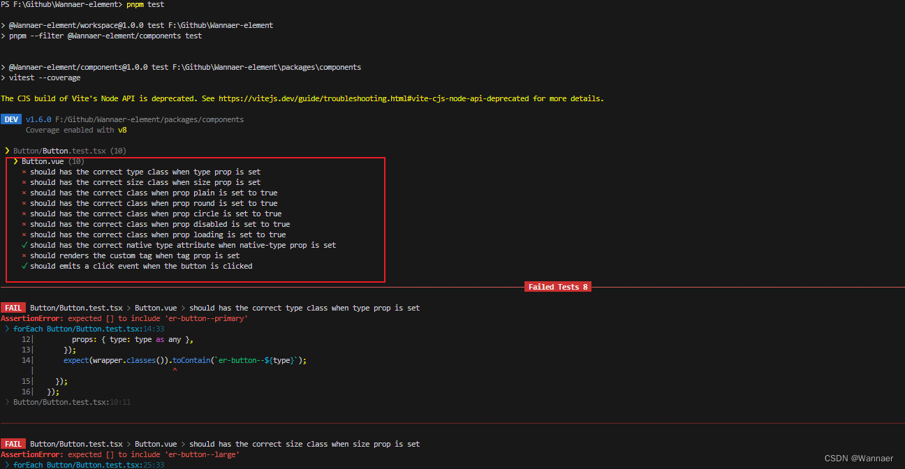
修改完成后 运行 pnpm test 发现一片红,因为我们的组件还没有完善,所以测试不通过
<template>
  <button style="color: red">this is a button</button>
</template>

<script setup lang="ts">
defineOptions({
  name: "WButton",
});
</script>
<style scoped></style>
完善 Button 组件
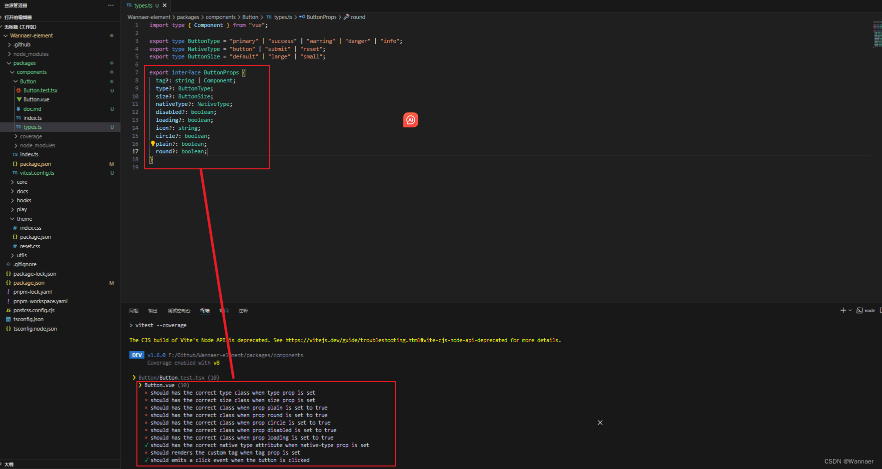
1、定义 types.ts
import type { Component } from "vue";

export type ButtonType = "primary" | "success" | "warning" | "danger" | "info";
export type NativeType = "button" | "submit" | "reset";
export type ButtonSize = "default" | "large" | "small";

export interface ButtonProps {
  tag?: string | Component;
  type?: ButtonType;
  size?: ButtonSize;
  nativeType?: NativeType;
  disabled?: boolean;
  loading?: boolean;
  icon?: string;
  circle?: boolean;
  plain?: boolean;
  round?: boolean;
}
2、Button.vue 引入 types.ts
<script setup lang="ts">
import { ref } from "vue";
import type { ButtonProps } from "./types";
defineOptions({
  name: "WButton",
});
const props = withDefaults(defineProps<ButtonProps>(), {
  tag: "button",
  nativeType: "button",
});

const slots = defineSlots();

const _ref = ref<HTMLButtonElement>();
</script>

<template>
  <component
    :is="props.tag"
    ref="_ref"
    class="wan-button"
    :class="{
      [`wan-button--${type}`]: type,
      [`wan-button--${size}`]: size,
      'is-plain': plain,
      'is-loading': loading,
      'is-disabled': disabled,
      'is-round': round,
      'is-circle': circle,
    }"
    :type="tag === 'button' ? nativeType : void 0"
    :disabled="disabled || loading ? true : void 0"
  >
    <slot></slot>
  </component>
</template>

<style scoped></style>
测试用例通过

3、添加Button样式
Button 组件 新建 style.css 文件
// style.css
.wan-button-group {
  --wan-button-group-border-color: var(--wan-border-color-lighter);
}
.wan-button {
  --wan-button-font-weight: var(--wan-font-weight-primary);
  --wan-button-border-color: var(--wan-border-color);
  --wan-button-bg-color: var(--wan-fill-color-blank);
  --wan-button-text-color: var(--wan-text-color-regular);
  --wan-button-disabled-text-color: var(--wan-disabled-text-color);
  --wan-button-disabled-bg-color: var(--wan-fill-color-blank);
  --wan-button-disabled-border-color: var(--wan-border-color-light);
  --wan-button-hover-text-color: var(--wan-color-primary);
  --wan-button-hover-bg-color: var(--wan-color-primary-light-9);
  --wan-button-hover-border-color: var(--wan-color-primary-light-7);
  --wan-button-active-text-color: var(--wan-button-hover-text-color);
  --wan-button-active-border-color: var(--wan-color-primary);
  --wan-button-active-bg-color: var(--wan-button-hover-bg-color);
  --wan-button-outline-color: var(--wan-color-primary-light-5);
  --wan-button-active-color: var(--wan-text-color-primary);
}

.wan-button {
  display: inline-flex;
  justify-content: center;
  align-items: center;
  line-height: 1;
  height: 32px;
  white-space: nowrap;
  cursor: pointer;
  color: var(--wan-button-text-color);
  text-align: center;
  box-sizing: border-box;
  outline: none;
  transition: 0.1s;
  font-weight: var(--wan-button-font-weight);
  user-select: none;
  vertical-align: middle;
  -webkit-appearance: none;
  background-color: var(--wan-button-bg-color);
  border: var(--wan-border);
  border-color: var(--wan-button-border-color);
  padding: 8px 15px;
  font-size: var(--wan-font-size-base);
  border-radius: var(--wan-border-radius-base);
  & + & {
    margin-left: 12px;
  }
  &:hover,
  &:focus {
    color: var(--wan-button-hover-text-color);
    border-color: var(--wan-button-hover-border-color);
    background-color: var(--wan-button-hover-bg-color);
    outline: none;
  }
  &:active {
    color: var(--wan-button-active-text-color);
    border-color: var(--wan-button-active-border-color);
    background-color: var(--wan-button-active-bg-color);
    outline: none;
  }
  /*plain*/
  &.is-plain {
    --wan-button-hover-text-color: var(--wan-color-primary);
    --wan-button-hover-bg-color: var(--wan-fill-color-blank);
    --wan-button-hover-border-color: var(--wan-color-primary);
  }
  /*round*/
  &.is-round {
    border-radius: var(--wan-border-radius-round);
  }
  /*circle*/
  &.is-circle {
    border-radius: 50%;
    padding: 8px;
  }
  /*disabled*/
  &.is-loading,
  &.is-disabled,
  &.is-disabled:hover,
  &.is-disabled:focus,
  &[disabled],
  &[disabled]:hover,
  &[disabled]:focus {
    color: var(--wan-button-disabled-text-color);
    cursor: not-allowed;
    background-image: none;
    background-color: var(--wan-button-disabled-bg-color);
    border-color: var(--wan-button-disabled-border-color);
  }
  [class*="wan-icon"] {
    width: 1em;
    height: 1em;
  }
}
@each $val in primary, success, warning, info, danger {
  .wan-button--$(val) {
    --wan-button-text-color: var(--wan-color-white);
    --wan-button-bg-color: var(--wan-color-$(val));
    --wan-button-border-color: var(--wan-color-$(val));
    --wan-button-outline-color: var(--wan-color-$(val)-light-5);
    --wan-button-active-color: var(--wan-color-$(val)-dark-2);
    --wan-button-hover-text-color: var(--wan-color-white);
    --wan-button-hover-bg-color: var(--wan-color-$(val)-light-3);
    --wan-button-hover-border-color: var(--wan-color-$(val)-light-3);
    --wan-button-active-bg-color: var(--wan-color-$(val)-dark-2);
    --wan-button-active-border-color: var(--wan-color-$(val)-dark-2);
    --wan-button-disabled-text-color: var(--wan-color-white);
    --wan-button-disabled-bg-color: var(--wan-color-$(val)-light-5);
    --wan-button-disabled-border-color: var(--wan-color-$(val)-light-5);
  }
  .wan-button--$(val).is-plain {
    --wan-button-text-color: var(--wan-color-$(val));
    --wan-button-bg-color: var(--wan-color-$(val)-light-9);
    --wan-button-border-color: var(--wan-color-$(val)-light-5);
    --wan-button-hover-text-color: var(--wan-color-white);
    --wan-button-hover-bg-color: var(--wan-color-$(val));
    --wan-button-hover-border-color: var(--wan-color-$(val));
    --wan-button-active-text-color: var(--wan-color-white);

    --wan-button-disabled-text-color: var(--wan-color-$(val)-light-5);
    --wan-button-disabled-bg-color: var(--wan-color-$(val)-light-9);
    --wan-button-disabled-border-color: var(--wan-color-$(val)-light-8);
  }
}
.wan-button--large {
  --wan-button-size: 40px;
  height: var(--wan-button-size);
  padding: 12px 19px;
  font-size: var(--wan-font-size-base);
  border-radius: var(--wan-border-radius-base);
  /*circle*/
  &.is-circle {
    border-radius: 50%;
    padding: 12px;
  }
}
.wan-button--small {
  --wan-button-size: 24px;
  height: var(--wan-button-size);
  padding: 5px 11px;
  font-size: 12px;
  border-radius: calc(var(--wan-border-radius-base) - 1px);
  /*circle*/
  &.is-circle {
    border-radius: 50%;
    padding: 5px;
  }
  [class*="wan-icon"] {
    width: 12px;
    height: 12px;
  }
}

.wan-button-group {
  display: inline-block;
  vertical-align: middle;

  &::after {
    clear: both;
  }
  & > :deep(.wan-button) {
    float: left;
    position: relative;
    margin-left: 0;
    &:first-child {
      border-top-right-radius: 0;
      border-bottom-right-radius: 0;
      border-right-color: var(--wan-button-group-border-color);
    }
    &:last-child {
      border-top-left-radius: 0;
      border-bottom-left-radius: 0;
      border-left-color: var(--wan-button-group-border-color);
    }
    &:not(:first-child):not(:last-child) {
      border-radius: 0;

      border-left-color: var(--wan-button-group-border-color);
      border-right-color: var(--wan-button-group-border-color);
    }
    &:not(:last-child) {
      margin-right: -1px;
    }
    &:first-child:last-child {
      border-top-right-radius: var(--wan-border-radius-base);
      border-bottom-right-radius: var(--wan-border-radius-base);
      border-top-left-radius: var(--wan-border-radius-base);
      border-bottom-left-radius: var(--wan-border-radius-base);

      &.is-round {
        border-radius: var(--wan-border-radius-round);
      }

      &.is-circle {
        border-radius: 50%;
      }
    }
  }
}
Button.vue 导入css
<style scoped>
@import "./style.css";
</style>
分包 theme 目录下 index.css 修改
@import "./reset.css";

:root {
  /* colors */
  --wan-color-white: #ffffff;
  --wan-color-black: #000000;
  --colors: (
    primary: #409eff,
    success: #67c23a,
    warning: #e6a23c,
    danger: #f56c6c,
    info: #909399
  );
  --wan-bg-color: #ffffff;
  --wan-bg-color-page: #f2f3f5;
  --wan-bg-color-overlay: #ffffff;
  --wan-text-color-primary: #303133;
  --wan-text-color-regular: #606266;
  --wan-text-color-secondary: #909399;
  --wan-text-color-placeholder: #a8abb2;
  --wan-text-color-disabled: #c0c4cc;
  --wan-border-color: #dcdfe6;
  --wan-border-color-light: #e4e7ed;
  --wan-border-color-lighter: #ebeef5;
  --wan-border-color-extra-light: #f2f6fc;
  --wan-border-color-dark: #d4d7de;
  --wan-border-color-darker: #cdd0d6;
  --wan-fill-color: #f0f2f5;
  --wan-fill-color-light: #f5f7fa;
  --wan-fill-color-lighter: #fafafa;
  --wan-fill-color-extra-light: #fafcff;
  --wan-fill-color-dark: #ebedf0;
  --wan-fill-color-darker: #e6e8eb;
  --wan-fill-color-blank: #ffffff;

  @each $val, $color in var(--colors) {
    --wan-color-$(val): $(color);
    @for $i from 3 to 9 {
      --wan-color-$(val)-light-$(i): mix(#fff, $(color), 0$ (i));
    }
    --wan-color-$(val)-dark-2: mix(#000, $(color), 0.2);
  }

  /* border */
  --wan-border-width: 1px;
  --wan-border-style: solid;
  --wan-border-color-hover: var(--wan-text-color-disabled);
  --wan-border: var(--wan-border-width) var(--wan-border-style)
    var(--wan-border-color);
  --wan-border-radius-base: 4px;
  --wan-border-radius-small: 2px;
  --wan-border-radius-round: 20px;
  --wan-border-radius-circle: 100%;

  /*font*/
  --wan-font-size-extra-large: 20px;
  --wan-font-size-large: 18px;
  --wan-font-size-medium: 16px;
  --wan-font-size-base: 14px;
  --wan-font-size-small: 13px;
  --wan-font-size-extra-small: 12px;
  --wan-font-family: "Helvetica Neue", Helvetica, "PingFang SC",
    "Hiragino Sans GB", "Microsoft YaHei", "\5fae\8f6f\96c5\9ed1", Arial,
    sans-serif;
  --wan-font-weight-primary: 500;

  /*disabled*/
  --wan-disabled-bg-color: var(--wan-fill-color-light);
  --wan-disabled-text-color: var(--wan-text-color-placeholder);
  --wan-disabled-border-color: var(--wan-border-color-light);

  /*animation*/
  --wan-transition-duration: 0.4s;
  --wan-transition-duration-fast: 0.2s;
}
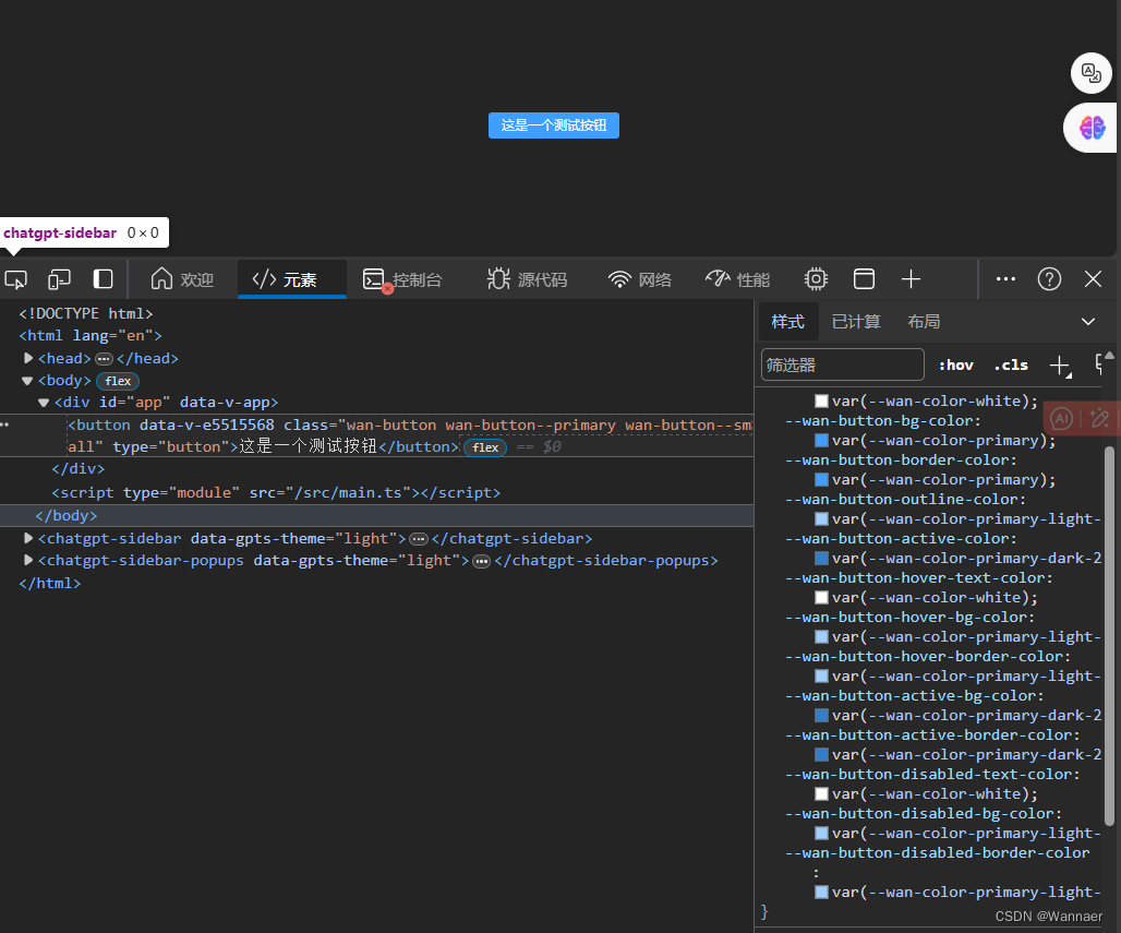
运行查看
点击事件 添加节流
// Button.vue
<script setup lang="ts">
import { ref } from "vue";
import type { ButtonEmits, ButtonProps } from "./types";
import { throttle } from "lodash-es";
defineOptions({
  name: "WanButton",
});
const props = withDefaults(defineProps<ButtonProps>(), {
  tag: "button",
  nativeType: "button",
  useThrottle: true,
  throttleDuration: 500,
});

const emits = defineEmits<ButtonEmits>();
const slots = defineSlots();

const _ref = ref<HTMLButtonElement>();

const handleBtnClick = (e: MouseEvent) => {
  emits("click", e);
};
const handlBtneCLickThrottle = throttle(handleBtnClick, props.throttleDuration);
</script>

<template>
  <component
    :is="props.tag"
    ref="_ref"
    class="wan-button"
    :class="{
      [`wan-button--${type}`]: type,
      [`wan-button--${size}`]: size,
      'is-plain': plain,
      'is-loading': loading,
      'is-disabled': disabled,
      'is-round': round,
      'is-circle': circle,
    }"
    :type="tag === 'button' ? nativeType : void 0"
    :disabled="disabled || loading ? true : void 0"
    @click="
      (e: MouseEvent) =>
        useThrottle ? handlBtneCLickThrottle(e) : handleBtnClick(e)
    "
  >
    <slot></slot>
  </component>
</template>

<style scoped>
@import "./style.css";
</style>
// types.ts
import type { Component, ComputedRef, Ref } from "vue";

export type ButtonType = "primary" | "success" | "warning" | "danger" | "info";
export type NativeType = "button" | "submit" | "reset";
export type ButtonSize = "default" | "large" | "small";

export interface ButtonProps {
  useThrottle?: boolean;
  throttleDuration?: number;
}

export interface ButtonEmits {
  (e: "click", value: MouseEvent): void;
}

export interface ButtonInstance {
  ref: Ref<HTMLButtonElement | void>;
  disabled: ComputedRef<boolean>;
  size: ComputedRef<string>;
  type: ComputedRef<string>;
}
添加 Icon
先创建一个Icon组件
分包 components 目录下 新建 Icon 文件夹,在文件夹中新建
// Icon.vue
<script setup lang="ts">
import { type IconProps } from "./types";
import { FontAwesomeIcon } from "@fortawesome/vue-fontawesome";
import { omit } from "lodash-es";
import { computed } from "vue";

defineOptions({
  name: "WanIcon",
  inheritAttrs: false,
});

const props = defineProps<IconProps>();

const filterProps = computed(() => omit(props, ["type", "color"]));
const customStyles = computed(() => ({ color: props.color ?? void 0 }));
</script>

<template>
  <i
    class="wan-icon"
    :class="{ [`wan-icon--${type}`]: type }"
    :style="customStyles"
    v-bind="$attrs"
  >
    <font-awesome-icon v-bind="filterProps" />
  </i>
</template>

<style scoped>
@import "./style.css";
</style>
// index.ts
import Icon from "./Icon.vue";
import { withInstall } from "@Wannaer-element/utils";

export const WanIcon = withInstall(Icon);
// style.css
.wan-icon {
  --wan-icon-color: inherit;
  display: inline-flex;
  justify-content: center;
  align-items: center;
  position: relative;
  fill: currentColor;
  color: var(--wan-icon-color);
  font-size: inherit;
}

@each $val in primary, info, success, warning, danger {
  .wan-icon--$(val) {
    --wan-icon-color: var(--wan-color-$(val));
  }
}
// types.ts
import type { IconDefinition } from "@fortawesome/fontawesome-svg-core";

export interface IconProps {
  border?: boolean;
  fixedWidth?: boolean;
  flip?: "horizontal" | "vertical" | "both";
  icon: object | Array<string> | string | IconDefinition;
  mask?: object | Array<string> | string;
  listItem?: boolean;
  pull?: "right" | "left";
  pulse?: boolean;
  rotation?: 90 | 180 | 270 | "90" | "180" | "270";
  swapOpacity?: boolean;
  size?:
    | "2xs"
    | "xs"
    | "sm"
    | "lg"
    | "xl"
    | "2xl"
    | "1x"
    | "2x"
    | "3x"
    | "4x"
    | "5x"
    | "6x"
    | "7x"
    | "8x"
    | "9x"
    | "10x";
  spin?: boolean;
  transform?: object | string;
  symbol?: boolean | string;
  title?: string;
  inverse?: boolean;
  bounce?: boolean;
  shake?: boolean;
  beat?: boolean;
  fade?: boolean;
  beatFade?: boolean;
  spinPulse?: boolean;
  spinReverse?: boolean;
  type?: "primary" | "success" | "warning" | "danger" | "info";
  color?: string;
}
// components index.ts
export * from "./Button";
export * from "./Icon";
// Icon index.ts
import { WanButton, WanIcon } from "@Wannaer-element/components";
import type { Plugin } from "vue";

export default [WanButton, WanIcon] as Plugin[];
// 根目录 package.json 添加依赖
  "dependencies": {
    "@fortawesome/fontawesome-svg-core": "^6.5.1",
    "@fortawesome/free-solid-svg-icons": "^6.5.1",
    "@fortawesome/vue-fontawesome": "^3.0.6"
  }
// core index.ts
import { makeInstaller } from "@Wannaer-element/utils";
import { library } from "@fortawesome/fontawesome-svg-core";
import { fas } from "@fortawesome/free-solid-svg-icons";
import components from "./components";
import "@Wannaer-element/theme/index.css";
library.add(fas);
const installer = makeInstaller(components);

export * from "@Wannaer-element/components";
export default installer;
// Button.vue 修改
<script setup lang="ts">
import { computed, ref } from "vue";
import type { ButtonEmits, ButtonInstance, ButtonProps } from "./types";
import { throttle } from "lodash-es";
import WanIcon from "../Icon/Icon.vue";
defineOptions({
  name: "WanButton",
});
const props = withDefaults(defineProps<ButtonProps>(), {
  tag: "button",
  nativeType: "button",
  useThrottle: true,
  throttleDuration: 500,
});

const emits = defineEmits<ButtonEmits>();
const slots = defineSlots();

const _ref = ref<HTMLButtonElement>();
const size = computed(() =>  props.size ?? "");
const type = computed(() => props.type ?? "");
const disabled = computed(
  () => props.disabled || false
);
const iconStyle = computed(() => ({
  marginRight: slots.default ? "6px" : "0px",
}));

const handleBtnClick = (e: MouseEvent) => {
  emits("click", e);
};
const handlBtneCLickThrottle = throttle(handleBtnClick, props.throttleDuration);

defineExpose<ButtonInstance>({
  ref: _ref,
  disabled,
  size,
  type,
});
</script>

<template>
  <component
    :is="props.tag"
    ref="_ref"
    class="wan-button"
    :class="{
      [`wan-button--${type}`]: type,
      [`wan-button--${size}`]: size,
      'is-plain': plain,
      'is-loading': loading,
      'is-disabled': disabled,
      'is-round': round,
      'is-circle': circle,
    }"
    :type="tag === 'button' ? nativeType : void 0"
    :disabled="disabled || loading ? true : void 0"
    @click="
      (e: MouseEvent) =>
        useThrottle ? handlBtneCLickThrottle(e) : handleBtnClick(e)
    "
  >
    <template v-if="loading">
      <slot name="loading">
        <wan-icon
          class="loading-icon"
          :icon="loadingIcon ?? 'spinner'"
          :style="iconStyle"
          size="1x"
          spin
        />
      </slot>
    </template>
    <wan-icon
      :icon="icon"
      size="1x"
      :style="iconStyle"
      v-if="icon && !loading"
    />
    <slot></slot>
  </component>
</template>

<style scoped>
@import "./style.css";
</style>
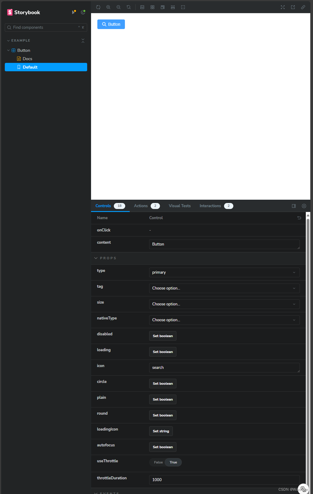
集成 StoryBook
Storybook 是一个 快速开发 UI 组件的工具
它是一个组件驱动的开发环境,可以通过隔离组件使开发更快更容易,一次只处理一个组件
Storybook 可以在已有项目中,无需修改业务逻辑的情况下,给组件自动形成文档,可很好的展示属性和功能
Storybook 可以让开发人员在独立的开发环境中展示组件的交互,使测试和调试组件以及与其他开发人员协作变得更加容易
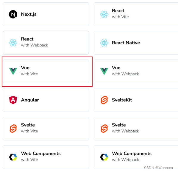
StoryBook 官方文档 选择 Vue with Vite 复制 指令 pnpm dlx storybook@latest init 到分包 play 目录下运行终端 选择Yes 选择 vue3 自动帮我们构建
pnpm storybook

stories 目录下只保留一个 文件 其他多余文件删除
// 自动生成的样例 全部清空 写入我们自己的逻辑
import type { Meta, StoryObj, ArgTypes } from "@storybook/vue3";
import { expect, fn, userEvent, within } from "@storybook/test";

// 引入组件
import { WanButton } from "Wannaer-element";

// 定义以下 Story 类型
type Story = StoryObj<typeof WanButton> & { argTypes: ArgTypes };

const meta: Meta<typeof WanButton> = {
  title: "Example/Button",
  component: WanButton,
  tags: ["autodocs"],
  argTypes: {
    type: {
      control: { type: "select" },
      options: ["primary", "success", "warning", "danger", "info", ""],
    },
    size: {
      control: { type: "select" },
      options: ["large", "default", "small", ""],
    },
    disabled: {
      control: "boolean",
    },
    loading: {
      control: "boolean",
    },
    useThrottle: {
      control: "boolean",
    },
    throttleDuration: {
      control: "number",
    },
    autofocus: {
      control: "boolean",
    },
    tag: {
      control: { type: "select" },
      options: ["button", "a", "div"],
    },
    nativeType: {
      control: { type: "select" },
      options: ["button", "submit", "reset", ""],
    },
    icon: {
      control: { type: "text" },
    },
    loadingIcon: {
      control: { type: "text" },
    },
  },
  args: { onClick: fn() },
};

const container = (val: string) => `
<div style="margin:5px">
  ${val}
</div>
`;

export const Default: Story & { args: { content: string } } = {
  argTypes: {
    content: {
      control: { type: "text" },
    },
  },
  args: {
    type: "primary",
    content: "Button",
  },
  render: (args) => ({
    components: { WanButton },
    setup() {
      return { args };
    },
    template: container(
      `<wan-button v-bind="args">{{args.content}}</wan-button>`
    ),
  }),
  play: async ({ canvasElement, args, step }) => {
    const canvas = within(canvasElement);
    await step("click button", async () => {
      await userEvent.tripleClick(canvas.getByRole("button"));
    });

    expect(args.onClick).toHaveBeenCalled();
  },
};

export default meta;
测试结果


 8782
8782


 被折叠的 条评论
为什么被折叠?
被折叠的 条评论
为什么被折叠?
 到【灌水乐园】发言


