


大佬博客功能参考:https://www.lvyueyang.top/#/article/5cb071f14c78846e1132c517
一、单行或多行文本添加省略号
(1)两个div,纵向排列,垂直居中
.content{
 display: flex;
 flex-direction: column;
 justify-content: center;
 align-items: center;
}
(2)css 文字单行或多行添加省略号
/* 超出1行,添加省略号 */
.line-clamp-one {
  white-space: nowrap;
  overflow: hidden;
  text-overflow: ellipsis;
}
/* 超出2行,添加省略号 */
.line-clamp-two {
  overflow: hidden;
  text-overflow: ellipsis;
  display: -webkit-box;
  -webkit-line-clamp: 2;
  -webkit-box-orient: vertical;
}
二、moment 常用操作:
https://blog.csdn.net/qq_34645412/article/details/102816116
https://www.cnblogs.com/sameen/p/14694671.html
https://www.coder.work/article/1454844
三、CSS居中
(1)css绝对定位居中
css3:使用transform代替margin. transform中translate偏移的百分比值是相对于自身大小的,可以这样实现:
.conter{
 width: 600px; height: 400px;
 position: absolute; left: 50%; top: 50%;
 transform: translate(-50%, -50%);    /* 50%为自身尺寸的一半 */
}
(2)flex 居中
.flex {
  display: flex;
  align-items: center;
  justify-content: flex-start;
  flex-wrap: wrap;
}
(3) 左右两端对齐
.flex-space-between {
  display: flex;
  align-items: center;
  justify-content: space-between;
}
(4)两个div,纵向排列,垂直居中 (上下左右垂直居中排列)
.flex-column {
  display: flex;
  flex-direction: column;
  justify-content: center;
  align-items: center;
}
(5)垂直居中
效果图:
代码:
<div id="parent">
    <div id="child">Content here</div>
</div>
#parent {display: table;}
#child {
    display: table-cell;
    vertical-align: middle;
}
(6)flex 实现一行或多行文字与左右标签对齐:
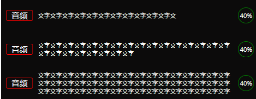
代码实现:
HTML
<div class="course-single">
    <span class="type">音频</span>
    <span class="title">文字文字文字文字文字文字文字文字文字文字文字文</span>
    <span class="type-icon">40%</span>
</div>
<br />
<div class="course-single">
    <span class="type">音频</span>
    <span class="title"
        >文字文字文字文字文字文字文字文字文字文字文字文 字文字文字文字文字文字文字文字文字文字文字文字文字</span
    >
    <span class="type-icon">40%</span>
</div>
<br />
<div class="course-single">
    <span class="type">音频</span>
    <span class="title"
        >文字文字文字文字文字文字文字文字文字文字文字文字
        文字文字文字文字文字文字文字文字文字文字文字文字文字文字文字文字文
        字文字文字文字文字文字文字文字文字文字文字文字文字文字文字文字文字 文字文字文字</span
    >
    <span class="type-icon">40%</span>
</div>
CSS
.course-single {
  width: 500px;
  min-height: 48px;
  padding: 10px 0 10px 10px;
  background-color: #0c0b0b;
  display: -webkit-inline-box;
  display: -ms-inline-flexbox;
  display: inline-flex;
  -ms-flex-wrap: wrap;
  flex-wrap: wrap;
  align-items: center;
}
.type {
  width: 40px;
  height: 20px;
  line-height: 20px;
  text-align: center;
  font-size: 16px;
  color: #ffffff;
  padding: 0 6px;
  border: 1px solid red;
  border-radius: 4px;
}
.title {
  font-size: 12px;
  margin-left: 10px;
  width: 390px;
  color: #ffffff;
}
.type-icon {
  font-size: 12px;
  width: 30px;
  height: 30px;
  text-align: center;
  line-height: 30px;
  border: 1px solid green;
  border-radius: 50%;
  color: #fff;
  margin-left: 10px;
}
总结:
- 父盒子给:display: inline-flex;
- 实现行内元素 Flex 布局:flex-wrap: wrap;
- flex-wrap属性定义,如果一条轴线排不下,如何换行
- wrap:换行,第一行在上方
- align-items: center; align-items属性定义项目在交叉轴上如何对齐
- 子盒子给:各个子块给相应的宽度等样式
四、表格的两种实现方式:table实现、div手写
效果图:
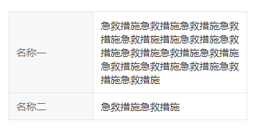
方法一:table实现
<table class="table-style">
    <tr>
        <td class="label">
        <div class="text">名称一</div>
        </td>
        <td class="value">
        <div class="text">急救措施急救措施急救措施急救措施急救措施</div>
        </td>
    </tr>
    <tr>
        <td class="label">
        <div class="text">名称二</div>
        </td>
        <td class="value">
        <div class="text">急救措施急救措施</div>
        </td>
    </tr>
    <tr>
        <td class="label">
        <div class="text">名称三</div>
        </td>
        <td class="value">
        <div class="text">急救措施急救措施急救</div>
        </td>
    </tr>
</table>
css样式
table,
th,
td {
  border: 1px solid #e6e6e6;
}

.table-style {
  font-size: 0.37rem;
  font-family: MiSans-Regular, MiSans;
  font-weight: 400;
}
// 第一列
.table-style .label {
  color: #666666;
  width: 3.16rem;
  background: #f6f8fa;
}
.table-style .label .text {
  margin: 0 0.27rem;
}
// 第二列
.table-style .value {
  color: #333333;
  width: 5.7rem;
  margin: 0.24rem;
}
.table-style .value .text {
  margin: 0.24rem 0.27rem;
}
方法二:div 写表格
flex 布局,第一列固定宽度,第二列设置 flex:1,则第二列可铺满
<div class="info-box">
    <div class="info-con">
        <div class="label">
        <div class="text">名称一</div>
        </div>
        <div class="value">
        <div class="text">
            急救措施急救措施急救措施急救措施急救措施措施急救措施急救措施急救措施急救措施急救措施急救措施急救措施急救措施急救措施急救措施
        </div>
        </div>
    </div>
    <div class="info-con">
        <div class="label">
        <div class="text">名称二</div>
        </div>
        <div class="value">
        <div class="text">急救措施急救措施</div>
        </div>
    </div>
</div>
css样式
.info-con {
  min-height: 0.96rem;
  display: flex;
  font-size: 0.37rem;
  font-family: MiSans-Regular, MiSans;
  border: 1px solid #e6e6e6;
  border-bottom: none;
}

.info-con &:last-child {
  border-bottom: 1px solid #e6e6e6;
}

.info-con .label {
  width: 3.15rem;
  min-height: 0.96rem;
  background: #f6f8fa;
  display: flex;
  align-items: center;
  color: #666666;
  border-right: 1px solid #e6e6e6;
  padding: 0.24rem 0.27rem;
}
.info-con .value {
  width: 5.79rem;
  min-height: 0.96rem;
  color: #333333;
  padding: 0.24rem 0.27rem;
  flex: 1;
}
五、月历图
效果图:
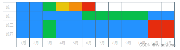
实现:
<template>
  <div>
    <div class="table_div">
      <div v-for="(item, index) in dataList" :key="index" class="row_tabel">
        <div class="one_td">{{ item.name }}</div>
        <div
          class="one_td"
          v-for="(Citem, Cindex) in item.value"
          :key="Cindex"
          :style="{ backgroundColor: colorConfig[Citem].color }"
        ></div>
      </div>
      <div class="row_tabel">
        <div class="one_td"></div>
        <div class="one_td" v-for="(Citem, Cindex) in 12" :key="Cindex">
          {{ Cindex + 1 }}月
        </div>
      </div>
    </div>
  </div>
</template>

<script>
export default {
  name: "",
  data() {
    return {
      dataList: [
        { name: "第一", value: [1, 2, 3, 4, 5, 6, "", "", "", "", "", ""] },
        { name: "第二", value: [1, 1, 1, 1, 1, 3, 3, 3, 3, 3, 2, 2] },
        { name: "第三", value: [1, 2, 3, 2, 2, 2, 2, 2, 2, 2, 6, 6] },
        { name: "第四", value: [1, 2, 3, 2, 2, 2, 2, 2, 2, 2, 6, 6] },
      ],
      colorConfig: {
        "": {
          name: "",
          color: "",
        },
        1: {
          name: "一",
          color: "#2492FF",
        },
        2: {
          name: "二",
          color: "#2492FF",
        },
        3: {
          name: "三",
          color: "#08BE4B",
        },
        4: {
          name: "四",
          color: "#E8C50B",
        },
        5: {
          name: "五",
          color: "#F38E0A",
        },
        6: {
          name: "六",
          color: "#E62C0E",
        },
      },
    };
  },
};
</script>

<style scoped>
.table_div {
  padding-top: 6px;
}
.row_tabel {
  display: flex;
  flex-direction: row;
  justify-content: flex-start;
  align-items: center;
  margin-left: 20px;
}
.row_tabel .one_td {
  width: 43px;
  height: 29px;
  border: 1px solid #506777;
  display: flex;
  flex-direction: row;
  justify-content: center;
  align-items: center;
  font-size: 12px;
  color: #ccc;
}
.row_tabel .one_td:nth-child(n + 2) {
  margin-left: -1px;
}
.row_tabel:nth-child(n + 2) {
  margin-top: -1px;
}
</style>
六、进度条
进度条效果图

代码:
<template>
  <div class="question">
    <div v-for="item in list" :key="item.index" class="item">
      <div class="text">{{ item.text }}</div>
      <div class="progress_box">
        <div
          class="progress"
          :style="{
            width: (item.percent / total) * 100 + '%',
          }"
        ></div>
      </div>
      <div class="percent">{{ item.percent }}%</div>
      <div class="num">{{ item.num }}家</div>
    </div>
  </div>
</template>

<script>
export default {
  name: 'crosswiseTable',
  data() {
    return {
      total: 100,
      list: [
        { text: 'XXXX', percent: 35, num: 35 },
        { text: 'XX', percent: 34, num: 34 },
        { text: 'XXXX', percent: 32, num: 32 },
        { text: 'DDDD', percent: 30, num: 30 },
        { text: 'DD', percent: 28, num: 28 },
        { text: 'DDDDD', percent: 27, num: 27 },
        { text: 'WWW', percent: 26, num: 26 },
        { text: 'WWWWW', percent: 24, num: 24 },
        { text: 'WWWW', percent: 20, num: 20 },
        { text: 'HHHHHH', percent: 16, num: 16 },
        { text: 'HH', percent: 14, num: 14 },
        { text: 'YYYY', percent: 10, num: 10 },
        { text: 'KKKK', percent: 8, num: 8 },
        { text: 'LLLL', percent: 7, num: 7 },
      ],
    }
  },
}
</script>

<style lang="scss" scoped>
.question {
  padding: 20px 0 40px 12px;
  max-height: calc(100vh - 300px);
  overflow-y: auto;

  .item {
    font-size: 14px;
    display: flex;
    justify-content: flex-start;
    align-items: center;

    .text {
      width: 20.4%;
      overflow-x: hidden;
      white-space: nowrap;
      text-overflow: ellipsis;
    }

    .progress_box {
      width: 50.06%;
      height: 12px;
      background: rgba(7, 28, 32, 0.8);
      border-radius: 10px;

      .progress {
        height: 8px;
        background: #67e5ff;
        border-radius: 4px;
        margin: 2px 0 0 2px;
      }
    }
    .percent {
      width: 10%;
      margin-left: 12px;
      text-align: right;
    }

    .num {
      width: 11.54%;
      text-align: right;
    }

    &:not(:last-child) {
      margin-bottom: 19px;
    }
  }
}
</style>
七、css 实现虚线
参考:https://zhuanlan.zhihu.com/p/478054559
方法一:利用边框的 dotted 或者 dashed 样式实现虚线
使用 dotted 或 dashed 边框实现的虚线是有区别的:
- dotted边框:是用一个个点(dot)组成的虚线;
- dashed边框:是用一个个破折号(dash)组成的虚线
<style>
    .box {
        margin: 20px;
        padding: 10px 30px;
        width: 200px;
    }
    .card1 {
        border: 1px dotted #000;
    }
    .card2 {
        border: 1px dashed #000;
    }
</style>

<body>
    <div class="box card1">
        用dotted边框实现的虚线
    </div>
    <div class="box card2">
        用dashed边框实现的虚线
    </div>
</body>
效果:
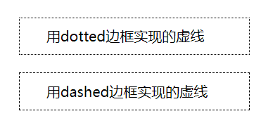
这种用边框实现的虚线,在边框宽度比较小(1px)的情况下,因为组成虚线的点排列的比较密集(这是没有办法修改的),导致虚线的效果看起来不明显。可以通过修改边框的宽度,来突出虚线的显示效果,但有时候会与设计图的要求不一致;
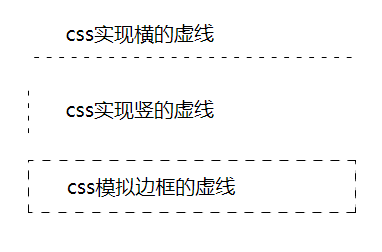
方法二:使用CSS实现效果显著的虚线
<style>
    .box {
        margin: 20px;
        padding: 10px 30px;
        width: 200px;
    }
    .card3 {
        background-image: linear-gradient(to right, #000 35%, rgba(255,255,255,0) 0%); /* 35%设置虚线点x轴上的长度 */
        background-position: bottom; /* top配置上边框位置的虚线 */
        background-size: 10px 1px; /* 第一个参数设置虚线点的间距;第二个参数设置虚线点y轴上的长度 */
        background-repeat: repeat-x;
    }
    .card4 {
        background-image: linear-gradient(#000 35%, rgba(255,255,255,0) 0%); /* 35%设置虚线点y轴上的长度 */
        background-position: left; /* right配置右边框位置的虚线 */
        background-size: 1px 10px; /* 第一个参数设置虚线点x轴上的长度;第二个参数设置虚线点的间距 */
        background-repeat: repeat-y;
    }
.card5 {
        border: 1px dashed transparent;
        background: linear-gradient(#fff,#fff) padding-box,
					repeating-linear-gradient(-45deg,#000 0, #000 0.3em, #fff 0,#fff 0.6em);
					/* 0.3em设置虚线点的宽度或长度;0.6em设置虚线点的间距 */
    }
</style>

<body>
    <div class="box card3">
        css实现横的虚线
    </div>
    <div class="box card4">
        css实现竖的虚线
    </div>
    <div class="box card5">
        css模拟边框的虚线
    </div>
</body>
效果图:
应用:竖的虚线
<style>
     .card4 {
      background-image: linear-gradient(#000 35%, rgba(255, 255, 255, 0) 0%); /* 35%设置虚线点y轴上的长度 */
      background-position: left; /* right配置右边框位置的虚线 */
      background-size: 1px 10px; /* 第一个参数设置虚线点x轴上的长度;第二个参数设置虚线点的间距 */
      background-repeat: repeat-y;
    }
    .dashWidth {
      height: 20px;
      border-left: 1px dashed #000;
    }
</style>

<body>
   <!-- 方法一:设置虚线:有间隔 -->
    <div class="card4">
      <div style="width: 1px; height: 30px"></div>
    </div>

    <!-- 方法二:border 方式实现虚线:虚线没有间隔 -->
    <div class="dashWidth"></div>
</body>
八、时间线
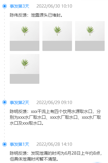
效果:
组件代码:
<template>
  <div>
    <div class="time-line-item" v-for="(item, index) in accidentTimeList" :key="index">
      <div class="time-line-head">
        <div class="dot-con">
          <div class="dot"></div>
        </div>
        <div>
          <span class="title">事发第{{ item.day }}天</span>
          <span class="time">{{ item.time }}</span>
        </div>
      </div>
      <div class="time-line-content">
        <div class="time-line-info">{{ item.content }}</div>
        <div class="img-box">
          <div class="img-con" v-for="(img, ind) in item.imgList" :key="ind" @click="previewIng(imgItem)">
            <img :src="img.url" alt="" srcset="" />
          </div>
        </div>
      </div>
      <div class="v-line">
        <div class="dashWidth"></div>
      </div>
    </div>
  </div>
</template>

<script>
import ImagePreview from "vant/lib/image-preview";

export default {
  name: "TimeLine",
  data() {
    return {
      accidentTimeList: [
        {
          day: 3,
          time: "2022/06/30  10:10",
          content: "陈伟反馈:泄露源头已堵封。",
          imgList: [
            { url: "https://img01.yzcdn.cn/vant/leaf.jpg", type: "img" },
            { url: "https://img01.yzcdn.cn/vant/leaf.jpg", type: "img" },
            { url: "https://img01.yzcdn.cn/vant/leaf.jpg", type: "video" },
            { url: "https://img01.yzcdn.cn/vant/leaf.jpg", type: "video" },
          ],
        },
        {
          day: 2,
          time: "2022/06/29  09:10",
          content:
            "陈明反馈:xxx干流上有四个饮用水源取水口,分别为xxx水厂取水口、xxx水厂取水口、xxx水厂取水口及xxx取水口。",
        },
        {
          day: 1,
          time: "2022/06/28  14:10",
          content: "陈明反馈:发现泄漏的时间为6月28日上午约8点,但具体泄漏时间暂不清楚。",
        },
      ],
    };
  },
  methods: {
    // 图片预览(vant)
    previewIng(item) {
      ImagePreview({
        images: ["https://img01.yzcdn.cn/vant/leaf.jpg"],
        showIndex: false,
        closeable: false,
      });
    },
  },
};
</script>

<style lang="scss" scoped>
.time-line-item {
  position: relative;

  .time-line-head {
    font-size: 0.37rem;
    font-family: MiSans-Regular, MiSans;
    margin-bottom: 0.27rem;
    display: flex;
    align-items: center;
    .dot-con {
      width: 0.37rem;
      height: 0.37rem;
      background: #ffffff;
      border: 0.03rem solid #2492ff;
      border-radius: 50%;
      display: flex;
      justify-content: center;
      align-items: center;
      margin-right: 0.27rem;
      .dot {
        width: 0.21rem;
        height: 0.21rem;
        background: #2492ff;
        border-radius: 50%;
      }
    }

    .title {
      font-weight: 500;
      color: #2492ff;
      margin-right: 0.53rem;
    }
    .time {
      font-weight: 400;
      color: #999999;
    }
  }

  .time-line-content {
    padding-left: 0.64rem;
    margin-bottom: 1.08rem;
    .time-line-info {
      font-size: 0.37rem;
      font-family: MiSans-Regular, MiSans;
      font-weight: 400;
      color: #333333;
      margin-bottom: 0.27rem;
    }

    .img-box {
      display: flex;
      flex-wrap: wrap;
      .img-con {
        width: 2.59rem;
        height: 2.59rem;
        background: #ccc;
        border-radius: 0.05rem;
        margin-right: 0.26rem;
        margin-bottom: 0.27rem;
        &:nth-child(3n + 0) {
          margin-right: 0rem;
        }
      }
    }
  }

  .v-line {
    position: absolute;
    left: 0.16rem;
    top: 0.5rem;
    background-image: linear-gradient(#ccc 35%, rgba(255, 255, 255, 0) 0%); /* 35%设置虚线点y轴上的长度 */
    background-position: left; /* right配置右边框位置的虚线 */
    background-size: 0.03rem 0.3rem; /* 第一个参数设置虚线点x轴上的长度;第二个参数设置虚线点的间距 */
    background-repeat: repeat-y;
    height: calc(100% + 0.77rem);

    .dashWidth {
      width: 0.03rem;
    }
  }
}

.time-line-item:last-child .v-line {
  display: none;
}
</style>
九、禁止文本框 textarea 框拖动
默认情况下,我们将鼠标移动到 textarea 的右下角时发现文本域是可以通过拖动的方式改变其大小的,这会影响我们原本的页面布局。
若想设置其不可拖动,可为其添加如下属性:
<textarea style="resize:none;"></textarea>
十、更改 input file 文件上传默认样式
1.1 原理实现:
- 首先在 input[file] 外层套一个容器(如div)
- 定义 div.avatar 样式, 和 input[file] 样式
- 设置 div.avatar 相对定位(position:relative;),设置 input 绝对定位(position:absolute; top:0; left:0;),后面的文字才能往上移动
- 将原来的 input 变透明(opacity: 0;)
- 设置 input[file] 的大小和 div.avatar 的大小一致
<template>
	<div class="avatar">
	    <input type="file" name="avatar" id="avatar" class="form-control" />点击这里上传文件
	</div>
</template>
<style>
.avatar{
    position: relative;
    width: 50px;
    height: 50px
    background:#ccc;
}
.avatar input{
    position: absolute;
    top: 0;
    left: 0;
    opacity: 0;
    z-index: 1;
    cursor: pointer;
}
</style>
1.2 实例:
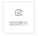
<template>
	<div class="img-item img-upload">
		<div class="icon">
			<i class="iconfont icon-tianjiazhaopian"></i>
		</div>
		<div class="text">添加照片</div>
		<input class="add-pic" type="file" ref="uploadFile" @change="fileChange" accept="image/*" multiple />
	</div>
</template>

<style lang="scss" scoped>
.img-upload {
   border: 0.01rem dashed #999999;
   display: flex;
   flex-direction: column;
   justify-content: center;
   align-items: center;
   position: relative;
   .icon {
     margin-bottom: 0.31rem;
     i {
       font-size: 0.64rem;
       color: #999999;
     }
   }
   .text {
     font-size: 0.43rem;
     font-family: MiSans-Regular, MiSans;
     font-weight: 400;
     color: #999999;
   }
   // 添加照片
   .add-pic {
     position: absolute;
     top: 0;
     left: 0;
     width: 2.8rem;
     height: 2.8rem;
     border-radius: 0.11rem;
     opacity: 0;
     z-index: 1;
     cursor: pointer;
   }
 }
</style>
2.1 上传后预览图片、并传给服务器
预览图片:
多文件上传预览基本思路: 参考:https://blog.csdn.net/weixin_41981909/article/details/118548037
- 获取所上传的文件,input 发生 change 事件时获取 e.target.files,这个变量就是文件列表
- 文件上传用的时 FormData 格式,这里我循环遍历了文件列表,并把文件 append 到 FormData 对象里
- 提交时把 FormData 对象提交到服务器即可
- 预览功能我用的 FileReader 的 readAsDataURL 方法将上传图片转为 base64
- 读取操作是异步读取,这里用了 Promise,读取操作完成后,触发 onload 事件,返回一个 resolve 状态并带上 base64 编码的字符串
- 将 base64 这串字符赋给 img 元素的 src,即可预览图片
效果图:

主要代码:
var inputFile = e.target;
if (!inputFile.files || inputFile.files.length <= 0) {
  return;
}
var fileUp = inputFile.files[0];
// 本地文件
var reader = new FileReader();
var that = this;
reader.readAsDataURL(fileUp);
reader.onload = function (e) {
  console.log("result", this.result);
};
传给后端接口的参数:Content-Type:multipart/form-data
let formData = new FormData();
formData.append("uploadFile", fileUp); //formData是上传给后端接口的文件参数
2.2 完整组件代码:
<template>
  <!-- 图片上传 -->
  <div>
    <div class="img-con">
      <div v-for="(item, index) in fileImgList" :key="index" class="img-item">
        <img :src="item.url" alt="" />
        <div class="delete-btn" @click="deleteImg(item, index)">
          <i class="iconfont icon-yichu"></i>
        </div>
      </div>
      <div class="img-item img-upload">
        <div class="icon">
          <i class="iconfont icon-tianjiazhaopian"></i>
        </div>
        <div class="text">添加照片</div>
        <input class="add-pic" type="file" ref="uploadFile" @change="fileChange" accept="image/*" multiple="multiple" />
      </div>
    </div>
  </div>
</template>

<script>
import eventApi from "@/api/eventNotice.js";

export default {
  name: "PicUpload",
  props: {
    imgList: {
      type: Array,
      default: () => [
        { url: "https://img01.yzcdn.cn/vant/leaf.jpg" },
        { url: "https://img01.yzcdn.cn/vant/leaf.jpg" },
        { url: "https://img01.yzcdn.cn/vant/leaf.jpg" },
        { url: "https://img01.yzcdn.cn/vant/leaf.jpg" },
      ],
    },
  },
  data() {
    return {
      fileImgList: [],
    };
  },
  methods: {
    // 上传图片
    async fileChange(e) {
      if (this.fileImgList.length > 15) {
        this.$toast("最多可上传 15 张图片");
        return;
      }

      var inputFile = e.target;
      if (!inputFile.files || inputFile.files.length <= 0) {
        return;
      }
      var fileUp = inputFile.files[0];
      let formData = new FormData();
      formData.append("uploadFile", fileUp); //上传给后端接口的文件参数

      // 请求接口
      let info = await eventApi.doUpload(formData);
      if (info.succeed) {
        // 预览当前上传的图片(本地)
        var reader = new FileReader();
        var that = this;
        reader.readAsDataURL(fileUp);
        reader.onload = function (e) {
          // console.log("result", this.result);
          let obj = info.data.data[0] || {};
          obj.url = this.result; // 本地图片预览
          that.fileImgList.push(obj);
        };
      } else {
        return;
      }
    },
    // 删除图片
    deleteImg(item, index) {
      this.fileImgList.splice(
        this.fileImgList.findIndex((work, ind) => ind === index),
        1
      );
      // console.log("删除某个值", this.fileImgList);
    },
  },
};
</script>

<style lang="scss" scoped>
// 照片
.img-con {
  display: flex;
  flex-wrap: wrap;
  margin-bottom: 0.26rem;

  .img-item {
    width: 2.8rem;
    height: 2.8rem;
    background: #ffffff;
    border-radius: 0.11rem;
    margin-right: 0.27rem;
    margin-bottom: 0.27rem;
    border: 0.01rem solid #fff;
    position: relative;
    img {
      width: 100%;
      height: 100%;
    }
    &:nth-child(3n + 0) {
      margin-right: 0;
    }
    .delete-btn {
      position: absolute;
      right: 0.13rem;
      top: 0.13rem;
      width: 0.48rem;
      height: 0.48rem;
      background: rgba(0, 0, 0, 0.6);
      border-radius: 0.05rem;
      line-height: 0.48rem;
      text-align: center;
      .iconfont {
        font-size: 0.21rem;
        color: #fff;
        display: inline-block;
        transform: scale(0.7);
        -webkit-transform: scale(0.7);
      }
    }
  }

  .img-upload {
    border: 0.01rem dashed #999999;
    display: flex;
    flex-direction: column;
    justify-content: center;
    align-items: center;
    position: relative;
    .icon {
      margin-bottom: 0.31rem;
      i {
        font-size: 0.64rem;
        color: #999999;
      }
    }
    .text {
      font-size: 0.43rem;
      font-family: MiSans-Regular, MiSans;
      font-weight: 400;
      color: #999999;
    }
    // 添加照片
    .add-pic {
      position: absolute;
      top: 0;
      left: 0;
      width: 2.8rem;
      height: 2.8rem;
      border-radius: 0.11rem;
      opacity: 0;
      z-index: 1;
      cursor: pointer;
    }
  }
}
</style>
十一、css字体缩放
当字体设置超过浏览器最小值 font-size(12px) 不起作用时:
.demo{
	font-size: 10px;
	display: inline-block;
	transform: scale(0.7);
	-webkit-transform: scale(0.7);
 }
十二、css实现三角形
参考:https://juejin.cn/post/7075884138900750372
示例:

<div class="water-con">
  <div class="water-img">
    <i class="iconfont icon-shuizhan"></i>
    <span>II类</span>
  </div>
  <div class="triangle"></div>
</div>
.water-con {
  .water-img {
    width: 1.92rem;
    height: 0.81rem;
    border: 1px solid #1ca0ff;
    background: #1ca0ff;
    border-radius: 0.1rem;
    color: #fff;
    display: flex;
    justify-content: center;
    align-items: center;
    position: relative;
    z-index: 2;
    i {
      font-size: 0.51rem;
      margin-right: 0.18rem;
    }
    span {
      font-size: 0.37rem;
      font-family: MiSans-Regular, MiSans;
      font-weight: 400;
      color: #ffffff;
    }
  }
  /**三角形 **/
  .triangle {
    position: absolute;
    width: 0;
    height: 0;
    border-right: 0.18rem solid transparent;
    border-left: 0.18rem solid transparent;
    border-top: 0.18rem solid #1ca0ff;
    bottom: -0.16rem;
    left: 50%;
    transform: translateX(-50%);
    z-index: 1;
  }
}
十三、解决:连续点击 div 等标签或其他的地方会出现一片蓝色问题
1、添加css:
body{
-webkit-user-select:none;
-moz-user-select:none;
-ms-user-select:none;
user-select:none;
}
2、或添加 js:
document.onselectstart=new Function("return false");
十四、实现圆环
参考:https://blog.csdn.net/LXY224/article/details/79526061
给 border 设置渐变色:https://segmentfault.com/a/1190000040794056
十五、字体缩放
问题:
pc端 字体通过 transform:scale(0.5) 缩小之后 为什么文字会对不齐
有的正常显示 10px 大小了 有的就变小 垂直方向还不对齐
回答:
transform-origin
这种缩小可以用zoom,会更好用一点
十六、鼠标悬浮、选中效果
<div class="item-con">
这是一个元素
</div>
写法一:这种写法:当鼠标悬浮时,不影响已选中状态
.item-con{
    color: black;
	&:hover {
	  color: red;
	}
	&.active {
	  color:green;
	}
}
写法二:这种写法:当鼠标悬浮时,会覆盖掉已选中的样式效果
.item-con{
    color: black;
	&:hover {
	  color: red;
	}
}
.active {
  color:green;
}
十七、CSS3 绘制不规则图形
参考:https://blog.csdn.net/suwyer/article/details/81045284
绘制直角梯形:https://blog.csdn.net/weixin_45948996/article/details/111875664
十八、手写 select 下拉框
参考:https://juejin.cn/post/6938602737793761310


 416
416


 被折叠的 条评论
为什么被折叠?
被折叠的 条评论
为什么被折叠?
 到【灌水乐园】发言


