


这是之前方位动画的衍生需求。先根据后端返回的数据排列内容,然后当用户点击某块内容后居中放大并根据具体的方位数据显示方位动画。
可以参考下面的效果。 
设计思路
定位动画我们在之前已经实现了。那么这里只要考虑如何实现放大动画,最后将两者结合起来就好。从后端拿到的返回值是一个固定长度的数组,所以这里还是用 div 利用 flex 布局将图片平铺展示,利用 CSS transform 进行位置移动和缩放。
接下来就是如何计算出每个 div 的位移。DOM 元素的位移主要关注左上角顶点的位移。针对这个需求可以画出如下草图。外层 div 为 container,内层 div 为 inner。
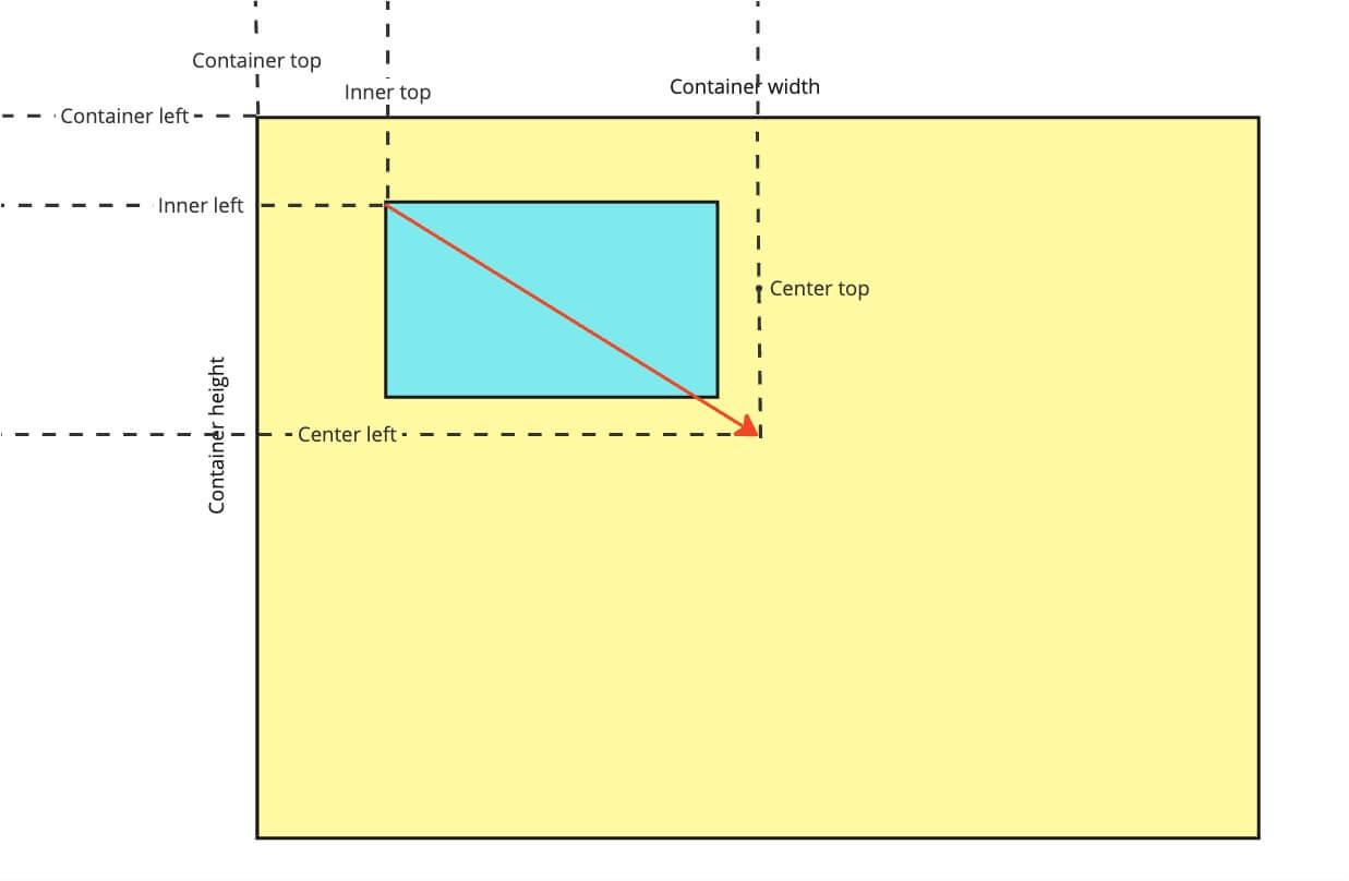
从上图可以看到,每个 div 的位移即 center.left - inner.left, center.top - inner.top. container 的中心点:
const containerCenterX = containerRect.left + containerRect.width / 2;
const containerCenterY = containerRect.top + containerRect.height / 2;
inner 移动的偏移量:
// 让 inner 移到 container 的正中间
const offsetX = containerCenterX - itemRect.width / 2 - itemRect.left;
const offsetY = containerCenterY - itemRect.height / 2 - itemRect.top;
最后将方位动画的 div 叠在 inner 上面即可。
代码实现和 Demo 演示
梳理清思路之后,就可以实现代码了。Demo 已经放在 CodeSandbox 上了。其中最主要的还是位移计算的逻辑。下面是Demo地址,也可以在我的博客上看到 Demo。 Demo 地址:https://codesandbox.io/p/devbox/simple-scale-animation-demo-vjhsyh?embed=1&file=%2Fsrc%2FApp.vue
布局部分代码:
  <div class="container" ref="container">
    <div
      v-for="(image, index) in imageList"
      :key="index"
      class="wrapper"
      ref="imageElList"
      :style="{ opacity: image.active ? 1 : 0.6 }"
      @click="toggleActiveImage(index)"
    >
      <img :src="image.src" class="image" />
      <direction
        ref="directionElList"
        class="direction"
        :style="{ display: image.active ? 'block' : 'none' }"
        :pinPosition="selectedDirection"
      />
    </div>
  </div>
数据结构部分:
export const imageDemos = [
  {
    name: "image-1",
    src: "https://images.adsttc.com/media/images/564c/8b23/e58e/ce4d/7300/01c1/newsletter/01.jpg?1447856922",
    active: false,
  },
  {
    name: "image-2",
    src: "https://i.pinimg.com/550x/65/a9/10/65a91018534fc59b675150fc432ccc41.jpg",
    active: false,
  },
  {
    name: "image-3",
    src: "https://1.bp.blogspot.com/-PcYuV8FVZmQ/VXWy7y-QjDI/AAAAAAABewE/La-BpNsCsY0/s1600/mapa-grande1.jpg",
    active: false,
  },
  {
    name: "image-4",
    src: "https://image2.sina.com.cn/gm/zhuanqu/sephiroth/rwjs/fomalhaut_b.gif",
    active: false,
  },
  {
    name: "image-5",
    src: "https://gd-hbimg.huaban.com/f0c7a577ed51f171967cbd3c1b21e90361b6924b1594b7-yrOBDd",
    active: false,
  },
];
偏移量计算部分代码:
const showActiveImage = (imageEl) => {
  const containerEl = container.value;

  const containerRect = containerEl!.getBoundingClientRect();
  const itemRect = imageEl!.getBoundingClientRect();

  const containerCenterX = containerRect.left + containerRect.width / 2;
  const containerCenterY = containerRect.top + containerRect.height / 2;

  const offsetX = containerCenterX - itemRect.width / 2 - itemRect.left;
  const offsetY = containerCenterY - itemRect.height / 2 - itemRect.top;

  imageEl!.style.transform = `translate(${offsetX}px, ${offsetY}px) scale(1.2)`;
  imageEl!.style.zIndex = 100;
};
拓展
这次的需求也可以用于展示动画。比如产品展示或者局部细节的展示。根据不同的需求结合不同的动画,可以让我们的页面变得更加酷炫。
题外话
其实这两次的动画效果,代码都是利用 ChatGPT 生成的,我自己基本没有什么参与。在 4 年前我就从前端转到了后端,因此对于前端方面的知识还停留在很久之前。但有了 ChatGPT 的加持,我也可以用当前的前端技术实现一些需求。
尽管这次的需求比较简单,但通过实践可以发现,利用好 AI 能够拓宽我们的技术面,让我们做到更多事情。但于此同时,作为开发者也应当思考与 AI 之间的关系了,这又是另一个话题了
本文由 mdnice 多平台发布


 扫一扫
扫一扫
 1255
1255

 被折叠的 条评论
为什么被折叠?
被折叠的 条评论
为什么被折叠?
 到【灌水乐园】发言


