


 本文展示了对糖尿病预测数据集的分析过程,包括数据导入、数据清洗(如将字符串转换为数值型)、缺失值处理和异常值处理。通过直方图、KDE图、条形图和箱线图等可视化手段,探讨了年龄、性别、吸烟史、糖尿病与心脏病的关系。最后,使用决策树模型评估了年龄、BMI、HbA1c水平和血糖水平对心脏病风险的影响。
# Downloading the Dataset
First of all, I find an interesting dataset on this page: https://www.kaggle.com/datasets?fileType=csv
Next, I will import all the packages that will be used later.
import pandas as pd
import numpy as np
from functools import reduce
import seaborn as sns
import matplotlib
import matplotlib.pyplot as plt
I import and read the CSV document, and then use the shape function, which meets the requirements.
df = pd.read_csv('./Dataset/DiabetesPredictionDataset.csv')

df.shape
I will print the first five rows of this document and explore the number of rows, columns, value range, median, average values and columns.
df.head()

df.describe()

df.columns
# Data Preparation and Cleaning
Based on observation of the CSV file, I noticed that there are some columns in string format. Therefore, the first step I took was to replace the string type with int64 type, to facilitate data visualization later on.
df['smoking_history'] = df['smoking_history'].replace({'never':0, 'not current':2, 'current':3, 'former':1,'ever':4,'No Info':2})
df['gender'] = df['gender'].replace({'Female':0,'Male':1})
df.head()
It's worth noting that by using this method to convert strings, it may appear that they have been converted to numerical form, but in reality, they have been converted to the object type. Therefore, we need to take an additional step here to convert the object type to int64 type
df['smoking_history'] = df['smoking_history'].astype('int64')
df['gender'] = df['gender'].astype('int64')
print(df.dtypes)

df = pd.DataFrame(df)
numeric_columns = df.select_dtypes(include=['int64', 'float64']).columns
print(numeric_columns)
Next, we will start with missing value treatment. First, we need to use the `isnull()` function to observe how many missing values there are. Since this is a dataset downloaded from the internet without missing values, I manually deleted some values randomly in the CSV file.
missing_values = df.isnull().sum()
print(missing_values)

for column in numeric_columns:
    df[column] = df[column].fillna(df[column].median())

missing_values = df.isnull().sum()
print(missing_values)
Next, we will handle outliers. Since certain columns have been transformed into simple numerical values such as 0 and 1 for categories like "disease status," "gender (male or female)," and "smoking history," we can exclude these columns from outlier processing.
# Identify the columns that only contain the numbers 0 and 1.
binary_columns = []
for col in df.columns:
    unique_values = df[col].unique()
    if len(unique_values) == 2 and 0 in unique_values and 1 in unique_values:
        binary_columns.append(col)

for col in df.columns:
    if col not in binary_columns:
        median = df[col].median()
        threshold = 3 * df[col].std()
        df[col] = np.where((df[col] < (median - threshold)) | (df[col] > (median + threshold)), median, df[col])

df.describe()
# Exploratory Analysis and Visualization
Compute the mean, sum, range and other interesting statistics for numeric columns
Explore distributions of numeric columns using histograms etc.
Explore relationship between columns using scatter plots, bar charts etc.
To prevent any formatting issues, I will first convert the column names to string type.
df.columns = df.columns.astype(str)
print(df.columns)

%matplotlib inline

sns.set_style('darkgrid')
matplotlib.rcParams['font.size'] = 14
matplotlib.rcParams['figure.figsize'] = (9, 5)
matplotlib.rcParams['figure.facecolor'] = '#00000000'
## IMAGE 1
We explored the age distribution in the dataset. We used the `cut()` function to divide the ages into four groups, calculated the count of each group using the `value_counts()` function, plotted a bar chart, set the graph title and axis labels, and annotated the count data on each bar for easy viewing.
bins = [0, 20, 40, 60, 80]

age_groups = pd.cut(df['age'], bins)

group_counts = age_groups.value_counts().sort_index()

plt.bar(group_counts.index.astype(str), group_counts.values)

plt.title('Age Group Counts')
plt.xlabel('Age Group')
plt.ylabel('Count')

for i, count in enumerate(group_counts):
    plt.text(i, count, str(count), ha='center', va='bottom')

plt.show()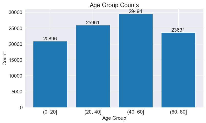
## IMAGE 2
The following code snippet uses the kdeplot() function from the Seaborn library to plot a kernel density estimation (KDE) plot of the 'age' column in the DataFrame 'df'. This plot showcases the distribution of age data. By observing the curve, we can see that the density is higher and narrower in the range of 40-60 years and at 80 years, indicating a relatively dense concentration of data in those age ranges. The curve is higher on the right side of the central point, suggesting a tendency towards larger age values and a right-skewed distribution.
sns.kdeplot(df['age'], shade=True)
plt.xlabel('Age')
plt.ylabel('Density')
plt.title('Age Distribution (KDE)')
plt.show()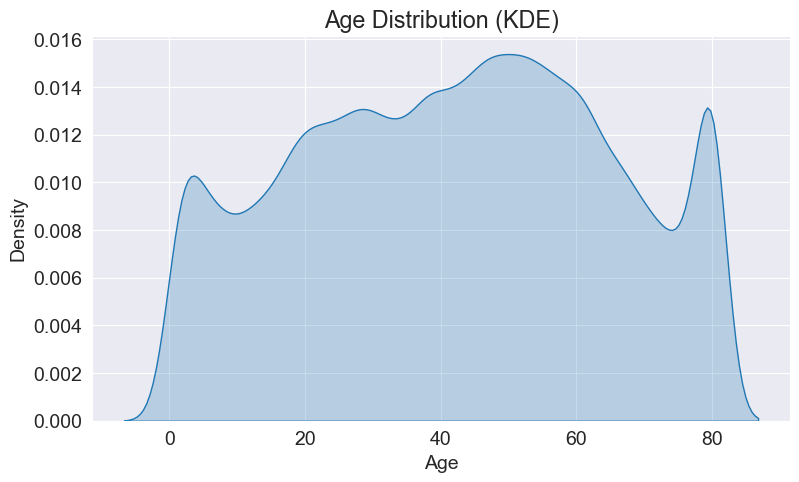
## IMAGE 3
We will analyze the gender ratio and distribution in the data. As you mentioned your teacher taught you about plotting two graphs on one canvas, we can apply that knowledge here. To do that, I will first create a figure and then plot a histogram and a pie chart.
column1_data = df['gender']
letter_counts = column1_data.value_counts()

fig, (ax1, ax2) = plt.subplots(1, 2, figsize=(12, 6))

ax1.bar(letter_counts.index, letter_counts.values)
ax1.set_title('Gender Group Counts')
ax1.set_xlabel('Gender Group')
ax1.set_ylabel('Count')

for i, v in enumerate(letter_counts.values):
    ax1.text(i, v, str(v), ha='center', va='bottom')


ax2.pie(letter_counts, labels=letter_counts.index,autopct='%1.1f%%')
ax2.set_title('pie picture')
plt.show()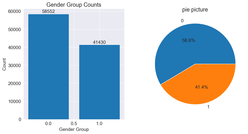
## IMAGE 4
The following code snippet uses the boxplot() function to plot a box plot of the blood glucose level (blood_glucose_level) data. In a box plot, the horizontal line represents the median (50th percentile) of the data. The median is a measure of the central tendency of the data. By observing the box plot, we can understand the distribution of the median, interquartile range, and outliers in the blood glucose level data. The box plot helps us assess the concentration, symmetry, and presence of outliers in the blood glucose level.
plt.boxplot(df['blood_glucose_level'])
plt.ylabel('Blood Glucose Level')
plt.title('Blood Glucose Level Distribution')
plt.show()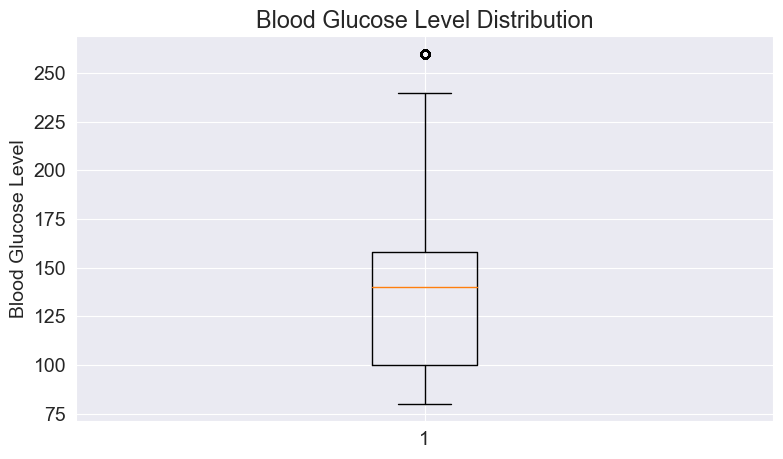
## IMAGE 5
The following code snippet is used to plot a stacked bar chart that shows the proportional distribution of diabetes across different smoking history categories. The proportions of each diabetes category are displayed in a stacked manner within each smoking history category, allowing for a visual comparison of the relative proportions of different diabetes categories across different smoking history categories.
# Bar chart of smoking history.
smoking_counts = df['smoking_history'].value_counts()
plt.bar(smoking_counts.index, smoking_counts)
plt.xlabel('Smoking History')
plt.ylabel('Count')
plt.title('Smoking History Distribution')
plt.show()

# Stacked percentage bar chart of smoking history.
smoking_diabetes_counts = df.groupby('smoking_history')['diabetes'].value_counts(normalize=True).unstack()
smoking_diabetes_counts.plot(kind='bar', stacked=True)
plt.xlabel('Smoking History')
plt.ylabel('Proportion')
plt.title('Smoking History Distribution by Diabetes')
plt.legend(title='Diabetes')
plt.show()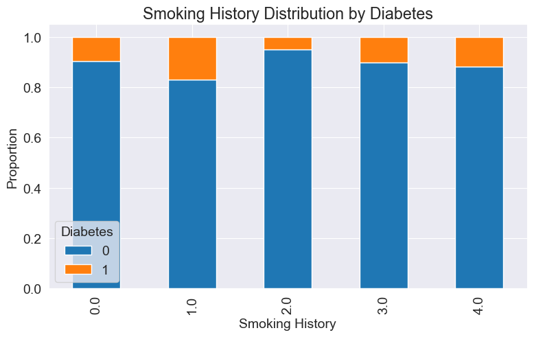
# Asking and Answering Questions
## Q1: Is the likelihood of a person having heart disease related to age?
First, we divide the age groups into eight categories and calculate the number of people with heart disease in each group.
bins = [0, 10, 20, 30, 40, 50, 60, 70, 80]
labels = ['0-10', '10-20', '20-30', '30-40', '40-50', '50-60', '60-70', '70-80']
df['age_group'] = pd.cut(df['age'], bins=bins, labels=labels, right=False)
heart_disease_counts = df.groupby('age_group')['heart_disease'].sum()

plt.plot(heart_disease_counts.index, heart_disease_counts.values, marker='o', linestyle='-', color='blue')
plt.xlabel('Age Group')
plt.ylabel('Number of Patients with Heart Disease')
plt.title('Heart Disease by Age Group')
plt.xticks(rotation=45)
plt.show()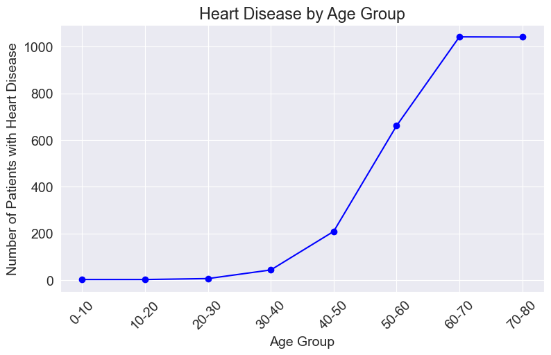
Conclusion: As shown in the graph, the number of people with heart disease increases with age, exhibiting a positive linear trend. This indicates that age is an important factor in determining whether a person has heart disease.
## Q2: Is the presence of diabetes related to a person's smoking history?
By observing the color intensity, you can examine the frequencies or proportions of different combinations. The heatmap helps us gain an intuitive understanding of the correlation between diabetes and smoking history, and the color variations assist in judging the relative frequencies or proportions of different combinations. Additionally, displaying the numerical values in each cell provides further insight into the specific cross-tabulated frequencies or proportions.
cross_tab = pd.crosstab(df['diabetes'], df['smoking_history'])
sns.heatmap(cross_tab, cmap='YlGnBu', annot=True, fmt='d')
plt.xlabel('Smoking History')
plt.ylabel('Diabetes')
plt.title('Diabetes vs Smoking History')
plt.show()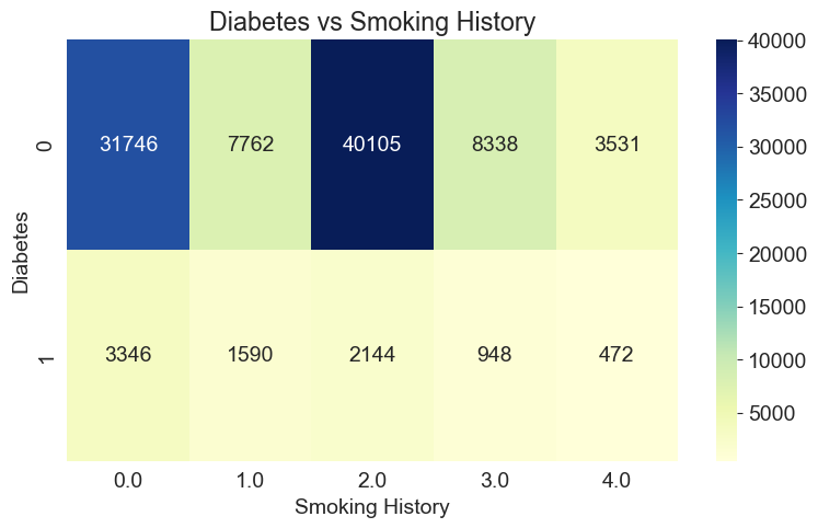
Conclusion: Due to the large amount of data, we should not rely solely on the numbers but instead consider the proportions. We can observe that the proportion of people without diabetes is higher among those who have never smoked or used to smoke but currently do not smoke. This suggests that individuals who smoke less are less likely to develop diabetes.
## Q3: Is there a trend or any other correlation between BMI and age as age increases?
I would like to explore the relationship between age and BMI, so I created a scatter plot. However, due to the large amount of data, the scatter plot appears very dense, making it difficult to visualize the data effectively.
plt.scatter(df['age'], df['bmi'], s=10, alpha=0.5)
plt.xlabel('Age')
plt.ylabel('BMI')
plt.title('BMI vs Age')
plt.show()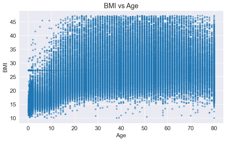
So, I chose to randomly sample 5% of the data for data visualization.
sampled_data = df.sample(frac=0.05)
plt.scatter(sampled_data['age'], sampled_data['bmi'], s=10, alpha=0.5)
plt.xlabel('Age')
plt.ylabel('BMI')
plt.title('BMI vs Age (Sampled Data)')
plt.show()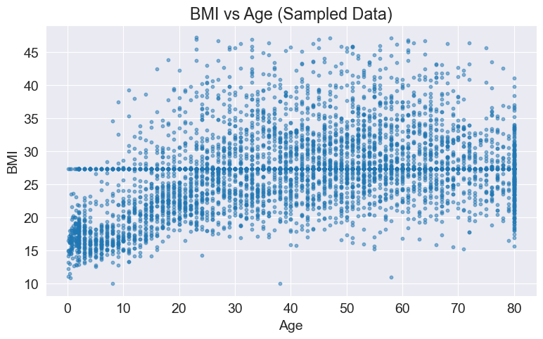
Conclusion: We can observe that as age increases, the BMI index initially rises and then decreases, reaching a peak in the 40-50 age range.
## Q4: How does the occurrence of diabetes vary across different blood glucose levels?
To make a better judgment, we will draw two plots to mutually confirm each other.
fig, axes = plt.subplots(1, 2, figsize=(12, 6))

blood_glucose_level = df['blood_glucose_level']
diabetes = df['diabetes']

axes[0].boxplot(blood_glucose_level, showfliers=False)
axes[0].set_xlabel('Diabetes')
axes[0].set_ylabel('Blood Glucose Level')
axes[0].set_title('Blood Glucose Level Distribution by Diabetes')
axes[0].set_xticks([1])
axes[0].set_xticklabels([''])
axes[0].spines['right'].set_visible(False)
axes[0].spines['top'].set_visible(False)

diabetes_counts = df.groupby('blood_glucose_level')['diabetes'].sum()

axes[1].bar(diabetes_counts.index, diabetes_counts.values, width=10, color='darkblue')
axes[1].set_xlabel('Blood Glucose Level')
axes[1].set_ylabel('Number of Diabetic Cases')
axes[1].set_title('Diabetes Cases by Blood Glucose Level')
axes[1].spines['right'].set_visible(False)
axes[1].spines['top'].set_visible(False)

# To adjust the spacing between subplots
plt.subplots_adjust(wspace=0.3)

plt.show()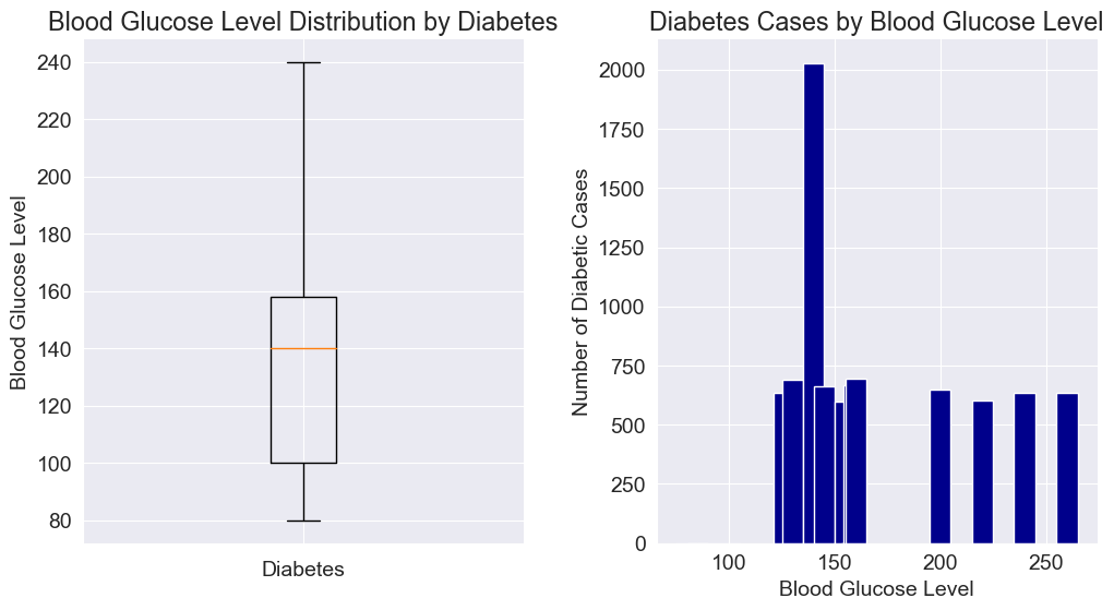
Conclusion: From the graph, we can observe that there is a significant increase in the number of individuals with diabetes between blood glucose levels of 100 and 160, especially at a blood glucose level of 140 where the number reaches a peak. This suggests that most individuals with diabetes have blood glucose levels ranging from 100 to 160, exhibiting a pattern of initially increasing and then decreasing.
## Q5: What kind of people are prone to heart disease?
from sklearn.tree import DecisionTreeClassifier
from sklearn.model_selection import train_test_split
from sklearn.metrics import accuracy_score
from sklearn.tree import plot_tree
from sklearn.ensemble import RandomForestClassifier
from sklearn.metrics import plot_confusion_matrix
I am using a decision tree model. I have created a training set and a test set with a ratio of 2:8. I trained the model using the training set and found that it has an impressive accuracy of 92%. This indicates that the model is well-suited for decision tree analysis
X = df[['gender', 'age', 'hypertension', 'smoking_history', 'bmi', 'HbA1c_level', 'blood_glucose_level', 'diabetes']]
y = df['heart_disease']

X_train, X_test, y_train, y_test = train_test_split(X, y, test_size=0.2, random_state=42)
clf = DecisionTreeClassifier()
clf.fit(X_train, y_train)
y_pred = clf.predict(X_test)
accuracy = accuracy_score(y_test, y_pred)
print(f"Accuracy: {accuracy}")
Next, we will use data visualization to plot the decision tree model. However, due to the large amount of data, the resulting plot may not be aesthetically pleasing, and it might be challenging to interpret the details.
plt.figure(figsize=(12, 8))
plot_tree(clf, feature_names=X.columns, class_names=['No Heart Disease', 'Heart Disease'], filled=True)
plt.show()
To draw conclusions, let's create a confusion matrix heatmap to assess the relationships between various factors.
plot_confusion_matrix(clf, X_test, y_test, cmap='Blues')
plt.xlabel('Predicted Label')
plt.ylabel('True Label')
plt.title('Confusion Matrix')
plt.show()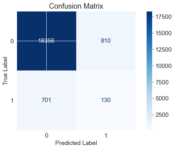 The confusion matrix typically consists of the following four important elements:
True Positive (TP): The number of samples predicted as positive class and actually belonging to the positive class.
True Negative (TN): The number of samples predicted as negative class and actually belonging to the negative class.
False Positive (FP): The number of samples predicted as positive class but actually belonging to the negative class.
False Negative (FN): The number of samples predicted as negative class but actually belonging to the positive class.
Accuracy: The proportion of correctly predicted samples out of the total number of samples. It can be calculated as (TP + TN) / (TP + TN + FP + FN). High accuracy indicates that the classifier performs well in identifying cases of heart disease and non-heart disease.
Precision: The proportion of correctly predicted positive samples out of all samples predicted as positive. It can be calculated as TP / (TP + FP). A higher precision indicates a lower false positive rate in predicting positive cases.
Recall: The proportion of correctly predicted positive samples out of all actual positive samples. It can be calculated as TP / (TP + FN). A higher recall indicates that the classifier performs well in identifying positive cases.
F1 score: A metric that considers both precision and recall, it can be calculated as 2 * (precision * recall) / (precision + recall). A higher F1 score indicates that the classifier performs well in balancing precision and recall.
importance = clf.feature_importances_
feature_names = X.columns

plt.barh(feature_names, importance)
plt.xlabel('Feature Importance')
plt.ylabel('Feature')
plt.title('Feature Importance')
plt.show()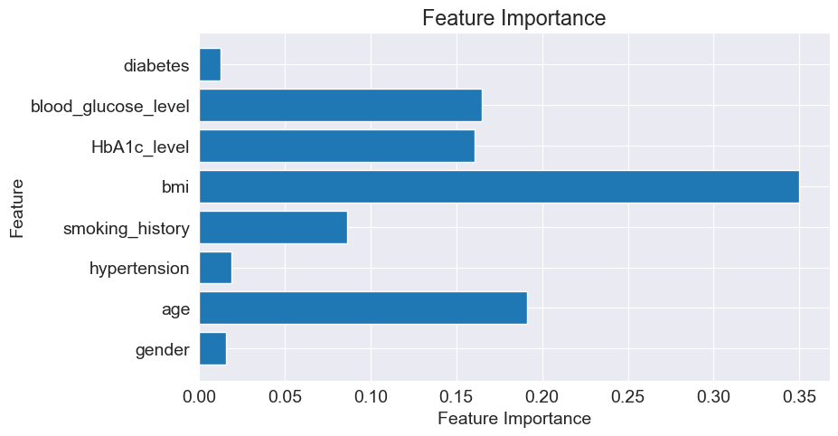
To enhance the visualization of the decision tree, I utilized Random Forest to optimize the model. I ranked the importance of each factor and discarded those with low importance. Additionally, I restricted the depth of the decision tree to 3. Subsequently, I performed predictions using the retrained decision tree model.
X = df[['age', 'bmi', 'HbA1c_level', 'blood_glucose_level']]
y = df['heart_disease']

X_train, X_test, y_train, y_test = train_test_split(X, y, test_size=0.2, random_state=42)

clf = DecisionTreeClassifier()
clf = DecisionTreeClassifier(max_depth=3)
clf.fit(X_train, y_train)
y_pred = clf.predict(X_test)

accuracy = accuracy_score(y_test, y_pred)
print(f"Accuracy: {accuracy}")

plt.figure(figsize=(12, 6))
plot_tree(clf, feature_names=X.columns, class_names=['No Heart Disease', 'Heart Disease'], filled=True)
plt.show()

plot_confusion_matrix(clf, X_test, y_test, cmap='Blues')
plt.xlabel('Predicted Label')
plt.ylabel('True Label')
plt.title('Confusion Matrix')
plt.show()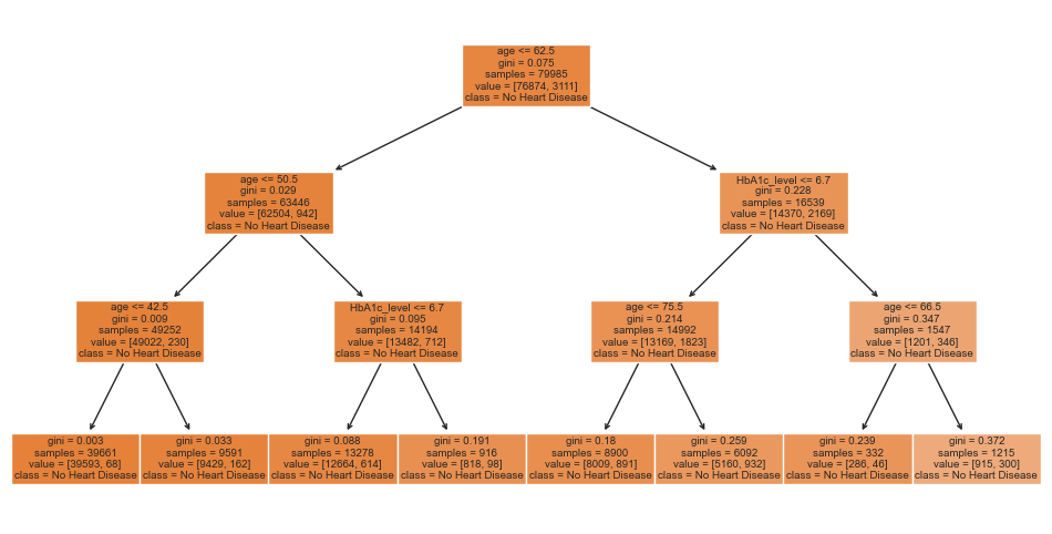
Conclusion:Based on the model, we can conclude that the following factors contribute to the likelihood of developing heart disease: age, BMI, HbA1c level, and blood glucose level.
# Conclusion
That's a fantastic summary of your experience with data visualization! Here's a translation of your summary:
Learning Summary:
1. Data Understanding and Preparation: Before diving into data visualization, I learned how to understand and prepare the data. This involved understanding the structure of the dataset and handling missing values and outliers.
2. Data Visualization Techniques: I learned to use different types of charts and tools such as bar charts, scatter plots, box plots, heatmaps, etc., to showcase the data. These visualizations helped me gain a more intuitive understanding of data distribution, correlations, and trends.
3. Data Interpretation and Storytelling: Through data visualization, I could better interpret the data and tell a story behind it. I learned to extract key insights, discover trends and patterns from the charts, and translate them into understandable narratives.
4. Identifying Insights and Asking Questions: Data visualization enabled me to identify insights and trends within the data and raise relevant questions. This helped me gain a deeper understanding of the data and derive valuable insights from it.
Overall, this data visualization project deepened my understanding of data analysis and improved my skills in data interpretation and communication. By transforming data into charts and stories, I could better grasp the insights and trends behind the data, providing valuable support for business decision-making and problem-solving. I will continue to learn and practice data visualization techniques to further enhance my abilities in the field of data analysis.


 1281
1281

 被折叠的 条评论
为什么被折叠?
被折叠的 条评论
为什么被折叠?
 到【灌水乐园】发言


