


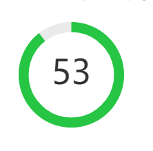
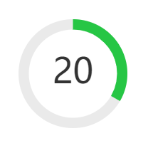
效果展示
1. 状态过渡:57s、20s、3s、0s


2.svg制作
由两圆环(一圆环作为灰色底色,一圆环倒计时60->0)一文本组成
 <svg viewBox="0,0,100,100">
        <circle cx="50" cy="50" r="50" stroke-width="19" stroke="#eaeaea" fill="none"></circle>
        <text
          x="50"
          y="50"
          font-size="32"
          text-anchor="middle"
          dominant-baseline="middle"
          :fill="seconds | filter_text_class"
        >
          {{ seconds | filter_text }}
        </text>
        <circle
          cx="50"
          cy="50"
          r="50"
          stroke-width="19"
          :stroke="seconds | filter_level"
          fill="none"
          :stroke-dasharray="seconds | filter_dash"
          transform="rotate(-90,50,50)"
        ></circle>
      </svg>
3.完整代码
<!DOCTYPE html>
<html>
<head>
	<meta charset="utf-8">
	<title>Vue 测试实例 - 菜鸟教程(runoob.com)</title>
	<script src="https://cdn.staticfile.org/vue/2.4.2/vue.min.js"></script>
	<style>
.monitor--circle {
  display: inline-block;

  padding: 6px;
  background: #fff;
  border-radius: 50%;
		}
  .s-circle-item {
    position: relative;
    width: 153px;
    height: 153px;
		}
    svg {
      position: relative;
      width: 153px;
      height: 153px;
      background: inherit;
      border-radius: 50%;
		}
      circle {
        -webkit-transition: stroke-dasharray 0.5s;
        transition: stroke-dasharray 0.5s;
      }

    .title {
      text-align: center;
      font-size: 14px;
      color: #333;
      margin: 5px 0;
    }
    mark {
      position: absolute;
      right: -20px;
      top: 0;
      width: 15px;
      height: 15px;
      background: #fb4c4c;
      border-radius: 50%;
      color: #fff;
      font-size: 12px;
      text-align: center;
    }


</style>
</head>
<body>
	<div id="vue_det">
		<h1>site : {{site}}</h1>
		<div class="monitor--circle">
    <div class="s-circle-item">
      <svg viewBox="0,0,100,100">
        <circle cx="50" cy="50" r="50" stroke-width="19" stroke="#eaeaea" fill="none"></circle>
        <text
          x="50"
          y="50"
          font-size="32"
          text-anchor="middle"
          dominant-baseline="middle"
          :fill="seconds | filter_text_class"
        >
          {{ seconds | filter_text }}
        </text>
        <circle
          cx="50"
          cy="50"
          r="50"
          stroke-width="19"
          :stroke="seconds | filter_level"
          fill="none"
          :stroke-dasharray="seconds | filter_dash"
          transform="rotate(-90,50,50)"
        ></circle>
      </svg>
    </div>
  </div>
	</div>
	<script type="text/javascript">
		var vm = new Vue({
			el: '#vue_det',
			data: {
				site: "菜鸟教程",
				url: "www.runoob.com",
				alexa: "10000",
				seconds:60
			},
			created() {
    let tid = setInterval(() => {
      this.seconds--;
      if (this.seconds <= 0) {
        clearInterval(tid);
      }
    }, 1000);
    this.$once('hook:beforeDestroy', () => {
      clearInterval(tid);
    });
  },
  filters: {
    filter_dash(seconds) {
      let lineLength = 2 * Math.PI * 50;
      let dash = seconds ? lineLength * (seconds / 60) + ' ' + lineLength * (1 - seconds / 60) : 0;
      return dash;
    },
    filter_level(seconds) {
      return seconds > 0 ? (seconds < 5 ? '#f7434e' : '#26c644') : '#eaeaea';
    },
    filter_text_class(seconds) {
      return seconds > 0 ? (seconds < 5 ? '#f7434e' : '#333') : '#ccc';
    }
  }
		})
	</script>
</body>
</html>


 1万+
1万+


 被折叠的 条评论
为什么被折叠?
被折叠的 条评论
为什么被折叠?
 到【灌水乐园】发言


