


自己制作了一款按钮,觉得会有用到的机会
代码:
<!DOCTYPE html>
<html>
	<head>
		<meta charset="utf-8">
		<title></title>
		  <link rel="stylesheet" href="myButton.css">
	</head>
	<body >
		<div class="btn">
			<table border="0" width="100%" height="16px" style="border-collapse: collapse;">
				<tr>
					<td width="20"><img src="images/card2/bg2.jpg" alt="图标"></td>
					<td align="center"><span>图标按钮</span></td>
				</tr>
			</table>
		</div>
		<div class="btn btn-info">
			<table border="0" width="100%" height="16px" style="border-collapse: collapse;">
				<tr>
					<!-- <td width="20"><img src="images/card2/bg.jpg" alt="图标"></td> -->
					<td align="center"><span>按钮</span></td>
				</tr>
			</table>
		</div>
	</body>
</html>
css文件:
.btn {
	font-size: 10px;
	font-weight: bolder;
	background-color: #a59ba46a;
	width: 80px;

	border: 1px solid #a59ba4;
	border-radius: 6px;
	float: left;
	color: #0a010c;
	-o-user-select: none;
	-moz-user-select: none;
	/*火狐 firefox*/
	-webkit-user-select: none;
	/*webkit浏览器*/
	-ms-user-select: none;
	/*IE10+*/
	-khtml-user-select: none;
	/*早期的浏览器*/
	user-select: none;
	margin: 5px;
}
.btn tr{
	height: 24px;
}

.btn img {
	width: 16px;
	padding-top: 3px;
	padding-left: 3px;
	height: 16px;
}

.btn:hover {
	background-color: #a59ba49a;
	cursor: pointer;
}

.btn:active {
	background-color: #a59ba4;
	/* box-shadow:5px 10px 15px 2px rgba(0,0,0,0.1); /*1.水平阴影  2.垂直阴影 3.模糊距离,改虚实 4.阴影尺寸*/
	*/
}

.btn-info {
	background-color: #2CB1BA6a;
	border: 1px solid #2CB1BA;
}

.btn-info:hover {
	background-color: #2CB1BA9a;
}

.btn-info:active {
	background-color: #2CB1BA;
}
效果:
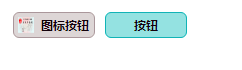
说明:
1 按钮提供图片所示两种样式
2 按钮适用于Chrome浏览器
希望有喜欢的朋友下载自己体验,欢迎评论,留言


 555
555


 被折叠的 条评论
为什么被折叠?
被折叠的 条评论
为什么被折叠?
 到【灌水乐园】发言


