


转自 :http://blog.csdn.net/liuhe688/article/details/51453330 译者辛苦了..
注:本文翻译自CHRIS COYIER的A Complete Guide to Flexbox这篇文章,点击链接可前往原版博文:https://css-tricks.com/snippets/css/a-guide-to-flexbox/
Tips: This tutorial is translated from the most popular article in CSS-Tricks - A Complete Guide to Flexbox, posted by CHRIS COYIER. Follow this link to see the original: https://css-tricks.com/snippets/css/a-guide-to-flexbox/
Flexbox布局旨在提供一种更有效的途径,来为容器内子元素进行布局、对齐和分配空间,即便它们的大小是未指定或动态变化的,也能够很好的适应。
Flexbox布局背后的原理是,赋予父容器更改子元素宽高(或顺序)的能力,来更好的填充可用的空间(主要使其适应各种显示设备和屏幕尺寸)。一个使用Flexbox布局的父容器会伸展每个子元素来填充可用的空间,或者压缩它们来阻止超出父容器。
最重要的是,Flexbox布局在方向上是不可预知的,这一点和常归布局不同(常规布局中块是基于竖直方向排列的,而内联是基于水平方向)。这些常规布局在页面中显示都没问题,但它们缺乏灵活性,难以支撑大型复杂应用的需求,特别是响应方向、大小、伸展、收缩等这些变化。
注意:Flexbox最适合用在组件和小规模的布局中,如果是更复杂的布局,Grid布局会比较好一些。
由于Flexbox是一个完整的模块,它不单单是一个属性,而是包含了一整套新的属性集,所以这里面涉及到了很多新东西。这些属性中一些是用来设置父容器的,而另外一些是设置子元素的。
设置父容器的属性有:
display: flex | inline-flex;
flex-direction: row | row-reverse | column | column-reverse;
flex-wrap: nowrap | wrap | wrap-reverse;
flex-flow: @flex-direction @flex-wrap;
justify-content: flex-start | flex-end | center | space-between | space-around;
align-items: flex-start | flex-end | center | baseline | strtch;
align-content: flex-start | flex-end | center | space-between | space-around | stretch;
设置子元素的属性有:
order: number;
flex-grow: number; /* default 0 */
flex-shrink: number; /* default 1 */
flex-basis: number | auto; /* default auto */
flex: none | @flex-grow @flex-shrink @flex-basis;
align-self: auto | flex-start | flex-end | center | baseline | stretch;
上面是属性的概括,接下来我们就一一介绍它们:
display
display属性用来定义一个flex布局的容器,容器本身是inline还是block,这取决于display的值是flex还是inline-flex。一旦声明了flex,容器下面的直接子元素就得接受flex布局的管理。
需要注意的是,CSS中的多列布局不会影响flex布局的容器。
下面我们定义一个父容器和几个子元素,分别为父容器声明flex和inline-flex的样式:
.parent {
    background: #88499C;
}

.child {
    margin: 10px;
    padding: 10px;
    background: #E77F24;
    text-align: center;
    color: white;
    overflow: hidden;
}

.parent.flex {
    display: flex;
}

.parent.inline-flex {
    display: inline-flex;
}
- 1
- 2
- 3
- 4
- 5
- 6
- 7
- 8
- 9
- 10
- 11
- 12
- 13
- 14
- 15
- 16
- 17
- 18
- 19
- 20
- 1
- 2
- 3
- 4
- 5
- 6
- 7
- 8
- 9
- 10
- 11
- 12
- 13
- 14
- 15
- 16
- 17
- 18
- 19
- 20
下面是HTML内容:
<h3>父容器设置了display:flex</h3>
<div class="parent flex">
    <div class="child">child</div>
    <div class="child">child</div>
    <div class="child">child</div>
</div>
<span style="background:wheat">我是个span元素</span>

<h3>父容器设置了display:inline-flex</h3>
<div class="parent inline-flex">
    <div class="child">child</div>
    <div class="child">child</div>
    <div class="child">child</div>
</div>
<span style="background:wheat">我是个span元素</span>
- 1
- 2
- 3
- 4
- 5
- 6
- 7
- 8
- 9
- 10
- 11
- 12
- 13
- 14
- 15
- 1
- 2
- 3
- 4
- 5
- 6
- 7
- 8
- 9
- 10
- 11
- 12
- 13
- 14
- 15
上面的代码中,第一个父容器使用了flex样式,第二个使用了inline-flex样式,现在我们来看看flex和inline-flex有什么不同吧:
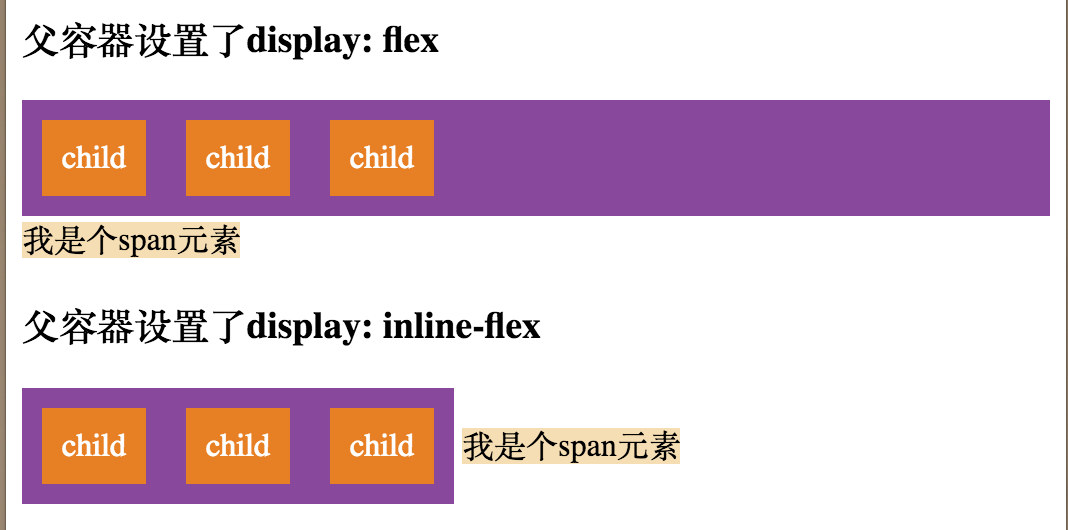
使用flex时父元素是block元素,而声明了inline-flex的父元素变成了inline元素。
flex-direction
flex-direction属性用于创建一个主轴,这个主轴规定了排列子元素的方向。Flexbox是单向排列的布局概念,除非我们额外使用了flex-wrap属性。Flexbox内部的子元素主要在水平方向排成一行或是在垂直方向排成一列。
一般常用的是flex-direction: row和flex-direction: column,而row-reverse和column-reverse从字面可以看出,是和前两个方向上是相反的。
默认情况下,是从左到右排成一行,也就是flex-direction: row。
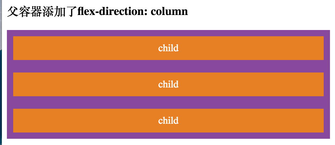
现在我们再为父容器声明一个flex-direction的样式:
.parent.flex-direction-column {
    flex-direction: column; /* row | row-reverse | column | column-reverse */
}
- 1
- 2
- 3
- 1
- 2
- 3
<h3>父容器添加了flex-direction: column</h3>
<div class="parent flex flex-direction-column">
    <div class="child">child</div>
    <div class="child">child</div>
    <div class="child">child</div>
</div>
- 1
- 2
- 3
- 4
- 5
- 6
- 1
- 2
- 3
- 4
- 5
- 6
排列效果如下:
flex-wrap
上面我们也提到了,默认情况下,Flexbox会在一个方向上自适应地排列子元素,但是我们也可以声明flex-wrap改变这个规定,允许一些子元素排列到下一行。
默认情况下,flex-wrap属性的值是nowrap,我们可以声明wrap和wrap-reverse来改变它。需要注意的是wrap和wrap-reverse的方向是跟flex-direction关联的,使用时需灵活运用。
现在我们再添加CSS样式然后在HTML中使用:
.parent.flex-wrap {
    flex-wrap: wrap; /* nowrap | wrap | wrap-reverse */
}
- 1
- 2
- 3
- 1
- 2
- 3
<h3>父容器未指定flex-wrap,使用默认值nowrap</h3>
<div class="parent flex">
    <div class="child">child</div>
    <div class="child">child</div>
    <div class="child">child</div>
    <div class="child">child</div>
    <div class="child">child</div>
    <div class="child">child</div>
</div>

<h3>父容器指定了flex-wrap: wrap</h3>
<div class="parent flex flex-wrap">
    <div class="child">child</div>
    <div class="child">child</div>
    <div class="child">child</div>
    <div class="child">child</div>
    <div class="child">child</div>
    <div class="child">child</div>
</div>

<h3>父容器添加了flex-direction: row-reverse</h3>
<div class="parent flex flex-wrap" style="flex-direction: row-reverse">
    <div class="child">child</div>
    <div class="child">child</div>
    <div class="child">child</div>
    <div class="child">child</div>
    <div class="child">child</div>
    <div class="child">child</div>
</div>
- 1
- 2
- 3
- 4
- 5
- 6
- 7
- 8
- 9
- 10
- 11
- 12
- 13
- 14
- 15
- 16
- 17
- 18
- 19
- 20
- 21
- 22
- 23
- 24
- 25
- 26
- 27
- 28
- 29
- 1
- 2
- 3
- 4
- 5
- 6
- 7
- 8
- 9
- 10
- 11
- 12
- 13
- 14
- 15
- 16
- 17
- 18
- 19
- 20
- 21
- 22
- 23
- 24
- 25
- 26
- 27
- 28
- 29
显示效果如下图所示:
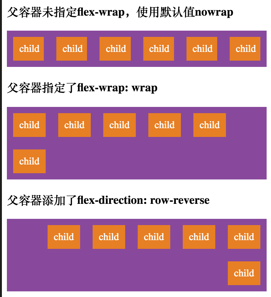
可以看出,默认情况下,容器会压缩子元素使其保持在一行,如果添加了flex-wrap: wrap,并不会强制子元素在同一行内,而是从下一行开始排列。
flex-flow
flex-flow属性是flex-direction和flex-wrap的简写方式,例如上面的flex-direction: row和flex-wrap同时声明时我们可以用只用一个属性表示:flex-flow: row wrap;
讲了这么多父容器的属性,也该结合父容器介绍一下子元素的属性了。
order
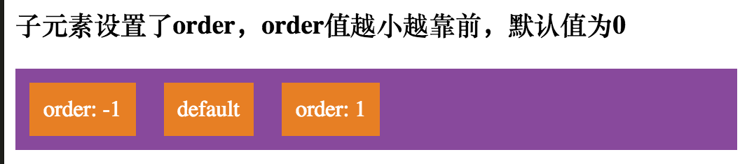
默认情况下,Flexbox内的子元素会按照文档声明顺序排列,不过我们可以使用order属性控制子元素出现在父容器的顺序。默认情况下,order值为0。
下面我们定义了子元素的两个order值,然后在HTML中应用:
.child.order-negative-1 {
    order: -1;
}

.child.order-positive-1 {
    order: 1;
}
- 1
- 2
- 3
- 4
- 5
- 6
- 7
- 1
- 2
- 3
- 4
- 5
- 6
- 7
<h3>子元素设置了order,order值越小越靠前,默认值为0</h3>
<div class="parent flex">
    <div class="child order-positive-1">order: 1</div>
    <div class="child">default</div>
    <div class="child order-negative-1">order: -1</div>
</div>
- 1
- 2
- 3
- 4
- 5
- 6
- 1
- 2
- 3
- 4
- 5
- 6
第一个子元素的order为1,最后一个子元素order为-1,所以理论上来讲,最后一个子元素和最后一个子元素应该会调换一下位置,而第二个子元素使用了默认值0,所以会排在中间位置。
下面这张图证实了我们的推断:
flex-grow
flex-grow属性赋予子元素在必要时伸展的能力,可指定一个不带单位的数值,作为父容器剩余空间的比例,它表示子元素在flex容器中可以分配多少可用的空间。
如果所有声明了flex-grow的子元素都指定flex-grow为1,那么父容器剩余的空间将会平均的分配到这些子元素上。如果其中一个flex-grow指定为2,那么容器将会试图为其分配一个空间,这个空间2倍于那些flex-grow为1的子元素。
需要注意的是,我们说的剩余空间,是指除子元素内容以外的父容器可用空间,另外,父容器并不保证所有情况下都能均匀分配,但至少它会这样尝试。flex-grow的值不能为负。
现在我们来为子元素声明flex-grow属性并应用到HTML文档中:
.child.flex-grow-1 {
    flex-grow: 1;
}

.child.flex-grow-2 {
    flex-grow: 2;
}
- 1
- 2
- 3
- 4
- 5
- 6
- 7
- 1
- 2
- 3
- 4
- 5
- 6
- 7
<h3>设置了flex-grow: 1的子元素,会平均分配剩余空间</h3>
<div class="parent flex">
<div class="child">default</div>
<div class="child flex-grow-1">flex-grow: 1</div>
<div class="child flex-grow-1">flex-grow: 1</div>
</div>
<h3>多个指定flex-grow的子元素会按比例划分剩余空间</h3>
<div class="parent flex">
<div class="child">default</div>
<div class="child flex-grow-1">flex-grow: 1</div>
<div class="child flex-grow-2">flex-grow: 2</div>
</div>
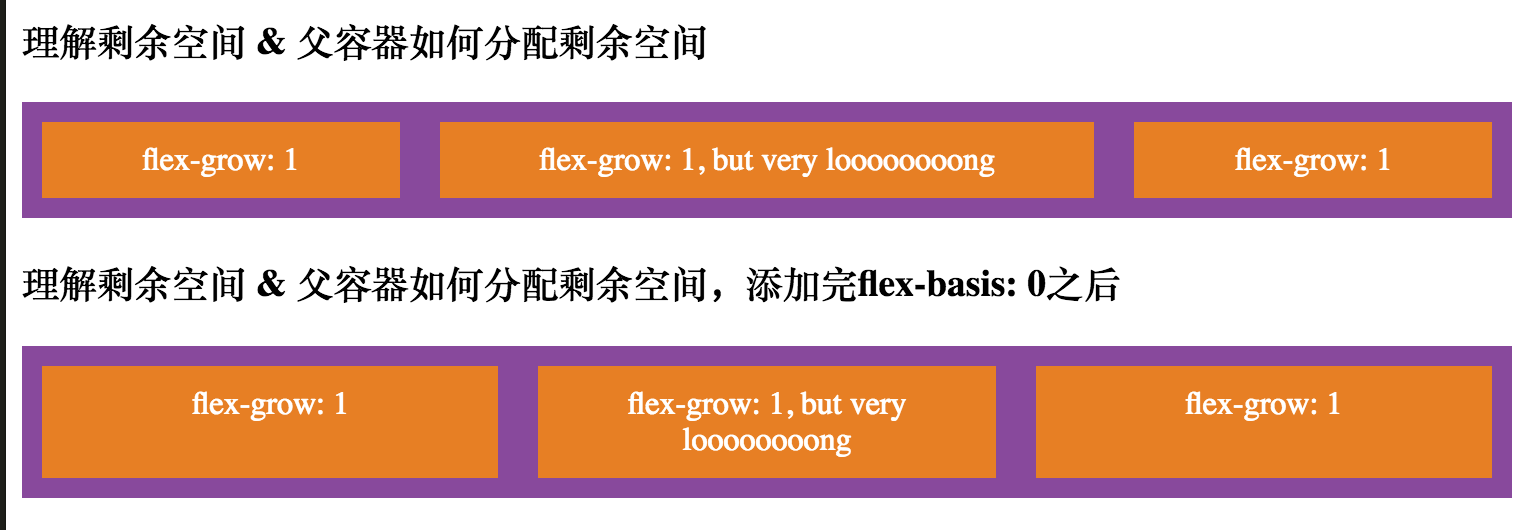
<h3>理解剩余空间 & 父容器如何分配剩余空间</h3>
<div class="parent flex">
<div class="child flex-grow-1">flex-grow: 1</div>
<div class="child flex-grow-1">flex-grow: 1, but very loooooooong</div>
<div class="child flex-grow-1">flex-grow: 1</div>
</div>
- 1
- 2
- 3
- 4
- 5
- 6
- 7
- 8
- 9
- 10
- 11
- 12
- 13
- 14
- 15
- 16
- 17
- 18
- 19
- 20
- 1
- 2
- 3
- 4
- 5
- 6
- 7
- 8
- 9
- 10
- 11
- 12
- 13
- 14
- 15
- 16
- 17
- 18
- 19
- 20
现在看一下flex-grow是如何分配空间的:
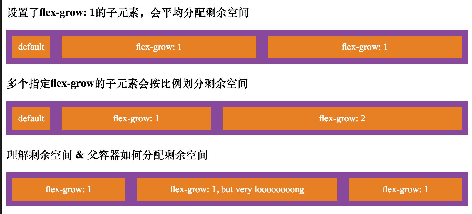
从图中第三个例子可以看出,容器只是对文本以外的可用空间进行平均分配,所以每个子元素的”padding”都是1比1的,但是对于子元素整体来讲,并非都是1比1的。
那么如何确保如何使子元素整体大小按照比例划分父容器空间呢,这里我们就需要使用flex-basis: 0这个属性了,稍后会介绍到。
flex-shrink
flex-shrink属性表示一个子元素在必要时是否收缩自己来适应当前的Flexbox,默认值是1。注意:flex-shrink不能为负值。
flex-shrink适合使用在固定尺寸的子元素上,默认情况下,固定大小的子元素并非始终保持设定的值,比如在父容器太小时,就会压缩子元素来适应,如果我们不想这些子元素被压缩,就可以使用flex-shrink,并设置其值为0。
我们先设置最后一个子元素的宽度为300px,然后为其添加flex-shrink: 0的样式,看看flex-shrink是怎么控制子元素的:
.child.flex-shrink-0 {
    flex-shrink: 0;
}
- 1
- 2
- 3
- 1
- 2
- 3
<h3>未设置flex-shrink的子元素,即使是固定宽度也会被强制压缩</h3>
<div class="parent flex">
    <div class="child">default</div>
    <div class="child flex-grow-1">flex-grow: 1</div>
    <div class="child" style="width: 300px;">width: 300px</div>
</div>

<h3>设置了flex-shrink: 0的子元素,会保持其设定宽度不会收缩</h3>
<div class="parent flex">
    <div class="child">default</div>
    <div class="child flex-grow-1">flex-grow: 1</div>
    <div class="child flex-shrink-0" style="width: 300px;">flex-shrink: 0</div>
</div>
- 1
- 2
- 3
- 4
- 5
- 6
- 7
- 8
- 9
- 10
- 11
- 12
- 13
- 1
- 2
- 3
- 4
- 5
- 6
- 7
- 8
- 9
- 10
- 11
- 12
- 13
现在来看看添加flex-shrink前后的区别:
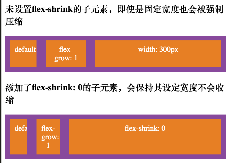
需要注意的是,上面的第一个视图中,最后的子元素当前的宽度已不是300px了,因为父容器宽度太小,强制压缩每个子元素的宽度,所以虽然最后一个子元素设定了宽度,但也受到了影响。而第二个视图中,最后一个子元素依旧保持它的宽度,未被压缩,因为它声明了flex-shrink: 0。
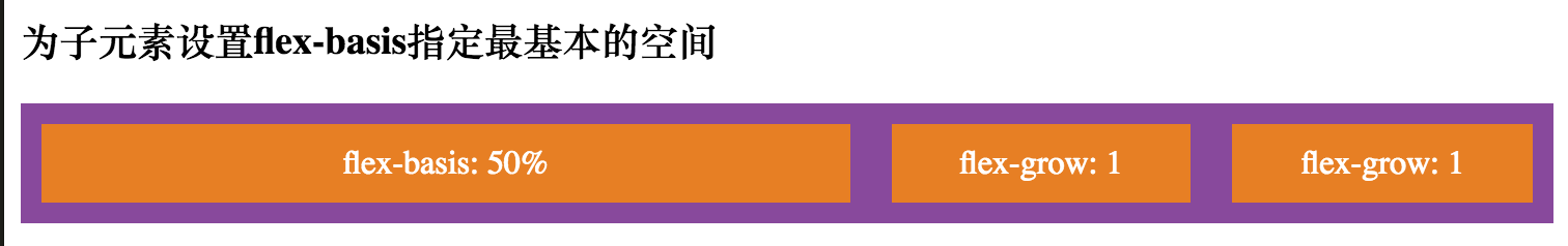
flex-basis
flex-basis属性告诉父容器,在剩余空间被分配之前先定义子元素的默认尺寸,可以指定为百分比或rem等长度单位或者auto关键字。如果设置为0,那么父容器分配分配之前,对每个子元素的默认尺寸都视之为0,剩余空间也就是父容器的全部空间,其结果是,直接按照flex-grow值的比例分配子元素整体的大小;如果设置为auto,那么父容器会将每个子元素中的内容作为子元素默认尺寸,然后再计算剩余空间,最后把剩余空间按照flex-grow值的比例平均分配到子元素除内容以外的空间,也就是”padding”。我们来看下面这张图(图片来源:https://i-blog.csdnimg.cn/blog_migrate/aaf395d7a40b1b0a48c7314536681eeb.png):

图中第一个视图子元素声明了flex-basis: 0,所以父容器会按照flex-grow值的比例,为每个子元素的整体分配空间。而第二个视图就不同了,子元素声明了flex-basis: auto,所以父容器会先把每个子元素的内容空间分配出去,然后对于除内容以外的剩余空间,再按照每个子元素flex-grow的比例进行分配。
上面介绍flex-grow时提到,如何利用flex-basis: 0将父容器的全部空间按比例分配到每个子元素上,下面我们就来为每个子元素添加flex-basis: 0属性:
.child.flex-grow-1 {
    flex-grow: 1;
}

.child.flex-basis-0 {
    flex-basis: 0;
}
- 1
- 2
- 3
- 4
- 5
- 6
- 7
- 1
- 2
- 3
- 4
- 5
- 6
- 7
<h3>理解剩余空间 & 父容器如何分配剩余空间</h3>
<div class="parent flex">
    <div class="child flex-grow-1">flex-grow: 1</div>
    <div class="child flex-grow-1">flex-grow: 1, but very loooooooong</div>
    <div class="child flex-grow-1">flex-grow: 1</div>
</div>

<h3>理解剩余空间 & 父容器如何分配剩余空间,添加完flex-basis: 0之后</h3>
<div class="parent flex">
    <div class="child flex-grow-1 flex-basis-0">flex-grow: 1</div>
    <div class="child flex-grow-1 flex-basis-0">flex-grow: 1, but very loooooooong</div>
    <div class="child flex-grow-1 flex-basis-0">flex-grow: 1</div>
</div>
- 1
- 2
- 3
- 4
- 5
- 6
- 7
- 8
- 9
- 10
- 11
- 12
- 13
- 1
- 2
- 3
- 4
- 5
- 6
- 7
- 8
- 9
- 10
- 11
- 12
- 13
看看前后的对比如何:
flex-basis默认值为auto,当子元素只声明flex-grow时,它会使用flex-basis: auto。
当然上面我们也提到,可以使用百分比或rem等长度单位明确告诉父容器,在剩余空间分配之前,我默认就应该占用多少比例,下面我们为其中一个子元素添加指定的flex-basis:
.child.flex-basis-50-percent {
    flex-basis: 50%;
}
- 1
- 2
- 3
- 1
- 2
- 3
<h3>为子元素设置flex-basis指定最基本的空间</h3>
<div class="parent flex">
    <div class="child flex-basis-50-percent">flex-basis: 50%</div>
    <div class="child flex-grow-1">flex-grow: 1</div>
    <div class="child flex-grow-1">flex-grow: 1</div>
</div>
- 1
- 2
- 3
- 4
- 5
- 6
- 1
- 2
- 3
- 4
- 5
- 6
显示效果如下:
flex
flex属性是flex-grow, flex-shrink, flex-basis的简写方式,其中flex-shrink和flex-basis是可选的。默认情况下,flex的值是0 1 auto。
在Flexbox中,对齐也是一个非常重要的概念,它也涉及到很多属性,下面我们来介绍一下父容器的几个关于对齐的属性:
justify-content
justify-content属性定义了父容器沿主轴方向的对其方式。需要注意这里的主轴方向,如果flex-direction为row,则主轴方向就是水平方向从左到右,如果为column,则主轴方向就是竖直方向从上到下,如果为row-reverse或column-reverse,大家也可以推断。
当Flexbox中的子元素都是大小固定的,或者其中可伸缩的子元素已经达到最大尺寸时,justify-content可以对剩余的可用空间进行分配,在超出行内的子元素对齐方式上,它也会加以控制。
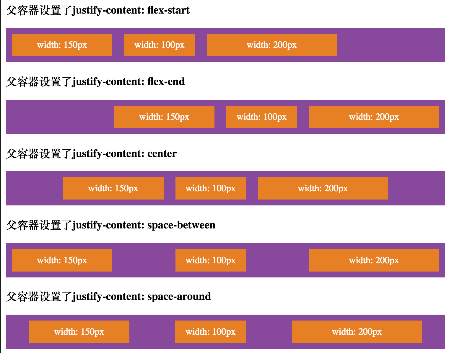
justify-content主要有以下几个值:
flex-start: 从主轴起始位置开始,紧凑型排列
flex-end: 从主轴末端位置开始,紧凑型排列
center: 居中排列在主轴线上
space-between: 子元素均匀分布在主轴线上,第一个子元素从起始位置开始,最后一个子元素从末端开始
space-around: 子元素均匀分布在主轴线上,并且每个子元素都会均匀的被周围的空间包裹着
我们现在为父容器添加不同的属性值,看看它们是怎么影响Flexbox内的子元素的:
.parent.justify-content-flex-start {
    justify-content: flex-start;
}

.parent.justify-content-flex-end {
    justify-content: flex-end;
}

.parent.justify-content-center {
    justify-content: center;
}

.parent.justify-content-space-between {
    justify-content: space-between;
}

.parent.justify-content-space-around {
    justify-content: space-around;
}

.child.width-100 {
    width: 100px;
}

.child.width-150 {
    width: 150px;
}

.child.width-200 {
    width: 200px;
}
- 1
- 2
- 3
- 4
- 5
- 6
- 7
- 8
- 9
- 10
- 11
- 12
- 13
- 14
- 15
- 16
- 17
- 18
- 19
- 20
- 21
- 22
- 23
- 24
- 25
- 26
- 27
- 28
- 29
- 30
- 31
- 1
- 2
- 3
- 4
- 5
- 6
- 7
- 8
- 9
- 10
- 11
- 12
- 13
- 14
- 15
- 16
- 17
- 18
- 19
- 20
- 21
- 22
- 23
- 24
- 25
- 26
- 27
- 28
- 29
- 30
- 31
<h3>父容器设置了justify-content: flex-start</h3>
<div class="parent flex justify-content-flex-start">
    <div class="child width-150">width: 150px</div>
    <div class="child width-100">width: 100px</div>
    <div class="child width-200">width: 200px</div>
</div>

<h3>父容器设置了justify-content: flex-end</h3>
<div class="parent flex justify-content-flex-end">
    <div class="child width-150">width: 150px</div>
    <div class="child width-100">width: 100px</div>
    <div class="child width-200">width: 200px</div>
</div>

<h3>父容器设置了justify-content: center</h3>
<div class="parent flex justify-content-center">
    <div class="child width-150">width: 150px</div>
    <div class="child width-100">width: 100px</div>
    <div class="child width-200">width: 200px</div>
</div>

<h3>父容器设置了justify-content: space-between</h3>
<div class="parent flex justify-content-space-between">
    <div class="child width-150">width: 150px</div>
    <div class="child width-100">width: 100px</div>
    <div class="child width-200">width: 200px</div>
</div>

<h3>父容器设置了justify-content: space-around</h3>
<div class="parent flex justify-content-space-around">
    <div class="child width-150">width: 150px</div>
    <div class="child width-100">width: 100px</div>
    <div class="child width-200">width: 200px</div>
</div>
- 1
- 2
- 3
- 4
- 5
- 6
- 7
- 8
- 9
- 10
- 11
- 12
- 13
- 14
- 15
- 16
- 17
- 18
- 19
- 20
- 21
- 22
- 23
- 24
- 25
- 26
- 27
- 28
- 29
- 30
- 31
- 32
- 33
- 34
- 1
- 2
- 3
- 4
- 5
- 6
- 7
- 8
- 9
- 10
- 11
- 12
- 13
- 14
- 15
- 16
- 17
- 18
- 19
- 20
- 21
- 22
- 23
- 24
- 25
- 26
- 27
- 28
- 29
- 30
- 31
- 32
- 33
- 34
效果如图所示:
align-items
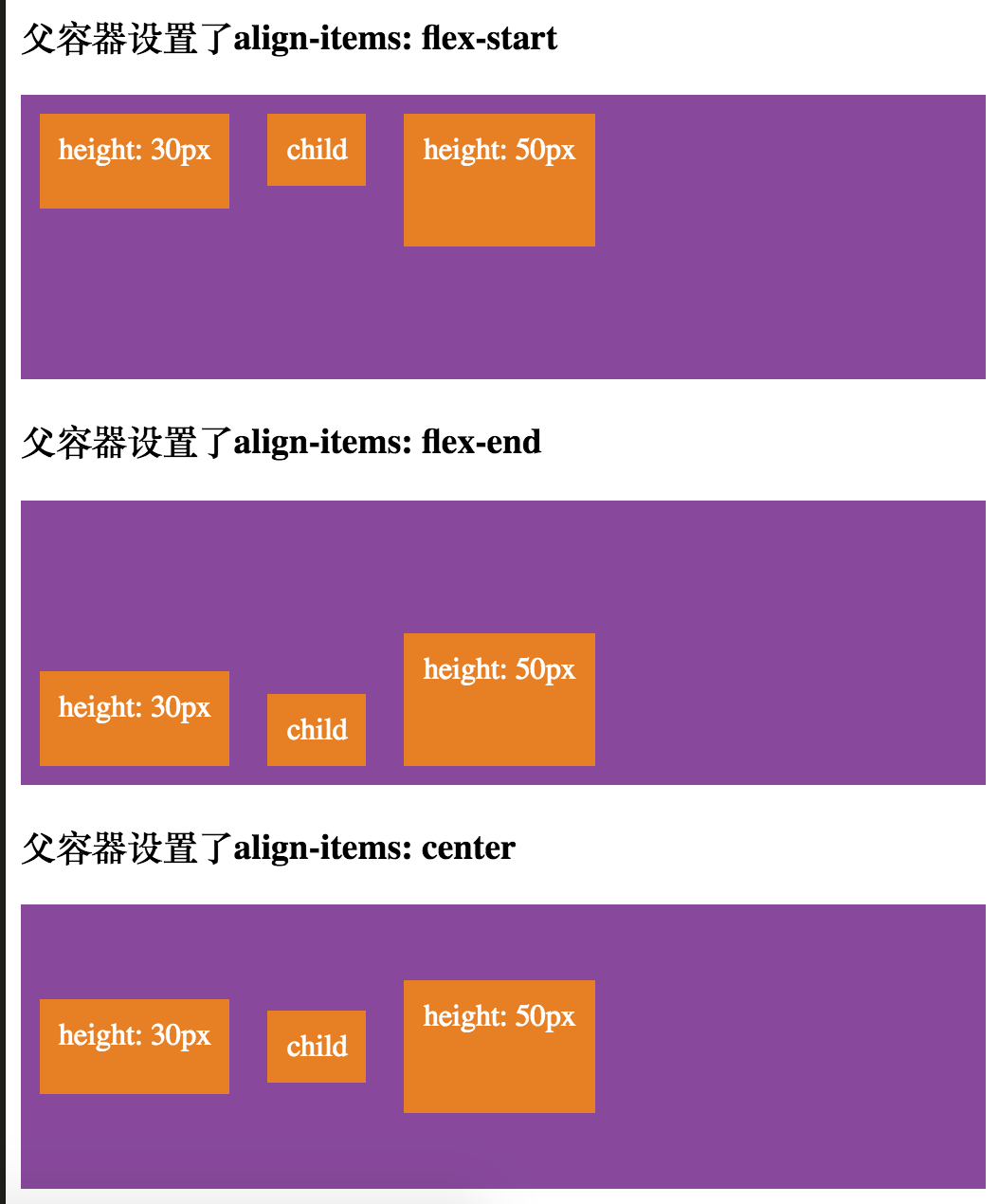
与justify-content不同,align-items是在主轴的垂直方向进行对齐。所以如果我们使用flex-direction: row时,align-items会在竖直方向对元素加以控制,让其以某种方式对齐。
align-items和justify-content相似,都有flex-start,flex-end,center这几种对齐方式,不同的是,align-items有自己的stretch和baseline。
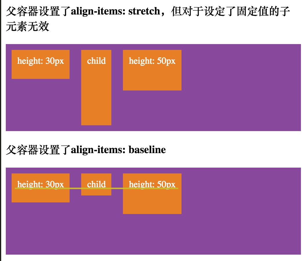
stretch表示父容器会尽可能在主轴的垂直方向上拉伸子元素,来填满容器垂直空间,但也要注意,它也会考虑子元素本身设定的宽度或高度等因素。
baseline表示子元素会以它们的基线为准对齐。
下面我们也照例添加一些CSS样式,看看几种不同对齐方式之间的差异:
.parent.height-150 {
    height: 150px;
}

.parent.align-items-flex-start {
    align-items: flex-start;
}

.parent.align-items-flex-end {
    align-items: flex-end;
}

.parent.align-items-center {
    align-items: center;
}

.parent.align-items-stretch {
    align-items: stretch;
}

.parent.align-items-baseline {
    align-items: baseline;
}

.child.height-30 {
    height: 30px;
}

.child.height-50 {
    height: 50px;
}

.child.font-size-big {
    font-size: 20px;
}
- 1
- 2
- 3
- 4
- 5
- 6
- 7
- 8
- 9
- 10
- 11
- 12
- 13
- 14
- 15
- 16
- 17
- 18
- 19
- 20
- 21
- 22
- 23
- 24
- 25
- 26
- 27
- 28
- 29
- 30
- 31
- 32
- 33
- 34
- 35
- 1
- 2
- 3
- 4
- 5
- 6
- 7
- 8
- 9
- 10
- 11
- 12
- 13
- 14
- 15
- 16
- 17
- 18
- 19
- 20
- 21
- 22
- 23
- 24
- 25
- 26
- 27
- 28
- 29
- 30
- 31
- 32
- 33
- 34
- 35
<h3>父容器设置了align-items: flex-start</h3>
<div class="parent flex align-items-flex-start height-150">
    <div class="child height-30">height: 30px</div>
    <div class="child">child</div>
    <div class="child height-50">height: 50px</div>
</div>

<h3>父容器设置了align-items: flex-end</h3>
<div class="parent flex align-items-flex-end height-150">
    <div class="child height-30">height: 30px</div>
    <div class="child">child</div>
    <div class="child height-50">height: 50px</div>
</div>

<h3>父容器设置了align-items: center</h3>
<div class="parent flex align-items-center height-150">
    <div class="child height-30">height: 30px</div>
    <div class="child">child</div>
    <div class="child height-50">height: 50px</div>
</div>

<h3>父容器设置了align-items: stretch,但对于设定了固定值的子元素无效</h3>
<div class="parent flex align-items-stretch height-150">
    <div class="child height-30">height: 30px</div>
    <div class="child">child</div>
    <div class="child height-50">height: 50px</div>
</div>

<h3>父容器设置了align-items: baseline</h3>
<div class="parent flex align-items-baseline height-150">
    <div class="child height-30">height: 30px</div>
    <div class="child">child</div>
    <div class="child height-50">height: 50px</div>
</div>
- 1
- 2
- 3
- 4
- 5
- 6
- 7
- 8
- 9
- 10
- 11
- 12
- 13
- 14
- 15
- 16
- 17
- 18
- 19
- 20
- 21
- 22
- 23
- 24
- 25
- 26
- 27
- 28
- 29
- 30
- 31
- 32
- 33
- 34
- 1
- 2
- 3
- 4
- 5
- 6
- 7
- 8
- 9
- 10
- 11
- 12
- 13
- 14
- 15
- 16
- 17
- 18
- 19
- 20
- 21
- 22
- 23
- 24
- 25
- 26
- 27
- 28
- 29
- 30
- 31
- 32
- 33
- 34
效果如下图所示:
align-content
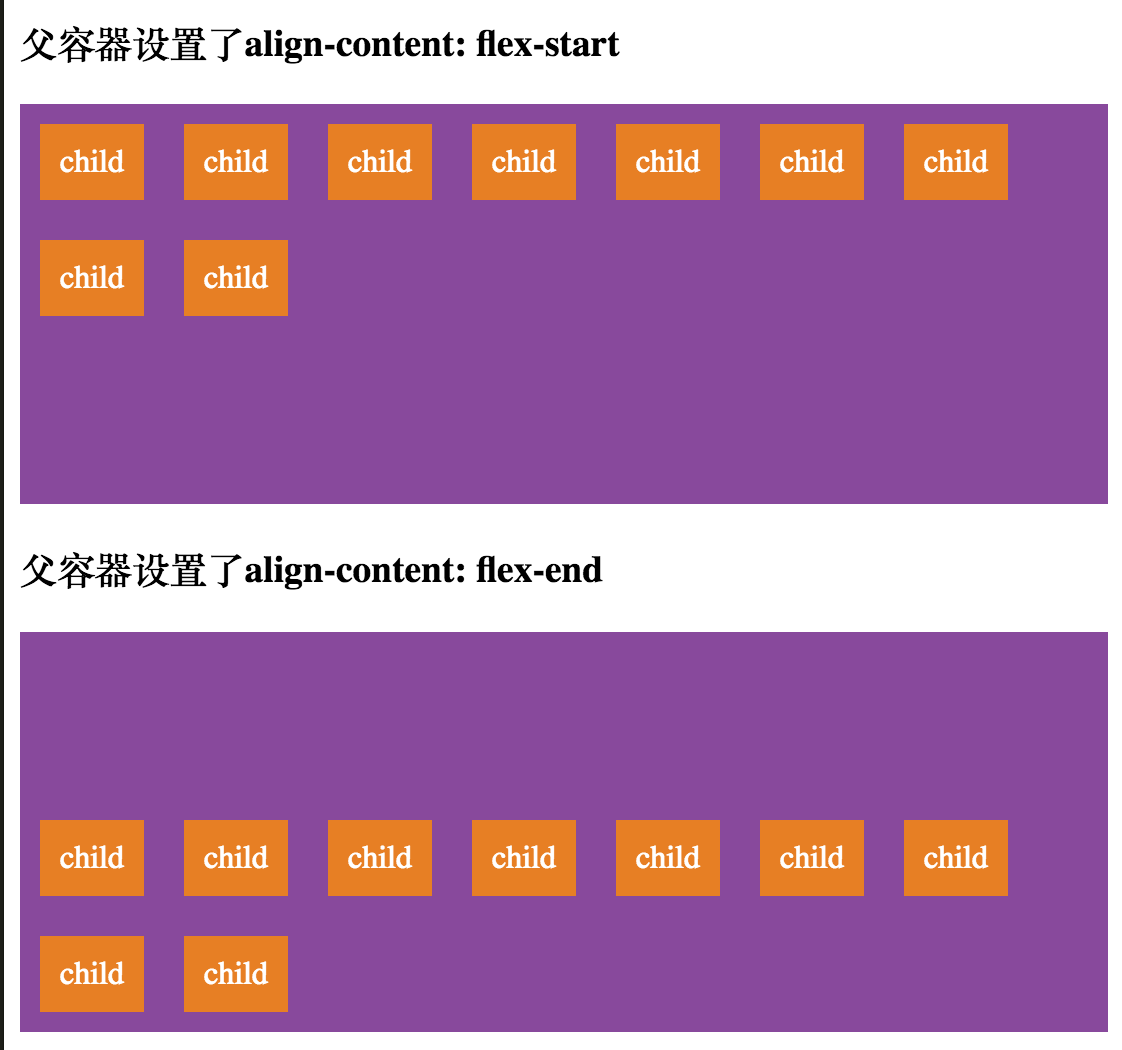
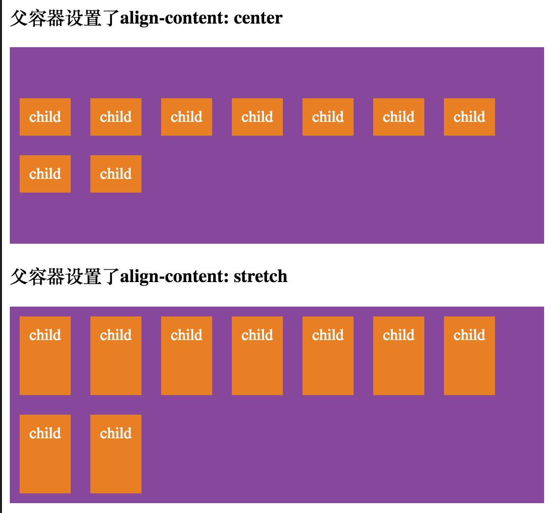
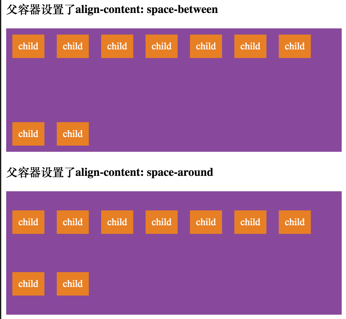
align-content主要用来对父容器内多个行在垂直方向上进行排列。该属性只针对父容器内多行的情况,如果父容器内只有一行子元素,则此属性无效。
align-content也有几个不同的值:flex-start,flex-end,center,stretch,space-between,space-around。现在我们也来应用不同的值,看看他们的样式:
.parent.height-200 {
    height: 200px;
}

.parent.align-content-flex-start {
    align-content: flex-start;
}

.parent.align-content-flex-end {
    align-content: flex-end;
}

.parent.align-content-center {
    align-content: center;
}

.parent.align-content-stretch {
    align-content: stretch;
}

.parent.align-content-space-between {
    align-content: space-between;
}

.parent.align-content-space-around {
    align-content: space-around;
}
- 1
- 2
- 3
- 4
- 5
- 6
- 7
- 8
- 9
- 10
- 11
- 12
- 13
- 14
- 15
- 16
- 17
- 18
- 19
- 20
- 21
- 22
- 23
- 24
- 25
- 26
- 27
- 1
- 2
- 3
- 4
- 5
- 6
- 7
- 8
- 9
- 10
- 11
- 12
- 13
- 14
- 15
- 16
- 17
- 18
- 19
- 20
- 21
- 22
- 23
- 24
- 25
- 26
- 27
<h3>父容器设置了align-content: flex-start</h3>
<div class="parent flex flex-wrap align-content-flex-start height-200">
    <div class="child">child</div>
    <div class="child">child</div>
    <div class="child">child</div>
    <div class="child">child</div>
    <div class="child">child</div>
    <div class="child">child</div>
    <div class="child">child</div>
    <div class="child">child</div>
    <div class="child">child</div>
</div>

<h3>父容器设置了align-content: flex-end</h3>
<div class="parent flex flex-wrap align-content-flex-end height-200">
    <div class="child">child</div>
    <div class="child">child</div>
    <div class="child">child</div>
    <div class="child">child</div>
    <div class="child">child</div>
    <div class="child">child</div>
    <div class="child">child</div>
    <div class="child">child</div>
    <div class="child">child</div>
</div>

<h3>父容器设置了align-content: center</h3>
<div class="parent flex flex-wrap align-content-center height-200">
    <div class="child">child</div>
    <div class="child">child</div>
    <div class="child">child</div>
    <div class="child">child</div>
    <div class="child">child</div>
    <div class="child">child</div>
    <div class="child">child</div>
    <div class="child">child</div>
    <div class="child">child</div>
</div>

<h3>父容器设置了align-content: stretch</h3>
<div class="parent flex flex-wrap align-content-stretch height-200">
    <div class="child">child</div>
    <div class="child">child</div>
    <div class="child">child</div>
    <div class="child">child</div>
    <div class="child">child</div>
    <div class="child">child</div>
    <div class="child">child</div>
    <div class="child">child</div>
    <div class="child">child</div>
</div>

<h3>父容器设置了align-content: space-between</h3>
<div class="parent flex flex-wrap align-content-space-between height-200">
    <div class="child">child</div>
    <div class="child">child</div>
    <div class="child">child</div>
    <div class="child">child</div>
    <div class="child">child</div>
    <div class="child">child</div>
    <div class="child">child</div>
    <div class="child">child</div>
    <div class="child">child</div>
</div>

<h3>父容器设置了align-content: space-around</h3>
<div class="parent flex flex-wrap align-content-space-around height-200">
    <div class="child">child</div>
    <div class="child">child</div>
    <div class="child">child</div>
    <div class="child">child</div>
    <div class="child">child</div>
    <div class="child">child</div>
    <div class="child">child</div>
    <div class="child">child</div>
    <div class="child">child</div>
</div>

<h3>align-content属性对单行无效</h3>
<div class="parent flex flex-wrap align-content-flex-start height-200">
    <div class="child">child</div>
    <div class="child">child</div>
    <div class="child">child</div>
    <div class="child">child</div>
    <div class="child">child</div>
    <div class="child">child</div>
</div>
- 1
- 2
- 3
- 4
- 5
- 6
- 7
- 8
- 9
- 10
- 11
- 12
- 13
- 14
- 15
- 16
- 17
- 18
- 19
- 20
- 21
- 22
- 23
- 24
- 25
- 26
- 27
- 28
- 29
- 30
- 31
- 32
- 33
- 34
- 35
- 36
- 37
- 38
- 39
- 40
- 41
- 42
- 43
- 44
- 45
- 46
- 47
- 48
- 49
- 50
- 51
- 52
- 53
- 54
- 55
- 56
- 57
- 58
- 59
- 60
- 61
- 62
- 63
- 64
- 65
- 66
- 67
- 68
- 69
- 70
- 71
- 72
- 73
- 74
- 75
- 76
- 77
- 78
- 79
- 80
- 81
- 82
- 83
- 84
- 85
- 86
- 87
再来看看几种不同的排列效果:
以上几个就是父容器控制子元素对齐方式的属性,在flex布局中,子元素也有一个控制对齐的属性,那就是align-self。
align-self
align-self用来为子元素自身声明对齐方式,如果子元素声明了此属性,它会覆盖父容器施加在子元素上的对齐规则。我们可以为align-self属性指定下面这几个值:flex-start,flex-end,center,stretch和baseline,这与父容器的align-items一致。align-self默认值为auto。
我们在前面align-items的例子上,为第一个子元素添加一个与父容器不同的样式:
.align-self-flex-end {
    align-self: flex-end;
}
- 1
- 2
- 3
- 1
- 2
- 3
<h3>父容器设置了align-items: flex-start,但第一个子元素设置了align-self: flex-end</h3>
<div class="parent flex align-items-flex-start height-150">
    <div class="child height-30 align-self-flex-end">height: 30px</div>
    <div class="child">child</div>
    <div class="child height-50">height: 50px</div>
</div>
- 1
- 2
- 3
- 4
- 5
- 6
- 1
- 2
- 3
- 4
- 5
- 6
然后我们来看看它会有什么变化:
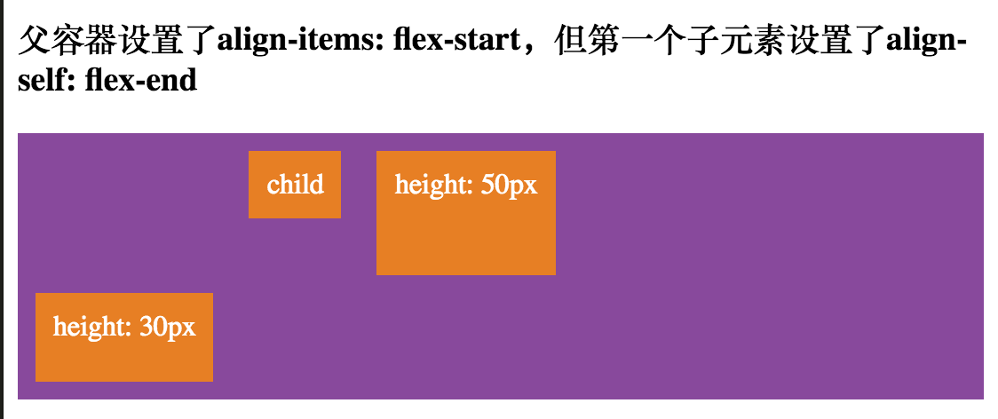
从图中可以看到,子元素并不再按照父元素的对齐方式放置自己了,它覆盖了原有的规则。
需要注意的是,在使用flex布局时,float,clear,和vertical-align属性都会对容器内的子元素失去作用。
写在最后:掌握Flexbox的每个细节并不是件轻松的事,博主也是从懵懵懂懂走过来的,CHRIS COYIER的这篇指导教程对初学者帮助很大,所以搜索排行榜第一也是理所当然的,翻译这篇文章更是进一步加深了博主对Flexbox细节的理解和把握,而对于原文没有阐述清楚的地方,我在这里都尽可能的把它们呈现出来,帮助大家理解,最后,希望大家都能够掌握并灵活运用Flexbox,谢谢。


 388
388

 被折叠的 条评论
为什么被折叠?
被折叠的 条评论
为什么被折叠?
 到【灌水乐园】发言


