


本篇文章给大家谈谈基于python的图表生成系统,以及python绘制非常漂亮的图表,希望对各位有所帮助,不要忘了收藏本站喔。
40张python图表
1. 条形图
# 库
import numpy as np
import matplotlib.pyplot as plt

# 创建数据集
height = [3, 12, 5, 18, 45]
bars = ('A', 'B', 'C', 'D', 'E')
x_pos = np.arange(len(bars))

# 创建条形图
(x_pos, height)

# 在x轴上创建名称
plt.xticks(x_pos, bars)

# 显示图形
()
#水平条形图
import matplotlib.pyplot as plt
import numpy as np

height = [3, 12, 5, 18, 45]
bars = ('A', 'B', 'C', 'D', 'E')
y_pos = np.arange(len(bars))
#height后面加上代码color=(0.2, 0.4, 0.6, 0.6)可以改变颜色
(y_pos, height)

plt.yticks(y_pos, bars)
()
# 堆垛条形图
# 库
import numpy as np
import matplotlib.pyplot as plt
from matplotlib import rc
import pandas as pd
rc('font', weight='bold')
bars1 = [12, 28, 1, 8, 22]
bars2 = [28, 7, 16, 4, 10]
bars3 = [25, 3, 23, 25, 17]
bars = (bars1, bars2).tolist()
r = [0,1,2,3,4]
names = ['A','B','C','D','E']
barWidth = 1
(r, bars1, color='#7f6d5f', edgecolor='white', width=barWidth)
(r, bars2, bottom=bars1, color='#557f2d', edgecolor='white', width=barWidth)
(r, bars3, bottom=bars, color='#2d7f5e', edgecolor='white', width=barWidth)
plt.xticks(r, names, fontweight='bold')
plt.xlabel("group")
()
2.散点图
import matplotlib.pyplot as plt
import numpy as np

rng = np.random.default_rng(1234)

# Generate data
x = rng.lognormal(size=200)
y = x + rng.normal(scale=5 * (x / (x)), size=200)

# Initialize layout
fig, ax = plt.subplots(figsize = (9, 6))

# Add scatterplot
ax.scatter(x, y, s=60, alpha=0.7, edgecolors="k");
![在这里插入图片描述]()
3.折线图
# Libraries and data
import matplotlib.pyplot as plt
import numpy as np
import pandas as pd
df=pd.DataFrame({
   'x_values': range(1,11), 'y_values': np.random.randn(10) })

# Draw plot
( 'x_values', 'y_values', data=df, color='skyblue')
()

# Draw line chart by modifiying transparency of the line
( 'x_values', 'y_values', data=df, color='skyblue', alpha=0.3)

# Show plot
()
4.面积图和刻面
# libraries
import numpy as np
import seaborn as sns
import pandas as pd
import matplotlib.pyplot as plt

# Create a dataset
my_count=["France","Australia","Japan","USA","Germany","Congo","China","England","Spain","Greece","Marocco","South Africa","Indonesia","Peru","Chili","Brazil"]
df = pd.DataFrame({

"country":np.repeat(my_count, 10),
"years":list(range(2000, 2010)) * 16,
"value"(160)
})

# Create a grid : initialize it
g = sns.FacetGrid(df, col='country', hue='country', col_wrap=4, )

# Add the line over the area with the plot function
g = g.map(, 'years', 'value')

# Fill the area with fill_between
g = g.map(plt.fill_between, 'years', 'value', alpha=0.2).set_titles("{col_name} country")

# Control the title of each facet
g = g.set_titles("{col_name}")

# Add a title for the whole plot
plt.subplots_adjust(top=0.92)
g = g.fig.suptitle('Evolution of the value of stuff in 16 countries')

# Show the graph
()
5.散点图
# libraries
import matplotlib.pyplot as plt
import numpy as np
import pandas as pd

# Create a dataset:
df=pd.DataFrame({
   'x_values': range(1,101), 'y_values': np.random.randn(100)*15+range(1,101) })

# plot
( 'x_values', 'y_values', data=df, linestyle='none', marker='o')
()
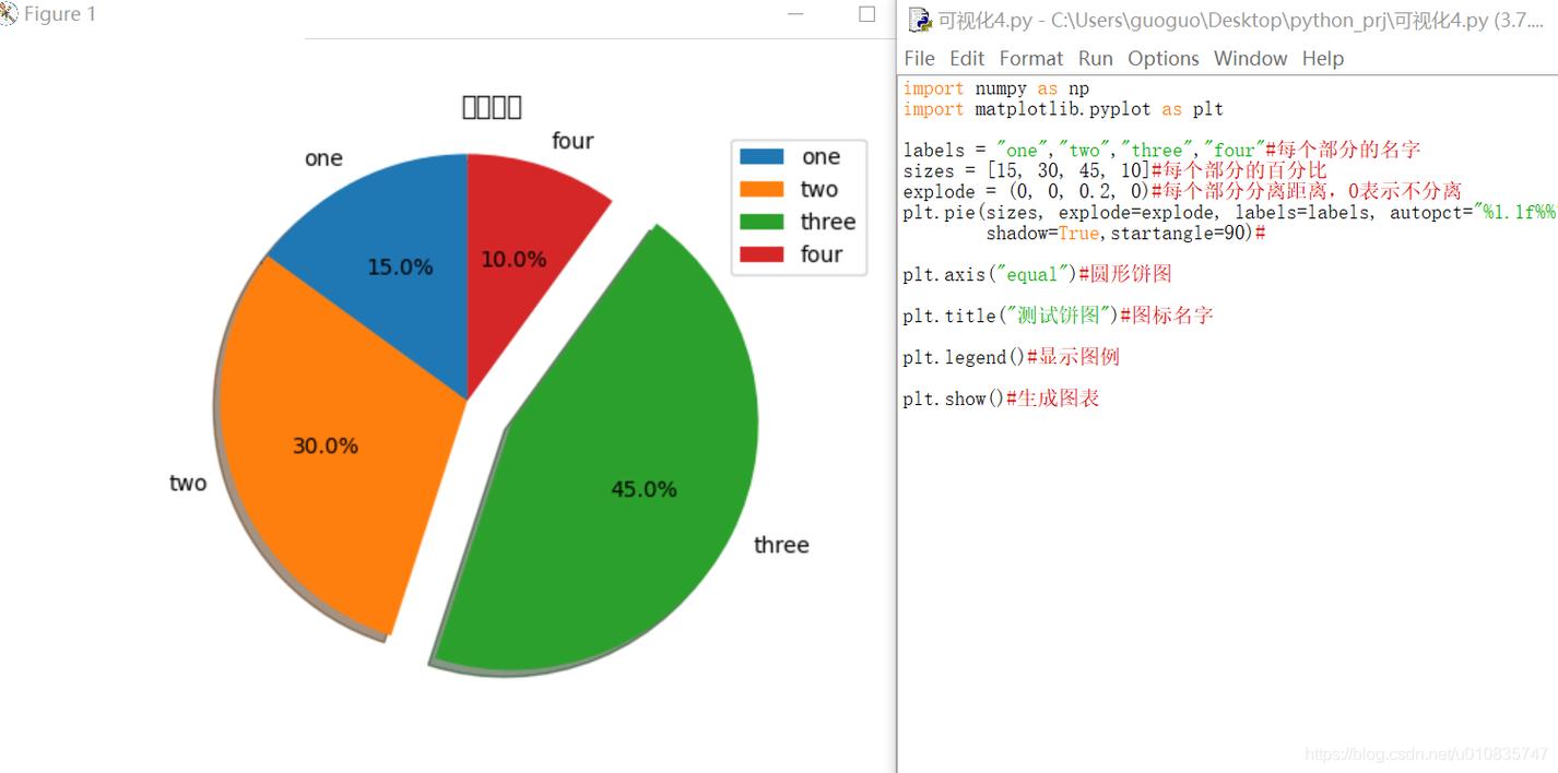
6. 基本饼图
# library
import pandas as pd
import matplotlib.pyplot as plt

# --- dataset 1: just 4 values for 4 groups:
df = pd.DataFrame([8,8,1,2], index=['a', 'b', 'c', 'd'], columns=['x'])

# make the plot
(kind='pie', subplots=True, figsize=(8, 8))

# show the plot
()
6.基本甜甜圈图
# library
import matplotlib.pyplot as plt

# create data
size_of_groups=[12,11,3,30]

# Create a pie plot
(size_of_groups)
()

# add a white circle at the center
my_circle=plt.Circle( (0,0), 0.7, color='white')
()
p.gca().add_artist(my_circle)

# show the graph
()
7.棒棒糖图
# libraries
import matplotlib.pyplot as plt
import numpy as np

# create data
x=range(1,41)
values=np.random.uniform(size=40)

# stem function
(x, values)
(0, 1.2)
()

# stem function: If x is not provided, a sequence of numbers is created by python:
(values)
()
8. 2D马赛克
# libraries
import matplotlib.pyplot as plt
import numpy as np

# Data
x = np.random.normal(size=50000)
y = x * 3 + np.random.normal(size=50000)

# A histogram 2D
plt.hist2d(x, y, bins=(50, 50), )

# Add a basic title
plt.title("A 2D histogram")

# Show the graph
()
9.树形图
# libraries
import pandas as pd
import matplotlib.pyplot as plt
import squarify    # pip install squarify (algorithm for treemap)

# If you have 2 lists
(sizes=[13,22,35,5], label=["group A", "group B", "group C", "group D"], alpha=.7 )
('off')
()

# If you have a data frame
df = pd.DataFrame({
   'nb_people':[8,3,4,2], 'group':["group A", "group B", "group C", "group D"] })
(sizes=df['nb_people'], label=df['group'], alpha=.8 )
('off')
()
10.带有颜色映射值的树状图
#libraries
import matplotlib
import matplotlib.pyplot as plt
import squarify # pip install squarify (algorithm for treemap)</pre>

# Create a dataset:
my_values=[i**3 for i in range(1,100)]

# create a color palette, mapped to these values
cmap = .Blues
mini=min(my_values)
maxi=max(my_values)
norm = matplotlib.colors.Normalize(vmin=mini, vmax=maxi)
colors = [cmap(norm(value)) for value in my_values]

# Change color
(sizes=my_values, alpha=.8, color=colors 


 4544
4544


 被折叠的 条评论
为什么被折叠?
被折叠的 条评论
为什么被折叠?
 到【灌水乐园】发言


