


HTML:
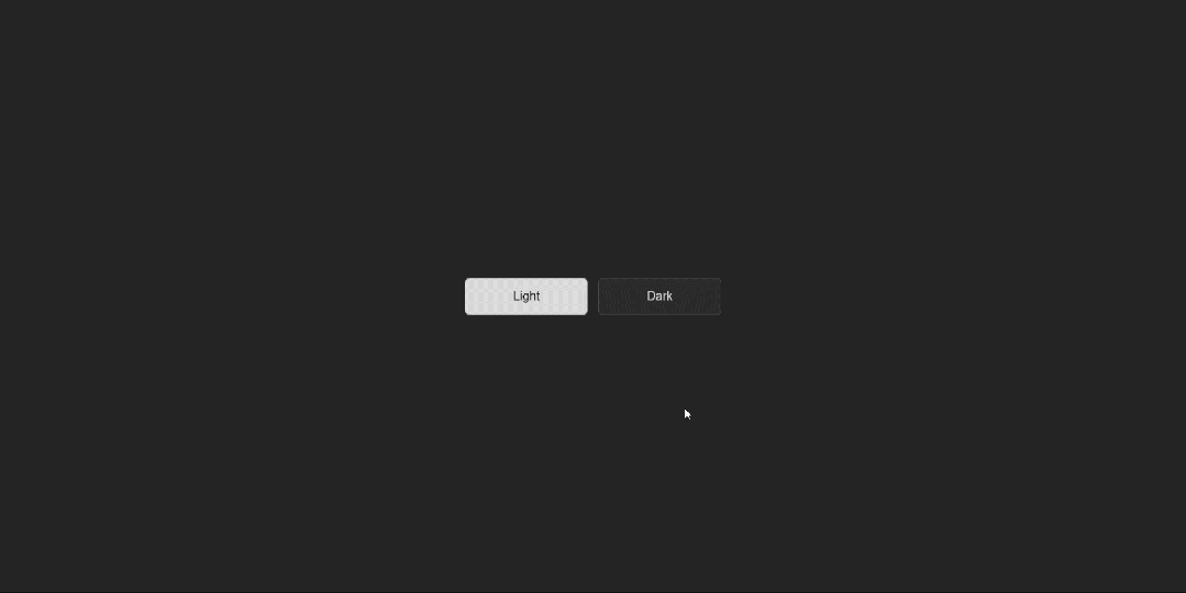
<button class="button">Light</button>
<button class="button dark">Dark</button>
*{
    margin: 0;
    padding: 0;
}
body{
    min-height: 100vh;
    /* 弹性布局 居中演示 */
    display: flex;
    justify-content: center;
    align-items: center;
    background-color: #242424;
}
.button{
    width: 200px;
    height: 60px;
    border: 1px solid rgba(0,0,0,0.35);
    border-radius: 8px;
    margin: 0 8px;
    background-color: #d8d8d8;
    cursor: pointer;
    font-size: 20px;
    position: relative;
    /* 加个溢出隐藏 */
    overflow: hidden;
}
.button.dark{
    border-color: rgba(255, 255, 255, 0.12);
    background-color: #2b2b2b;
    color: #d8d8d8;
}
.button::after{
    content: "";
    width: 100px;
    height: 100px;
    /* 绝对定位 */
    position: absolute;
    /* --x、--y为CSS的自定义变量,通过var函数可对其调用 */
    /* 这里可以通过js获取鼠标的坐标并赋值给自定义变量,实现跟随鼠标移动 */
    left: var(--x);
    top: var(--y);
    transform: translate(-50%,-50%);
    /* 圆锥渐变 */
    background-image: conic-gradient(#00f,#0ff,#0f0,#ff0,#f00,#f0f,#00f);
    border-radius: 50%;
    /* 模糊滤镜 */
    filter: blur(15px);
    /* 混合模式:叠加 */
    mix-blend-mode: overlay;
    /* 默认隐藏 */
    opacity: 0;
    /* 不透明度变化时的过渡效果 */
    transition: opacity 0.2s ease-in-out;
}
/* Light按钮悬停 */
.button:hover::after{
    opacity: 1;
}
/* Dark按钮悬停 */
.button.dark:hover::after{
    opacity: 0.5;
}
JS:
// 获取按钮
const buttons=document.querySelectorAll('.button');

// 循环为每一个按钮绑定鼠标移动事件
buttons.forEach((button)=>{
    button.addEventListener('mousemove',(e)=>{
        // 获取鼠标的x、y坐标
        const x=e.offsetX;
        const y=e.offsetY;
        // 将x、y坐标赋值给CSS中的自定义变量--x、--y
        button.style.setProperty('--x',`${x}px`);
        button.style.setProperty('--y',`${y}px`);
    })
})


 被折叠的 条评论
为什么被折叠?
被折叠的 条评论
为什么被折叠?
 到【灌水乐园】发言


