


【先看效果】
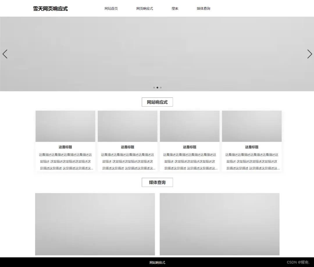
【PC端显示】
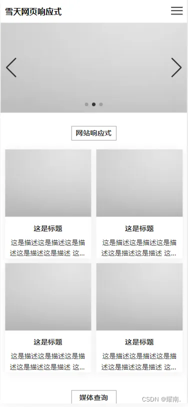
【手机端显示】
响应式就是使用媒体查询,在多个的屏幕尺寸下,让网页的布局不要乱。
核心就是,在对应的屏幕下,通过对发生错乱的元素样式进行更改,让其在该屏幕下排列整齐,在对应的屏幕下,把版心改成当前屏幕的合适大小,去掉元素的定高定宽,宽度改为100%,去除多余的内外边距,左右布局改成上下。
这个需要一个个div逐个去更改,看着费劲,其实也花不了多少时间。
本文仅做网页适配案例,学习使用媒体查询,所以只有一个简单的页面,且只写了布局。
上代码:
HTML
<!DOCTYPE html>
<html>
	<head>
		<meta charset="utf-8" />
		<title>网站首页</title>
		<meta name="viewport" content="width=device-width, initial-scale=1.0">
		<link rel="stylesheet" href="./js/swiper.min.css">
		<link rel="stylesheet" href="css/index.css">
		<script src="js/jquery.js"></script>
		<script src="js/swiper.min.js"></script>
	</head>
	<body>
		<nav class="navbar w">
			<div class="logo">
				<h1>耀南网页响应式</h1>
			</div>
			<ul>
				<li><a href="index.html">网站首页</a></li>
				<li><a href="#">网页响应式</a></li>
				<li><a href="#">搜索</a></li>
				<li><a href="#">媒体查询</a></li>
			</ul>
			<!-- 手机端 -->
			<div class="hbg">
				<div class="line"></div>
				<div class="line"></div>
				<div class="line"></div>
			</div>
		</nav>


		<div class="banner">
			<div class="swiper mySwiper swiper-container">
				<div class="swiper-wrapper">
					<div class="swiper-slide">
						<img src="./img/img.webp" alt="">
					</div>
					<div class="swiper-slide">
						<img src="./img/img.webp" alt="">
					</div>
					<div class="swiper-slide">
						<img src="./img/img.webp" alt="">
					</div>
				</div>
				<div class="swiper-button-next"></div>
				<div class="swiper-button-prev"></div>
				<div class="swiper-pagination"></div>
			</div>
		</div>


		<div class="index-list">
			<div class="w">
				<h3 class="title">网站响应式</h3>
				<div class="list-box">
					<div class="l-item">
						<a href="detail.html">
							<img src="./img/img.webp" alt="">
							<h3>这是标题</h3>
							<p>
								这是描述这是描述这是描述这是描述这是描述
								这是描述这是描述这是描述这是描述这是描述
								这是描述这是描述这是描述这是描述这是描述
							</p>
						</a>
					</div>
					<div class="l-item">
						<a href="detail.html">
							<img src="./img/img.webp" alt="">
							<h3>这是标题</h3>
							<p>
								这是描述这是描述这是描述这是描述这是描述
								这是描述这是描述这是描述这是描述这是描述
								这是描述这是描述这是描述这是描述这是描述
							</p>
						</a>
					</div>
					<div class="l-item">
						<a href="detail.html">
							<img src="./img/img.webp" alt="">
							<h3>这是标题</h3>
							<p>
								这是描述这是描述这是描述这是描述这是描述
								这是描述这是描述这是描述这是描述这是描述
								这是描述这是描述这是描述这是描述这是描述
							</p>
						</a>
					</div>
					<div class="l-item">
						<a href="detail.html">
							<img src="./img/img.webp" alt="">
							<h3>这是标题</h3>
							<p>
								这是描述这是描述这是描述这是描述这是描述
								这是描述这是描述这是描述这是描述这是描述
								这是描述这是描述这是描述这是描述这是描述
							</p>
						</a>
					</div>
				</div>
			</div>
		</div>

		<div class="two">
			<div class="w">
				<h3 class="title">媒体查询</h3>
				<div class="two-list">
					<img src="./img/img.webp" alt="">
					<img src="./img/img.webp" alt="">
				</div>
			</div>
		</div>


		<footer>
			网站响应式
		</footer>
	</body>
</html>

<script>
	// 轮播图
	var swiper = new Swiper(".mySwiper", {
		autoplay: true,
		pagination: {
			el: ".swiper-pagination",
		},
		navigation: {
			nextEl: ".swiper-button-next",
			prevEl: ".swiper-button-prev",
		},
	});


	// 导航栏
	var flag = false;
	$('.hbg').click(function(){
		flag = !flag;
		if(flag){
			$('.line:nth-child(2)').hide()
			$('.line:nth-child(1)').css({
				'transform': 'translateY(5px) rotate(225deg)'
			})
			$('.line:nth-child(3)').css({
				'transform': 'translateY(-3px) rotate(-225deg)'
			})
		}else{
			$('.line:nth-child(2)').show()
			$('.line:nth-child(1)').css({
				'transform': 'translateY(0) rotate(0)'
			})
			$('.line:nth-child(3)').css({
				'transform': 'translateY(0) rotate(0)'
			})
		}

		$('.navbar ul').stop().slideToggle();
	})
</script>
CSS
/* css样式统一化 去除某些元素自带样式 */

* {
	margin: 0;
	padding: 0;
	box-sizing: border-box;
}

li {
	list-style-type: none;
}

a {
	text-decoration: none;
	color: #333;
}

/* 版心 */
.w {
	width: 1200px;
	margin: 0 auto;
}

/* 导航 */


nav {
	height: 80px;
	background-color: #ffffff;
}

.navbar {
	height: 100%;
	display: flex;
	justify-content: space-between;
	align-items: center;
}

.logo {
	width: 20%;
	height: 50px;
	line-height: 50px;
}

.navbar ul {
	width: 70%;
	height: 100%;
}

.navbar ul li {
	list-style: none;
	float: left;
}

.navbar ul li a {
	display: block;
	height: 80px;
	text-decoration: none;
	line-height: 80px;
	padding: 0 10px;
	margin: 0 35px;
	color: #000000;
	text-align: center;
}

.navbar ul li a:hover {
	background-color: #00aaff;
	color: #ffffff;
}

.navbar ul li ol {
	display: none;
	width: 100px;
}

.navbar ul li ol li {
	width: 100px;
	background-color: red !important;
}

.navbar ul li ol li a {
	margin: 0;

}

.navbar ul li a:hover .navbar ul li ol {
	display: block;
}


/* 首页 */


/* 轮播图样式 */
.banner {
	height: 360px;
}

.swiper {
	width: 100%;
	height: 100%;
}

.swiper-slide {
	text-align: center;
	font-size: 18px;
	background: #fff;
	display: flex;
	justify-content: center;
	align-items: center;
	background-color: #b1b1b1;
}

.swiper-slide img {
	display: block;
	width: 100%;
	height: 100%;
	object-fit: cover;
}

.swiper-pagination-bullet-active {
	opacity: 1;
	background: #333 !important;
}

.swiper-button-next,
.swiper-button-prev {
	color: #333 !important;
}


/* 首页列表 */
.index-list {
	padding: 10px;
}

.index-list .list-box {
	display: flex;
	justify-content: flex-start;
	align-items: center;
}

.l-item {
	width: 24%;
	background-color: #fff;
	text-align: center;
	box-shadow: 1px 2px 20px #eeeeee;
	margin-left: 1%;
}

.l-item:hover {
	cursor: pointer;
}

.l-item img {
	width: 100%;
	height: 150px;
	object-fit: cover;
}

.l-item h3 {
	font-size: 16px;
	color: #333;
	font-weight: 700;
	margin: 10px 0;
}

.l-item p {
	font-size: 15px;
	color: #333;
	line-height: 33px;
	padding: 0 15px;
	overflow: hidden;
	display: -webkit-box;
	-webkit-box-orient: vertical;
	-webkit-line-clamp: 3;
	text-overflow: ellipsis;
}


.title {
	font-size: 20px;
	color: #333;
	text-align: center;
	margin: 20px auto;
	width: 150px;
	line-height: 42px;
	border: 1px solid rgb(125, 125, 125);
}


.two-list {
	padding: 10px;
	display: flex;
	justify-content: space-between;
	align-items: center;
}

.two-list img {
	width: 49%;
	height: 300px;
	background-color: #666;
}

/* 网站底部 */
footer {
	text-align: center;
	font-size: 15px;
	color: #fff;
	background-color: #000000;
	line-height: 50px;
}


.pp-img {
	width: 100%;
	height: 300px;
}

.pp-img img {
	width: 100%;
	height: 100%;
	object-fit: cover;
}

.pp-list .w {
	margin: 20px auto;
	display: flex;
	justify-content: flex-start;
	align-items: center;
	flex-wrap: wrap;
}

.pp-list .l-item {
	margin-bottom: 10px;
}

.pp-list .l-item img {
	height: 240px;
}

.pp-list .l-item h3 {
	line-height: 40px;
}


/* 媒体查询 */


@media screen and (max-width:1600px) {
	.w {
		max-width: 1400px;
	}
}

@media screen and (max-width:1400px) {
	.w {
		max-width: 1200px;
	}
}

@media screen and (max-width:1200px) {
	.w {
		max-width: 1000px;
	}
}

@media screen and (max-width:1000px) {
	.w {
		max-width: 100%;
	}

	.navbar {
		display: block;
	}

	.navbar ul li {
		float: inherit;
	}

	.navbar ul li a {
		display: inline-block;
		color: #fff;
	}

	.navbar {
		width: 100%;
		padding: 0 10px;
	}

	.logo {
		width: 50%;
	}

	.logo h1{
		font-size: 18px;
	}

	.navbar ul {
		display: none;
		width: 100%;
		height: auto;
		position: absolute;
		z-index: 99;
		top: 50px;
		left: 0;
		background: #000000d1;
		text-align: center;
	}

	.hbg {
		position: absolute;
		top: 10px;
		right: 10px;
	}

	.line {
		width: 25px;
		height: 2.5px;
		margin-top: 5px;
		background-color: #444;
		transition: all .5s;


	}

	/* 三线变成差号  通过js控制整个样式 \
   线影藏掉一根线  把剩下的两根使用旋转 成交叉的样子
   */
	/* .line:nth-child(2){
   display: none;
   }
   .line:nth-child(1){
   transform: translateY(5px) rotate(45deg);
   }
   .line:nth-child(3){
   transform: translateY(-3px) rotate(-45deg);
   }
   */


  .banner {
      height: 200px;
  }
.title {
    font-size: 16px;
    color: #333;
    text-align: center;
    margin: 20px auto;
    width: 100px;
    line-height: 30px;
    border: 1px solid rgb(143, 143, 143);
}

.index-list .list-box {
    display: flex;
    justify-content: space-between;
    align-items: center;
    flex-wrap: wrap;
}
.l-item {
    width: 48.5%;
    background-color: #fff;
    text-align: center;
    box-shadow: 1px 2px 20px #eeeeee;
    margin-left: 0;
    margin-bottom: 10px;
}
.two-list img {
    width: 100%;
    height: 200px;
    background-color: #666;
	margin-bottom: 10px;
}
.two-list {
    flex-wrap: wrap;
}
.l-item p {
    font-size: 15px;
    color: #333;
    line-height: 24px;
    padding: 0 10px;
    overflow: hidden;
    display: -webkit-box;
    -webkit-box-orient: vertical;
    -webkit-line-clamp: 2;
    text-overflow: ellipsis;
}
}
JS
(由于代码量过多,所以已经将程序打包上传到上面了,可以自行下载运行)


 被折叠的 条评论
为什么被折叠?
被折叠的 条评论
为什么被折叠?
 到【灌水乐园】发言


