


文章目录
HTML
1.如何理解语义化
①让人更容易读懂(增加代码可读性)②让搜索引擎更容易读懂(SEO问题,让搜索排名靠前)
③正确的标签做正确的事情④页面内容结构化
2.哪些标签是块级元素?哪些标签是内联元素?
块级(display:block/table):div、p、h1-h6、ul、ol、dl、li、header、footer、aside、section、article、form、table等
内联(display:inline/inline-block):span、img、button、input、b、q、i、a、em、label等
CSS布局
1.盒子模型的宽度(offsetWidth)如何计算?
盒子模型分为两种:标准盒子模型和IE盒子模型
区别:
1.标准盒子模型(content-box)中width中包含content
2.IE盒子模型中(border-box)width中包含content、padding、border
    <!-- 请问div1 的offsetWidth 是多大 -->
    <style type="text/css">
        #div1 {
            width: 100px;
            padding: 10px;
            border: 1px solid #ccc;
            margin: 10px;
            box-sizing: content-box;
        }
    </style>

    <div id="div1">
        this is div1
    </div>
offsetWidth = (内容宽度+内边距+边框),无外边距
答案:100px + 20px + 2px = 122px
补充︰如果让offsetWidth 等于100px,该如何做?
添加 box-sizing: border-box;
2.margin纵向重叠问题
    <!-- AAA 和 BBB 之间的距离是多少 -->
    <style type="text/css">
        p {
            font-size: 16px;
            line-height: 1;
            margin-top: 10px;
            margin-bottom: 15px;
        }
    </style>

    <p>AAA</p>
    <p></p>
    <p></p>
    <p></p>
    <p>BBB</p>
    </style>
相邻元素的margin-top和margin-bottom会发生重叠
空白内容的<p></p>也会重叠
答案:15px
3.margin上下左右分别设置负值,有何效果?
top、left:设置负值,该元素会向上向左移动
right:设置负值,右侧元素左移,自身不动
bottom:设置负值,下方元素上移,自身不受影响
4.BFC理解和应用
是什么?
- Block format content,块级格式化上下文
- 是一块独立渲染区域,内部元素的渲染不会影响边界以外的元素
BFC如何产生?
-
float属性【不为】none;
-
display属性【为】:flex,line-block等
-
position属性【为】:absolute或fixed;
-
overflow属性【不为】:visible;
应用
- 清除浮动
        .bfc {
            overflow: hidden; /* 触发元素 BFC */
        }
- 作用:解决父元素高度塌陷问题;解决外边距重叠问题;清除内部元素浮动
5.float布局
如何实现圣杯布局、双飞翼布局
圣杯布局和双飞翼布局的目的
- 三栏布局,中间一栏最先加载和渲染(内容最重要)
- 两侧内容固定,中间内容随着宽度自适应
- 一般用于PC网页
圣杯布局和双飞翼布局的技术总结
- 使用float布局
- 两侧使用margin负值,以便和中间内容横向重叠
- 防止中间内容被两侧覆盖,一个用padding一个用margin
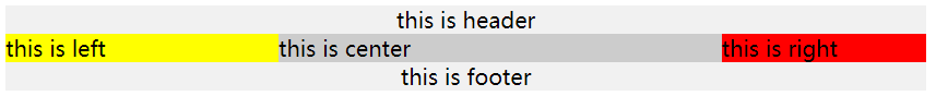
圣杯布局
    <!-- 圣杯布局 -->
    <style type="text/css">
        body {
            min-width: 550px;
        }
        #header {
            text-align: center;
            background-color: #f1f1f1;
        }

        #container {
            padding-left: 200px;
            padding-right: 150px;
        }
        #container .column {
            float: left;
        }

        #center {
            background-color: #ccc;
            width: 100%;
        }
        #left {
            position: relative;
            background-color: yellow;
            width: 200px;
            margin-left: -100%;
            right: 200px;
        }
        #right {
            background-color: red;
            width: 150px;
            margin-right: -150px;
        }

        #footer {
         	clear:both;
            text-align: center;
            background-color: #f1f1f1;
        }

    </style>

    <div id="header">this is header</div>
    <div id="container" class="clearfix">
        <div id="center" class="column">this is center</div>
        <div id="left" class="column">this is left</div>
        <div id="right" class="column">this is right</div>
    </div>
    <div id="footer">this is footer</div>
双飞翼布局
    <!-- 双飞翼布局 -->
    <style type="text/css">
        body {
            min-width: 550px;
        }

        .col {
            float: left;
        }

        #main {
            width: 100%;
            height: 200px;
            background-color: #ccc;
        }

        #main-wrap {
            margin: 0 190px 0 190px;
        }

        #left {
            width: 190px;
            height: 200px;
            background-color: #0000FF;
            margin-left: -100%;
        }

        #right {
            width: 190px;
            height: 200px;
            background-color: #FF0000;
            margin-left: -190px;
        }
    </style>

    <div id="main" class="col">
        <div id="main-wrap">
            this is main
        </div>
    </div>
    <div id="left" class="col">
        this is left
    </div>
    <div id="right" class="col">
        this is right
    </div>

手写clearfix
        /* 手写 clearfix */
        .clearfix:after {
            content: '';
            display: table;
            clear: both;
        }
6.flex布局
实现一个三点的色子


CSS定位
1.absolute和relative分别依据什么定位?
- relative 依据自身定位
- absolute 依据最近一层的定位元素定位
2.居中对齐有哪些实现方式?
水平居中
- inline元素:text-align:center
- block元素:margin:0 auto
- absolute元素: left:50% + margin-left负值
- translateX
- flex:( display: flex; justify-content: center;)
垂直居中
- inline元素: line-height的值等于height值
- absolute元素: top:50% + margin-top负值
- absolute元素:transform: translate(-50%, -50%)
- absolute元素:top, left, bottom, right = 0 + margin: auto
- flex:(display: flex; flex-direction: column; justify-content: center;)
CSS图文样式
1. line-height的继承问题
    <!-- p标签的行高是多少 -->
    <style type="text/css">
        body {
            font-size: 20px;
            line-height: 200%;
        }
        p {
            background-color: #ccc;
            font-size: 16px;
        }
    </style>

<body>
    <p>这是一行文字</p>
</body>
答案:40px
- 写具体数值,如30px ,则继承该值(比较好理解)
- 写比例,如2 ,则继承该比例(
16*2 比较好理解) - 写百分比,如200%,则继承计算出来的值(
20*200% 考点)
CSS响应式
1.rem是什么?
rem是一个长度单位
- px,绝对长度单位,最常用
- em ,相对长度单位,相对于父元素,不常用
- rem ,相对长度单位,相对于根元素,常用于响应式布局
2.响应式布局的常见方案?
- 媒体查询(media-query),根据不同的屏幕宽度设置根元素font-size
- flex 布局
- 百分比布局
3.vw/vh
- rem的弊端:“阶梯”性
- 网页视口尺寸
- window.screen.height//屏幕高度
- window.innerHeight //网页视口高度
- document.body.clientHeight // body 高度
vh、vw,网页视口高度、宽度的1%- vmax取两者最大值;vmin取两者最小值
    <style>
        #container {
            background-color: red;
            width: 10vw;
            height: 10vh;
        }
    </style>

    <div id="container">
    </div>


 1万+
1万+


 被折叠的 条评论
为什么被折叠?
被折叠的 条评论
为什么被折叠?
 到【灌水乐园】发言


