


简述
QAbstractButton是按钮控件的抽象基类,提供了按钮所共有的功能。
这个类实现了一个抽象的按钮。对这个按钮进行子类化可以处理用户行为,以及指定按钮如何绘制。
QAbstractButton提供了点击和勾选按钮。QRadioButton和QCheckBox类只提供了勾选按钮,QPushButton和QToolButton提供了点击按钮,如果需要的话,它们还可以提供切换行为。
任何按钮,都可以显示一个包含文本和图标的标签。setText()用来设置文本,setIcon()可以置图标。如果按钮被禁用,其标签更改为“disabled”样式。
基本用法
先用一个小例子来直观感受一下
效果
源码
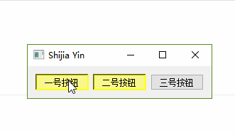
    this->setWindowTitle("Shijia Yin");
    QHBoxLayout *layout = new QHBoxLayout;
    QAbstractButton * btn1 = new QPushButton("一号按钮", this);
    QAbstractButton * btn2 = new QPushButton("二号按钮", this);
    QAbstractButton * btn3 = new QPushButton("三号按钮", this);
    btn1->setStyleSheet("QPushButton:hover {background-color:red}");
    btn2->setStyleSheet("QPushButton:hover {background-color:green}");
    btn3->setStyleSheet("QPushButton:hover {background-color:blue}");

    layout->addWidget(btn1);
    layout->addWidget(btn2);
    layout->addWidget(btn3);

    this->setLayout(layout);
常用接口
公共函数
- 是否能被选中
- bool isCheckable()
- 是否被选中
- bool isChecked()
- 是否被按下
- bool isDown()
- 设置能被选中
- setCheckable(bool)
- 设置按钮被按下
- setDown(bool)
- 设置图标
- setIcon()
效果
源码
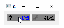
    btn2->setIcon(QIcon(":/picture/tool.png"));
    btn2->setCheckable(true);
    btn2->setStyleSheet("QPushButton:checked {background-color: white;border-radius: 6px; border:2px solid gray}"
                        "QPushButton {background-color:gray;}");

    btn1->setIcon(QIcon(":/picture/paste.png"));
    btn1->setCheckable(true);
    btn1->setStyleSheet("QPushButton:checked {background-color: white;border-radius: 6px; border:2px solid red}"
                        "QPushButton {background-color:gray;color:blue}");
- 设置快捷键
- setShortCut()
效果
源码
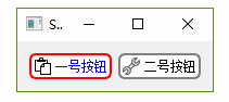
    btn1->setShortcut(QKeySequence(tr("Ctrl+P")));//Ctrl+P之间不能有空格
    btn2->setShortcut(QKeySequence(tr("Alt+P")));//Alt+P之间不能有空格
- 设置文本
- setText()
- 当前按钮文本
- text()
槽函数
- 触发点击效果
- click()
效果
源码
    this->setWindowTitle("Shijia Yin");
    QHBoxLayout *layout = new QHBoxLayout;
    QAbstractButton * btn1 = new QPushButton("一号按钮", this);
    QAbstractButton * btn2 = new QPushButton("二号按钮", this);
    QAbstractButton * btn3 = new QPushButton("三号按钮", this);
    btn1->setStyleSheet("QPushButton:hover {background-color:red} QPushButton:checked {background-color:yellow}");
    btn1->setCheckable(true);
    btn2->setStyleSheet("QPushButton:hover {background-color:green} QPushButton:checked {background-color:yellow}");
    btn2->setCheckable(true);
    btn3->setStyleSheet("QPushButton:hover {background-color:blue}");

    layout->addWidget(btn1);
    layout->addWidget(btn2);
    layout->addWidget(btn3);

    this->setLayout(layout);

    connect(btn1, &QPushButton::clicked, btn2, &QPushButton::click);
- 设置选中
- setChecked(bool)
设置按钮为选中状态。
- 设置图标大小
- setIconSize(const QSize &size)
- 反转按钮的选中状态
- toggle()
信号
- 点击
- clicked(bool checked = false)
- 按下
- pressed()
- 释放
- released()
- 选中状态翻转
- toggled(bool checked)
引用
[1] Qt助手
[2] https://blog.csdn.net/liang19890820/article/details/51509764


 扫一扫
扫一扫


 3939
3939

 被折叠的 条评论
为什么被折叠?
被折叠的 条评论
为什么被折叠?
 到【灌水乐园】发言


