


06-Flex布局
思维导图:

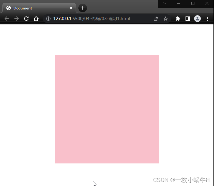
练习1-小米登录

第一步搭建大盒子
<!DOCTYPE html>
<html lang="en">

<head>
  <meta charset="UTF-8">
  <meta http-equiv="X-UA-Compatible" content="IE=edge">
  <meta name="viewport" content="width=device-width, initial-scale=1.0">
  <title>Document</title>
  <style>
    * {
      margin: 0;
      padding: 0;
      box-sizing: border-box;
    }

    .mi {
      width: 339px;
      height: 356px;
      background-color: pink;
      margin: 100px auto;
    }
  </style>
</head>

<body>
  <div class="mi"></div>
</body>

</html>
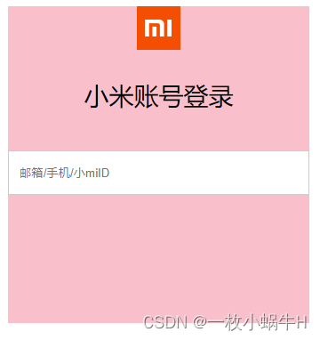
logo设置
一般情况下,logo都是背景图片,而且是 h1
html设置
<body>
  <div class="mi">
    <h1></h1>
  </div>
</body>
css 设置
 /* h1是logo 一般情况下都是背景 */
    .mi h1 {
      width: 49px;
      height: 49px;
      margin: 0 auto;
      background: #ff4c00 url(./images/mi-logo.png) no-repeat;
      /* background-color: red; */
    }
效果如下:

标题和input设置
html
<h2>小米账号登录</h2>
<input type="text" placeholder="邮箱/手机/小miID">
css
.mi h2 {
  text-align: center;
  font-weight: 400;
  font-size: 28px;
  margin: 32px 0 44px;
}

.mi input {
  width: 339px;
  height: 50px;
  border: 1px solid #ccc;
  padding-left: 12px;
}
效果:
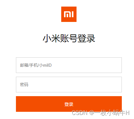
密码框和登录按钮
html
<input type="password" placeholder="密码">
<button>登录</button>
css
.mi input {
  width: 339px;
  height: 50px;
  border: 1px solid #ccc;
  padding-left: 12px;
  margin-bottom: 12px;
}

.mi button {
  width: 339px;
  height: 50px;
  background-color: #ff4c00;
  border: 0;
  font-size: 14px;
  color: #fff;
}

.mi button:hover {
  background-color: red;
}
收工
完整写法:
<!DOCTYPE html>
<html lang="en">

  <head>
    <meta charset="UTF-8">
    <meta http-equiv="X-UA-Compatible" content="IE=edge">
    <meta name="viewport" content="width=device-width, initial-scale=1.0">
    <title>Document</title>
    <style>
      * {
        margin: 0;
        padding: 0;
        box-sizing: border-box;
      }

      .mi {
        width: 339px;
        height: 356px;
        /* background-color: pink; */
        margin: 100px auto;
      }

      /* h1是logo 一般情况下都是背景 */
      .mi h1 {
        width: 49px;
        height: 49px;
        margin: 0 auto;
        background: #ff4c00 url(./images/mi-logo.png) no-repeat;
        /* background-color: red; */
      }

      .mi h2 {
        text-align: center;
        font-weight: 400;
        font-size: 28px;
        margin: 32px 0 44px;
      }

      .mi input {
        width: 339px;
        height: 50px;
        border: 1px solid #ccc;
        padding-left: 12px;
        margin-bottom: 12px;
      }

      .mi button {
        width: 339px;
        height: 50px;
        background-color: #ff4c00;
        border: 0;
        font-size: 14px;
        color: #fff;
      }

      .mi button:hover {
        background-color: red;
      }
    </style>
  </head>

  <body>
    <div class="mi">
      <h1></h1>
      <h2>小米账号登录</h2>
      <input type="text" placeholder="邮箱/手机/小miID">
      <input type="password" placeholder="密码">
      <button>登录</button>
    </div>
  </body>

</html>
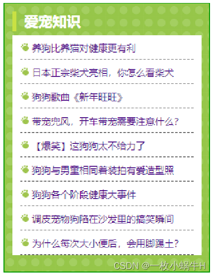
爱宠案例
效果:
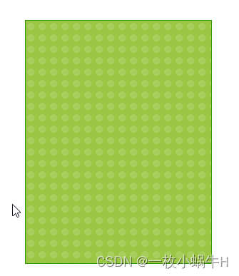
大盒子 dog 搭建
<!DOCTYPE html>
<html lang="en">

<head>
  <meta charset="UTF-8">
  <meta http-equiv="X-UA-Compatible" content="IE=edge">
  <meta name="viewport" content="width=device-width, initial-scale=1.0">
  <title>Document</title>
  <style>
    * {
      margin: 0;
      padding: 0;
      box-sizing: border-box;
    }

    li {
      list-style: none;
    }

    .dog {
      width: 262px;
      height: 342px;
      /* background-color: pink; */
      margin: 100px auto;
      border: 1px solid #090;
      background: url(./images/bg.gif);
    }
  </style>
</head>

<body>
  <div class="dog"></div>


  <!-- 爱宠知识
  养狗比养猫对健康更有利
  日本正宗柴犬亮相,你怎么看柴犬
  狗狗歌曲《新年旺旺》
  带宠兜风,开车带宠需要注意什么?
  【爆笑】这狗狗太不给力了
  狗狗与男童相同着装拍有爱造型照
  狗狗各个阶段健康大事件
  调皮宠物狗陷在沙发里的搞笑瞬间
  为什么每次大小便后,会用脚踢土? -->
</body>

</html>
h2标题的做法
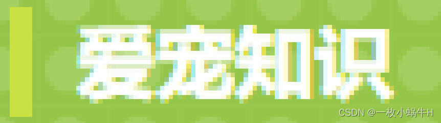
<div class="dog">
  <h2>爱宠知识</h2>
</div>
css
.dog {
  width: 262px;
  height: 342px;
  /* background-color: pink; */
  margin: 100px auto;
  border: 1px solid #090;
  background: url(./images/bg.gif);
  padding: 9px 9px 0;
}

.dog h2 {
  height: 25px;
  line-height: 25px;
  border-left: 5px solid #c9e143;
  font-size: 18px;
  color: #fff;
  padding-left: 10px;
}
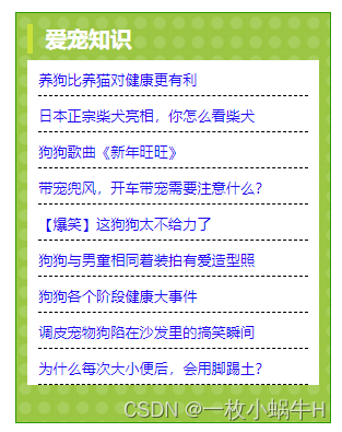
ul 布局
<ul>
  <li><a href="#">养狗比养猫对健康更有利</a></li>
  <li><a href="#">日本正宗柴犬亮相,你怎么看柴犬</a></li>
  <li><a href="#">狗狗歌曲《新年旺旺》</a></li>
  <li><a href="#">带宠兜风,开车带宠需要注意什么?</a></li>
  <li><a href="#">【爆笑】这狗狗太不给力了</a></li>
  <li><a href="#">狗狗与男童相同着装拍有爱造型照</a></li>
  <li><a href="#">狗狗各个阶段健康大事件</a></li>
  <li><a href="#">调皮宠物狗陷在沙发里的搞笑瞬间</a></li>
  <li><a href="#">为什么每次大小便后,会用脚踢土?</a></li>
</ul>
css
.dog ul {
  /* 背景给ul好一些 */
  background-color: #fff;
  /* 给ul padding 这样可以把li 挤到中间 */
  padding: 0 9px;
  margin-top: 5px;
}
效果

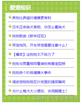
修改li和a链接的样式
.dog ul li {
  height: 30px;
  line-height: 30px;
  /* 大师的 */
  border-bottom: 1px dashed #000;
}

.dog ul li a {
  font-size: 12px;
  text-decoration: none;
}
给li添加背景图片
给li添加, 让图片左侧对齐,垂直居中, 让li 做内边距 14px
.dog ul li {
  height: 31px;
  line-height: 31px;
  /* 大师的 */
  border-bottom: 1px dashed #000;
  /*代码*/
  background: url(./images/tb.gif) no-repeat left center;
  padding-left: 14px;
}
完整的写法:
<!DOCTYPE html>
<html lang="en">

<head>
  <meta charset="UTF-8">
  <meta http-equiv="X-UA-Compatible" content="IE=edge">
  <meta name="viewport" content="width=device-width, initial-scale=1.0">
  <title>Document</title>
  <style>
    * {
      margin: 0;
      padding: 0;
      box-sizing: border-box;
    }

    li {
      list-style: none;
    }

    .dog {
      width: 262px;
      height: 342px;
      /* background-color: pink; */
      margin: 100px auto;
      border: 1px solid #090;
      background: url(./images/bg.gif);
      padding: 9px 9px 0;
    }

    .dog h2 {
      height: 25px;
      line-height: 25px;
      border-left: 5px solid #c9e143;
      font-size: 18px;
      color: #fff;
      padding-left: 10px;
    }

    .dog ul {
      /* 背景给ul好一些 */
      background-color: #fff;
      /* 给ul padding 这样可以把li 挤到中间 */
      padding: 0 9px;
      margin-top: 5px;
    }

    .dog ul li {
      height: 31px;
      line-height: 31px;
      /* 大师的 */
      border-bottom: 1px dashed #000;
      background: url(./images/tb.gif) no-repeat left center;
      padding-left: 14px;
    }

    .dog ul li a {
      font-size: 12px;
      text-decoration: none;
    }
  </style>
</head>

<body>
  <div class="dog">
    <h2>爱宠知识</h2>
    <ul>
      <li><a href="#">养狗比养猫对健康更有利</a></li>
      <li><a href="#">日本正宗柴犬亮相,你怎么看柴犬</a></li>
      <li><a href="#">狗狗歌曲《新年旺旺》</a></li>
      <li><a href="#">带宠兜风,开车带宠需要注意什么?</a></li>
      <li><a href="#">【爆笑】这狗狗太不给力了</a></li>
      <li><a href="#">狗狗与男童相同着装拍有爱造型照</a></li>
      <li><a href="#">狗狗各个阶段健康大事件</a></li>
      <li><a href="#">调皮宠物狗陷在沙发里的搞笑瞬间</a></li>
      <li><a href="#">为什么每次大小便后,会用脚踢土?</a></li>
    </ul>
  </div>


</body>

</html>
目标:熟练使用 Flex 完成结构化布局
01-标准流
标准流也叫文档流,指的是标签在页面中默认的排布规则,例如:块元素独占一行,行内元素可以一行显示多个。
02-浮动(了解即可,不用复习)
基本使用
作用:让块元素水平排列。
属性名:float
属性值
- left:左对齐
- right:右对齐
<!DOCTYPE html>
<html lang="en">

<head>
  <meta charset="UTF-8">
  <meta http-equiv="X-UA-Compatible" content="IE=edge">
  <meta name="viewport" content="width=device-width, initial-scale=1.0">
  <title>浮动</title>
  <style>
    .left,
    .right {
      /* width: 200px; */
      height: 200px;
      background-color: pink;
    }

    .left {
      /* 左浮动 */
      float: left;
      margin-left: 20px;
    }

    .right {
      /* 右侧浮动 */
      float: left;
      height: 300px;
      background-color: purple;
    }

    .bottom {
      height: 50px;
      background-color: black;
    }
  </style>
</head>

<body>
  <div class="left">左侧123</div>
  <div class="right">右侧123</div>
  <div class="bottom"></div>
</body>

</html>
特点:
- 浮动后的盒子顶对齐
- 浮动后的盒子具备行内块特点
- 浮动后的盒子脱标,不占用标准流的位置
产品区域布局

左右布局
html结构
  <div class="mi">
    <div class="left">左侧</div>
    <div class="right">右侧</div>
  </div>
css样式
 <style>
    * {
      margin: 0;
      padding: 0;
      box-sizing: border-box;
    }

    li {
      list-style: none;
    }

    .mi {
      width: 1226px;
      height: 614px;
      /* background-color: pink; */
      margin: 100px auto;
    }

    .left {
      float: left;
      width: 234px;
      height: 614px;
      background-color: skyblue;
    }

    .right {
      float: right;
      width: 978px;
      height: 614px;
      background-color: purple;
    }
</style>
效果:
区域小li布局
完整写法
<!DOCTYPE html>
<html lang="en">

<head>
  <meta charset="UTF-8">
  <meta http-equiv="X-UA-Compatible" content="IE=edge">
  <meta name="viewport" content="width=device-width, initial-scale=1.0">
  <title>Document</title>
  <style>
    * {
      margin: 0;
      padding: 0;
      box-sizing: border-box;
    }

    li {
      list-style: none;
    }

    .mi {
      width: 1226px;
      height: 614px;
      /* background-color: pink; */
      margin: 100px auto;
    }

    .left {
      float: left;
      width: 234px;
      height: 614px;
      background-color: skyblue;
    }

    .right {
      float: right;
      width: 978px;
      height: 614px;
      /* background-color: purple; */
    }

    .right li {
      float: left;
      width: 234px;
      height: 300px;
      background-color: pink;
      margin-bottom: 14px;
      margin-right: 14px;
    }

    /* 让第4,8 个li 去掉外边距 */
    .right li:nth-child(4n) {
      margin-right: 0;
    }
  </style>
</head>

<body>
  <div class="mi">
    <div class="left">左侧</div>
    <div class="right">
      <ul>
        <li>1</li>
        <li>1</li>
        <li>1</li>
        <li>1</li>
        <li>1</li>
        <li>1</li>
        <li>1</li>
        <li>1</li>
      </ul>
    </div>
  </div>
</body>

</html>
清除浮动
场景:浮动元素会脱标,如果父级没有高度,子级无法撑开父级高度(可能导致页面布局错乱)
解决方法:清除浮动(清除浮动带来的影响)
场景搭建
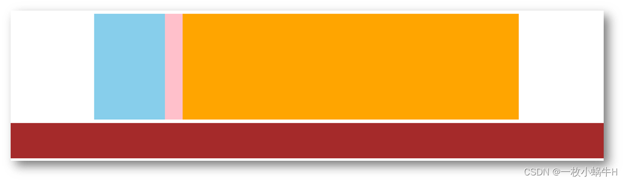
<style>
  .top {
    margin: 10px auto;
    width: 1200px;
    /* height: 300px; */
    background-color: pink;
  }

  .left {
    float: left;
    width: 200px;
    height: 300px;
    background-color: skyblue;
  }

  .right {
    float: right;
    width: 950px;
    height: 300px;
    background-color: orange;
  }

  .bottom {
    height: 100px;
    background-color: brown;
  }

</style>

<div class="top">
  <div class="left"></div>
  <div class="right"></div>
</div>
<div class="bottom"></div>
额外标签法
在父元素内容的最后添加一个块级元素,设置 CSS 属性 clear: both
<style>
.clearfix {
  clear: both;
}
</style>

<div class="father">
  <div class="left"></div>
  <div class="right"></div>
  <div class="clearfix"></div>
</div>
单伪元素法
- 准备 after 伪元素
.clearfix::after {
  content: "";
  display: block;
  clear: both;
}
- 父级使用 clearfix 类
<div class="father clearfix"></div>
双伪元素法
- 准备 after 和 before 伪元素
/* before 解决外边距塌陷问题 */
/* 双伪元素法 */
.clearfix::before,
.clearfix::after {
  content: "";
  display: table;
}

/* after 清除浮动 */
.clearfix::after {
  clear: both;
}
- 父级使用 clearfix 类
<div class="father clearfix"></div>
overfow法
.father {
  margin: 10px auto;
  width: 1200px;
  /* height: 300px; */
  background-color: pink;

  overflow: hidden;
}
03-Flex布局(重点)
Flex 布局也叫弹性布局,是浏览器提倡的布局模型,非常适合结构化布局,提供了强大的空间分布和对齐能力。
Flex 模型不会产生浮动布局中脱标现象,布局网页更简单、更灵活。
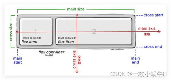
Flex组成
设置方式:给父元素设置 display: flex,子元素可以自动挤压或拉伸
组成部分:
- 弹性容器
- 弹性盒子
- 主轴:默认在水平方向
- 侧轴 / 交叉轴:默认在垂直方向
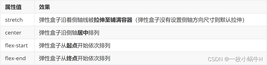
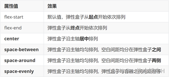
主轴对齐方式
属性名:justify-content

重点记住标红的。如果非要问我那个常用,我只能说是 space-between
justify-content: space-between;
显示效果:两侧没缝隙
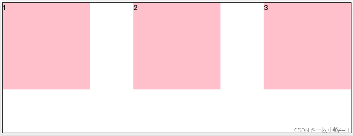
justify-content: space-around;
效果如下: 记住2倍
justify-content: space-evenly;
效果如下: 记住空隙一样大

justify-content: center;
效果如下: 经常用于让一个盒子水平居中

记忆:
两侧没缝隙是 between- 缝隙一样大是 evenly
- 2倍缝隙是 around
<!DOCTYPE html>
<html lang="en">

<head>
  <meta charset="UTF-8">
  <meta http-equiv="X-UA-Compatible" content="IE=edge">
  <meta name="viewport" content="width=device-width, initial-scale=1.0">
  <title>Document</title>
  <style>
    .box {
      /* 给父亲添加 flex */
      display: flex;
      /* 主轴的排列方式 */
      /* justify-content: flex-start; */
      /* justify-content: flex-end; */
      /* 让子盒子居中对齐 */
      /* justify-content: center; */
      /* between  */
      /* justify-content: space-between; */
      /* justify-content: space-around; */
      justify-content: space-evenly;
      width: 900px;
      height: 200px;
      background-color: pink;
    }

    .box div {
      width: 249px;
      height: 200px;
      background-color: skyblue;
    }
  </style>
</head>

<body>
  <div class="box">
    <div>1</div>
    <div>2</div>
    <div>3</div>
  </div>
</body>

</html>

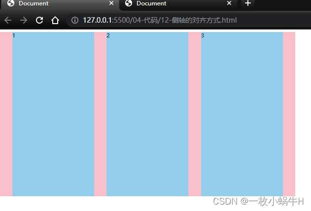
侧轴对齐方式
- align-items:当前弹性容器内所有弹性盒子的侧轴对齐方式(给弹性容器设置)
- align-self:单独控制某个弹性盒子的侧轴对齐方式(给弹性盒子设置)
<!DOCTYPE html>
<html lang="en">

<head>
  <meta charset="UTF-8">
  <meta http-equiv="X-UA-Compatible" content="IE=edge">
  <meta name="viewport" content="width=device-width, initial-scale=1.0">
  <title>Document</title>
  <style>
    .box {
      /* 给父亲添加 flex */
      display: flex;
      /* 主轴的排列方式 */
      /* justify-content: flex-start; */
      /* justify-content: flex-end; */
      /* 让子盒子居中对齐 */
      /* justify-content: center; */
      /* between  */
      /* 两侧没缝隙 */
      /* justify-content: space-between; */
      /* 两倍缝隙 */
      /* justify-content: space-around; */
      justify-content: space-evenly;

      /* 侧轴的对齐方式 */
      /* 顶部对齐 */
      /* align-items: flex-start; */
      /* 底部对齐 */
      /* align-items: flex-end; */
      /* 居中对齐 */
      /* align-items: center; */
      /* 默认的 拉伸和父亲一样 */
      align-items: stretch;
      width: 900px;
      height: 500px;
      background-color: pink;
    }

    .box div {
      width: 249px;
      /* height: 200px; */
      background-color: skyblue;
    }
  </style>
</head>

<body>
  <div class="box">
    <div>1</div>
    <div>2</div>
    <div>3</div>
  </div>
</body>

</html>
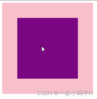
盒子水平和垂直居中的写法
<!DOCTYPE html>
<html lang="en">

<head>
  <meta charset="UTF-8">
  <meta http-equiv="X-UA-Compatible" content="IE=edge">
  <meta name="viewport" content="width=device-width, initial-scale=1.0">
  <title>Document</title>
  <style>
    .father {
      /* 利用flex实现 */
      display: flex;
      /* 主轴水平居中 */
      justify-content: center;
      /* 侧轴水平居中 */
      align-items: center;
      width: 300px;
      height: 300px;
      background-color: pink;
    }

    .son {
      width: 200px;
      height: 200px;
      background-color: purple;
    }
  </style>
</head>

<body>
  <div class="father">
    <div class="son"></div>
  </div>
</body>

</html>
综合案例

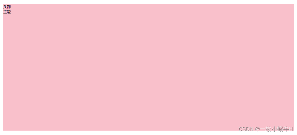
大盒子搭建
html结构
<div class="box">
    <div class="box-hd">头部</div>
    <div class="box-bd">主题</div>
  </div>
css 样式
* {
  margin: 0;
  padding: 0;
  box-sizing: border-box;
}

li {
  list-style: none;
}

.box {
  width: 1240px;
  height: 540px;
  background-color: pink;
  margin: 100px auto;
}
显示:
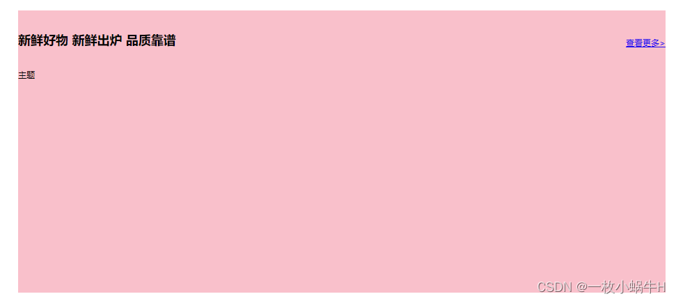
头部标题制作
html写法
<div class="box">
  <div class="box-hd">
    <h2>新鲜好物
      <span>新鲜出炉 品质靠谱</span>
    </h2>
    <a href="#">查看更多> </a>
  </div>
  <div class="box-bd">主题</div>
</div>
css 写法
.box-hd {
  /* 给父亲添加 flex 里面的孩子  h2 和 a 可以一样显示 */
  display: flex;
  /* 两侧没缝隙 主轴对齐 */
  justify-content: space-between;
  /* 侧轴底对齐 */
  align-items: flex-end;
  padding: 40px 0;
}
效果:
修饰文字
css样式
.box-hd h2 {
  font-size: 32px;
  font-weight: 400;
}

.box-hd h2 span {
  font-size: 16px;
  color: #999;
}

.box-hd a {
  font-size: 16px;
  color: #999;
}
展示:

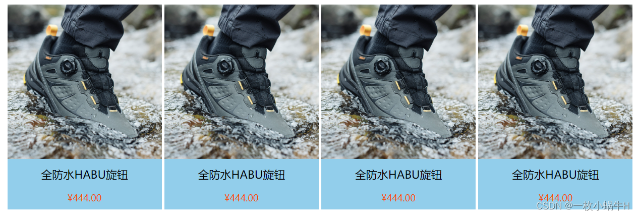
底部小li 制作
html结构
<ul>
  <li>
    <img src="./images/1.jpg" alt="">
    <h4>全防水HABU旋钮</h4>
    <p>¥444.00</p>
  </li>
</ul>
css样式
.box-bd li {
  width: 306px;
  height: 406px;
  background-color: skyblue;
  text-align: center;
}

.box-bd li img {
  width: 100%;
}

.box-bd li h4 {
  font-size: 22px;
  font-weight: 400;
  margin: 12px 0 20px;
}

.box-bd li p {
  font-size: 18px;
  color: orangered;
}
展示

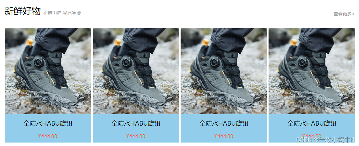
让多个li显示到一行并且对齐
css样式
.box-bd ul {
  /* 一定是li的亲爸爸 */
  display: flex;
  justify-content: space-between;
}
展示
最后完整效果
<!DOCTYPE html>
<html lang="en">

  <head>
    <meta charset="UTF-8">
    <meta http-equiv="X-UA-Compatible" content="IE=edge">
    <meta name="viewport" content="width=device-width, initial-scale=1.0">
    <title>Document</title>
    <style>
      * {
        margin: 0;
        padding: 0;
        box-sizing: border-box;
      }

      li {
        list-style: none;
      }

      .box {
        width: 1240px;
        height: 540px;
        /* background-color: pink; */
        margin: 100px auto;
      }

      .box-hd {
        /* 给父亲添加 flex 里面的孩子  h2 和 a 可以一样显示 */
        display: flex;
        /* 两侧没缝隙 主轴对齐 */
        justify-content: space-between;
        /* 侧轴底对齐 */
        align-items: flex-end;
        padding: 40px 0;
      }

      .box-hd h2 {
        font-size: 32px;
        font-weight: 400;
      }

      .box-hd h2 span {
        font-size: 16px;
        color: #999;
      }

      .box-hd a {
        font-size: 16px;
        color: #999;
      }

      .box-bd ul {
        /* 一定是li的亲爸爸 */
        display: flex;
        justify-content: space-between;
      }

      .box-bd li {
        width: 306px;
        height: 406px;
        background-color: skyblue;
        text-align: center;
      }

      .box-bd li img {
        width: 100%;
      }

      .box-bd li h4 {
        font-size: 22px;
        font-weight: 400;
        margin: 12px 0 20px;
      }

      .box-bd li p {
        font-size: 18px;
        color: orangered;
      }
    </style>
  </head>

  <body>
    <div class="box">
      <!-- 头部部分 -->
      <div class="box-hd">
        <h2>新鲜好物
          <span>新鲜出炉 品质靠谱</span>
        </h2>
        <a href="#">查看更多> </a>
      </div>

      <!-- 主体部分 -->
      <div class="box-bd">
        <ul>
          <li>
            <img src="./images/1.jpg" alt="">
            <h4>全防水HABU旋钮</h4>
            <p>¥444.00</p>
          </li>

          <li>
            <img src="./images/1.jpg" alt="">
            <h4>全防水HABU旋钮</h4>
            <p>¥444.00</p>
          </li>

          <li>
            <img src="./images/1.jpg" alt="">
            <h4>全防水HABU旋钮</h4>
            <p>¥444.00</p>
          </li>

          <li>
            <img src="./images/1.jpg" alt="">
            <h4>全防水HABU旋钮</h4>
            <p>¥444.00</p>
          </li>
        </ul>
      </div>
    </div>
  </body>

</html>
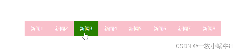
自动换行
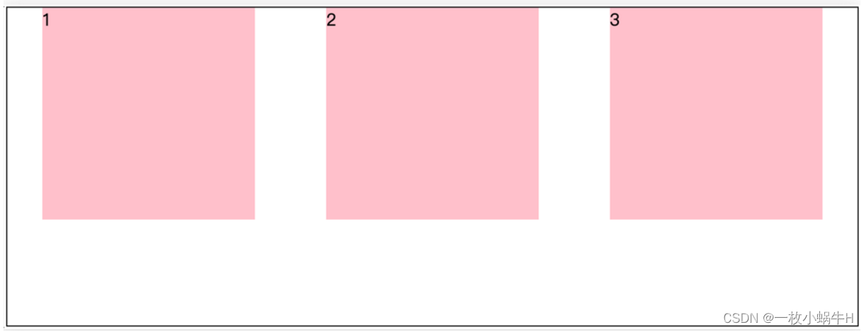
弹性盒子可以自动挤压或拉伸,默认情况下,所有弹性盒子都在一行显示。
属性名:flex-wrap
属性值
•wrap:换行
•nowrap:不换行(默认)
小米flex布局

<!DOCTYPE html>
<html lang="en">

<head>
  <meta charset="UTF-8">
  <meta http-equiv="X-UA-Compatible" content="IE=edge">
  <meta name="viewport" content="width=device-width, initial-scale=1.0">
  <title>Document</title>

  <style>
    * {
      margin: 0;
      padding: 0;
      box-sizing: border-box;
    }

    .mi {
      /* 父控子 */
      display: flex;
      justify-content: space-between;
      width: 1226px;
      height: 614px;
      /* background-color: pink; */
      margin: 100px auto;
    }

    .left {
      width: 234px;
      height: 614px;
      background-color: skyblue;
    }

    .right {
      width: 978px;
      height: 614px;
      background-color: purple;
    }

    .right ul {
      display: flex;
      /* 让li 自动换行 */
      flex-wrap: wrap;
      /* 主轴两侧对齐 */
      justify-content: space-between;

    }

    .right li {
      width: 234px;
      height: 300px;
      background-color: orange;
      list-style: none;
      margin-bottom: 14px;
    }
  </style>
</head>

<body>
  <div class="mi">
    <div class="left"></div>
    <div class="right">
      <ul>
        <li>1</li>
        <li>2</li>
        <li>3</li>
        <li>4</li>
        <li>1</li>
        <li>2</li>
        <li>3</li>
        <li>4</li>
      </ul>
    </div>
  </div>
</body>

</html>
多行对齐方式
如果有多行侧轴对齐,则去找align-content
如果是单行侧轴对齐,则去找 align-items
属性名:align-content
注意:该属性对单行弹性盒子模型无效。
<!DOCTYPE html>
<html lang="en">

<head>
  <meta charset="UTF-8">
  <meta http-equiv="X-UA-Compatible" content="IE=edge">
  <meta name="viewport" content="width=device-width, initial-scale=1.0">
  <title>Document</title>
  <style>
    .box {
      display: flex;
      /* 换行 */
      flex-wrap: wrap;
      /* 主轴对齐 */
      justify-content: space-between;
      /* 侧轴单行控制 */
      /* align-items: center; */
      /* 侧轴多行对齐 */

      /* align-content: center; */
      align-content: space-between;
      width: 1000px;
      /* 亲父亲得有高度 */
      height: 500px;
      border: 3px solid #000;
      margin: 100px auto;
    }

    .box div {
      width: 300px;
      height: 200px;
      background-color: pink;
    }
  </style>
</head>

<body>
  <div class="box">
    <div>1</div>
    <div>2</div>
    <div>3</div>
    <div>4</div>
    <div>5</div>
    <div>6</div>
  </div>
</body>

</html>

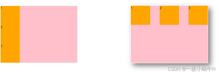
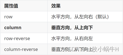
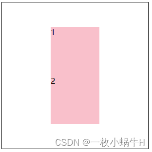
修改主轴方向
为什么要修改主轴? 只要父亲添加了display: flex, 所有的子盒子都会一行显示(水平显示) →
但是, 我们很多情况下,需要 盒子垂直竖着显示,此时就需要把主轴修改一下。修改为 竖着 ↓
主轴默认在水平方向,侧轴默认在垂直方向**
属性名:flex-direction
想要如下效果:
代码:
<!DOCTYPE html>
<html lang="en">

<head>
  <meta charset="UTF-8">
  <meta http-equiv="X-UA-Compatible" content="IE=edge">
  <meta name="viewport" content="width=device-width, initial-scale=1.0">
  <title>Document</title>
  <style>
    .box {
      display: flex;
      /* 默认主轴是横向 row  */
      /* 更改主轴的方向 我想要1和2盒子竖着排列 */
      flex-direction: column;
      width: 300px;
      height: 300px;
      border: 1px solid #000;
      /* 主轴 */
      justify-content: center;
      /* 侧轴 */
      align-items: center;

    }

    .box div {
      width: 100px;
      height: 100px;
      background-color: pink;
    }
  </style>
</head>

<body>
  <div class="box">
    <div>1</div>
    <div>2</div>
  </div>
</body>

</html>
弹性伸缩比
作用:控制弹性盒子的主轴方向的尺寸。
属性名:flex
属性值:整数数字,表示占用父级剩余尺寸的份数。
<!DOCTYPE html>
<html lang="en">

<head>
  <meta charset="UTF-8">
  <meta http-equiv="X-UA-Compatible" content="IE=edge">
  <meta name="viewport" content="width=device-width, initial-scale=1.0">
  <title>Document</title>
  <style>
    .box {
      display: flex;
      width: 80%;
      height: 200px;
      border: 1px solid #000;
    }

    .box span {
      /* 不会区分原来属于什么模式 */
      /* width: 100px;
      height: 100px;
      background-color: pink; */
      flex: 1;
      background-color: pink;
    }

    /* 圣杯布局两侧固定,中间自适应 */
    .left,
    .right {
      width: 100px;
      background-color: skyblue;
    }

    .center {
      flex: 1;
      background-color: purple;
    }

    .center1 {
      flex: 2;
      background-color: pink;
    }
  </style>
</head>

<body>
  <div class="box">
    <span>1</span>
    <span>2</span>
    <span>3</span>
    <span>4</span>
  </div>

  <div class="box">
    <div class="left">左</div>
    <div class="center">中</div>
    <div class="center1">中</div>
    <div class="right">右</div>
  </div>
</body>

</html>

作业
- 利用flex 完成以下效果图
-
利用flex完成京东效果
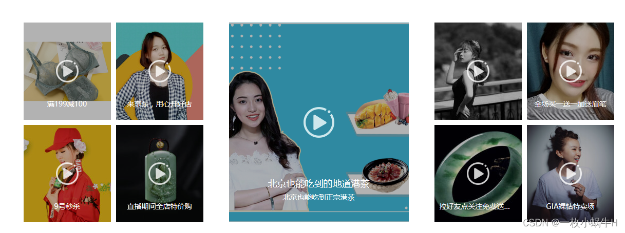
说明:
-
大盒子 宽度 1150 高度 390
-
左侧盒子宽度为 350像素, 中间盒子宽度 350, 右侧盒子宽度 350
-
里面填充图片即可


 6866
6866


 被折叠的 条评论
为什么被折叠?
被折叠的 条评论
为什么被折叠?
 到【灌水乐园】发言


