


安装&使用
Tips:需要结合 tailwindccs 使用,可以根据官网的安装指引
npm install -D @inspira-ui/plugins clsx tailwind-merge class-variance-authority tailwindcss-animate
npm install @vueuse/core motion-v
流动边框样例
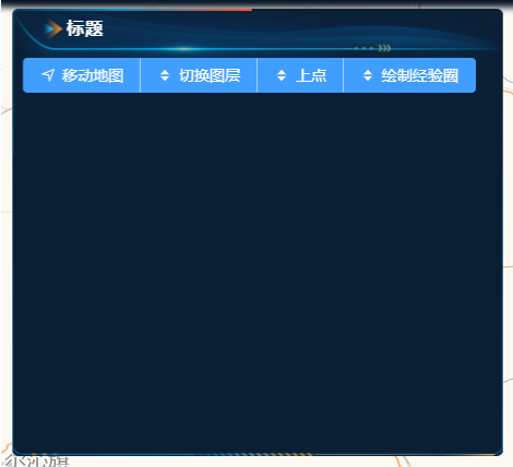
最终效果
- 流动边框组件
<template>
  <div
      :class="
      cn(
        'border-beam',
        'pointer-events-none absolute inset-0 rounded-[inherit] [border:calc(var(--border-width)*1px)_solid_transparent]',
        '![mask-clip:padding-box,border-box] ![mask-composite:intersect] [mask:linear-gradient(transparent,transparent),linear-gradient(white,white)]',
        'after:absolute after:aspect-square after:w-[calc(var(--size)*1px)] animate-border-beam after:[animation-delay:var(--delay)] after:[background:linear-gradient(to_left,var(--color-from),var(--color-to),transparent)] after:[offset-anchor:calc(var(--anchor)*1%)_50%] after:[offset-path:rect(0_auto_auto_0_round_calc(var(--size)*1px))]',
        props.class,
      )
    "
  >
    <slot></slot>
  </div>
</template>

<script setup lang="ts">
import {cn} from "../../lib/utils";
import {computed} from "vue";

interface BorderBeamProps {
  class?: string;
  size?: number;
  duration?: number;
  borderWidth?: number;
  anchor?: number;
  colorFrom?: string;
  colorTo?: string;
  delay?: number;
}

const props = withDefaults(defineProps<BorderBeamProps>(), {
  size: 200,
  duration: 15000,
  anchor: 90,
  borderWidth: 1.5,
  // colorFrom: "#ffaa40",
  colorFrom: "#fb5430",
  // colorTo: "#9c40ff",
  colorTo: "#0387bc",
  delay: 0,
});

const durationInSeconds = computed(() => `${props.duration}s`);
const delayInSeconds = computed(() => `${props.delay}s`);
</script>

<style scoped>
.border-beam {
  --size: v-bind(size);
  --duration: v-bind(durationInSeconds);
  --anchor: v-bind(anchor);
  --border-width: v-bind(borderWidth);
  --color-from: v-bind(colorFrom);
  --color-to: v-bind(colorTo);
  --delay: v-bind(delayInSeconds);
}

.animate-border-beam::after {
  animation: border-beam-anim var(--duration) infinite linear;
}

@keyframes border-beam-anim {
  to {
    offset-distance: 100%;
  }
}
</style>
- 使用流动边框组件
<template>
  <div class="CommonPanel" ref="panelRef">
    <div class="tittle">标题</div>
    <BorderBeam :size="250" :duration="12" :delay="9" :border-width="2" />
    <div class="content">
      <slot></slot>
    </div>
  </div>
</template>

<script setup lang="ts">
import { ref } from "vue";
import BorderBeam from "./ BorderBeam.vue";
const panelRef = ref<HTMLElement>();
</script>

<style scoped lang="less">
.CommonPanel {
  display: flex;
  flex-direction: column;
  border-radius: 6px;
  width: 100%;
  height: 410px;
  position: relative;
  background: url("@/assets/imgs/layout/panel/panel_bg.png") no-repeat center
      center / 100% 100%,
    rgba(255, 255, 255, 0.4);
  transition: background 0.3s ease;
  overflow: hidden;
  will-change: transform;
  transform: translateZ(0);
  backface-visibility: hidden;
  perspective: 1000px;
  transform-style: preserve-3d;
  -webkit-font-smoothing: antialiased;
  -moz-osx-font-smoothing: grayscale;
  filter: brightness(1);

  .border-box {
    position: absolute;
    top: 0;
    left: 0;
    width: 100%;
    height: 100%;
    pointer-events: none;
  }

  .tittle {
    position: relative;
    z-index: 1;
    color: white;
    font-size: 16px;
    height: 35px;
    display: flex;
    align-items: center;
    padding-left: 50px;
    font-weight: 550;
    letter-spacing: 1px;
  }

  .content {
    flex: 1;
    z-index: 1;
    overflow: auto;
    padding: 10px;
  }
}
</style>


 扫一扫
扫一扫


 8372
8372

 被折叠的 条评论
为什么被折叠?
被折叠的 条评论
为什么被折叠?
 到【灌水乐园】发言


