


目录
1、CSS常见问题
在引入BFC之前,我们先来看一看几个常见的css布局问题。
(1)、外边距塌陷
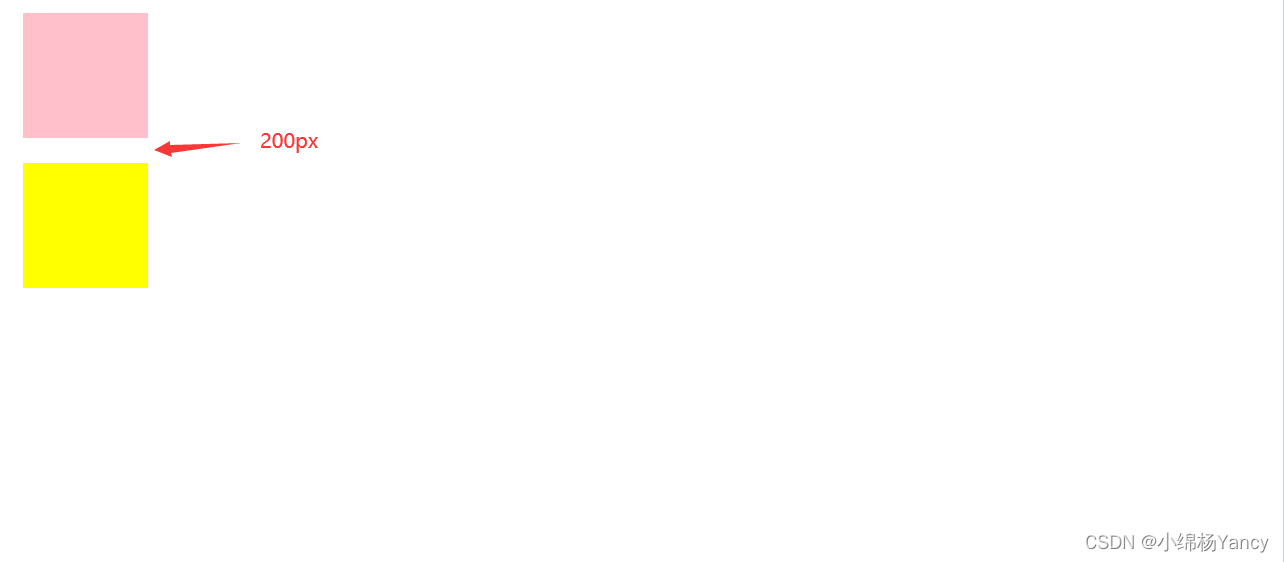
1、兄弟元素
<!DOCTYPE html>
<html lang="en">

<head>
    <meta charset="UTF-8">
    <meta http-equiv="X-UA-Compatible" content="IE=edge">
    <meta name="viewport" content="width=device-width, initial-scale=1.0">
    <title>外边距塌陷</title>
    <style>
        .one{
             width: 100px;
             height: 100px;
             background-color: pink;
             margin:10px;
         }
         .two{
             width: 100px;
             height: 100px;
             background-color: yellow;
             margin:10px;
         }
    </style>
</head>
<body>
    <div class="one"></div>
    <div class="two"></div>
</body>
</html>
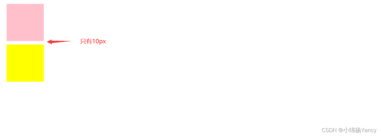
我们为两个div都设置了margin:10px;,二者之间应该的边距应该为20px,但是事实上是10px。
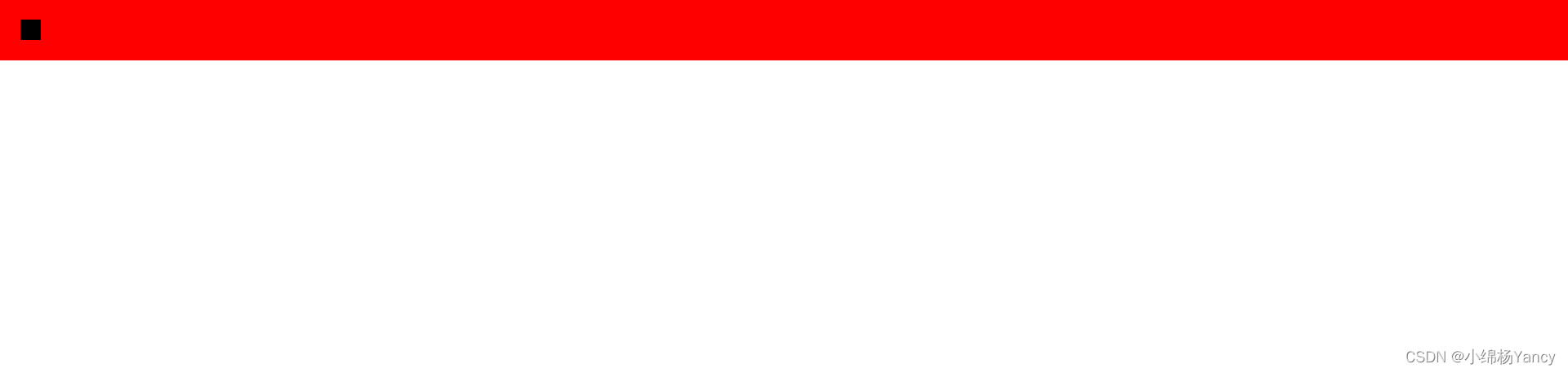
2、父子元素
<!DOCTYPE html>
<html lang="en">
<head>
    <meta charset="UTF-8">
    <meta http-equiv="X-UA-Compatible" content="IE=edge">
    <meta name="viewport" content="width=device-width, initial-scale=1.0">
    <title>Document</title>
    <style>
        *{
            margin: 0;
        }
        .box{
            background-color: red;
        }
        .inner{
            background-color: black;
            width: 20px;
            height: 20px;
            margin: 20px;
        }
    </style>
</head>
<body>
    <div class="box">
        <div class="inner"></div>
    </div>
</body>
</html>
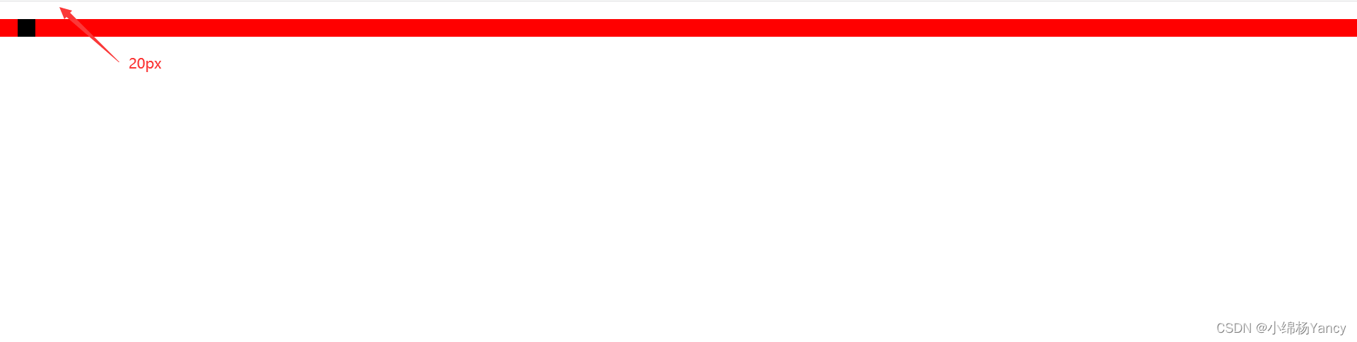
可以看到,设置自div的边距,却影响了父div的边距。
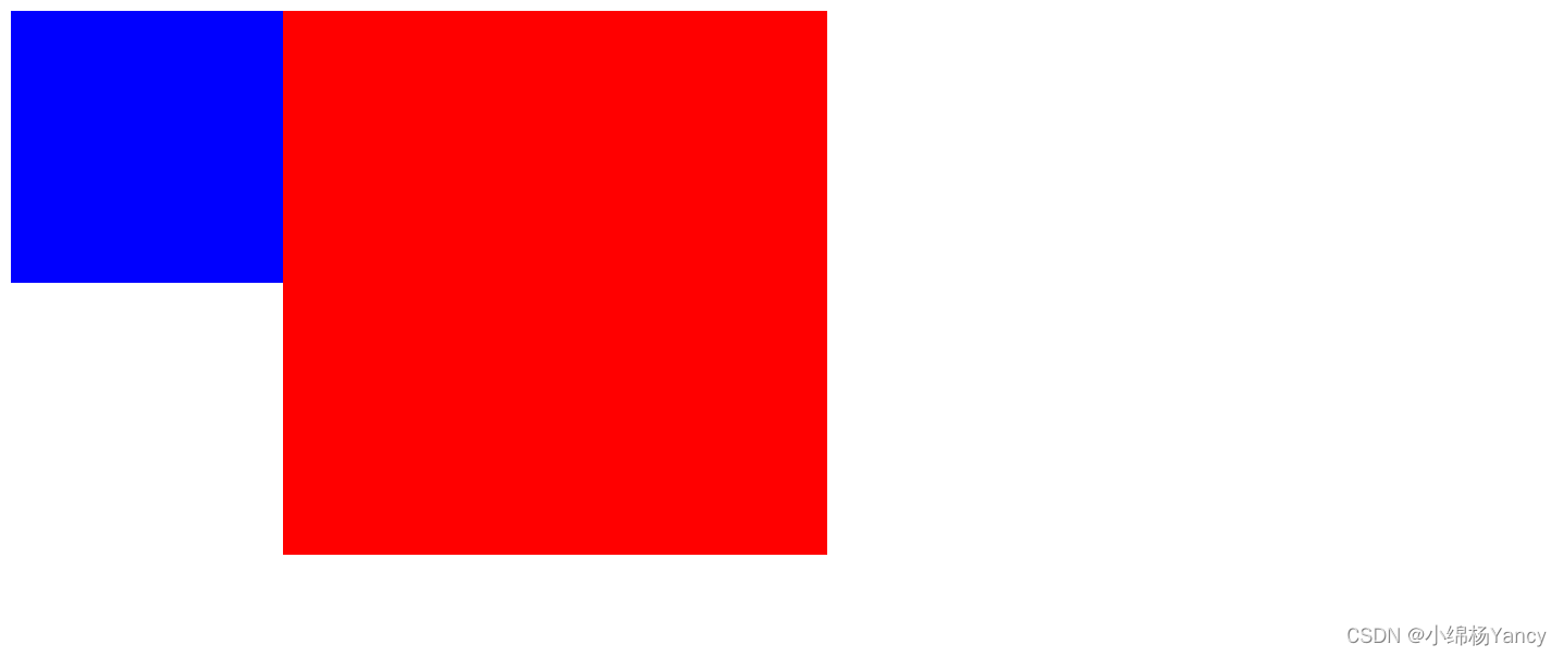
(2)、浮动元素覆盖
<!DOCTYPE html>
<html lang="en">
<head>
    <meta charset="UTF-8">
    <meta http-equiv="X-UA-Compatible" content="IE=edge">
    <meta name="viewport" content="width=device-width, initial-scale=1.0">
    <title>浮动元素覆盖</title>
    <style>
        .box1{
            width: 200px;
            height: 200px;
            background-color: blue;
            float: left;
        }
        .box2{
            width: 400px;
            height: 400px;
            background-color: red;
        }
    </style>
</head>
<body>
    <div class="box1"></div>
    <div class="box2"></div>
</body>
</html>
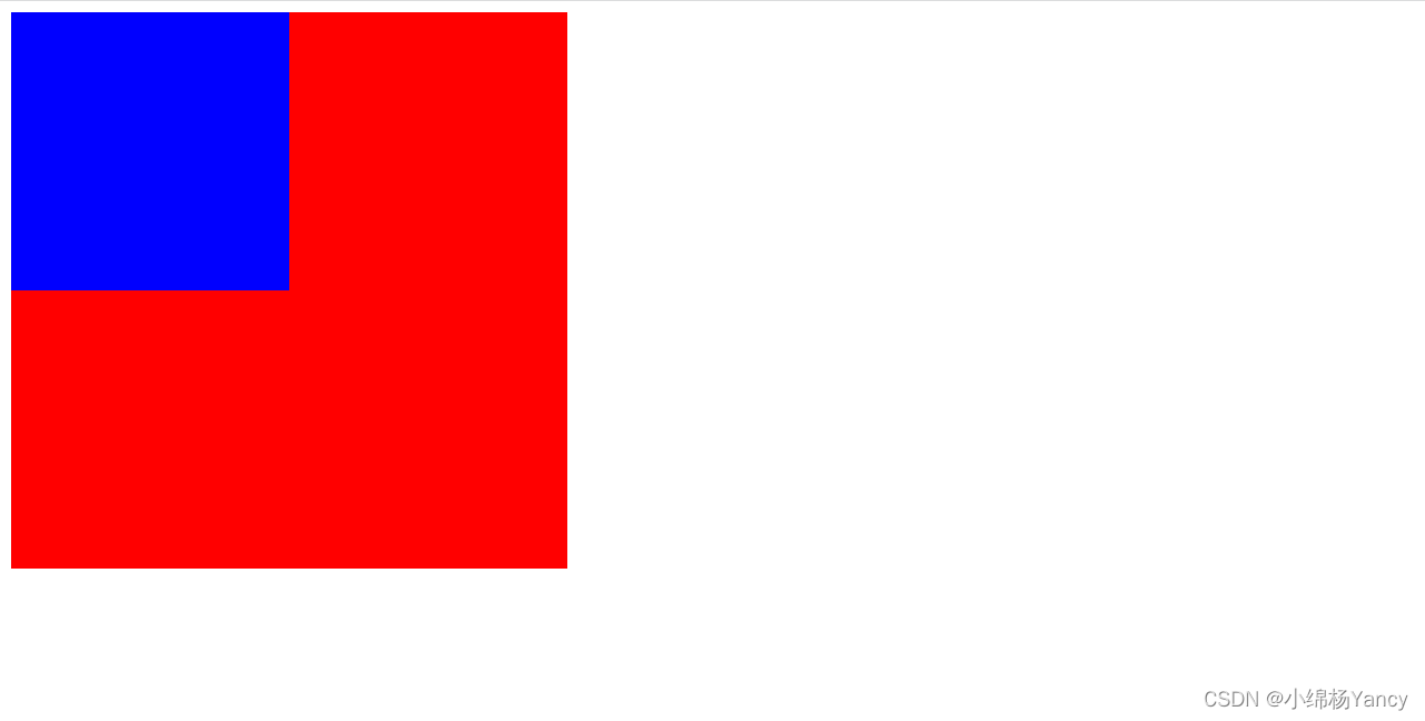
可以看到,由于蓝色div脱离了文档流,所以会覆盖红色的div,因为浮动元素在文档中并没有位置。
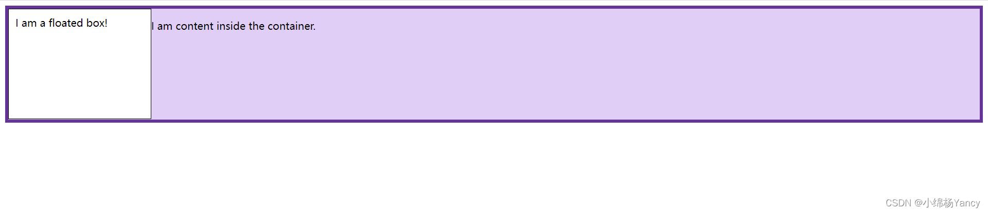
(3)、高度坍塌
<!DOCTYPE html>
<html lang="en">

<head>
    <meta charset="UTF-8">
    <meta http-equiv="X-UA-Compatible" content="IE=edge">
    <meta name="viewport" content="width=device-width, initial-scale=1.0">
    <title>高度塌陷问题</title>
    <style>
        .box {
            background-color: rgb(224, 206, 247);
            border: 5px solid rebeccapurple;
        }

        .float {
            float: left;
            width: 200px;
            height: 150px;
            background-color: white;
            border: 1px solid black;
            padding: 10px;
        }
    </style>
</head>
<body>
    <div class="box">
        <div class="float">I am a floated box!</div>
        <p>I am content inside the container.</p>
    </div>
</body>
</html>
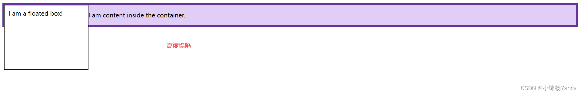
父div的高度不会包含浮动元素的高度,所以会显示浮动元素超出了父元素。
2、BFC
BFC(块级格式化上下文)属于普通流,BFC是一块独立的渲染区域,且有自己的渲染规则,将BFC看作元素的属性,若某元素拥有了BFC,则该元素便形成了一个独立的容器,容器内的元素不会在布局上影响到外面的元素。
常见创建BFC的方式:
根元素(<html>)
浮动元素(元素的 float 不是 none)
绝对定位元素(元素的 position 为 absolute 或 fixed)
行内块元素(元素的 display 为 inline-block)
overflow 计算值(Computed)不为 visible 的块元素
display 值为 flow-root 的元素
contain 值为 layout、content 或 paint 的元素
弹性元素(display 为 flex 或 inline-flex 元素的直接子元素)
网格元素(display 为 grid 或 inline-grid 元素的直接子元素)。
由创建BFC的方式可以看出,我们其实平时会经常使用BFC。
例如设置元素浮动,设置position,设置flex布局……
BFC特性:
1.BFC内部的BOX会垂直方向,一个一个放置。

2.box处置方向之间距离,由margin决定,属于同一个BFC内的连个相邻BOX的margin会重叠

   如:第一个容器设置下外边距为100px , 第一个容器下面的第二个容器设置上外边距为200px.当出现这种情况时,2个容器之间距离只有200px.
   也就是所谓的外边距塌陷.

3.BFC的区域不会与float box发生重叠

    如 :自适应两栏布局,解决悬浮元素覆盖问题。

4计算BFC的高度时,浮动元素也参与计算

    如:解决浮动造成的高度塌陷

5.BFC就是页面上的一个独立容器,容器里面的元素不会影响到外面的元素

6每个元素的margin box的左边会与包含块border box的左边相接触(对于从左到右的格式化,否则相反),即使存在浮动也会如此。
3、使用BFC解决上述问题
(1)、解决外边距塌陷问题
1、兄弟
由于两个div属于同一个BFC(html),所以出现了边距重合的问题,那么将一个div外套一个BFC,便可以解决。
<!DOCTYPE html>
<html lang="en">

<head>
    <meta charset="UTF-8">
    <meta http-equiv="X-UA-Compatible" content="IE=edge">
    <meta name="viewport" content="width=device-width, initial-scale=1.0">
    <title>外边距塌陷</title>
    <style>
        .one{
             width: 100px;
             height: 100px;
             background-color: pink;
             margin:10px;
         }
         .two{
             width: 100px;
             height: 100px;
             background-color: yellow;
             margin: 10px;
         }
         .box{
            /* BFC */
            overflow: hidden;
         }
    </style>
</head>
<body>
    <div class="one"></div>
    <div class="box">
        <div class="two"></div>
    </div>
</body>
</html>
2、父子
<!DOCTYPE html>
<html lang="en">
<head>
    <meta charset="UTF-8">
    <meta http-equiv="X-UA-Compatible" content="IE=edge">
    <meta name="viewport" content="width=device-width, initial-scale=1.0">
    <title>Document</title>
    <style>
        *{
            margin: 0;
        }
        .box{
            background-color: red;
            overflow: hidden;
        }
        .inner{
            background-color: black;
            width: 20px;
            height: 20px;
            margin: 20px;
        }
    </style>
</head>
<body>
    <div class="box">
        <div class="inner"></div>
    </div>
</body>
</html>
(2)、解决浮动元素覆盖问题
<!DOCTYPE html>
<html lang="en">
<head>
    <meta charset="UTF-8">
    <meta http-equiv="X-UA-Compatible" content="IE=edge">
    <meta name="viewport" content="width=device-width, initial-scale=1.0">
    <title>浮动元素覆盖</title>
    <style>
        .box1{
            width: 200px;
            height: 200px;
            background-color: blue;
            float: left;
        }
        .box2{
            width: 400px;
            height: 400px;
            background-color: red;
            /* BFC */
            overflow: hidden;
        }
    </style>
</head>
<body>
    <div class="box1"></div>
    <div class="box2"></div>
</body>
</html>
(3)、解决高度塌陷问题
<!DOCTYPE html>
<html lang="en">

<head>
    <meta charset="UTF-8">
    <meta http-equiv="X-UA-Compatible" content="IE=edge">
    <meta name="viewport" content="width=device-width, initial-scale=1.0">
    <title>高度塌陷问题</title>
    <style>
        .box {
            background-color: rgb(224, 206, 247);
            border: 5px solid rebeccapurple;
           /* BFC */
            overflow: hidden;
        }

        .float {
            float: left;
            width: 200px;
            height: 150px;
            background-color: white;
            border: 1px solid black;
            padding: 10px;
        }
    </style>
</head>
<body>
    <div class="box">
        <div class="float">I am a floated box!</div>
        <p>I am content inside the container.</p>
    </div>
</body>
</html>


 扫一扫
扫一扫


 661
661

 被折叠的 条评论
为什么被折叠?
被折叠的 条评论
为什么被折叠?
 到【灌水乐园】发言


