


一、简单使用
刚开始,就先不讲一堆标签的意义及用法,先简单看看shape标签怎么用。
1、新建shape文件
首先在res/drawable文件夹下,新建一个文件,命名为:shape_radius.xml
内容是这样的:(先不需要理解,先看shape怎么用)
<?xml version="1.0" encoding="utf-8"?>
<shape xmlns:android="http://schemas.android.com/apk/res/android" >
    <corners android:radius="20dip"/>
    <solid android:color="#ff00ff"/>

</shape>
2、添加到控件中
在定义好shape文件后,下一步就是将其添加到控件中,添加到控件中,一般是使用设置background属性,将其为控件背景,下面,我们将其设置为MainActivity对应的布局中(activity_main.xml),将其设为TextView的背景,看显示出来 是什么样子的。
<RelativeLayout xmlns:android="http://schemas.android.com/apk/res/android"
xmlns:tools="http://schemas.android.com/tools"
android:layout_width="match_parent"
android:layout_height="match_parent"
tools:context="com.harvic.tryshape.MainActivity" >
<TextView
android:layout_width="wrap_content"
android:layout_height="wrap_content"
android:layout_margin="50dip"
android:text="@string/hello_world"
android:background="@drawable/shape_radius"/>
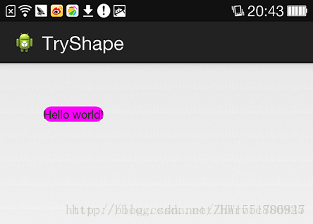
</RelativeLayout> 显示出来的结果是这样的:
二、基本属性(corners、gradient、padding、size、solid、stroke)
上面给大家简单的讲了下shape标签组的简单使用方法,下面就具体讲讲shape标签里所具有的几个子标签及所具有的属性。
1、Corners
<corners    //定义圆角
    android:radius="dimension"      //全部的圆角半径
    android:topLeftRadius="dimension"   //左上角的圆角半径
    android:topRightRadius="dimension"  //右上角的圆角半径
    android:bottomLeftRadius="dimension"    //左下角的圆角半径
    android:bottomRightRadius="dimension" />    //右下角的圆角半径
Corners标签是用来字义圆角的,其中radius与其它四个并不能共同使用。
android:radius:定义四个角的的圆角半径。
其它四个是逐个字义每个角的圆角半径。


 71
71

 被折叠的 条评论
为什么被折叠?
被折叠的 条评论
为什么被折叠?
 到【灌水乐园】发言


