


前言
项目上有视频播放功能,但是视频控制条需要自定义,因为包含其他功能,近期整理了部分功能,自己重新写了控制栏,记录一下(实在没找到什么现成插件,可能还是我懒吧~)。目前只抽了进度条的组件,整个控制栏还没完全抽出,等我啥时候有时间了再慢慢搞。
然后因为项目用的是elementUI,所以组件中也是直接用了里面的一些组件。
进度条效果图
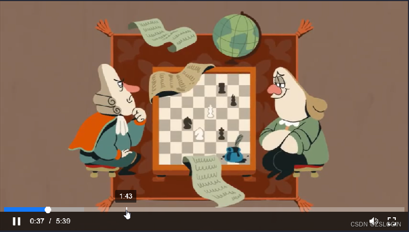
下面为gif演示,抽帧太多拖动颜色有点丢失,看个效果就行了

一、进度条
本来这个进度条是直接用的 el-slider 来实现的,但是后面我想加入鼠标移动时的时间 tooltip,发现有点bug,所以就直接重新写了,拖动按钮是直接搬运的 el-slider 里面的按钮。
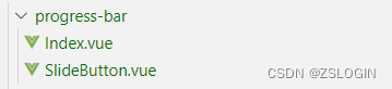
目录结构
Index.vue
代码如下:
<template>
  <div :class="barClass">
    <div ref="slider" class="progress-bar__slider" @mousemove="calcPos" @mouseenter="calcPos" @mouseleave="hideProgressFrame" @click="onSliderClick">
      <!-- 播放进度 -->
      <div class="progress__played" ref="played" :style="{width:currentPercentage+'%'}"></div>
      <!-- 滑动按钮 -->
      <slide-button v-if="!sliderDisabled" ref="sliderButton" v-model="currentPercentage" />
      <!-- 缓冲条 -->
      <div class="progress__buffer" ref="buffer" :style="{width:buffered}"></div>
      <!-- 帧 -->
      <div ref="frame" class="progress__frame"></div>
      <!-- tooltip -->
      <div ref="frameTip" class="frame__tip">{{pointerPercentage|filterPercentage(this)}}</div>
    </div>
  </div>
</template>

<script>
import SlideButton from './SlideButton.vue'
export default {
  name: 'ProgressBar',
  components: { SlideButton },
  model: {
    prop: 'value',
    event: 'input'
  },
  props: {
    value: { type: Number, default: 0 },
    disabled: { type: Boolean, default: false }, // 进度条是否可拖拽
    duration: { type: [Number, String], default: 0 }, // 视频总时长
    buffered: { type: [Number, String], default: 0 }, // 缓冲进度
    showTooltip: { type: Boolean, default: false }, // 写了另外的tooltip,这个可根据需要直接删,这是控制SlideButton中el-tooltip显示的,没有配合自己写的tooltip功能
  },
  filters: {
    filterPercentage(val, that) {
      return that.formatTooltip(val)
    }
  },
  computed: {
    sliderDisabled() {
      return this.disabled
    },
    barClass() {
      let classStr = ''
      if (this.dragging) {
        classStr += ' is-dragging'
      }
      if (this.sliderDisabled) {
        classStr += ' is-disabled'
      }
      return 'progress-bar' + classStr
    }
  },
  data() {
    return {
      currentPercentage: 0,
      wrapperPos: 0,
      pointerPercentage: 0, // 鼠标指向时间
      played: 0, // 播放进度
      sliderSize: 1, // 进度条尺寸
      vertical: false, // 这个是因为 el-slider 支持竖向,但是这里没有写竖向功能,先预留,等后续开发~
      step: 1,
      dragging: false
    }
  },
  watch: {
    value() {
      if (this.dragging) {
        return
      }
      this.getPercentage()
    }
  },
  created() {
    this.getPercentage()
  },
  mounted() {
    const bounds = this.$refs.slider.getBoundingClientRect()
    this.wrapperPos = bounds.left
    this.resetSize()
  },
  methods: {
    resetSize() {
      if (this.$refs.slider) {
        this.sliderSize = this.$refs.slider[`clientWidth`];
      }
    },
    // 计算当前鼠标指向位置
    calcPos(e) {
      if (this.disabled) return
      if (this.$refs.sliderButton.hovering || this.dragging) {
      	if (this.$refs.sliderButton.hovering) {
          this.pointerPercentage = this.currentPercentage
        }
        this.$refs.frame.style.display = 'none'
        return
      }
      this.setFramePosition(e)
      this.setTooltipPosition(e)
    },
    calcPosition(e) {
      const offsetX = e.clientX - this.wrapperPos
      const pos = offsetX < 0 ? 0 : offsetX > this.sliderSize ? this.sliderSize : offsetX
      // 当前鼠标指针进度百分比
      this.pointerPercentage = parseFloat(pos / this.sliderSize * 100)
      return pos
    },
    // 指示器位置(鼠标移动时的小白条)
    setFramePosition(e) {
      const pos = this.calcPosition(e)
      this.$refs.frame.style.left = pos / this.sliderSize * 100 + '%'
      this.$refs.frame.style.display = 'block'
    },
    // tooltip(指示时间)
    setTooltipPosition(e) {
      const pos = this.calcPosition(e)
      // 计算 tooltip 位置,获取 tooltip 宽度
      const tipWidth = this.$refs.frameTip?.getBoundingClientRect().width
      // 贴边偏移量,到边缘左右位置不再变化
      const tipOffset = tipWidth / 2
      const tipPos = pos < tipOffset ? tipOffset : pos > this.sliderSize - tipOffset ? this.sliderSize - tipOffset : pos
      this.$refs.frameTip.style.left = tipPos / this.sliderSize * 100 + '%'
      this.$refs.frameTip.style.display = 'block'
    },
    hideProgressFrame() {
      // 隐藏指示器
      setTimeout(() => {
        this.$refs.frame.style.display = 'none'
        this.$refs.frameTip.style.display = 'none'
      }, 200)
    },
    onSliderClick() {
      if (this.sliderDisabled || this.dragging) return;
      this.setPosition()
      this.emitChange()
    },
    setPosition() {
      this.$refs.sliderButton.setPosition(this.pointerPercentage)
    },
    getPercentage() {
      this.currentPercentage = !isNaN(this.duration) && this.duration > 0 ? this.value / this.duration * 100 : 0
    },
    formatTooltip(val) {
      const time = this.duration * (val / 100)
      return this.formatTime(time)
    },
    formatTime(t) {
      let time = '0:00'
      if (t) {
        const h = parseInt(t / 3600)
        const m = parseInt(t % 3600 / 60)
        let s = parseInt(t % 60)
        s = s < 10 ? '0' + s : s
        time = h ? h + ':' + m + ':' + s : m + ':' + s
      }
      return time
    },
    emitChange() {
      const currentTime = this.duration * this.currentPercentage / 100
      this.$emit('change', currentTime)
    }
  }
}
</script>

<style lang="scss" scoped>
.progress-bar {
  position: absolute;
  height: 2px;
  top: -2px;
  z-index: 2;
  left: 0;
  width: 100%;
  margin: 0 8px;
  width: calc(100% - 16px);
  transition: all 200ms cubic-bezier(0.215, 0.61, 0.355, 1);
  background-color: rgba(255, 255, 255, 0.3);
  cursor: pointer;
  .progress__played,
  .progress__buffer {
    position: absolute;
    top: 0;
    left: 0;
    width: 0;
    height: 100%;
  }
  .progress__buffer {
    background-color: rgba(169, 169, 169, 0.7);
    z-index: 1;
  }
  .progress__played {
    z-index: 2;
    background: #1479f9;
  }
}
.played__slider {
  position: absolute;
  height: 14px;
  width: 14px;
  background: #fff;
  border-radius: 50%;
  top: 50%;
  transform: translateY(-50%);
  cursor: pointer;
}

.progress-bar__slider {
  position: relative;
  height: 100%;
  width: 100%;
}
.progress__frame {
  position: absolute;
  top: 0;
  bottom: 0;
  width: 3px;
  left: 0;
  background: #fff;
  z-index: 99;
  display: none;
  cursor: pointer;
}
.frame__tip {
  position: absolute;
  top: -38px;
  left: 0;
  transform: translateX(-50%);
  width: fit-content;
  height: fit-content;
  background: rgba(0, 0, 0, 0.6);
  padding: 6px 10px;
  border-radius: 4px;
  font-size: 14px;
  color: #fff;
  white-space: nowrap;
  user-select: none;
  display: none;
}
.progress-bar.is-dragging,
.progress-bar:not(.is-disabled):hover {
  height: 10px;
  top: -10px;
}
.progress-bar:hover ::v-deep .el-slider__button {
  background-color: #fff;
}
.progress-bar.is-disabled {
  &,
  .progress__frame,
  .played__slider {
    cursor: default;
  }
}
</style>
SlideButton.vue
这个是直接用的 el-slider 中的代码,改了一点点点的内容(一些没用上的我也没有删,如果不用elementUI的话,有些样式需要自己加上,还要删掉这个tooltip等)。
代码如下:
<template>
  <div class="progress__slide el-slider__button-wrapper" @mouseenter="handleMouseEnter" @mouseleave="handleMouseLeave" @mousedown="onButtonDown" @touchstart="onButtonDown" :class="{ 'hover': hovering, 'dragging': dragging }" :style="wrapperStyle" ref="button" tabindex="0" @focus="handleMouseEnter" @blur="handleMouseLeave">
    <el-tooltip placement="top" ref="tooltip" popper-class="slider__tooltip" :disabled="!showTooltip">
      <span slot="content">{{ formatValue }}</span>
      <div class="el-slider__button" :class="{ 'hover': hovering, 'dragging': dragging }"></div>
    </el-tooltip>
  </div>
</template>

<script>
export default {
  name: 'ElSliderButton',
  props: {
    value: {
      type: Number,
      default: 0
    },
    vertical: { // 暂时未写竖直情况
      type: Boolean,
      default: false
    },
    // tooltipClass: String
  },

  data() {
    return {
      hovering: false,
      dragging: false,
      isClick: false,
      startX: 0,
      currentX: 0,
      startY: 0,
      currentY: 0,
      startPosition: 0,
      newPosition: null,
      oldValue: this.value,
      diff: 0
    };
  },

  computed: {
    disabled() {
      return this.$parent.sliderDisabled;
    },

    showTooltip() {
      return this.$parent.showTooltip;
    },

    currentPosition() {
      return `${this.value}%`;
    },

    step() {
      return this.$parent.step;
    },

    enableFormat() {
      return this.$parent.formatTooltip instanceof Function;
    },

    formatValue() {
      return this.enableFormat && this.$parent.formatTooltip(this.value) || this.value;
    },

    wrapperStyle() {
      return this.vertical ? { bottom: this.currentPosition } : { left: this.currentPosition };
    }
  },

  watch: {
    dragging(val) {
      this.$parent.dragging = val;
    }
  },

  methods: {
    displayTooltip() {
      this.$refs.tooltip && (this.$refs.tooltip.showPopper = true);
    },

    hideTooltip() {
      this.$refs.tooltip && (this.$refs.tooltip.showPopper = false);
    },

    handleMouseEnter() {
      if (this.disabled) return;
      this.hovering = true;
      this.displayTooltip();
    },

    handleMouseLeave() {
      if (this.disabled) return;
      this.hovering = false;
      this.hideTooltip();
    },

    onButtonDown(event) {
      if (this.disabled) return;
      event.preventDefault();
      this.onDragStart(event);
      window.addEventListener('mousemove', this.onDragging);
      window.addEventListener('touchmove', this.onDragging);
      window.addEventListener('mouseup', this.onDragEnd);
      window.addEventListener('touchend', this.onDragEnd);
      window.addEventListener('contextmenu', this.onDragEnd);
    },
    onDragStart(event) {
      this.dragging = true;
      this.isClick = true;
      if (event.type === 'touchstart') {
        event.clientY = event.touches[0].clientY;
        event.clientX = event.touches[0].clientX;
      }
      if (this.vertical) {
        this.startY = event.clientY;
      } else {
        this.startX = event.clientX;
      }
      this.startPosition = parseFloat(this.currentPosition);
      this.newPosition = this.startPosition;
    },

    onDragging(event) {
      if (this.dragging) {
        this.isClick = false;
        let diff = 0
        if (event.type === 'touchmove') {
          event.clientY = event.touches[0].clientY;
          event.clientX = event.touches[0].clientX;
        }
        if (this.vertical) {
          this.currentY = event.clientY;
          diff = this.startY - this.currentY;
        } else {
          this.currentX = event.clientX;
          diff = this.currentX - this.startX;
        }
        this.newPosition = this.startPosition + diff / this.$parent.sliderSize * 100;
        this.setPosition(this.newPosition);
        this.$parent.setTooltipPosition(event)
      }
    },

    onDragEnd() {
      if (this.dragging) {
        /*
         * 防止在 mouseup 后立即触发 click,导致滑块有几率产生一小段位移
         * 不使用 preventDefault 是因为 mouseup 和 click 没有注册在同一个 DOM 上
         */
        setTimeout(() => {
          this.dragging = false;
          this.hideTooltip();
          if (!this.isClick) {
            this.setPosition(this.newPosition);
            this.$parent.emitChange()
          }
        }, 0);
        window.removeEventListener('mousemove', this.onDragging);
        window.removeEventListener('touchmove', this.onDragging);
        window.removeEventListener('mouseup', this.onDragEnd);
        window.removeEventListener('touchend', this.onDragEnd);
        window.removeEventListener('contextmenu', this.onDragEnd);
      }
    },

    setPosition(newPosition) {
      if (newPosition === null || isNaN(newPosition)) return;
      if (newPosition < 0) {
        newPosition = 0;
      } else if (newPosition > 100) {
        newPosition = 100;
      }
      this.$emit('input', newPosition);
      this.$nextTick(() => {
        this.displayTooltip();
        this.$refs.tooltip && this.$refs.tooltip.updatePopper();
      });
      if (!this.dragging && this.value !== this.oldValue) {
        this.oldValue = this.value;
      }
    }
  }
};
</script>

<style lang="scss" scoped>
.progress__slide {
  &.el-slider__button-wrapper {
    height: 14px;
    width: 14px;
    top: 50%;
    transform: translate(-50%, -50%);
    display: flex;
    align-items: center;
    justify-content: center;
  }
  .el-slider__button {
    width: 14px;
    height: 14px;
    border: none;
    background-color: transparent;
  }
  .el-slider__button.hover,
  .el-slider__button.dragging {
    background-color: #fff;
  }
  // .el-slider__button-wrapper:hover,
  // .el-slider__button-wrapper.hover {
  //   cursor: pointer;
  // }
  .el-slider__button.dragging,
  .el-slider__button.hover,
  .el-slider__button:hover {
    transform: unset;
    // cursor: pointer;
  }
}
</style>

<style lang="scss">
.el-tooltip__popper.is-dark.slider__tooltip {
  background: rgba(0, 0, 0, 0.6);
  padding: 6px 10px;
  border-radius: 4px;
  font-size: 14px;
  margin-bottom: 10px;
  .popper__arrow,
  &[x-placement^='top'] .popper__arrow::after {
    border: none;
  }
}
</style>
二、视频页面
控制条的部分是 control-bar 那里,这里其实应该再抽成组件的,但是最近没什么时间暂时就这样了,将就看吧。
样式是根据UI设计稿来的,但是没有UE,UE基本上是借鉴的ckplayer(肯定没有人家写得好,将就用用~)。关于为什么不直接用ckplayer,其实用了,但是控制条还是要自己写,就放弃了,直接还是用的原来自己写的(其实能用插件更好,如果没什么定制化的需求的话)。
ckplayer网址:https://www.ckplayer.com/
fullscreen用的是 vue-fullscreen 插件
npm install vue-fullscreen
<template>
  <fullscreen :fullscreen.sync="fullscreen" class="fullscreen">
    <div v-if="data.url" class="main-container">
      <div class="video-box" @dblclick="handleFullscreen" @mouseout="hideControlBar">
        <div v-if="loading" class="overlay"><i class="el-icon-loading" />加载中...</div>
        <video ref="video" oncontextmenu="return false" class="video" :muted="muted" @timeupdate="ontimeupdate" @playing="handlePlaying" @waiting="handleWaiting" @loadeddata="loadeddata" @ended="onended" @mousemove="showControlBar">
          <source :src="data.url" type="video/mp4" />
          <source :src="data.url" type="video/ogg" />
          <source :src="data.url" type="video/webm" />
          您的浏览器不支持 HTML5 video 标签。
        </video>
        <div ref="control-bar" class="control-bar" :class="{'show':controlBarShow}">
          <div class="control-bar-wrapper">
            <progress-bar ref="progressBar" v-model="currentTime" :disabled="!fastForward" :duration="duration" :buffered="bufferedLength" @change="progressChange" />
            <div class="control-bar-inner">
              <div class="control-bar-inner__left centered-flex">
                <div class="control-item" :title="paused?'播放':'暂停'">
                  <svg-icon :icon-class="paused?'icon-play':'icon-pause'" @click="handleVideoPause" />
                </div>
                <div class="control-item">
                  <span>{{ currentTime | filterDuration(this) }}</span>
                  <span>/</span>
                  <span>{{ duration | filterDuration(this) }}</span>
                </div>
              </div>
              <div class="control-bar-inner__right centered-flex">
                <div class="control-item volume-block">
                  <div class="volume">
                    <el-slider v-model="volume" vertical height="100px" :show-tooltip="false" @input="volumeChange" />
                  </div>
                  <div class="svg-icon-box" @click="handleMuted">
                    <svg-icon :icon-class="muted?'icon-volume-muted':'icon-volume'" />
                  </div>
                </div>
                <div class="control-item" :title="fullscreen?'退出全屏':'全屏'">
                  <svg-icon :icon-class="fullscreen?'shrink-screen':'icon-fullscreen'" @click="handleFullscreen" />
                </div>
              </div>
            </div>
          </div>
        </div>
      </div>
    </div>
  </fullscreen>
</template>

<script>
import ProgressBar from '@/components/progress-bar/Index'
export default {
  name: 'CourseMain',
  components: { MenuList, ProgressBar },
  props: {
    data: { type: Object, default: () => { } },
    menus: { type: Array, default: () => [] },
    active: { type: Number, default: 0 },
    fastForward: { type: [Number, Boolean], default: false },
    overlay: { type: Boolean, default: true },
    percentage: { type: Number, default: 0 }
  },
  filters: {
    filterDuration(val, that) {
      return that.formatTime(val)
    }
  },
  data() {
    return {
      loading: false, // 缓冲遮罩
      currentTime: 0, // 视频当前播放位置
      currentPercentage: 0, // 视频进度
      controlBarShow: false, // 是否显示控制栏
      duration: 0, // 视频总时长
      fullscreen: false, // 是否全屏
      muted: false,
      paused: true, // 是否为暂停状态
      showVolume: false,
      timeout: 0, // 延时器
      volume: 10,
      bufferedLength: 0,
    }
  },
  watch: {
    active(val) {
      this.currentMenu = val
      this.$nextTick(() => {
        this.$refs.video.src = this.data.url
        if (!this.overlay) {
          this.paused = true
          this.handleVideoPause()
        }
      })
    }
  },
  mounted() {
    window.addEventListener('keydown', this.handleKeyCode)
  },
  async beforeDestroy() {
    window.removeEventListener('keydown', this.handleKeyCode)
  },
  methods: {
    handleKeyCode(e) {
      if (e.code === 'ArrowUp') {
        this.volume = this.volume <= 99 ? this.volume + 1 : 100
        this.volumeChange(this.volume)
      }
      if (e.code === 'ArrowDown') {
        this.volume = this.volume >= 1 ? this.volume - 1 : 0
        this.volumeChange(this.volume)
      }
      if (e.code === 'Space') {
        e.preventDefault()
        this.handleVideoPause()
      }
    },
    loadeddata() {
      this.duration = this.$refs.video.duration
      this.currentTime = this.$refs.video.currentTime
      this.volumeChange(this.volume)
    },
    ontimeupdate() {
      // ontimeupdate 触发间隔为 250ms
      const video = this.$refs.video
      const currentTime = video.currentTime
      // if (this.duration > 0) {
      for (let i = 0; i < video.buffered.length; i++) {
        // 寻找当前时间之后最近的点
        if (video.buffered.start(video.buffered.length - 1 - i) < currentTime) {
          this.bufferedLength = (video.buffered.end(video.buffered.length - 1 - i) / video.duration) * 100 + '%'
          break
        }
      }
      // }
      this.currentTime = currentTime
    },
    formatTime(t) {
      let time = '0:00'
      if (t) {
        const h = parseInt(t / 3600)
        const m = parseInt(t % 3600 / 60)
        let s = parseInt(t % 60)
        s = s < 10 ? '0' + s : s
        time = h ? h + ':' + m + ':' + s : m + ':' + s
      }
      return time
    },
    handleMuted() {
      this.$refs.video.muted = !this.$refs.video.muted
      this.muted = this.$refs.video.muted
    },
    startPlay(val) {
      this.paused = true
      this.handleVideoPause()
    },
    handleVideoPause() {
      try {
        if (this.paused) {
          this.$refs.video.play()
          this.paused = false
        } else {
          this.$refs.video.pause()
          this.paused = true
        }
      } catch (error) {
        console.log(error)
      }

    },
    handleWaiting() {
      this.loading = true
    },
    handlePlaying() {
      this.loading = false
    },
    volumeChange(vol) {
      this.muted = this.$refs.video.muted = vol / 100 <= 0
      // The volume provided must at the range [0, 1]
      this.$refs.video.volume = vol / 100
    },
    handleFullscreen() {
      this.fullscreen = !this.fullscreen
    },
    progressChange(val) {
      this.$refs.video.currentTime = val
    },
    // 视频播放完成
    onended() {
      this.$emit('ended')
    },
    handleMenuChange(val, index) {
      this.$emit('change', val, index)
    },
    showControlBar(clear = true) {
      this.timeout && window.clearTimeout(this.timeout)
      this.timeout = 0
      this.controlBarShow = true
      if (clear) {
        this.timeout = window.setTimeout(this.hideControlBar, 3000)
      }
    },
    hideControlBar() {
      this.controlBarShow = false
    }
  }
}
</script>

<style lang="scss" scoped>
.fullscreen {
  height: 100%;
}
.main-container {
  position: relative;
  height: 100%;
  width: 100%;
  overflow: hidden;
  background: #000;
}
.main-container.is-fullscreen {
  position: fixed;
  top: 0;
  bottom: 0;
  left: 0;
  right: 0;
  z-index: 2000;
}
.control-bar:hover,
.control-bar.show {
  opacity: 1;
  visibility: visible;
}
.control-bar {
  position: absolute;
  bottom: 0;
  width: 100%;
  height: 40px;
  background: rgba(0, 0, 0, 0.7);
  opacity: 0;
  visibility: hidden;
  transition: all 300ms linear;
}
.overlay,
.video-box {
  position: absolute;
  top: 0;
  left: 0;
  right: 0;
  bottom: 0;
  display: flex;
  justify-content: center;
  align-items: center;
}
.video {
  width: 100%;
  height: 100%;
}
.centered-flex {
  display: flex;
  justify-content: center;
  align-items: center;
}
.overlay {
  z-index: 199;
  background: #000000db;
  .el-button {
    width: 140px;
    height: 48px;
    background: #1479f9;
    color: #fff;
    font-size: 18px;
    border-color: #1479f9;
    border-radius: 24px;
    transition: cubic-bezier(0.075, 0.82, 0.165, 1);
    &:hover {
      background: #1974e8;
    }
  }
}

.control-bar-wrapper {
  position: relative;
  height: 100%;
}
.control-bar-inner {
  position: absolute;
  left: 0;
  top: 0;
  z-index: 5;
  transition: background linear;
}

.control-bar-inner {
  display: flex;
  justify-content: space-between;
  align-items: center;
  right: 0;
  bottom: 0;
  height: 100%;
  width: 100%;
  padding: 0 16px;
  span + span {
    margin-left: 10px;
  }
  .svg-icon + span {
    margin-left: 22px;
  }
  .svg-icon:hover {
    color: #1974e8;
  }
}
.control-bar-inner__left,
.control-bar-inner__right,
.control-item {
  height: 100%;
}

.control-item {
  position: relative;
  display: inline-flex;
  align-items: center;
  padding: 0 10px;
  user-select: none;
}

.svg-icon {
  cursor: pointer;
  font-size: 18px;
}

.menu-block {
  .menu-context {
    display: none;
    position: absolute;
    right: 0;
    bottom: 26px;
    padding-bottom: 26px;
  }
  &:hover .menu-context,
  .menu-context:hover {
    display: block;
  }
}

::v-deep .volume-block {
  border-radius: 20px;
  font-size: 18px;
  .volume {
    position: absolute;
    bottom: 26px;
    right: 50%;
    transform: translateX(50%);
    z-index: 9;
    padding-bottom: 26px;
    display: none;
  }
  .volume:hover,
  &:hover .volume {
    display: block;
  }
  .el-slider.is-vertical {
    padding: 12px 14px;
    background: #000000b3;
    border-radius: 4px;

    .el-slider__bar {
      background-color: #fff;
    }
    .el-slider__button {
      border-color: #000000b3;
    }
    & .el-slider__runway {
      background-color: #999;
    }
    & .el-slider__runway,
    & .el-slider__bar {
      width: 2px;
      margin: 0;
    }
    & .el-slider__button-wrapper {
      left: 50%;
      transform: translate(-50%, 50%);
    }
  }
}
</style>
总结
结束,以后有机会再整理


 1万+
1万+


 被折叠的 条评论
为什么被折叠?
被折叠的 条评论
为什么被折叠?
 到【灌水乐园】发言


